'%3e%3cpath%20fill-rule='evenodd'%20clip-rule='evenodd'%20d='M51.1303%2019.2492C50.7278%2019.913%2050.1346%2020.4426%2049.3508%2020.838C48.5669%2021.2335%2047.6172%2021.4312%2046.5014%2021.4312C44.8208%2021.4312%2043.4367%2021.0216%2042.3492%2020.2025C41.2617%2019.3833%2040.6686%2018.2394%2040.5697%2016.7706H44.4253C44.4818%2017.3355%2044.6831%2017.7804%2045.0291%2018.1052C45.3751%2018.43%2045.8164%2018.5924%2046.3531%2018.5924C46.8192%2018.5924%2047.1864%2018.4653%2047.4547%2018.2111C47.7231%2017.9569%2047.8572%2017.618%2047.8572%2017.1943C47.8572%2016.8129%2047.7337%2016.4952%2047.4865%2016.241C47.2393%2015.9867%2046.9322%2015.7784%2046.565%2015.616C46.1978%2015.4536%2045.6893%2015.2594%2045.0397%2015.0334C44.0934%2014.7086%2043.3202%2014.3944%2042.72%2014.0907C42.1197%2013.7871%2041.6042%2013.3351%2041.1735%2012.7349C40.7427%2012.1347%2040.5273%2011.3544%2040.5273%2010.394C40.5273%209.50418%2040.7533%208.73448%2041.2053%208.08481C41.6572%207.43515%2042.2821%206.93731%2043.0801%206.5913C43.8781%206.24528%2044.7925%206.07227%2045.8235%206.07227C47.49%206.07227%2048.8141%206.46771%2049.7956%207.25861C50.7772%208.04951%2051.3315%209.13698%2051.4586%2010.5211H47.5395C47.4689%2010.0268%2047.2888%209.63483%2046.9993%209.3453C46.7097%209.05578%2046.3178%208.91102%2045.8235%208.91102C45.3998%208.91102%2045.0573%209.024%2044.7961%209.24997C44.5348%209.47594%2044.4041%209.80783%2044.4041%2010.2457C44.4041%2010.5988%2044.5207%2010.8989%2044.7537%2011.146C44.9867%2011.3932%2045.2798%2011.5944%2045.6328%2011.7498C45.9859%2011.9052%2046.4944%2012.1029%2047.1581%2012.343C48.1185%2012.6678%2048.9023%2012.9891%2049.5096%2013.3069C50.1169%2013.6246%2050.6395%2014.0872%2051.0773%2014.6945C51.5151%2015.3018%2051.734%2016.0927%2051.734%2017.0672C51.734%2017.8581%2051.5328%2018.5854%2051.1303%2019.2492ZM59.0242%206.3053V21.2829H55.4016V6.3053H59.0242ZM73.9409%206.3053V9.18642H69.8734V21.2829H66.2296V9.18642H62.2046V6.3053H73.9409ZM80.7438%209.18642V12.3218H85.8069V15.0546H80.7438V18.3806H86.4425V21.2829H77.1212V6.3053H86.4425V9.18642H80.7438ZM99.667%2016.0291V21.2829H96.0444V6.3053H101.913C103.692%206.3053%20105.048%206.74665%20105.98%207.62934C106.912%208.51204%20107.378%209.7019%20107.378%2011.199C107.378%2012.1311%20107.17%2012.9609%20106.753%2013.6882C106.337%2014.4155%20105.719%2014.9875%20104.9%2015.4042C104.08%2015.8208%20103.085%2016.0291%20101.913%2016.0291H99.667ZM103.692%2011.199C103.692%209.8855%20102.965%209.22879%20101.51%209.22879H99.667V13.1268H101.51C102.965%2013.1268%20103.692%2012.4842%20103.692%2011.199ZM120.092%2018.5501H114.478L113.546%2021.2829H109.732L115.219%206.41123H119.393L124.879%2021.2829H121.024L120.092%2018.5501ZM119.16%2015.7961L117.295%2010.2881L115.41%2015.7961H119.16ZM131.555%2018.5077H136.385V21.2829H127.933V6.3053H131.555V18.5077ZM143.337%209.18642V12.3218H148.4V15.0546H143.337V18.3806H149.035V21.2829H139.714V6.3053H149.035V9.18642H143.337ZM163.507%206.3053V9.18642H159.44V21.2829H155.796V9.18642H151.771V6.3053H163.507ZM177.449%206.3053V9.18642H173.382V21.2829H169.738V9.18642H165.713V6.3053H177.449ZM184.252%209.18642V12.3218H189.315V15.0546H184.252V18.3806H189.951V21.2829H180.629V6.3053H189.951V9.18642H184.252Z'%20fill='%23EEF0ED'/%3e%3cmask%20id='mask0_3101_7327'%20style='mask-type:alpha'%20maskUnits='userSpaceOnUse'%20x='0'%20y='0'%20width='27'%20height='28'%3e%3cpath%20d='M23.8328%200.759766H2.64808C1.18559%200.759766%200%201.94535%200%203.40785V24.5925C0%2026.055%201.18559%2027.2406%202.64808%2027.2406H23.8328C25.2952%2027.2406%2026.4808%2026.055%2026.4808%2024.5925V3.40785C26.4808%201.94535%2025.2952%200.759766%2023.8328%200.759766Z'%20fill='white'/%3e%3c/mask%3e%3cg%20mask='url(%23mask0_3101_7327)'%3e%3cpath%20d='M23.8328%200.759766H2.64808C1.18559%200.759766%200%201.94535%200%203.40785V24.5925C0%2026.055%201.18559%2027.2406%202.64808%2027.2406H23.8328C25.2952%2027.2406%2026.4808%2026.055%2026.4808%2024.5925V3.40785C26.4808%201.94535%2025.2952%200.759766%2023.8328%200.759766Z'%20fill='%23D8D8D8'/%3e%3cpath%20d='M13.2404%200.759766H0V14.0001H13.2404V0.759766Z'%20fill='%238C61FF'/%3e%3cpath%20d='M13.2404%2014H0V27.2404H13.2404V14Z'%20fill='%2336C3FE'/%3e%3cpath%20d='M26.4806%2014H13.2402V27.2404H26.4806V14Z'%20fill='%236592FE'/%3e%3cpath%20d='M26.4806%200.759766H13.2402V14.0002H26.4806V0.759766Z'%20fill='%236059F7'/%3e%3c/g%3e%3c/g%3e%3cdefs%3e%3cclipPath%20id='clip0_3101_7327'%3e%3crect%20width='190'%20height='28'%20fill='white'/%3e%3c/clipPath%3e%3c/defs%3e%3c/svg%3e)
'%3e%3cpath%20d='M23.8328%200.759521H2.64808C1.18559%200.759521%200%201.94511%200%203.40761V24.5923C0%2026.0548%201.18559%2027.2404%202.64808%2027.2404H23.8328C25.2952%2027.2404%2026.4808%2026.0548%2026.4808%2024.5923V3.40761C26.4808%201.94511%2025.2952%200.759521%2023.8328%200.759521Z'%20fill='%23D8D8D8'/%3e%3cpath%20d='M13.2404%200.759521H0V13.9999H13.2404V0.759521Z'%20fill='%238C61FF'/%3e%3cpath%20d='M13.2404%2013.9998H0V27.2402H13.2404V13.9998Z'%20fill='%2336C3FE'/%3e%3cpath%20d='M26.4809%2013.9998H13.2405V27.2402H26.4809V13.9998Z'%20fill='%236592FE'/%3e%3cpath%20d='M26.4809%200.759277H13.2405V13.9997H26.4809V0.759277Z'%20fill='%236059F7'/%3e%3c/g%3e%3c/svg%3e)
Calm Before the Storm: The Prevalence of Living Rooms and Offices in Top Palettes
29 Jul 2025 · 3 min readThe anticipation before a significant event, the quiet before the storm – it's a feeling many seek to capture, especially when designing personal and professional spaces. Color, of course, serves as the pivotal tool in crafting such an atmosphere. It’s about channeling energy, finding equilibrium, and creating domains that support focused activity and serene relaxation, all while storms rage, both metaphorical and real, outside the walls. The colors we select for our living sanctuaries and workspaces should offer, above all, a sense of refuge.
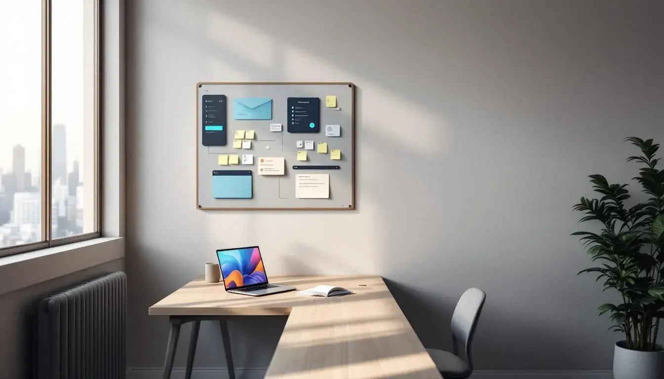
The "Workflow Board" palette offers a promise of organized thinking and smooth operation. Imagine a clean, pure white canvas punctuated by the cool resolve of deep teal blue. Consider how light sky blue invokes open space and calm, while the neutral gray whispers groundedness. Dusty rose appears as an unexpected warmth, a subtle invitation to empathy amidst the structure. The near black anchors the whole experience, offering a visual commitment to thoroughness. Envision this playing itself out in a home office, where documents array themselves tidily on a white desk, illuminated by diffused light, a room where focus comes naturally. Or, suppose you're designing a presentation suite. Here, the palette can convey reliability, a sense that every detail has been carefully considered. The balance between the cool and warm shades creates an impression of diligence. It's a color scheme dedicated to functionality, a commitment to calm deliberation in spaces where thoughtful decisions are made.
Then there’s "Tech Palette," a reminder of the sharp, considered approach that defines innovation. The initial impression is one of considered neutrality, starting with light grayish white. However, peeking through is an underlying momentum – the forward lean of grayish teal and the assured growth of forest green. Deep sapphire hints at the meticulous planning, the well-considered strategies that drive technological advance. The dark slate grounds the entire vision, a nod to practicality and lasting power. Transform a simple study by using this palette as your guide: create a sanctuary where creativity and computation combine. Visualize these colors in a startup environment, coding team deep in concentration, lit by the gentle hum of servers; the palette fosters innovation and clarity. It's a composition fit for developers, designers, anyone seeking the perfect atmosphere to bring their complex ideas to fruition.
"Vibrant Webinar" strikes an intriguing balance. It is grounded by the seriousness of raven black, but lifted by the promise of aqua marine. Pale beige acts as a counterpoint to the boldness of burnt sienna, while dusty blue offers a whisper of quiet contemplation. Imagine a small office space transformed, one wall a deep neutral, the others a pale tint – ready for brainstorming sessions or virtual meetings. Envision this array in a modern studio, where the push and pull of light and shade informs creative direction. The palette can establish an atmosphere of collaborative brilliance, where diverse ideas can coalesce, as if on a digital stage facing the world. The scheme communicates confidence, an understanding of how to stay connected while remaining grounded in the essentials.
With "Vibrant Balance," a different energy emerges. Bright salmon shouts creative zeal, countered by the level-headedness of cool gray. Fiery red offers a vision of spirited invention, while russet brown lends a sense of earthy grounding. Ebony black acts as punctuation, underscoring the composition as a whole. This combination finds its stride in a shared workspace— designers, marketers, and strategists generating concepts collaboratively. Or picture it as the color scheme for a stylish living space, where muted tones mix beautifully with bold accents; a visual promise that serenity and dynamism can co-exist. The overall impact suggests a confident approach to balance. It's a palette for those who desire both peace and power, calm and energy, to fuel their day.
Finally, "Modern Finance" presents an aura of refined contemplation. Neutral gray sets a tone of professional reserve, one that is softened gently by soft lavender. Deep slate and dark purple hint toward rigorous analysis, while deep eggplant gives the sense of insightful vision. Envision this selection adorning a home study, where an individual contemplates their next investment move, immersed in thoughtfulness. Imagine an entire financial firm adopting this approach, the gentle use of color serving as a constant reminder of integrity and considered strategy. The mood leans towards sophistication, a visual assurance that decisions are rooted in careful exploration. "Modern Finance" suggests that sophistication and a methodical process can be conveyed through the quiet confidence of considered color.
These palettes, though distinct, collectively draw our attention to the crucial role living rooms and offices play as sanctuaries – places where color provides necessary solace and serves as a compass, guiding our focus when the external world is in tumult. They illustrate sensitivity in design, an awareness of the need for personal and professional spaces to embody a sense of equilibrium, empowering us to navigate the inevitable storms with a grounded spirit.