'%3e%3cpath%20fill-rule='evenodd'%20clip-rule='evenodd'%20d='M51.1303%2019.2492C50.7278%2019.913%2050.1346%2020.4426%2049.3508%2020.838C48.5669%2021.2335%2047.6172%2021.4312%2046.5014%2021.4312C44.8208%2021.4312%2043.4367%2021.0216%2042.3492%2020.2025C41.2617%2019.3833%2040.6686%2018.2394%2040.5697%2016.7706H44.4253C44.4818%2017.3355%2044.6831%2017.7804%2045.0291%2018.1052C45.3751%2018.43%2045.8164%2018.5924%2046.3531%2018.5924C46.8192%2018.5924%2047.1864%2018.4653%2047.4547%2018.2111C47.7231%2017.9569%2047.8572%2017.618%2047.8572%2017.1943C47.8572%2016.8129%2047.7337%2016.4952%2047.4865%2016.241C47.2393%2015.9867%2046.9322%2015.7784%2046.565%2015.616C46.1978%2015.4536%2045.6893%2015.2594%2045.0397%2015.0334C44.0934%2014.7086%2043.3202%2014.3944%2042.72%2014.0907C42.1197%2013.7871%2041.6042%2013.3351%2041.1735%2012.7349C40.7427%2012.1347%2040.5273%2011.3544%2040.5273%2010.394C40.5273%209.50418%2040.7533%208.73448%2041.2053%208.08481C41.6572%207.43515%2042.2821%206.93731%2043.0801%206.5913C43.8781%206.24528%2044.7925%206.07227%2045.8235%206.07227C47.49%206.07227%2048.8141%206.46771%2049.7956%207.25861C50.7772%208.04951%2051.3315%209.13698%2051.4586%2010.5211H47.5395C47.4689%2010.0268%2047.2888%209.63483%2046.9993%209.3453C46.7097%209.05578%2046.3178%208.91102%2045.8235%208.91102C45.3998%208.91102%2045.0573%209.024%2044.7961%209.24997C44.5348%209.47594%2044.4041%209.80783%2044.4041%2010.2457C44.4041%2010.5988%2044.5207%2010.8989%2044.7537%2011.146C44.9867%2011.3932%2045.2798%2011.5944%2045.6328%2011.7498C45.9859%2011.9052%2046.4944%2012.1029%2047.1581%2012.343C48.1185%2012.6678%2048.9023%2012.9891%2049.5096%2013.3069C50.1169%2013.6246%2050.6395%2014.0872%2051.0773%2014.6945C51.5151%2015.3018%2051.734%2016.0927%2051.734%2017.0672C51.734%2017.8581%2051.5328%2018.5854%2051.1303%2019.2492ZM59.0242%206.3053V21.2829H55.4016V6.3053H59.0242ZM73.9409%206.3053V9.18642H69.8734V21.2829H66.2296V9.18642H62.2046V6.3053H73.9409ZM80.7438%209.18642V12.3218H85.8069V15.0546H80.7438V18.3806H86.4425V21.2829H77.1212V6.3053H86.4425V9.18642H80.7438ZM99.667%2016.0291V21.2829H96.0444V6.3053H101.913C103.692%206.3053%20105.048%206.74665%20105.98%207.62934C106.912%208.51204%20107.378%209.7019%20107.378%2011.199C107.378%2012.1311%20107.17%2012.9609%20106.753%2013.6882C106.337%2014.4155%20105.719%2014.9875%20104.9%2015.4042C104.08%2015.8208%20103.085%2016.0291%20101.913%2016.0291H99.667ZM103.692%2011.199C103.692%209.8855%20102.965%209.22879%20101.51%209.22879H99.667V13.1268H101.51C102.965%2013.1268%20103.692%2012.4842%20103.692%2011.199ZM120.092%2018.5501H114.478L113.546%2021.2829H109.732L115.219%206.41123H119.393L124.879%2021.2829H121.024L120.092%2018.5501ZM119.16%2015.7961L117.295%2010.2881L115.41%2015.7961H119.16ZM131.555%2018.5077H136.385V21.2829H127.933V6.3053H131.555V18.5077ZM143.337%209.18642V12.3218H148.4V15.0546H143.337V18.3806H149.035V21.2829H139.714V6.3053H149.035V9.18642H143.337ZM163.507%206.3053V9.18642H159.44V21.2829H155.796V9.18642H151.771V6.3053H163.507ZM177.449%206.3053V9.18642H173.382V21.2829H169.738V9.18642H165.713V6.3053H177.449ZM184.252%209.18642V12.3218H189.315V15.0546H184.252V18.3806H189.951V21.2829H180.629V6.3053H189.951V9.18642H184.252Z'%20fill='%23EEF0ED'/%3e%3cmask%20id='mask0_3101_7327'%20style='mask-type:alpha'%20maskUnits='userSpaceOnUse'%20x='0'%20y='0'%20width='27'%20height='28'%3e%3cpath%20d='M23.8328%200.759766H2.64808C1.18559%200.759766%200%201.94535%200%203.40785V24.5925C0%2026.055%201.18559%2027.2406%202.64808%2027.2406H23.8328C25.2952%2027.2406%2026.4808%2026.055%2026.4808%2024.5925V3.40785C26.4808%201.94535%2025.2952%200.759766%2023.8328%200.759766Z'%20fill='white'/%3e%3c/mask%3e%3cg%20mask='url(%23mask0_3101_7327)'%3e%3cpath%20d='M23.8328%200.759766H2.64808C1.18559%200.759766%200%201.94535%200%203.40785V24.5925C0%2026.055%201.18559%2027.2406%202.64808%2027.2406H23.8328C25.2952%2027.2406%2026.4808%2026.055%2026.4808%2024.5925V3.40785C26.4808%201.94535%2025.2952%200.759766%2023.8328%200.759766Z'%20fill='%23D8D8D8'/%3e%3cpath%20d='M13.2404%200.759766H0V14.0001H13.2404V0.759766Z'%20fill='%238C61FF'/%3e%3cpath%20d='M13.2404%2014H0V27.2404H13.2404V14Z'%20fill='%2336C3FE'/%3e%3cpath%20d='M26.4806%2014H13.2402V27.2404H26.4806V14Z'%20fill='%236592FE'/%3e%3cpath%20d='M26.4806%200.759766H13.2402V14.0002H26.4806V0.759766Z'%20fill='%236059F7'/%3e%3c/g%3e%3c/g%3e%3cdefs%3e%3cclipPath%20id='clip0_3101_7327'%3e%3crect%20width='190'%20height='28'%20fill='white'/%3e%3c/clipPath%3e%3c/defs%3e%3c/svg%3e)
'%3e%3cpath%20d='M23.8328%200.759521H2.64808C1.18559%200.759521%200%201.94511%200%203.40761V24.5923C0%2026.0548%201.18559%2027.2404%202.64808%2027.2404H23.8328C25.2952%2027.2404%2026.4808%2026.0548%2026.4808%2024.5923V3.40761C26.4808%201.94511%2025.2952%200.759521%2023.8328%200.759521Z'%20fill='%23D8D8D8'/%3e%3cpath%20d='M13.2404%200.759521H0V13.9999H13.2404V0.759521Z'%20fill='%238C61FF'/%3e%3cpath%20d='M13.2404%2013.9998H0V27.2402H13.2404V13.9998Z'%20fill='%2336C3FE'/%3e%3cpath%20d='M26.4809%2013.9998H13.2405V27.2402H26.4809V13.9998Z'%20fill='%236592FE'/%3e%3cpath%20d='M26.4809%200.759277H13.2405V13.9997H26.4809V0.759277Z'%20fill='%236059F7'/%3e%3c/g%3e%3c/svg%3e)
Dominant Food Palettes for Website Design: A July 2025 Forecast
28 Jul 2025 · 3 min readThe world of food whispers its stories not just on our tongues, but through the colors that dress it. Imagine scrolling through a website, the promise of a perfect meal hanging in the balance. Is it the saturated hues of a vibrant marketplace, the comforting warmth of a rustic kitchen, or the stark lines of modern gastronomy that beckons you in? Color becomes flavor, texture, and aroma, all before the first bite. As we gaze toward July 2025, let's consider the palettes poised to define our online culinary experiences. These are not mere trends, but evocative landscapes, built to inspire cravings and cultivate connection in the sprawling digital domain of food. These palettes capture the spirit, the nostalgia, and the anticipation of culinary creations.
The "Earthy Contrast" palette presents a narrative of rich, grounded experiences. Imagine foraging through a sun-dappled orchard, the air thick with the scent of ripening fruit and damp soil. Creamy Beige casts a soft, inviting glow, reminiscent of freshly baked bread or creamy polenta served on a wooden board. Mustard Yellow adds a touch of playful warmth, perhaps hinting at a spicy aioli or a vibrant turmeric-infused dish. The occasional glint of Bright Crimson introduces an unexpected spark, like a scattering of cranberries or a drizzle of chili oil. Dark Olive and Olive Drab impart a sense of timelessness, suggesting generations of culinary wisdom passed down through worn hands. Steel Blue and Deep Indigo, in contrast, add a layer of sophistication, like handcrafted ceramic dishes, or the deepening twilight as an outdoor feast unfolds. This palette isn’t about fleeting trends; it’s about embracing the enduring allure of rustic simplicity. On a website, it invites you to linger, to savor each ingredient, and to imagine the hands that crafted the meal. The subtle blend of colors lends itself seamlessly to both gourmet restaurants and home cooking blogs, portraying a picture of wholesome richness and shared culinary heritage. It is a palette that encourages you to embrace the natural world and create dishes that nourish both body and soul. It speaks of authenticity, warmth, and a celebration of earthy delights.
"Earthy Autumn" calls to mind the sensory richness of a harvest festival. Pale Ivory sets the stage, like a linen tablecloth spread across a weathered wooden table. Apricot Tan evokes the warmth of roasted squash or sun-dried tomatoes, each bite bursting with concentrated flavor. Dusty Taupe delivers a touch of elegant restraint, like the soft whisper of a crackling fire in the background. Cinnamon Stick adds a spicy, comforting accent, reminiscent of mulled wine or a freshly baked apple pie. Dark Forest grounds the palette, evoking the scent of damp leaves and the quiet bounty of the earth. Imagine this palette gracing the website of a farm-to-table restaurant. The subtle tones create a sense of intimacy and authenticity, inviting guests to experience the connection between the land and their plate. Every element emphasizes the restaurant’s commitment to seasonality and sustainability. Or envision it on a baking blog, each recipe presented against a backdrop of warm, inviting hues, the colors creating a sense of nostalgia and comfort. It serves as a subtle reminder of warmth and abundance. A culinary experience crafted with authenticity will likely be emphasized by this palette.
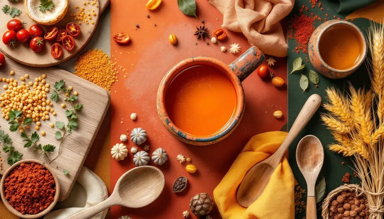
"Fiery earth" sizzles with an undeniable energy, hinting at bold flavors and dynamic culinary creations. Off White provides a clean, modern canvas, allowing the other colors to truly pop. Burnt Orange and Vibrant Orange create a captivating warmth, like the glow of a wood-fired oven or the vibrant zest of citrus fruits. The color composition emphasizes the intensity of flavors and the passion behind each creation. Medium Gray tempers the heat with a grounding element, like polished concrete floors or sleek stainless steel appliances. This combination inspires a sense of modern sophistication with an exciting twist. Dark Charcoal adds a touch of drama, much like a darkened sear on a perfectly grilled steak. A modern restaurant website could use this palette to show vibrant dishes against a minimalist background demonstrating modern elegance, enhanced by warm, fiery accents. It's a dynamic visual language, appropriate for eateries unafraid to push boundaries. Or imagine a food-delivery app using "Fiery earth" to portray an efficiency and speed. The colors communicate convenience and boldness, ensuring the user feels connected to the heat of a freshly cooked meal.
"Earthy Vigor" balances grounded sensibilities with a sense of revitalizing freshness. Off-White offers a clean, airy backdrop, like sunlight streaming through open windows. Teal Green recalls lush herbs and vibrant vegetables, elements of nature's healthy bounty. The palette promotes wellness in every sense of the word. Bright Orange introduces a burst of energy, perhaps a zesty vinaigrette or the bright tang of preserved citrus. Mauve Taupe brings a comforting, mellow tone, resembling aged wood or the soft texture of handmade pottery. Dark Gray anchors the composition, referencing cast iron cookware or a slate countertop. A health-food brand could use this selection to convey authenticity and quality, highlighting organic textures and natural ingredients. Imagine it on a recipe website emphasizing the natural goodness of whole foods with the color scheme being a constant visual reminder of its wholesome values. It’s a palette that appeals to those seeking nourishment and authenticity, bridging the gap between rustic charm and modern wellbeing.
The "Sunbaked Umber" palette evokes the warmth of a late summer afternoon. Off White feels like a soft, sun-drenched wall, providing a calming backdrop for richer tones. Pale Yellow hints at golden fields of wheat or a delicate lemon tart. Bright Yellow adds a playful touch, like the vibrant yolk of a farm-fresh egg. Grayish Beige provides a grounding element, resembling weathered stone or a well-worn cutting board. Burnt Orange contributes a touch of spice, like a perfectly caramelized crust, or the subtle heat of smoked paprika. Medium Gray and Dark Black adds depth and contrast, bringing to mind wrought iron details or the satisfying char of grilled vegetables. This palette presents a sense of timelessness and simplicity. Website design will use minimalist aesthetics, warm textures, and inviting colors to convey a welcoming, comforting atmosphere. It is a testament to the natural beauty of ingredients prepared with care. Used online, it suggests an experience that is both comforting and quietly luxurious, rooted in tradition yet entirely modern.
These five palettes, each with its unique character, paint a compelling picture of the food landscape awaiting us in July 2025. From the rustic charm of "Earthy Contrast" to the vibrant energy of "Fiery earth", each composition tells a story, promising experiences both grounded and exhilarating. These palettes are more than just colors; they are carefully considered narratives of flavor, texture, and connection. They remind us that the digital representation of food is not just about replicating flavors, but about capturing the emotions and expectations that surround the culinary experience. In the ever-evolving world of website design, color remains a potent ingredient, capable of transforming a simple online presence into a compelling and irresistible invitation to the table.