'%3e%3cpath%20fill-rule='evenodd'%20clip-rule='evenodd'%20d='M51.1303%2019.2492C50.7278%2019.913%2050.1346%2020.4426%2049.3508%2020.838C48.5669%2021.2335%2047.6172%2021.4312%2046.5014%2021.4312C44.8208%2021.4312%2043.4367%2021.0216%2042.3492%2020.2025C41.2617%2019.3833%2040.6686%2018.2394%2040.5697%2016.7706H44.4253C44.4818%2017.3355%2044.6831%2017.7804%2045.0291%2018.1052C45.3751%2018.43%2045.8164%2018.5924%2046.3531%2018.5924C46.8192%2018.5924%2047.1864%2018.4653%2047.4547%2018.2111C47.7231%2017.9569%2047.8572%2017.618%2047.8572%2017.1943C47.8572%2016.8129%2047.7337%2016.4952%2047.4865%2016.241C47.2393%2015.9867%2046.9322%2015.7784%2046.565%2015.616C46.1978%2015.4536%2045.6893%2015.2594%2045.0397%2015.0334C44.0934%2014.7086%2043.3202%2014.3944%2042.72%2014.0907C42.1197%2013.7871%2041.6042%2013.3351%2041.1735%2012.7349C40.7427%2012.1347%2040.5273%2011.3544%2040.5273%2010.394C40.5273%209.50418%2040.7533%208.73448%2041.2053%208.08481C41.6572%207.43515%2042.2821%206.93731%2043.0801%206.5913C43.8781%206.24528%2044.7925%206.07227%2045.8235%206.07227C47.49%206.07227%2048.8141%206.46771%2049.7956%207.25861C50.7772%208.04951%2051.3315%209.13698%2051.4586%2010.5211H47.5395C47.4689%2010.0268%2047.2888%209.63483%2046.9993%209.3453C46.7097%209.05578%2046.3178%208.91102%2045.8235%208.91102C45.3998%208.91102%2045.0573%209.024%2044.7961%209.24997C44.5348%209.47594%2044.4041%209.80783%2044.4041%2010.2457C44.4041%2010.5988%2044.5207%2010.8989%2044.7537%2011.146C44.9867%2011.3932%2045.2798%2011.5944%2045.6328%2011.7498C45.9859%2011.9052%2046.4944%2012.1029%2047.1581%2012.343C48.1185%2012.6678%2048.9023%2012.9891%2049.5096%2013.3069C50.1169%2013.6246%2050.6395%2014.0872%2051.0773%2014.6945C51.5151%2015.3018%2051.734%2016.0927%2051.734%2017.0672C51.734%2017.8581%2051.5328%2018.5854%2051.1303%2019.2492ZM59.0242%206.3053V21.2829H55.4016V6.3053H59.0242ZM73.9409%206.3053V9.18642H69.8734V21.2829H66.2296V9.18642H62.2046V6.3053H73.9409ZM80.7438%209.18642V12.3218H85.8069V15.0546H80.7438V18.3806H86.4425V21.2829H77.1212V6.3053H86.4425V9.18642H80.7438ZM99.667%2016.0291V21.2829H96.0444V6.3053H101.913C103.692%206.3053%20105.048%206.74665%20105.98%207.62934C106.912%208.51204%20107.378%209.7019%20107.378%2011.199C107.378%2012.1311%20107.17%2012.9609%20106.753%2013.6882C106.337%2014.4155%20105.719%2014.9875%20104.9%2015.4042C104.08%2015.8208%20103.085%2016.0291%20101.913%2016.0291H99.667ZM103.692%2011.199C103.692%209.8855%20102.965%209.22879%20101.51%209.22879H99.667V13.1268H101.51C102.965%2013.1268%20103.692%2012.4842%20103.692%2011.199ZM120.092%2018.5501H114.478L113.546%2021.2829H109.732L115.219%206.41123H119.393L124.879%2021.2829H121.024L120.092%2018.5501ZM119.16%2015.7961L117.295%2010.2881L115.41%2015.7961H119.16ZM131.555%2018.5077H136.385V21.2829H127.933V6.3053H131.555V18.5077ZM143.337%209.18642V12.3218H148.4V15.0546H143.337V18.3806H149.035V21.2829H139.714V6.3053H149.035V9.18642H143.337ZM163.507%206.3053V9.18642H159.44V21.2829H155.796V9.18642H151.771V6.3053H163.507ZM177.449%206.3053V9.18642H173.382V21.2829H169.738V9.18642H165.713V6.3053H177.449ZM184.252%209.18642V12.3218H189.315V15.0546H184.252V18.3806H189.951V21.2829H180.629V6.3053H189.951V9.18642H184.252Z'%20fill='%23EEF0ED'/%3e%3cmask%20id='mask0_3101_7327'%20style='mask-type:alpha'%20maskUnits='userSpaceOnUse'%20x='0'%20y='0'%20width='27'%20height='28'%3e%3cpath%20d='M23.8328%200.759766H2.64808C1.18559%200.759766%200%201.94535%200%203.40785V24.5925C0%2026.055%201.18559%2027.2406%202.64808%2027.2406H23.8328C25.2952%2027.2406%2026.4808%2026.055%2026.4808%2024.5925V3.40785C26.4808%201.94535%2025.2952%200.759766%2023.8328%200.759766Z'%20fill='white'/%3e%3c/mask%3e%3cg%20mask='url(%23mask0_3101_7327)'%3e%3cpath%20d='M23.8328%200.759766H2.64808C1.18559%200.759766%200%201.94535%200%203.40785V24.5925C0%2026.055%201.18559%2027.2406%202.64808%2027.2406H23.8328C25.2952%2027.2406%2026.4808%2026.055%2026.4808%2024.5925V3.40785C26.4808%201.94535%2025.2952%200.759766%2023.8328%200.759766Z'%20fill='%23D8D8D8'/%3e%3cpath%20d='M13.2404%200.759766H0V14.0001H13.2404V0.759766Z'%20fill='%238C61FF'/%3e%3cpath%20d='M13.2404%2014H0V27.2404H13.2404V14Z'%20fill='%2336C3FE'/%3e%3cpath%20d='M26.4806%2014H13.2402V27.2404H26.4806V14Z'%20fill='%236592FE'/%3e%3cpath%20d='M26.4806%200.759766H13.2402V14.0002H26.4806V0.759766Z'%20fill='%236059F7'/%3e%3c/g%3e%3c/g%3e%3cdefs%3e%3cclipPath%20id='clip0_3101_7327'%3e%3crect%20width='190'%20height='28'%20fill='white'/%3e%3c/clipPath%3e%3c/defs%3e%3c/svg%3e)
'%3e%3cpath%20d='M23.8328%200.759521H2.64808C1.18559%200.759521%200%201.94511%200%203.40761V24.5923C0%2026.0548%201.18559%2027.2404%202.64808%2027.2404H23.8328C25.2952%2027.2404%2026.4808%2026.0548%2026.4808%2024.5923V3.40761C26.4808%201.94511%2025.2952%200.759521%2023.8328%200.759521Z'%20fill='%23D8D8D8'/%3e%3cpath%20d='M13.2404%200.759521H0V13.9999H13.2404V0.759521Z'%20fill='%238C61FF'/%3e%3cpath%20d='M13.2404%2013.9998H0V27.2402H13.2404V13.9998Z'%20fill='%2336C3FE'/%3e%3cpath%20d='M26.4809%2013.9998H13.2405V27.2402H26.4809V13.9998Z'%20fill='%236592FE'/%3e%3cpath%20d='M26.4809%200.759277H13.2405V13.9997H26.4809V0.759277Z'%20fill='%236059F7'/%3e%3c/g%3e%3c/svg%3e)
Beyond the Screen: The Rise of Autumn Palettes in Everyday Occasions
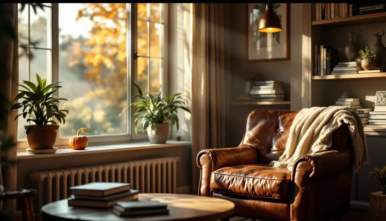
28 Jul 2025 · 5 min readThe air crisps. Sunlight filters through thinning leaves, casting long shadows that dance and stretch with the breeze. A shift occurs – not just in temperature, but in perception. The world, once a riot of summer greens and blues, softens, matures. It's a visual exhale, a grounding in the rich, comforting tones of the season. But these aren’t just signals of an impending hibernation. Instead, they point toward a newfound appreciation for these colors in our daily lives, a desire to bring the tranquility and warmth normally associated with a specific time of year into the everyday. Think of the comforting shades of a perfectly worn leather armchair or the lingering sunset glow on a quiet walk. The appeal isn't about replicating a specific aesthetic, but about creating spaces and experiences that feel authentic and restorative, all year round, by embracing hues previously confined to a seasonal moment.
Imagine a space defined by the quiet elegance of the Earthy Harmony palette. Pale Cream blankets the room, a gentle whisper against the sturdy Charcoal Gray of structural elements. Soft Yellow, like diffused sunlight, peeks through linen curtains, and a touch of Bright Green within plantings brings the outside in. This palette moves beyond fleeting seasonal trends; it cultivates an environment of serene stability. The Burnt Sienna, sparingly applied in a rug or throw, offers a grounded warmth, contrasting thoughtfully with Deep Forest hues found within art or furniture details. It’s a haven suited to contemplation and creativity, offering respite from the clamor of modern existence. Here, the colors aren't statements, but companions, fostering a sense of belonging and understated luxury. These colors speak of lasting comfort, like a favorite worn sweater or a familiar landscape, shaping interactions and easing transitions with a subtle hand.
With Earthy Autumn, the resonance deepens. Creamy Beige acts as a grounding canvas allowing Russet Brown and Burnt Sienna to emerge, telling stories of heritage and the beauty of imperfection. Though traditionally associated with Thanksgiving gatherings, there's something universally appealing about the palette’s invitation to pause and appreciate the familiar. The slight contrast offered through Sage Green, much like the quiet resilience of nature, acts as a gentle counterbalance. Consider a library filled with well-loved books, their pages aged to similar tones – or a gathering of friends, each bringing their experiences to the shared space. This palette is an affirmation of connection, a reminder of shared history, and an invitation to linger in moments of genuine togetherness, regardless of the season, bringing richness to the simplest moments.
The Eclectic Harmony palette tells a story of curated exploration. Vivid Indigo offers a pop of bold expression, while Sandy Brown acts as an anchor. Olive Drab, Slate Gray, and Bright Yellow bring in the understated beauty of the natural world. This is an everyday palette fit for spaces as varied as creative studios to bustling coffee shops. Envision walls adorned with art from different eras, mismatched furniture that somehow complements each other perfectly, and an overall feeling of inspired randomness. This is a palette unafraid to embrace individuality, a canvas for making the ordinary extraordinary. More than a visual statement, it’s an invitation to embrace playful authenticity.
Ferris Palette offers a fresh perspective on the everyday. Teal Blue and Light Steel Blue meet the warmth of Russet Brown, contrasting with the Deep Charcoal of grounding elements. Sandstone Beige unifies these tones with a soft neutral foundation. This palette conveys energy, suited for spaces that thrive on engaging collaboration. Think of a dynamic workplace that values both innovation and collaboration, but equally seeks a sense of calm. It's a statement of modern progress, embracing both the efficiency of technology and the comfort of human engagement, proving that even in functional spaces, beauty can be an integral part of the everyday experience.
The Earthy Neutral palette evokes a sense of quiet luxury. Light Gray and Soft Blue-Gray provide the foundation, like cloudscapes on a warm day. Steel Blue and Muted Brown offer depth, grounding the lightness with a touch of earthiness, contrasted by the grounding presence of Dark Slate. This palette offers a soothing experience, appropriate for creating tranquil environments focused on overall wellbeing, from spas to yoga studios and meditation rooms. More than an aesthetic choice, it speaks to a desire for greater peace, a tangible expression of finding calm amidst chaos.
With Earthy Contrast, we see a blend of the reassuring and the invigorating. Light Grayish Green mirrors the calm outside world, while Light Taupe forms a neutral mid-ground. Mustard Yellow, Burnt Sienna and Dark Teal offer a considered burst of energy, like finding a hidden garden amidst a cityscape. This palette cultivates environments that foster creativity and collaboration, balancing moments of focused work with shared interaction, be it in modern offices or bustling creative hubs. More than a reflection of aesthetic sophistication, it speaks to a desire for enriched environments in daily experiences.
To further prove the point that warm colour palettes usage is not only tightly bound to Autumn, data needs to be collected with warmer hues during different seasons and especially different occasions.
The migration of these palettes from seasonal novelty to everyday essentials signifies a broader cultural shift. It represents our growing desire for comfort, authenticity, and connection in a world that often feels ephemeral. The colors invite a thoughtfulness, a deliberate slowing down, not about escaping the present, but about enriching it. The quiet luxury of embracing the earthy tones serves as a reminder that beauty can be found not just in fleeting moments, but in the enduring power and the warmth of the familiar.