'%3e%3cpath%20fill-rule='evenodd'%20clip-rule='evenodd'%20d='M51.1303%2019.2492C50.7278%2019.913%2050.1346%2020.4426%2049.3508%2020.838C48.5669%2021.2335%2047.6172%2021.4312%2046.5014%2021.4312C44.8208%2021.4312%2043.4367%2021.0216%2042.3492%2020.2025C41.2617%2019.3833%2040.6686%2018.2394%2040.5697%2016.7706H44.4253C44.4818%2017.3355%2044.6831%2017.7804%2045.0291%2018.1052C45.3751%2018.43%2045.8164%2018.5924%2046.3531%2018.5924C46.8192%2018.5924%2047.1864%2018.4653%2047.4547%2018.2111C47.7231%2017.9569%2047.8572%2017.618%2047.8572%2017.1943C47.8572%2016.8129%2047.7337%2016.4952%2047.4865%2016.241C47.2393%2015.9867%2046.9322%2015.7784%2046.565%2015.616C46.1978%2015.4536%2045.6893%2015.2594%2045.0397%2015.0334C44.0934%2014.7086%2043.3202%2014.3944%2042.72%2014.0907C42.1197%2013.7871%2041.6042%2013.3351%2041.1735%2012.7349C40.7427%2012.1347%2040.5273%2011.3544%2040.5273%2010.394C40.5273%209.50418%2040.7533%208.73448%2041.2053%208.08481C41.6572%207.43515%2042.2821%206.93731%2043.0801%206.5913C43.8781%206.24528%2044.7925%206.07227%2045.8235%206.07227C47.49%206.07227%2048.8141%206.46771%2049.7956%207.25861C50.7772%208.04951%2051.3315%209.13698%2051.4586%2010.5211H47.5395C47.4689%2010.0268%2047.2888%209.63483%2046.9993%209.3453C46.7097%209.05578%2046.3178%208.91102%2045.8235%208.91102C45.3998%208.91102%2045.0573%209.024%2044.7961%209.24997C44.5348%209.47594%2044.4041%209.80783%2044.4041%2010.2457C44.4041%2010.5988%2044.5207%2010.8989%2044.7537%2011.146C44.9867%2011.3932%2045.2798%2011.5944%2045.6328%2011.7498C45.9859%2011.9052%2046.4944%2012.1029%2047.1581%2012.343C48.1185%2012.6678%2048.9023%2012.9891%2049.5096%2013.3069C50.1169%2013.6246%2050.6395%2014.0872%2051.0773%2014.6945C51.5151%2015.3018%2051.734%2016.0927%2051.734%2017.0672C51.734%2017.8581%2051.5328%2018.5854%2051.1303%2019.2492ZM59.0242%206.3053V21.2829H55.4016V6.3053H59.0242ZM73.9409%206.3053V9.18642H69.8734V21.2829H66.2296V9.18642H62.2046V6.3053H73.9409ZM80.7438%209.18642V12.3218H85.8069V15.0546H80.7438V18.3806H86.4425V21.2829H77.1212V6.3053H86.4425V9.18642H80.7438ZM99.667%2016.0291V21.2829H96.0444V6.3053H101.913C103.692%206.3053%20105.048%206.74665%20105.98%207.62934C106.912%208.51204%20107.378%209.7019%20107.378%2011.199C107.378%2012.1311%20107.17%2012.9609%20106.753%2013.6882C106.337%2014.4155%20105.719%2014.9875%20104.9%2015.4042C104.08%2015.8208%20103.085%2016.0291%20101.913%2016.0291H99.667ZM103.692%2011.199C103.692%209.8855%20102.965%209.22879%20101.51%209.22879H99.667V13.1268H101.51C102.965%2013.1268%20103.692%2012.4842%20103.692%2011.199ZM120.092%2018.5501H114.478L113.546%2021.2829H109.732L115.219%206.41123H119.393L124.879%2021.2829H121.024L120.092%2018.5501ZM119.16%2015.7961L117.295%2010.2881L115.41%2015.7961H119.16ZM131.555%2018.5077H136.385V21.2829H127.933V6.3053H131.555V18.5077ZM143.337%209.18642V12.3218H148.4V15.0546H143.337V18.3806H149.035V21.2829H139.714V6.3053H149.035V9.18642H143.337ZM163.507%206.3053V9.18642H159.44V21.2829H155.796V9.18642H151.771V6.3053H163.507ZM177.449%206.3053V9.18642H173.382V21.2829H169.738V9.18642H165.713V6.3053H177.449ZM184.252%209.18642V12.3218H189.315V15.0546H184.252V18.3806H189.951V21.2829H180.629V6.3053H189.951V9.18642H184.252Z'%20fill='%23EEF0ED'/%3e%3cmask%20id='mask0_3101_7327'%20style='mask-type:alpha'%20maskUnits='userSpaceOnUse'%20x='0'%20y='0'%20width='27'%20height='28'%3e%3cpath%20d='M23.8328%200.759766H2.64808C1.18559%200.759766%200%201.94535%200%203.40785V24.5925C0%2026.055%201.18559%2027.2406%202.64808%2027.2406H23.8328C25.2952%2027.2406%2026.4808%2026.055%2026.4808%2024.5925V3.40785C26.4808%201.94535%2025.2952%200.759766%2023.8328%200.759766Z'%20fill='white'/%3e%3c/mask%3e%3cg%20mask='url(%23mask0_3101_7327)'%3e%3cpath%20d='M23.8328%200.759766H2.64808C1.18559%200.759766%200%201.94535%200%203.40785V24.5925C0%2026.055%201.18559%2027.2406%202.64808%2027.2406H23.8328C25.2952%2027.2406%2026.4808%2026.055%2026.4808%2024.5925V3.40785C26.4808%201.94535%2025.2952%200.759766%2023.8328%200.759766Z'%20fill='%23D8D8D8'/%3e%3cpath%20d='M13.2404%200.759766H0V14.0001H13.2404V0.759766Z'%20fill='%238C61FF'/%3e%3cpath%20d='M13.2404%2014H0V27.2404H13.2404V14Z'%20fill='%2336C3FE'/%3e%3cpath%20d='M26.4806%2014H13.2402V27.2404H26.4806V14Z'%20fill='%236592FE'/%3e%3cpath%20d='M26.4806%200.759766H13.2402V14.0002H26.4806V0.759766Z'%20fill='%236059F7'/%3e%3c/g%3e%3c/g%3e%3cdefs%3e%3cclipPath%20id='clip0_3101_7327'%3e%3crect%20width='190'%20height='28'%20fill='white'/%3e%3c/clipPath%3e%3c/defs%3e%3c/svg%3e)
'%3e%3cpath%20d='M23.8328%200.759521H2.64808C1.18559%200.759521%200%201.94511%200%203.40761V24.5923C0%2026.0548%201.18559%2027.2404%202.64808%2027.2404H23.8328C25.2952%2027.2404%2026.4808%2026.0548%2026.4808%2024.5923V3.40761C26.4808%201.94511%2025.2952%200.759521%2023.8328%200.759521Z'%20fill='%23D8D8D8'/%3e%3cpath%20d='M13.2404%200.759521H0V13.9999H13.2404V0.759521Z'%20fill='%238C61FF'/%3e%3cpath%20d='M13.2404%2013.9998H0V27.2402H13.2404V13.9998Z'%20fill='%2336C3FE'/%3e%3cpath%20d='M26.4809%2013.9998H13.2405V27.2402H26.4809V13.9998Z'%20fill='%236592FE'/%3e%3cpath%20d='M26.4809%200.759277H13.2405V13.9997H26.4809V0.759277Z'%20fill='%236059F7'/%3e%3c/g%3e%3c/svg%3e)
Analogous Aura: Exploring the Most Common Analogous Color Combinations
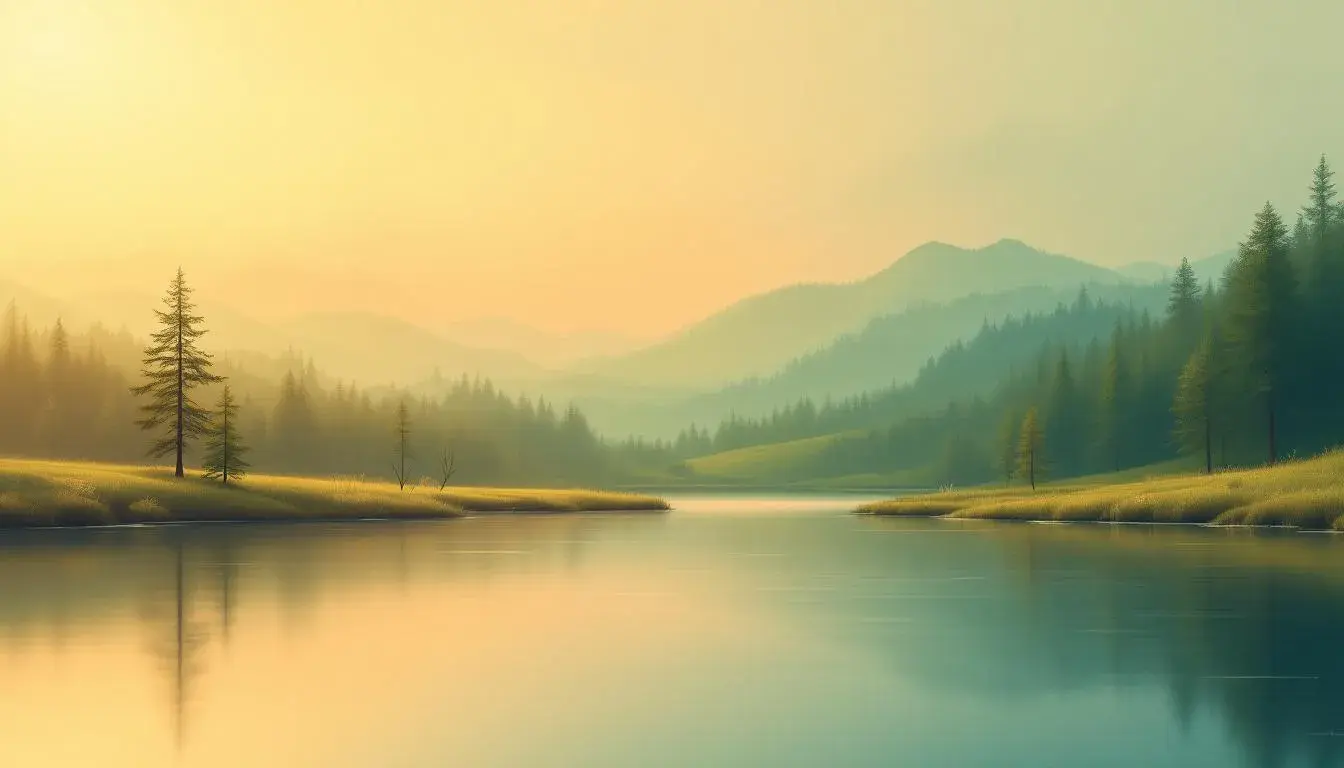
28 Jul 2025 · 3 min readColor whispers, not shouts. They are the unsung melodies that shape our perceptions, the subtle undercurrents that define a mood. When colors decide to sidle up next to each other, to lean in and harmonize in a tight, related family, the effect can be utterly transporting. An analogous color scheme, where hues are close neighbors on the color wheel, lends a space a serene and often sophisticated aura. Imagine the soft transition from sunrise yellow to radiant peach, the gentle shift from forest green to tranquil teal. These are not jarring contrasts, but comforting progressions that resonate deep within our visual senses. Discovering the combinations we return to most frequently reveals something fundamental about our aesthetic preferences. So, let us explore some popular combinations.
The palette of Earthy Contrast 🎨 speaks of cultivated fields under a late afternoon sun. Creamy Beige provides the foundation, like the parched earth itself, while Mustard Yellow hints at ripening crops, promising a harvest soon to come. Light Gray echoes the dust motes dancing in the golden light. Steel Blue appears unexpectedly, a flash of distant water or perhaps the glint of steel tools put to rest for the day. Olive Drab reinforces this connection to the land, a reminder of enduring growth even as the season begins to turn. Bright Crimson introduces an element of drama, perhaps the blaze of sunset over the landscape, where Deep Indigo signals the arrival of evening and promises respite. A final touch of Dark Olive ties us back to the source. This is an experience of grounded comfort, a vision of rural simplicity and honest labor, like an old master's landscape viewed through a modern lens. These colors would drape a room in understated luxury, evoking a sense of cultivated ease. The palette is a gentle reminder of a life lived deliberately, in harmony with the rhythms of nature. It lends an air of timelessness, defying fleeting trends in favor of enduring values.
Shifting from the sun-drenched fields to a verdant grove reveals the inspiration behind Earthy Greens ☘️. Pale Lime Green breathes with freshness, like spring buds bursting forth. Bright Olive Green suggests the deeper foliage, the established greenery of a thriving ecosystem. The presence of Dusty Beige tempers the liveliness, a reminder of the soil from which all things blossom. Dark Teal hints at hidden waters, a cool, refreshing presence deep within the woods, while Very Dark Green represents the shadowed depths, the secrets held within the heart of the forest. The overall impression speaks of renewal, of the restorative power of nature, of an unhurried pace and an unburdened mind. Imagine breathable fabrics with this colour mix, allowing the skin to feel as supple as bark after a rain shower. This palette creates a space that feels both invigorating and serene, a balanced place where the senses are reawakened and soothed. The tones speak of sustainability, of respecting the earth and its resources. To be wrapped in it suggests natural beauty, of embracing simplicity and authenticity, a refreshing departure from the cacophony of modern life.
Earthy Harmony 🌲 presents a grounded composition, a symphony of quiet yet deliberate choices. Dusty Rose softly alludes to fading blooms, fragile beauty hinting at a passing season. Lime Green offers a spark of life, a reminder that vitality persists. Umber Brown provides a secure foundation, rooted strength connecting all elements. Grayish Brown further enhances the earthiness, like weathered bark or stones kissed by rain. Midnight Green acts as a counterpoint, a muted conclusion to the palette as the shadows of time. All of those combine into understated elegance, a blend of the romantic and the rustic. This palette communicates a story of resilience, of enduring beauty found in imperfection. Applied, these tones would envelop a room in a sense of lived-in comfort, a refuge from the outside world. It is evocative of a well-loved garment, one that bears the marks of time with grace and character. It inspires a feeling of belonging, of being at ease within one's surroundings. It whispers of quiet, unpretentious luxury, a true reflection of natural beauty.
Stepping into the realm of Vivid Harmony 🎨 we encounter a more dynamic expression of related colors. Bright Yellow bursts forth with an almost startling energy, a celebratory shout of warmth. Sandy Brown grounds this exuberance with earthy stability. Electric Indigo adds a touch of mystique, its vibrant presence an unexpected counterpoint playing with the senses. Teal Gray cools the energy, bringing the palette back into focus, a calming balance. The muted nature is there to ensure things aren't too loud. Finally, Olive Drab contributes a note of refined nature, connecting the palette to the natural world. The overall impression is one of controlled exuberance, a balance between the playful and the serene. These analogous colors used in a setting would feel both inspiring and comforting, a space where creativity can thrive, a place to feel alive. The combination elicits a feeling of joy and celebration in a way similar to how walking into a flower shop feels during an early summer's morning.
Modern Chic ☕ doesn't make use of color cubes.
Whispering Woods 🌲 guides us into a landscape of subtle nuances. Pale White establishes the foundation, a canvas of serene neutrality, allowing the other shades to breathe. Seafoam Green evokes a gentle breeze rustling through leaves, where Olive Drab suggests the deeper shadows and the earth from which all things grow. Burnt Sienna introduces warmth, like the glow of a setting sun filtering through the branches, and finally, Charcoal Olive grounds the palette, representing the strength and endurance of the forest floor. This combination has a way of evoking quiet luxury, a sense of timelessness and refined comfort. These colors translate into textures, of natural fibres and handcrafted details. These tones would transform a space into a sanctuary, where one can escape the noise and chaos of the world. It is evocative of calm mornings where coffee is enjoyed in a hand-thrown mug by the window.
The art of color is one of suggestion and evocation. The palettes we’ve explored, each leaning on the harmony of analogous color schemes, are testaments to the power of gentle visual stories. Each combination reveals how colors, like notes in a melody, can create varying moods, stir memories, and shape our experiences. From the rustic warmth of Earthy Contrast 🎨 to the serene whispers of Whispering Woods 🌲, there's a way to see how color is more than just something to look at, but rather to live around. They transform the mundane, offering a lens through which we can savor the beauty that exists around us.