'%3e%3cpath%20fill-rule='evenodd'%20clip-rule='evenodd'%20d='M51.1303%2019.2492C50.7278%2019.913%2050.1346%2020.4426%2049.3508%2020.838C48.5669%2021.2335%2047.6172%2021.4312%2046.5014%2021.4312C44.8208%2021.4312%2043.4367%2021.0216%2042.3492%2020.2025C41.2617%2019.3833%2040.6686%2018.2394%2040.5697%2016.7706H44.4253C44.4818%2017.3355%2044.6831%2017.7804%2045.0291%2018.1052C45.3751%2018.43%2045.8164%2018.5924%2046.3531%2018.5924C46.8192%2018.5924%2047.1864%2018.4653%2047.4547%2018.2111C47.7231%2017.9569%2047.8572%2017.618%2047.8572%2017.1943C47.8572%2016.8129%2047.7337%2016.4952%2047.4865%2016.241C47.2393%2015.9867%2046.9322%2015.7784%2046.565%2015.616C46.1978%2015.4536%2045.6893%2015.2594%2045.0397%2015.0334C44.0934%2014.7086%2043.3202%2014.3944%2042.72%2014.0907C42.1197%2013.7871%2041.6042%2013.3351%2041.1735%2012.7349C40.7427%2012.1347%2040.5273%2011.3544%2040.5273%2010.394C40.5273%209.50418%2040.7533%208.73448%2041.2053%208.08481C41.6572%207.43515%2042.2821%206.93731%2043.0801%206.5913C43.8781%206.24528%2044.7925%206.07227%2045.8235%206.07227C47.49%206.07227%2048.8141%206.46771%2049.7956%207.25861C50.7772%208.04951%2051.3315%209.13698%2051.4586%2010.5211H47.5395C47.4689%2010.0268%2047.2888%209.63483%2046.9993%209.3453C46.7097%209.05578%2046.3178%208.91102%2045.8235%208.91102C45.3998%208.91102%2045.0573%209.024%2044.7961%209.24997C44.5348%209.47594%2044.4041%209.80783%2044.4041%2010.2457C44.4041%2010.5988%2044.5207%2010.8989%2044.7537%2011.146C44.9867%2011.3932%2045.2798%2011.5944%2045.6328%2011.7498C45.9859%2011.9052%2046.4944%2012.1029%2047.1581%2012.343C48.1185%2012.6678%2048.9023%2012.9891%2049.5096%2013.3069C50.1169%2013.6246%2050.6395%2014.0872%2051.0773%2014.6945C51.5151%2015.3018%2051.734%2016.0927%2051.734%2017.0672C51.734%2017.8581%2051.5328%2018.5854%2051.1303%2019.2492ZM59.0242%206.3053V21.2829H55.4016V6.3053H59.0242ZM73.9409%206.3053V9.18642H69.8734V21.2829H66.2296V9.18642H62.2046V6.3053H73.9409ZM80.7438%209.18642V12.3218H85.8069V15.0546H80.7438V18.3806H86.4425V21.2829H77.1212V6.3053H86.4425V9.18642H80.7438ZM99.667%2016.0291V21.2829H96.0444V6.3053H101.913C103.692%206.3053%20105.048%206.74665%20105.98%207.62934C106.912%208.51204%20107.378%209.7019%20107.378%2011.199C107.378%2012.1311%20107.17%2012.9609%20106.753%2013.6882C106.337%2014.4155%20105.719%2014.9875%20104.9%2015.4042C104.08%2015.8208%20103.085%2016.0291%20101.913%2016.0291H99.667ZM103.692%2011.199C103.692%209.8855%20102.965%209.22879%20101.51%209.22879H99.667V13.1268H101.51C102.965%2013.1268%20103.692%2012.4842%20103.692%2011.199ZM120.092%2018.5501H114.478L113.546%2021.2829H109.732L115.219%206.41123H119.393L124.879%2021.2829H121.024L120.092%2018.5501ZM119.16%2015.7961L117.295%2010.2881L115.41%2015.7961H119.16ZM131.555%2018.5077H136.385V21.2829H127.933V6.3053H131.555V18.5077ZM143.337%209.18642V12.3218H148.4V15.0546H143.337V18.3806H149.035V21.2829H139.714V6.3053H149.035V9.18642H143.337ZM163.507%206.3053V9.18642H159.44V21.2829H155.796V9.18642H151.771V6.3053H163.507ZM177.449%206.3053V9.18642H173.382V21.2829H169.738V9.18642H165.713V6.3053H177.449ZM184.252%209.18642V12.3218H189.315V15.0546H184.252V18.3806H189.951V21.2829H180.629V6.3053H189.951V9.18642H184.252Z'%20fill='%23EEF0ED'/%3e%3cmask%20id='mask0_3101_7327'%20style='mask-type:alpha'%20maskUnits='userSpaceOnUse'%20x='0'%20y='0'%20width='27'%20height='28'%3e%3cpath%20d='M23.8328%200.759766H2.64808C1.18559%200.759766%200%201.94535%200%203.40785V24.5925C0%2026.055%201.18559%2027.2406%202.64808%2027.2406H23.8328C25.2952%2027.2406%2026.4808%2026.055%2026.4808%2024.5925V3.40785C26.4808%201.94535%2025.2952%200.759766%2023.8328%200.759766Z'%20fill='white'/%3e%3c/mask%3e%3cg%20mask='url(%23mask0_3101_7327)'%3e%3cpath%20d='M23.8328%200.759766H2.64808C1.18559%200.759766%200%201.94535%200%203.40785V24.5925C0%2026.055%201.18559%2027.2406%202.64808%2027.2406H23.8328C25.2952%2027.2406%2026.4808%2026.055%2026.4808%2024.5925V3.40785C26.4808%201.94535%2025.2952%200.759766%2023.8328%200.759766Z'%20fill='%23D8D8D8'/%3e%3cpath%20d='M13.2404%200.759766H0V14.0001H13.2404V0.759766Z'%20fill='%238C61FF'/%3e%3cpath%20d='M13.2404%2014H0V27.2404H13.2404V14Z'%20fill='%2336C3FE'/%3e%3cpath%20d='M26.4806%2014H13.2402V27.2404H26.4806V14Z'%20fill='%236592FE'/%3e%3cpath%20d='M26.4806%200.759766H13.2402V14.0002H26.4806V0.759766Z'%20fill='%236059F7'/%3e%3c/g%3e%3c/g%3e%3cdefs%3e%3cclipPath%20id='clip0_3101_7327'%3e%3crect%20width='190'%20height='28'%20fill='white'/%3e%3c/clipPath%3e%3c/defs%3e%3c/svg%3e)
'%3e%3cpath%20d='M23.8328%200.759521H2.64808C1.18559%200.759521%200%201.94511%200%203.40761V24.5923C0%2026.0548%201.18559%2027.2404%202.64808%2027.2404H23.8328C25.2952%2027.2404%2026.4808%2026.0548%2026.4808%2024.5923V3.40761C26.4808%201.94511%2025.2952%200.759521%2023.8328%200.759521Z'%20fill='%23D8D8D8'/%3e%3cpath%20d='M13.2404%200.759521H0V13.9999H13.2404V0.759521Z'%20fill='%238C61FF'/%3e%3cpath%20d='M13.2404%2013.9998H0V27.2402H13.2404V13.9998Z'%20fill='%2336C3FE'/%3e%3cpath%20d='M26.4809%2013.9998H13.2405V27.2402H26.4809V13.9998Z'%20fill='%236592FE'/%3e%3cpath%20d='M26.4809%200.759277H13.2405V13.9997H26.4809V0.759277Z'%20fill='%236059F7'/%3e%3c/g%3e%3c/svg%3e)
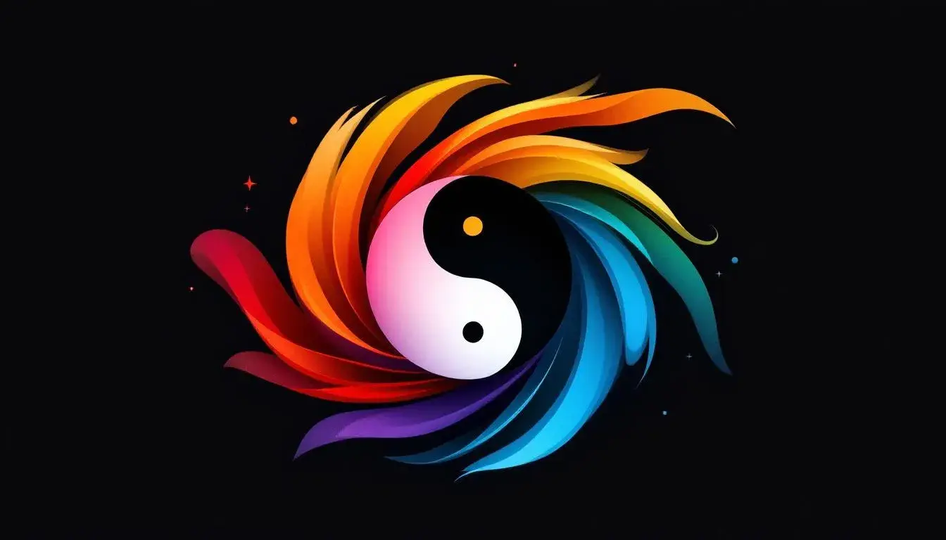
The Yin and Yang of 2025: Balancing Warm vs. Cool Palettes
25 Jul 2025 · 5 min readThe dance of light and shadow, warmth and chill—it's a fundamental rhythm shaping our perceptions. In the design world of 2025, this duality is more potent than ever. Color, the most visible aspect of any creation, acts as the fulcrum upon which this balance rests. Palettes aren't just arrangements of hues; they are emotional landscapes, dictating the tone of a project, whispering promises of comfort or bracing challenge. A world bathed in golden light offers solace, while one steeped in cool blues and grays might suggest innovation or solemnity. The skillful balancing of these elements is more than just a trend; it's a sophisticated response to a world craving both stability and stimulation, mirroring the way we ourselves navigate existence. It's about crafting experiences that feel authentic, that invite engagement on a deeply human level, and recognize the inherent tension between opposing forces. As we move deeper into this interplay, the power to shape narratives and evoke feeling through carefully considered color choices takes on a renewed significance.
The "Business Directory" 🏢 palette leans heavily into the realm of cool deliberation. The Deep Blue asserts a position of authority, tempered by the neutrality of Off White. Yet, it's the subtle insertions of warmth, the Golden Yellow and the Brick Red, that prevent the composition from feeling sterile. These colors act as quiet disruptors, sparks of energy within a structured environment. One might envision this palette applied to a collaborative workspace, where calm focus is paramount, but creativity needs occasional jolts to thrive. The Bright Turquoise injects a sense of forward motion, while the Bright Pink and Vivid Purple introduce complexity. It's a study in creating equilibrium: the Charcoal Gray provides grounding shadow, offsetting the airy lightness, a counterpoint inviting contemplation amid activity. Imagine encountering this color scheme navigating a digital interface, the Deep Blue creating a secure backdrop for interaction, while the Golden Yellow highlights the actionable elements, guiding the user through a complex data landscape with intuitive ease. The Grayish Teal feels like a breath of fresh air, a serene note in an otherwise energized composition. The palette avoids extremes, instead offering a path to thoughtful consideration.
"Earthy Serenity" 🌿 evokes a sense of grounded ease. The Seafoam Green establishes a soothing foundation, while Coral Red and Golden Yellow bring in just enough solar energy to keep things vibrant but not frantic. The Onyx Black and Charcoal Gray provide structural contrast, grounding the airy brightness with subtle gravity. This palette evokes the feeling of a sunlit forest floor, dappled with shadows and bursting with new life. The Fuchsia Pink, a surprise element, adds a touch of whimsy, suggesting the unexpected beauty found even in the most natural of settings. Imagine using this palette to design a wellness retreat, where the colors would work harmoniously to foster a sense of calm. The Pure White provides a clean, uncluttered backdrop, while the Burgundy Red lends sophistication and depth. Even the Teal Blue plays a role, suggesting water and purification. In the context of opposing color temperatures, this palette highlights the power of harmonious convergence, demonstrating that warmth and coolness can exist side-by-side, each enhancing the other. The Olive Green functions as an anchor, suggesting stability and trustworthiness in a world often characterized by uncertainty.
The "SACDE Palette" 🎨 presents a sophisticated interplay between the vibrant and the subdued. The Bright Golden Yellow acts as a focal point, pulling the eye in against the deeper, more contemplative shades. The Light Steel Blue contributes a sense of spaciousness, while the Deep Cerulean offers an element of grounded assurance. There is a push and pull between effervescence and seriousness, making this palette perfect for environments that require both creativity and stability. Consider how this play works for someone navigating a website: the Pure White creates a sense of clarity; the contrasting Deep Midnight Blue makes key navigation elements visible; and the Lime Green Yellow highlights calls to action. The Dusty Rose Tan adds a human touch, while the Olive Drab Green conveys trustworthiness. The balance between energy and stability makes this palette capable of supporting nuanced, compelling experiences. The Charcoal Gray acts as a shadow, giving the other colors greater depth and dimension, while the Vivid Sky Blue brings in a breath of fresh air. The whole effect is both invigorating and reassuring, making it a fitting color choice for complex situations.
"Corporate Blue" 🟦 conveys a sense of measured innovation, pairing icy confidence with moments of surprising heat. The Royal Blue forms a deep and reliable foundation, while the Off White lifts the composition toward a brighter, more accessible plane. It's a palette reminiscent of a twilight cityscape: the cool indigo fading on the horizon, punctuated by the warm glow of office lights beginning to flicker on. The Vivid Azure offers vitality, balanced by the grounding presence of the Cool Gray. The Bright Red, a small but significant inclusion, adds an unexpected spark, a hint of daring within a structured environment. This touch is critical in preventing the palette from feeling staid, suggesting underlying agility. Imagine this color combination guiding a user through a complex software interface, where the Royal Blue establishes credibility, and the Light Sky Blue offers clear and concise navigation cues. The Pale Greenish Gray provides a neutral backdrop, while the Deep Indigo enhances the sense of depth. The Olive Drab and Dark Charcoal adds a touch of earthiness to this palette that is otherwise dominated by blues.
"Playful Brights" 🎨 is an unapologetic eruption of joy. This palette embraces the full spectrum, balancing its warmer tones, like Amber Yellow and Bright Coral, against the cooler washes of Vibrant Blue. The result is an environment of pure, unadulterated energy. The elements of warmth don’t just sit prettily; here, it drives engagement, prompting a natural sense of dynamism. Imagine a child's playroom, where this combination would spark creativity and exploration. The Golden Yellow invites curiosity, while the Vibrant Blue encourages movement and discovery. The Emerald Green brings in a touch of nature, giving the eyes a place to rest. The Soft Gray and Deep Steel provide a sense of grounding, preventing the overall effect from becoming overwhelming. Even the Deep Burgundy plays its vital role, adding a touch of depth and sophistication. Here, the interplay of warmth and coolness isn't about creating perfect balance; it's about capturing the frenetic energy of childhood, where every moment is filled with possibility.
The "Academic Palette" 🧑🎓 presents a studied contrast, inviting a thoughtful approach through color. The Cerulean Blue builds a strong foundation, while the Pure White and Vibrant Gold highlight key points and create a feeling of intellectual spaciousness. It evokes the hushed atmosphere of an old library: the cool blues and greens suggesting focus and concentration, while the BurlyWood and Maroon Red provide hints of warmth and invitation. This palette balances the need for stability with the desire for innovative thinking. One might imagine this palette implemented within an online learning platform, the key colors guiding the student through complex information while also injecting moments of subtle encouragement, such as the Pale Green. The BurlyWood adds a distinctly human touch, and the Pale Green provides much-needed moments of rest, as well as a connection with nature. The Electric Blue draws attention to itself, while the Deep Indigo provides a somber and intellectual backdrop. There are moments of vibrancy, but the effect is overall one of thoughtful study.
"Verde Nature" 🌿 pulls together an impression of organic vitality. The Lime Green and Bright Green evoke a sense of flourishing life, grounded by the Dark Forest Green. The Pale Yellow is reminiscent of sunlight, and the Light Sky Blue adds airy brightness. The Steel Blue introduces a complementary cooling counterpoint. This palette embodies a peaceful woodland scene: the greens suggest abundance, while the neutrals create a haven for introspection. Used in branding, the dominant greens of "Verde Nature" 🌿 signal a commitment to the environment. The Pale Yellow calls up a feeling of optimism. The interplay of varying greens results in a calm and reassuring experience and also serves to signal vitality. The Pure White keeps the palette light and ensures no particular element overwhelms the viewer's senses, and the Dusty Gray emphasizes the natural, unrefined character of the palette. It suggests responsible growth that is free of artifice, inviting viewers to interact with a scene of unpretentious openness.
By 2025, the conversation around color extends beyond mere aesthetics, reaching into deeper, more resonant spaces. As we move further into an era defined by constant change and sensory overload, the skill to wield color effectively will be more highly prized than ever. These palettes, while diverse in their specific applications, collectively point to the central truth: that the most compelling visuals are constructed from thoughtful pairings, a delicate balance between opposing forces. Whether it's the professional demeanor of the blues and grays paired with small bursts of gold ("Business Directory" 🏢 and "Corporate Blue" 🟦) or the exuberant blend of warm and cool ("Playful Brights" 🎨), a subtle tension keeps our attention, makes us want to engage with the designs around us, to linger, to explore. The shift goes beyond simply following trends to forging deeper connections, constructing visual experiences that are both aesthetically pleasing and emotionally nourishing.