'%3e%3cpath%20fill-rule='evenodd'%20clip-rule='evenodd'%20d='M51.1303%2019.2492C50.7278%2019.913%2050.1346%2020.4426%2049.3508%2020.838C48.5669%2021.2335%2047.6172%2021.4312%2046.5014%2021.4312C44.8208%2021.4312%2043.4367%2021.0216%2042.3492%2020.2025C41.2617%2019.3833%2040.6686%2018.2394%2040.5697%2016.7706H44.4253C44.4818%2017.3355%2044.6831%2017.7804%2045.0291%2018.1052C45.3751%2018.43%2045.8164%2018.5924%2046.3531%2018.5924C46.8192%2018.5924%2047.1864%2018.4653%2047.4547%2018.2111C47.7231%2017.9569%2047.8572%2017.618%2047.8572%2017.1943C47.8572%2016.8129%2047.7337%2016.4952%2047.4865%2016.241C47.2393%2015.9867%2046.9322%2015.7784%2046.565%2015.616C46.1978%2015.4536%2045.6893%2015.2594%2045.0397%2015.0334C44.0934%2014.7086%2043.3202%2014.3944%2042.72%2014.0907C42.1197%2013.7871%2041.6042%2013.3351%2041.1735%2012.7349C40.7427%2012.1347%2040.5273%2011.3544%2040.5273%2010.394C40.5273%209.50418%2040.7533%208.73448%2041.2053%208.08481C41.6572%207.43515%2042.2821%206.93731%2043.0801%206.5913C43.8781%206.24528%2044.7925%206.07227%2045.8235%206.07227C47.49%206.07227%2048.8141%206.46771%2049.7956%207.25861C50.7772%208.04951%2051.3315%209.13698%2051.4586%2010.5211H47.5395C47.4689%2010.0268%2047.2888%209.63483%2046.9993%209.3453C46.7097%209.05578%2046.3178%208.91102%2045.8235%208.91102C45.3998%208.91102%2045.0573%209.024%2044.7961%209.24997C44.5348%209.47594%2044.4041%209.80783%2044.4041%2010.2457C44.4041%2010.5988%2044.5207%2010.8989%2044.7537%2011.146C44.9867%2011.3932%2045.2798%2011.5944%2045.6328%2011.7498C45.9859%2011.9052%2046.4944%2012.1029%2047.1581%2012.343C48.1185%2012.6678%2048.9023%2012.9891%2049.5096%2013.3069C50.1169%2013.6246%2050.6395%2014.0872%2051.0773%2014.6945C51.5151%2015.3018%2051.734%2016.0927%2051.734%2017.0672C51.734%2017.8581%2051.5328%2018.5854%2051.1303%2019.2492ZM59.0242%206.3053V21.2829H55.4016V6.3053H59.0242ZM73.9409%206.3053V9.18642H69.8734V21.2829H66.2296V9.18642H62.2046V6.3053H73.9409ZM80.7438%209.18642V12.3218H85.8069V15.0546H80.7438V18.3806H86.4425V21.2829H77.1212V6.3053H86.4425V9.18642H80.7438ZM99.667%2016.0291V21.2829H96.0444V6.3053H101.913C103.692%206.3053%20105.048%206.74665%20105.98%207.62934C106.912%208.51204%20107.378%209.7019%20107.378%2011.199C107.378%2012.1311%20107.17%2012.9609%20106.753%2013.6882C106.337%2014.4155%20105.719%2014.9875%20104.9%2015.4042C104.08%2015.8208%20103.085%2016.0291%20101.913%2016.0291H99.667ZM103.692%2011.199C103.692%209.8855%20102.965%209.22879%20101.51%209.22879H99.667V13.1268H101.51C102.965%2013.1268%20103.692%2012.4842%20103.692%2011.199ZM120.092%2018.5501H114.478L113.546%2021.2829H109.732L115.219%206.41123H119.393L124.879%2021.2829H121.024L120.092%2018.5501ZM119.16%2015.7961L117.295%2010.2881L115.41%2015.7961H119.16ZM131.555%2018.5077H136.385V21.2829H127.933V6.3053H131.555V18.5077ZM143.337%209.18642V12.3218H148.4V15.0546H143.337V18.3806H149.035V21.2829H139.714V6.3053H149.035V9.18642H143.337ZM163.507%206.3053V9.18642H159.44V21.2829H155.796V9.18642H151.771V6.3053H163.507ZM177.449%206.3053V9.18642H173.382V21.2829H169.738V9.18642H165.713V6.3053H177.449ZM184.252%209.18642V12.3218H189.315V15.0546H184.252V18.3806H189.951V21.2829H180.629V6.3053H189.951V9.18642H184.252Z'%20fill='%23EEF0ED'/%3e%3cmask%20id='mask0_3101_7327'%20style='mask-type:alpha'%20maskUnits='userSpaceOnUse'%20x='0'%20y='0'%20width='27'%20height='28'%3e%3cpath%20d='M23.8328%200.759766H2.64808C1.18559%200.759766%200%201.94535%200%203.40785V24.5925C0%2026.055%201.18559%2027.2406%202.64808%2027.2406H23.8328C25.2952%2027.2406%2026.4808%2026.055%2026.4808%2024.5925V3.40785C26.4808%201.94535%2025.2952%200.759766%2023.8328%200.759766Z'%20fill='white'/%3e%3c/mask%3e%3cg%20mask='url(%23mask0_3101_7327)'%3e%3cpath%20d='M23.8328%200.759766H2.64808C1.18559%200.759766%200%201.94535%200%203.40785V24.5925C0%2026.055%201.18559%2027.2406%202.64808%2027.2406H23.8328C25.2952%2027.2406%2026.4808%2026.055%2026.4808%2024.5925V3.40785C26.4808%201.94535%2025.2952%200.759766%2023.8328%200.759766Z'%20fill='%23D8D8D8'/%3e%3cpath%20d='M13.2404%200.759766H0V14.0001H13.2404V0.759766Z'%20fill='%238C61FF'/%3e%3cpath%20d='M13.2404%2014H0V27.2404H13.2404V14Z'%20fill='%2336C3FE'/%3e%3cpath%20d='M26.4806%2014H13.2402V27.2404H26.4806V14Z'%20fill='%236592FE'/%3e%3cpath%20d='M26.4806%200.759766H13.2402V14.0002H26.4806V0.759766Z'%20fill='%236059F7'/%3e%3c/g%3e%3c/g%3e%3cdefs%3e%3cclipPath%20id='clip0_3101_7327'%3e%3crect%20width='190'%20height='28'%20fill='white'/%3e%3c/clipPath%3e%3c/defs%3e%3c/svg%3e)
'%3e%3cpath%20d='M23.8328%200.759521H2.64808C1.18559%200.759521%200%201.94511%200%203.40761V24.5923C0%2026.0548%201.18559%2027.2404%202.64808%2027.2404H23.8328C25.2952%2027.2404%2026.4808%2026.0548%2026.4808%2024.5923V3.40761C26.4808%201.94511%2025.2952%200.759521%2023.8328%200.759521Z'%20fill='%23D8D8D8'/%3e%3cpath%20d='M13.2404%200.759521H0V13.9999H13.2404V0.759521Z'%20fill='%238C61FF'/%3e%3cpath%20d='M13.2404%2013.9998H0V27.2402H13.2404V13.9998Z'%20fill='%2336C3FE'/%3e%3cpath%20d='M26.4809%2013.9998H13.2405V27.2402H26.4809V13.9998Z'%20fill='%236592FE'/%3e%3cpath%20d='M26.4809%200.759277H13.2405V13.9997H26.4809V0.759277Z'%20fill='%236059F7'/%3e%3c/g%3e%3c/svg%3e)
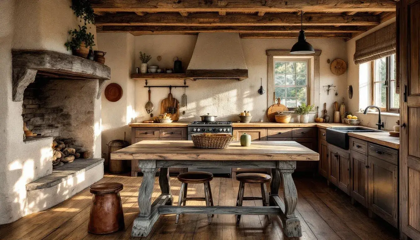
The Rise of Modern Rustic: A Breakdown of 'Earthy Contrast' and Variations
25 Jul 2025 · 3 min readThe pull toward nature isn't a novel idea. But its current form—a sophisticated, knowing embrace of organic textures and muted tones—feels particularly potent. This isn't your grandmother's chintz-laden country kitchen. Instead, it's a mindful curation of elements that speak of the hand-hewn, the weathered, and the quietly luxurious. Think sun-drenched plaster walls meeting exposed timber beams; linen throws draped across handcrafted leather sofas. The color story, crucial to achieving this delicate balance, eschews bright, jarring hues in favor of palettes that whisper of the earth itself. Color becomes a tactile experience, a visual echo of the materials chosen to define the spaces. Color choices guide our perception, suggesting narratives of slow living, sustainability, and an appreciation for the imperfect beauty of the natural world. By choosing carefully, we can transform spaces to encourage serenity paired with subtle sophistication. The following palettes seek the earthy embrace of modern rustic living.
Earthy Contrast 🌳 hints at the subtle drama to be found in nature. Imagine a room where Light Beige walls serve as a canvas for furniture upholstered in Terracotta Brown; the eye is drawn to the interplay between the gentle, almost sandy neutrality and the richer, more grounding tone. Touches of Forest Green and Deep Brown provide necessary depth, recalling the shadowy undergrowth glimpsed on a forest floor. This is a palette that invites contemplation, suggesting a space where one might curl up with a well-worn book and lose track of time. Taupe Brown brings the calm of aged wood into the arrangement. It's a palette that favors natural light, allowing the shades to shift and evolve throughout the day, mimicking the ever-changing conditions of the outside world. Consider it for spaces meant to be lived in slowly, savored fully: a sunroom bathed in afternoon light, or a study where the scent of beeswax lingers in the air. The contrast doesn’t shout; it murmurs, a quiet assertion of style and comfort. This would enhance a rustic style that appreciates the beauty of imperfect surfaces.
Earthy Corporate 🏢 offers a refined take on natural hues, proving that the organic can indeed thrive in a professional setting. Light Tan, reminiscent of raw silk or unbleached linen, sets the stage for a sophisticated neutrality. The inclusion of Burnt Sienna adds a touch of warmth, like the glow of a setting sun on a brick façade; it's unexpected yet welcoming. The real brilliance lies in the integration of Cool Gray and Emerald Green. These shades speak of intelligence and innovation, offering a calming counterpoint to the earthier tones. Dark Taupe provides an anchor, a grounded presence that instills confidence and stability. Envision this palette in a modern office space, where sleek lines and natural materials coexist in perfect harmony. It is a design that promotes clarity and focus, while also fostering a sense of well-being. This color scheme steers clear of sterile minimalism; it opts for a more human approach, one that recognizes the importance of comfort and connection in the workplace.
Earthy Freshness 🌿 captures the essence of spring's awakening, translating the delicate balance of nature into a revitalizing and welcoming interior scheme. Pale Beige serves as a soft, light-reflecting base, reminiscent of early morning mist blanketing a field. Lively Green brings forth the energy of new growth, the vibrant hue immediately lifting the spirits and instilling a sense of optimism. The subtlety of Earthy Brown is like well-worn leather gently aged by the passage of time, lending a sense of history and permanence. A calming Neutral Gray keeps all the colors from overpowering, lending a sense of maturity, while the Midnight Green adds depth and contrast, akin to the rich soil that nourishes all life. Imagine this palette gracing the walls of a sun-drenched living room, perhaps accented by woven textures and the soft gleam of brass fixtures. This combination creates a space that feels both grounded and buoyant, perfect for relaxation and contemplation, echoing the harmony of a garden in full bloom.
Earthy Harmony 🌿 delivers a whisper of the outdoors, a masterclass in understated elegance that brings peace to any interior. Off White forms a canvas as pure as morning light, a versatile foundation that allows the other hues to sing. Seafoam Green, brings a cool, restorative element, echoing the tranquility of shallow pools. Khaki Brown, hints at sun-baked earth, giving the palette an overall grounding sense. Burnt Sienna evokes memories of fiery autumnal foliage, adding subtle warmth and texture, while Dark Charcoal lends depth. Picture this palette enhancing a bedroom, the combination inspiring rest. Fabrics feel softer, textures appear richer, and the overall atmosphere promotes rest. The choice of colors here creates spaces where the outside world is welcomed, but on our own terms, controlled and serene. This color ensemble celebrates the art of slow living.
The modern rustic aesthetic, it becomes clear, is not simply about embracing natural tones; it's about understanding the relationships between them. It's about composing symphonies of shades that evoke specific moods, create tailored experiences, and ultimately, celebrate the beauty and restorative power of the earth itself. These palettes offer blueprints for crafting spaces that are not only visually appealing, but deeply nourishing to the soul. By carefully selecting the colors that surround us, we can transform our living spaces into sanctuaries of calm, creativity, and connection. The choices are subtle yet profound, and the effect, when executed with intention and care, can be truly transformative.