'%3e%3cpath%20fill-rule='evenodd'%20clip-rule='evenodd'%20d='M51.1303%2019.2492C50.7278%2019.913%2050.1346%2020.4426%2049.3508%2020.838C48.5669%2021.2335%2047.6172%2021.4312%2046.5014%2021.4312C44.8208%2021.4312%2043.4367%2021.0216%2042.3492%2020.2025C41.2617%2019.3833%2040.6686%2018.2394%2040.5697%2016.7706H44.4253C44.4818%2017.3355%2044.6831%2017.7804%2045.0291%2018.1052C45.3751%2018.43%2045.8164%2018.5924%2046.3531%2018.5924C46.8192%2018.5924%2047.1864%2018.4653%2047.4547%2018.2111C47.7231%2017.9569%2047.8572%2017.618%2047.8572%2017.1943C47.8572%2016.8129%2047.7337%2016.4952%2047.4865%2016.241C47.2393%2015.9867%2046.9322%2015.7784%2046.565%2015.616C46.1978%2015.4536%2045.6893%2015.2594%2045.0397%2015.0334C44.0934%2014.7086%2043.3202%2014.3944%2042.72%2014.0907C42.1197%2013.7871%2041.6042%2013.3351%2041.1735%2012.7349C40.7427%2012.1347%2040.5273%2011.3544%2040.5273%2010.394C40.5273%209.50418%2040.7533%208.73448%2041.2053%208.08481C41.6572%207.43515%2042.2821%206.93731%2043.0801%206.5913C43.8781%206.24528%2044.7925%206.07227%2045.8235%206.07227C47.49%206.07227%2048.8141%206.46771%2049.7956%207.25861C50.7772%208.04951%2051.3315%209.13698%2051.4586%2010.5211H47.5395C47.4689%2010.0268%2047.2888%209.63483%2046.9993%209.3453C46.7097%209.05578%2046.3178%208.91102%2045.8235%208.91102C45.3998%208.91102%2045.0573%209.024%2044.7961%209.24997C44.5348%209.47594%2044.4041%209.80783%2044.4041%2010.2457C44.4041%2010.5988%2044.5207%2010.8989%2044.7537%2011.146C44.9867%2011.3932%2045.2798%2011.5944%2045.6328%2011.7498C45.9859%2011.9052%2046.4944%2012.1029%2047.1581%2012.343C48.1185%2012.6678%2048.9023%2012.9891%2049.5096%2013.3069C50.1169%2013.6246%2050.6395%2014.0872%2051.0773%2014.6945C51.5151%2015.3018%2051.734%2016.0927%2051.734%2017.0672C51.734%2017.8581%2051.5328%2018.5854%2051.1303%2019.2492ZM59.0242%206.3053V21.2829H55.4016V6.3053H59.0242ZM73.9409%206.3053V9.18642H69.8734V21.2829H66.2296V9.18642H62.2046V6.3053H73.9409ZM80.7438%209.18642V12.3218H85.8069V15.0546H80.7438V18.3806H86.4425V21.2829H77.1212V6.3053H86.4425V9.18642H80.7438ZM99.667%2016.0291V21.2829H96.0444V6.3053H101.913C103.692%206.3053%20105.048%206.74665%20105.98%207.62934C106.912%208.51204%20107.378%209.7019%20107.378%2011.199C107.378%2012.1311%20107.17%2012.9609%20106.753%2013.6882C106.337%2014.4155%20105.719%2014.9875%20104.9%2015.4042C104.08%2015.8208%20103.085%2016.0291%20101.913%2016.0291H99.667ZM103.692%2011.199C103.692%209.8855%20102.965%209.22879%20101.51%209.22879H99.667V13.1268H101.51C102.965%2013.1268%20103.692%2012.4842%20103.692%2011.199ZM120.092%2018.5501H114.478L113.546%2021.2829H109.732L115.219%206.41123H119.393L124.879%2021.2829H121.024L120.092%2018.5501ZM119.16%2015.7961L117.295%2010.2881L115.41%2015.7961H119.16ZM131.555%2018.5077H136.385V21.2829H127.933V6.3053H131.555V18.5077ZM143.337%209.18642V12.3218H148.4V15.0546H143.337V18.3806H149.035V21.2829H139.714V6.3053H149.035V9.18642H143.337ZM163.507%206.3053V9.18642H159.44V21.2829H155.796V9.18642H151.771V6.3053H163.507ZM177.449%206.3053V9.18642H173.382V21.2829H169.738V9.18642H165.713V6.3053H177.449ZM184.252%209.18642V12.3218H189.315V15.0546H184.252V18.3806H189.951V21.2829H180.629V6.3053H189.951V9.18642H184.252Z'%20fill='%23EEF0ED'/%3e%3cmask%20id='mask0_3101_7327'%20style='mask-type:alpha'%20maskUnits='userSpaceOnUse'%20x='0'%20y='0'%20width='27'%20height='28'%3e%3cpath%20d='M23.8328%200.759766H2.64808C1.18559%200.759766%200%201.94535%200%203.40785V24.5925C0%2026.055%201.18559%2027.2406%202.64808%2027.2406H23.8328C25.2952%2027.2406%2026.4808%2026.055%2026.4808%2024.5925V3.40785C26.4808%201.94535%2025.2952%200.759766%2023.8328%200.759766Z'%20fill='white'/%3e%3c/mask%3e%3cg%20mask='url(%23mask0_3101_7327)'%3e%3cpath%20d='M23.8328%200.759766H2.64808C1.18559%200.759766%200%201.94535%200%203.40785V24.5925C0%2026.055%201.18559%2027.2406%202.64808%2027.2406H23.8328C25.2952%2027.2406%2026.4808%2026.055%2026.4808%2024.5925V3.40785C26.4808%201.94535%2025.2952%200.759766%2023.8328%200.759766Z'%20fill='%23D8D8D8'/%3e%3cpath%20d='M13.2404%200.759766H0V14.0001H13.2404V0.759766Z'%20fill='%238C61FF'/%3e%3cpath%20d='M13.2404%2014H0V27.2404H13.2404V14Z'%20fill='%2336C3FE'/%3e%3cpath%20d='M26.4806%2014H13.2402V27.2404H26.4806V14Z'%20fill='%236592FE'/%3e%3cpath%20d='M26.4806%200.759766H13.2402V14.0002H26.4806V0.759766Z'%20fill='%236059F7'/%3e%3c/g%3e%3c/g%3e%3cdefs%3e%3cclipPath%20id='clip0_3101_7327'%3e%3crect%20width='190'%20height='28'%20fill='white'/%3e%3c/clipPath%3e%3c/defs%3e%3c/svg%3e)
'%3e%3cpath%20d='M23.8328%200.759521H2.64808C1.18559%200.759521%200%201.94511%200%203.40761V24.5923C0%2026.0548%201.18559%2027.2404%202.64808%2027.2404H23.8328C25.2952%2027.2404%2026.4808%2026.0548%2026.4808%2024.5923V3.40761C26.4808%201.94511%2025.2952%200.759521%2023.8328%200.759521Z'%20fill='%23D8D8D8'/%3e%3cpath%20d='M13.2404%200.759521H0V13.9999H13.2404V0.759521Z'%20fill='%238C61FF'/%3e%3cpath%20d='M13.2404%2013.9998H0V27.2402H13.2404V13.9998Z'%20fill='%2336C3FE'/%3e%3cpath%20d='M26.4809%2013.9998H13.2405V27.2402H26.4809V13.9998Z'%20fill='%236592FE'/%3e%3cpath%20d='M26.4809%200.759277H13.2405V13.9997H26.4809V0.759277Z'%20fill='%236059F7'/%3e%3c/g%3e%3c/svg%3e)
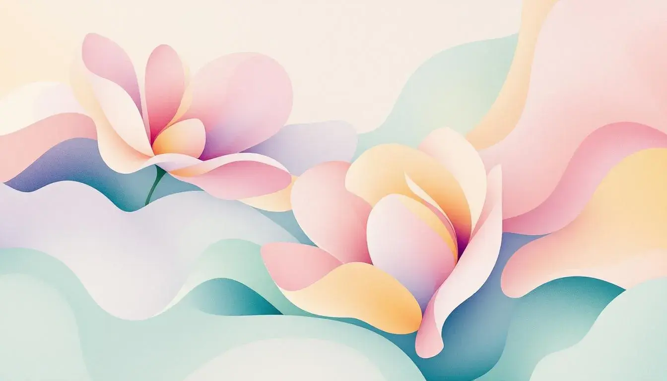
Spring in Our Step: The Prevalence of 'Spring' Palettes
24 Jul 2025 · 5 min readThe yearning for lightness, for air after months cloaked in shadow – that's Spring. It isn't just a season; it's a feeling, a shift in the very spirit. Color, then, becomes more than mere decoration. It's an expression of this burgeoning energy, a visual exhale. The palettes we choose to surround ourselves with during this time become powerful storytellers, reflecting our hopes for the future, our desire for renewal. From the first tentative blossoms to the sun-drenched afternoons, Spring whispers its presence through hues that awaken and inspire and carry us forward.
The aptly named Calm Health palette presents a quiet entry into the season. It’s a tableau of subtlety, less a shout of new life and more a gentle awakening. Off White anchors the scene, a blank canvas ready to absorb the nascent colors of Spring. Pale Yellow, like the first sunlight filtering through budding trees, whispers of warmth and vitality. Light Lavender introduces a touch of ethereal cool, reminiscent of a spring rain shower leaving behind a sense of freshness and cleansing. These airy notes find grounding in Medium Gray, Dark Brown, and Dark Charcoal, tones that speak of stability and the enduring presence of the earth beneath the blossoming surface. Imagine this palette in a sunlit office, a waiting room designed to soothe, or a website intended to inspire trust. It speaks of clean lines, natural elements, and a measured approach to well-being. It avoids the jarring vibrancy of a sudden burst, instead opting for a sense of quiet confidence, like a promise of steady growth and rejuvenation. It suggests a considered approach to health, where vitality is nurtured, not forced, and where the transition from dormancy to vibrant life is a gradual, graceful dance. This is not a palette of immediate impact. Instead, it offers a sanctuary, a space to breathe and find equilibrium as the world outside reclaims its color.
Vibrant Contrast, in stark opposition to the calm described prior, is Spring at full throttle. It captures the youthful energy that blooms alongside the daffodils, a bold statement that resists restraint. Off White serves as a crisp foundation, a bright stage upon which the other colors dance and play. Seafoam Green evokes the feeling of crashing waves. Muted Olive grounds the composition, a shade that is both earthy and unexpected. Steel Blue, reminiscent of a clear spring sky, provides a cool counterbalance. Anchoring the palette is Charcoal Gray, a tone of quiet strength that allows the brighter shades to truly shimmer. This palette would suit a lively living room, infusing it with modern appeal, or a marketing campaign searching to capture attention. Imagine the possibilities of branding that seeks to grab attention. This is the spirit of Spring, amplified and unapologetic.
Record Planet offers a more retrospective view of Spring. It's less about the explosive emergence of color and more about the memories and potential born in the change of season. Light Beige provides a warm, nostalgic base. Evoking the tranquility of a calm lagoon sits Seafoam Green. Olive Drab is reminiscent of a hidden grove, a spot where the earth and plantlife embrace. Lavender Ink adds an element of mystique, hinting at the introspective moments that come with longer days and renewed possibilities. At the core lies Dark Espresso, a comforting anchor that speaks of quiet evenings spent reflecting on change. This is a palette that would feel at home in a minimalist living room, a space designed for both contemplation and connection. It conjures images of quiet mornings, the scent of old books, and an atmosphere of creativity and exploration. The energy is inward-focused, a Spring cleaning of the mind and spirit. It's about preparing for the journey ahead, using the momentum of the season to clear the path for new ideas and experiences.
Bold Contrast takes a different tack. It's Spring as an act of creation, a deliberate and striking expression of individuality. Light Gray provides a clean, modern backdrop. Then comes Turquoise that is reminiscent of the jewel-toned clarity of a tropical lagoon. Dusty Blue adds a touch that calls to peaceful introspection. Royal Blue injects a sense of drama, of creative expression that demands attention. Anchoring the palette is Olive Green, an offering to the season of growth. Imagine this palette in a studio or office, a space where ideas are born and brought to life. It's a fitting choice for brands unafraid to challenge conventions and forge their own paths. This is the energy of Spring channeled into purposeful action, the desire to transform and leave a lasting mark.
Vibrant Web paints Spring as a moment of coming together, a celebration of shared joy and connection. Light Blush sets a soft, welcoming tone, like the delicate flush of cherry blossoms in full bloom. Cool Gray provides a sophisticated counterpoint, a reminder that vibrancy need not be overwhelming. Dusty Rose lends a touch of elegance, a nod to the timeless beauty of the season. Amethyst Purple brings an air of festivity, reminiscent of the twilight sky on a warm Spring evening. Deepening the composition, Dark Purple grants closure. This palette creates intimate and collaborative spaces. Imagine websites, social media campaigns, and brands that want to show happiness. This is the warmth of renewed connections, the joy of shared experiences, the feeling of Spring expressed in a way that is both modern and deeply heartfelt.
Vibrant Spectrum presents us with Spring's promise of evolution, the kaleidoscope of possibilities that come with renewal. Pale Gray offers a refined start, suggesting the beauty in quiet contemplation. Olive Drab evokes a timeless quality. Muted Teal whispers of hidden depths, of emotions that are both complex and compelling. Dusty Plum leads to introspection. Finally, Dark Slate is mysterious and powerful. Imagine this palette in a modern living room, a creative office, or a technology brand seeking to express innovation. This is Spring in its most expansive form, a season of transformation captured in a spectrum of colors that inspire exploration and celebrate the journey of growth.
These Spring palettes are portals, then, each offering a distinct pathway into the essence of the season. They propose distinct experiences, from the soothing tranquility of a spa-like sanctuary to the effervescent energy of a celebratory gathering. Color moves us, shapes our experience, reminds us of the promise inherent in every new beginning. It is in this spirit of renewal that Spring finds its most profound expression, a vibrant, multifaceted dance of light and shadow, calm and exuberance, that awakens the senses and inspires us to embrace change.