'%3e%3cpath%20fill-rule='evenodd'%20clip-rule='evenodd'%20d='M51.1303%2019.2492C50.7278%2019.913%2050.1346%2020.4426%2049.3508%2020.838C48.5669%2021.2335%2047.6172%2021.4312%2046.5014%2021.4312C44.8208%2021.4312%2043.4367%2021.0216%2042.3492%2020.2025C41.2617%2019.3833%2040.6686%2018.2394%2040.5697%2016.7706H44.4253C44.4818%2017.3355%2044.6831%2017.7804%2045.0291%2018.1052C45.3751%2018.43%2045.8164%2018.5924%2046.3531%2018.5924C46.8192%2018.5924%2047.1864%2018.4653%2047.4547%2018.2111C47.7231%2017.9569%2047.8572%2017.618%2047.8572%2017.1943C47.8572%2016.8129%2047.7337%2016.4952%2047.4865%2016.241C47.2393%2015.9867%2046.9322%2015.7784%2046.565%2015.616C46.1978%2015.4536%2045.6893%2015.2594%2045.0397%2015.0334C44.0934%2014.7086%2043.3202%2014.3944%2042.72%2014.0907C42.1197%2013.7871%2041.6042%2013.3351%2041.1735%2012.7349C40.7427%2012.1347%2040.5273%2011.3544%2040.5273%2010.394C40.5273%209.50418%2040.7533%208.73448%2041.2053%208.08481C41.6572%207.43515%2042.2821%206.93731%2043.0801%206.5913C43.8781%206.24528%2044.7925%206.07227%2045.8235%206.07227C47.49%206.07227%2048.8141%206.46771%2049.7956%207.25861C50.7772%208.04951%2051.3315%209.13698%2051.4586%2010.5211H47.5395C47.4689%2010.0268%2047.2888%209.63483%2046.9993%209.3453C46.7097%209.05578%2046.3178%208.91102%2045.8235%208.91102C45.3998%208.91102%2045.0573%209.024%2044.7961%209.24997C44.5348%209.47594%2044.4041%209.80783%2044.4041%2010.2457C44.4041%2010.5988%2044.5207%2010.8989%2044.7537%2011.146C44.9867%2011.3932%2045.2798%2011.5944%2045.6328%2011.7498C45.9859%2011.9052%2046.4944%2012.1029%2047.1581%2012.343C48.1185%2012.6678%2048.9023%2012.9891%2049.5096%2013.3069C50.1169%2013.6246%2050.6395%2014.0872%2051.0773%2014.6945C51.5151%2015.3018%2051.734%2016.0927%2051.734%2017.0672C51.734%2017.8581%2051.5328%2018.5854%2051.1303%2019.2492ZM59.0242%206.3053V21.2829H55.4016V6.3053H59.0242ZM73.9409%206.3053V9.18642H69.8734V21.2829H66.2296V9.18642H62.2046V6.3053H73.9409ZM80.7438%209.18642V12.3218H85.8069V15.0546H80.7438V18.3806H86.4425V21.2829H77.1212V6.3053H86.4425V9.18642H80.7438ZM99.667%2016.0291V21.2829H96.0444V6.3053H101.913C103.692%206.3053%20105.048%206.74665%20105.98%207.62934C106.912%208.51204%20107.378%209.7019%20107.378%2011.199C107.378%2012.1311%20107.17%2012.9609%20106.753%2013.6882C106.337%2014.4155%20105.719%2014.9875%20104.9%2015.4042C104.08%2015.8208%20103.085%2016.0291%20101.913%2016.0291H99.667ZM103.692%2011.199C103.692%209.8855%20102.965%209.22879%20101.51%209.22879H99.667V13.1268H101.51C102.965%2013.1268%20103.692%2012.4842%20103.692%2011.199ZM120.092%2018.5501H114.478L113.546%2021.2829H109.732L115.219%206.41123H119.393L124.879%2021.2829H121.024L120.092%2018.5501ZM119.16%2015.7961L117.295%2010.2881L115.41%2015.7961H119.16ZM131.555%2018.5077H136.385V21.2829H127.933V6.3053H131.555V18.5077ZM143.337%209.18642V12.3218H148.4V15.0546H143.337V18.3806H149.035V21.2829H139.714V6.3053H149.035V9.18642H143.337ZM163.507%206.3053V9.18642H159.44V21.2829H155.796V9.18642H151.771V6.3053H163.507ZM177.449%206.3053V9.18642H173.382V21.2829H169.738V9.18642H165.713V6.3053H177.449ZM184.252%209.18642V12.3218H189.315V15.0546H184.252V18.3806H189.951V21.2829H180.629V6.3053H189.951V9.18642H184.252Z'%20fill='%23EEF0ED'/%3e%3cmask%20id='mask0_3101_7327'%20style='mask-type:alpha'%20maskUnits='userSpaceOnUse'%20x='0'%20y='0'%20width='27'%20height='28'%3e%3cpath%20d='M23.8328%200.759766H2.64808C1.18559%200.759766%200%201.94535%200%203.40785V24.5925C0%2026.055%201.18559%2027.2406%202.64808%2027.2406H23.8328C25.2952%2027.2406%2026.4808%2026.055%2026.4808%2024.5925V3.40785C26.4808%201.94535%2025.2952%200.759766%2023.8328%200.759766Z'%20fill='white'/%3e%3c/mask%3e%3cg%20mask='url(%23mask0_3101_7327)'%3e%3cpath%20d='M23.8328%200.759766H2.64808C1.18559%200.759766%200%201.94535%200%203.40785V24.5925C0%2026.055%201.18559%2027.2406%202.64808%2027.2406H23.8328C25.2952%2027.2406%2026.4808%2026.055%2026.4808%2024.5925V3.40785C26.4808%201.94535%2025.2952%200.759766%2023.8328%200.759766Z'%20fill='%23D8D8D8'/%3e%3cpath%20d='M13.2404%200.759766H0V14.0001H13.2404V0.759766Z'%20fill='%238C61FF'/%3e%3cpath%20d='M13.2404%2014H0V27.2404H13.2404V14Z'%20fill='%2336C3FE'/%3e%3cpath%20d='M26.4806%2014H13.2402V27.2404H26.4806V14Z'%20fill='%236592FE'/%3e%3cpath%20d='M26.4806%200.759766H13.2402V14.0002H26.4806V0.759766Z'%20fill='%236059F7'/%3e%3c/g%3e%3c/g%3e%3cdefs%3e%3cclipPath%20id='clip0_3101_7327'%3e%3crect%20width='190'%20height='28'%20fill='white'/%3e%3c/clipPath%3e%3c/defs%3e%3c/svg%3e)
'%3e%3cpath%20d='M23.8328%200.759521H2.64808C1.18559%200.759521%200%201.94511%200%203.40761V24.5923C0%2026.0548%201.18559%2027.2404%202.64808%2027.2404H23.8328C25.2952%2027.2404%2026.4808%2026.0548%2026.4808%2024.5923V3.40761C26.4808%201.94511%2025.2952%200.759521%2023.8328%200.759521Z'%20fill='%23D8D8D8'/%3e%3cpath%20d='M13.2404%200.759521H0V13.9999H13.2404V0.759521Z'%20fill='%238C61FF'/%3e%3cpath%20d='M13.2404%2013.9998H0V27.2402H13.2404V13.9998Z'%20fill='%2336C3FE'/%3e%3cpath%20d='M26.4809%2013.9998H13.2405V27.2402H26.4809V13.9998Z'%20fill='%236592FE'/%3e%3cpath%20d='M26.4809%200.759277H13.2405V13.9997H26.4809V0.759277Z'%20fill='%236059F7'/%3e%3c/g%3e%3c/svg%3e)
Monochromatic Moments: A Single-Hue Success Story
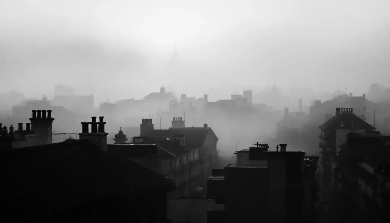
24 Jul 2025 · 3 min readMonochrome isn't about limitation; it's about depth. It's about discovering the infinite capacity held within a single shade, the subtle shifts and textures that paint a richer picture than any riot of hues ever could. Think of a fog-drenched cityscape, a field of lavender stretching to the horizon, or the quiet drama of shadows playing across a sculpted face. These are moments where a single color takes center stage, revealing a world of feeling and form. It demands attention to detail, an appreciation for the understated, and the courage to find beauty in simplicity. We'll explore several color palettes, each a testament to how one color can tell a complete story, inviting you to consider the possibilities hidden in plain sight and how considered uses can unlock the quiet power of a focused vision.
Imagine stepping into a loft bathed in the muted light of dawn. The color palette of Urban Calm captures that very essence. There are shades reminiscent of freshly poured concrete, softened by charcoal, hints of sun-baked leather, antique rose, and an almost denim blue. These colors evoke the feel of raw materials refined, the intersection of grit and grace. Consider the use of this palette in creating a personal sanctuary, where the weight of the outside world melts away. Imagine a living space where textured linens mimic the off white, paired with furniture in the slate gray. The mustard yellow emerges in small details, a carefully chosen ceramic vase or the threads of a woven throw. The mauve plum might appear in the deep shadows of a painting, a study in light and form. The steel blue grounds the space, hinting at the depth in the skyline beyond the window. It is a palette made for quiet moments, for contemplation and rejuvenation, a space where thoughts can flow freely. It speaks of artistry and self-awareness, of finding peace amidst the vibrancy of urban life.
Earthy Vibrance unfolds like a secret garden after a spring rain. The shades within this palette whisper of mossy stone paths and the still surface of a hidden pond. The off white is the gentle mist that hangs in the air, softening the edges of the world. Light blue gray embodies the clarity of the water, reflecting the sky above. Deeper hues of steel blue gray mimic the shadows cast by ancient trees. The comforting essence of taupe gray speaks of the earth itself, grounding the palette in a sense of belonging. Then the dark forest green emerges, the quiet pulse of life thriving beneath the surface. Envision applying these shades to a study filled with natural light, where the boundaries between indoors and outdoors blur. Let walls be painted the off white, creating a canvas for the dance of light and shadow. Furniture upholstered in light blue gray, evoke a sense of calm reflection. Bookshelves of wood stained with taupe gray hint at stories waiting to be discovered. The dark forest green appears in the leaves of plants, breathing life into the space, and in the fibers of a grounding rug. This is a palette for those seeking solace in the natural world, a haven where creativity can flourish and the soul can find rest.
Classic Elegance conjures images of a grand library, steeped in history and the scent of aged paper. The tones within this palette evoke a sense of timeless refinement, a subtle beauty that speaks of quiet confidence. Imagine walls painted in soft gray to capture the light, creating a sense of depth and space. Upholstery in neutral gray hints at the textures of the finest fabrics, inviting you to sink in and lose yourself in thought. The khaki tan of aged leather-bound books echoes that sense of time, a witness to generations of stories. The russet brown provides warmth and comfort, like the glow of a fireplace on a winter evening. Finally, the deep slate adds a touch of drama, the weight of history that grounds the space. Picture the palette enriching a dining room where laughter and conversation linger long into the night. Let the soft gray serve as a backdrop for treasured antiques, and the neutral gray soften the hard lines of contemporary chairs. The khaki tan comes alive in a carefully chosen centerpiece, and the russet brown might appear in the wood of a vintage sideboard. The deep slate grounds the space, reminding us of history and tradition. This is a palette for those who appreciate the beauty of the past, but live fully in the present.
Earthy Contrast whispers of a secluded cabin nestled deep within a forest, where the boundaries between indoors and out become beautifully blurred. The light taupe of aged wood, the golden khaki of sun-drenched meadows, the stone gray, the rich chocolate brown of fertile earth, and the grounding shade of dark charcoal. Imagine walls washed in light taupe, offering a serene stage for nature’s symphony. Furniture cloaked in golden khaki evokes a feeling of cozy comfort. The echoes of stone gray, and chocolate brown, add depth and warmth to the space. And the dark charcoal brings a sense of grounding quiet and sophistication, offering a stark contrast to the warmer shades. Think about the addition of textural elements that further enhance the connection of this palette. Perhaps handmade ceramics in colors mirroring the stone gray and golden khaki. Imagine a chunky woven blanket in light taupe, offering comfort on cooler nights. Consider using this palette to create a space that is not just beautiful, but also deeply restorative.
Lifestyle Hues brings to mind a well-curated workspace, designed for both focus and inspiration. Combining off-white walls and slate blue-gray accents, a feeling of professional tranquility unfolds. Touches of olive taupe and dusty burgundy add depth, while dark teal ground the space, a sanctuary for creative thinking. Picture walls painted in the off-white providing a clean and neutral canvas to foster an atmosphere free of excess distractions. Furnishings in slate blue-gray evoke a calming, logical mood. Details in olive taupe lend a touch of creativity, sparking imagination; while hints of dusty burgundy offer feelings of depth and sophistication. Consider natural light for this palette, to bring an honest representation of the hues. Consider using Lifestyle Hues to create a room that supports your best work and allows for moments of quiet contemplation.
Hydraulic Hues reminds us of sleek, modern spaces, yet grounded in industrial strength. The off white represents clarity and openness, creating a clean canvas. The lime green offers a touch of brightness and energy, hinting at precision processes happening behind the scenes. The slate gray provides a sense of grounding, reflecting the strength of steel and concrete. The dark grayish brown provides balance, while deep teal blue evokes innovation and technological advancement. This palette is perfect for those seeking an environment that blends form and practicality, where creativity and utility intertwine. Imagine a space enhanced by natural materials, and bright light, where the focus is not just on the work being done, but on the environment in which it happens.
Monochromatic palettes prove that simplicity can be a source of strength and richness. From the urban grays of Urban Calm, whispering stories of cityscapes and quiet introspection, to Earthy Vibrance, which brings verdant gardens to mind with its range of natural shades, we've seen how a single hue can be stretched and sculpted to evoke a symphony of feelings. Classic Elegance transported us to leather-bound libraries, while Lifestyle Hues suggested contemporary, professional environments. Earthy Contrast grounded us in nature's embrace. Hydraulic Hues took inspiration from industrial precision, proving the versatility that awaits when you restrict yourself and discover the magic within a single shade. Embrace the challenge and enjoy the quiet beauty that unfolds. Five out of six palettes analyzed contain the 'Monochromatic' color scheme. #ffffff and #000000 were the most common values within the 'dominant_colors' property.