'%3e%3cpath%20fill-rule='evenodd'%20clip-rule='evenodd'%20d='M51.1303%2019.2492C50.7278%2019.913%2050.1346%2020.4426%2049.3508%2020.838C48.5669%2021.2335%2047.6172%2021.4312%2046.5014%2021.4312C44.8208%2021.4312%2043.4367%2021.0216%2042.3492%2020.2025C41.2617%2019.3833%2040.6686%2018.2394%2040.5697%2016.7706H44.4253C44.4818%2017.3355%2044.6831%2017.7804%2045.0291%2018.1052C45.3751%2018.43%2045.8164%2018.5924%2046.3531%2018.5924C46.8192%2018.5924%2047.1864%2018.4653%2047.4547%2018.2111C47.7231%2017.9569%2047.8572%2017.618%2047.8572%2017.1943C47.8572%2016.8129%2047.7337%2016.4952%2047.4865%2016.241C47.2393%2015.9867%2046.9322%2015.7784%2046.565%2015.616C46.1978%2015.4536%2045.6893%2015.2594%2045.0397%2015.0334C44.0934%2014.7086%2043.3202%2014.3944%2042.72%2014.0907C42.1197%2013.7871%2041.6042%2013.3351%2041.1735%2012.7349C40.7427%2012.1347%2040.5273%2011.3544%2040.5273%2010.394C40.5273%209.50418%2040.7533%208.73448%2041.2053%208.08481C41.6572%207.43515%2042.2821%206.93731%2043.0801%206.5913C43.8781%206.24528%2044.7925%206.07227%2045.8235%206.07227C47.49%206.07227%2048.8141%206.46771%2049.7956%207.25861C50.7772%208.04951%2051.3315%209.13698%2051.4586%2010.5211H47.5395C47.4689%2010.0268%2047.2888%209.63483%2046.9993%209.3453C46.7097%209.05578%2046.3178%208.91102%2045.8235%208.91102C45.3998%208.91102%2045.0573%209.024%2044.7961%209.24997C44.5348%209.47594%2044.4041%209.80783%2044.4041%2010.2457C44.4041%2010.5988%2044.5207%2010.8989%2044.7537%2011.146C44.9867%2011.3932%2045.2798%2011.5944%2045.6328%2011.7498C45.9859%2011.9052%2046.4944%2012.1029%2047.1581%2012.343C48.1185%2012.6678%2048.9023%2012.9891%2049.5096%2013.3069C50.1169%2013.6246%2050.6395%2014.0872%2051.0773%2014.6945C51.5151%2015.3018%2051.734%2016.0927%2051.734%2017.0672C51.734%2017.8581%2051.5328%2018.5854%2051.1303%2019.2492ZM59.0242%206.3053V21.2829H55.4016V6.3053H59.0242ZM73.9409%206.3053V9.18642H69.8734V21.2829H66.2296V9.18642H62.2046V6.3053H73.9409ZM80.7438%209.18642V12.3218H85.8069V15.0546H80.7438V18.3806H86.4425V21.2829H77.1212V6.3053H86.4425V9.18642H80.7438ZM99.667%2016.0291V21.2829H96.0444V6.3053H101.913C103.692%206.3053%20105.048%206.74665%20105.98%207.62934C106.912%208.51204%20107.378%209.7019%20107.378%2011.199C107.378%2012.1311%20107.17%2012.9609%20106.753%2013.6882C106.337%2014.4155%20105.719%2014.9875%20104.9%2015.4042C104.08%2015.8208%20103.085%2016.0291%20101.913%2016.0291H99.667ZM103.692%2011.199C103.692%209.8855%20102.965%209.22879%20101.51%209.22879H99.667V13.1268H101.51C102.965%2013.1268%20103.692%2012.4842%20103.692%2011.199ZM120.092%2018.5501H114.478L113.546%2021.2829H109.732L115.219%206.41123H119.393L124.879%2021.2829H121.024L120.092%2018.5501ZM119.16%2015.7961L117.295%2010.2881L115.41%2015.7961H119.16ZM131.555%2018.5077H136.385V21.2829H127.933V6.3053H131.555V18.5077ZM143.337%209.18642V12.3218H148.4V15.0546H143.337V18.3806H149.035V21.2829H139.714V6.3053H149.035V9.18642H143.337ZM163.507%206.3053V9.18642H159.44V21.2829H155.796V9.18642H151.771V6.3053H163.507ZM177.449%206.3053V9.18642H173.382V21.2829H169.738V9.18642H165.713V6.3053H177.449ZM184.252%209.18642V12.3218H189.315V15.0546H184.252V18.3806H189.951V21.2829H180.629V6.3053H189.951V9.18642H184.252Z'%20fill='%23EEF0ED'/%3e%3cmask%20id='mask0_3101_7327'%20style='mask-type:alpha'%20maskUnits='userSpaceOnUse'%20x='0'%20y='0'%20width='27'%20height='28'%3e%3cpath%20d='M23.8328%200.759766H2.64808C1.18559%200.759766%200%201.94535%200%203.40785V24.5925C0%2026.055%201.18559%2027.2406%202.64808%2027.2406H23.8328C25.2952%2027.2406%2026.4808%2026.055%2026.4808%2024.5925V3.40785C26.4808%201.94535%2025.2952%200.759766%2023.8328%200.759766Z'%20fill='white'/%3e%3c/mask%3e%3cg%20mask='url(%23mask0_3101_7327)'%3e%3cpath%20d='M23.8328%200.759766H2.64808C1.18559%200.759766%200%201.94535%200%203.40785V24.5925C0%2026.055%201.18559%2027.2406%202.64808%2027.2406H23.8328C25.2952%2027.2406%2026.4808%2026.055%2026.4808%2024.5925V3.40785C26.4808%201.94535%2025.2952%200.759766%2023.8328%200.759766Z'%20fill='%23D8D8D8'/%3e%3cpath%20d='M13.2404%200.759766H0V14.0001H13.2404V0.759766Z'%20fill='%238C61FF'/%3e%3cpath%20d='M13.2404%2014H0V27.2404H13.2404V14Z'%20fill='%2336C3FE'/%3e%3cpath%20d='M26.4806%2014H13.2402V27.2404H26.4806V14Z'%20fill='%236592FE'/%3e%3cpath%20d='M26.4806%200.759766H13.2402V14.0002H26.4806V0.759766Z'%20fill='%236059F7'/%3e%3c/g%3e%3c/g%3e%3cdefs%3e%3cclipPath%20id='clip0_3101_7327'%3e%3crect%20width='190'%20height='28'%20fill='white'/%3e%3c/clipPath%3e%3c/defs%3e%3c/svg%3e)
'%3e%3cpath%20d='M23.8328%200.759521H2.64808C1.18559%200.759521%200%201.94511%200%203.40761V24.5923C0%2026.0548%201.18559%2027.2404%202.64808%2027.2404H23.8328C25.2952%2027.2404%2026.4808%2026.0548%2026.4808%2024.5923V3.40761C26.4808%201.94511%2025.2952%200.759521%2023.8328%200.759521Z'%20fill='%23D8D8D8'/%3e%3cpath%20d='M13.2404%200.759521H0V13.9999H13.2404V0.759521Z'%20fill='%238C61FF'/%3e%3cpath%20d='M13.2404%2013.9998H0V27.2402H13.2404V13.9998Z'%20fill='%2336C3FE'/%3e%3cpath%20d='M26.4809%2013.9998H13.2405V27.2402H26.4809V13.9998Z'%20fill='%236592FE'/%3e%3cpath%20d='M26.4809%200.759277H13.2405V13.9997H26.4809V0.759277Z'%20fill='%236059F7'/%3e%3c/g%3e%3c/svg%3e)
Dominating Design Themes: 'Minimalist' vs. 'Industrial'
24 Jul 2025 · 5 min readColor, above all, creates atmosphere. It whispers unspoken promises, setting the stage for experiences before they even begin. Colors in the spaces we inhabit—the sharp angles of a downtown loft, the open expanse of a co-working space—do more than meet the eye; they shape our perceptions of work, creativity, and even ourselves. Understanding how design trends intersect with color is key because the way we interact with spaces influences everything from productivity to our very peace of mind. With the convergence of Minimalist and Industrial aesthetics, it is time to ask: How does color define this dominant trend, and what feelings does it bring to the fore?
The Corporate Palette 🏢 presents an intriguing study in controlled contrasts. Off White leads the way, a grounding presence against the backdrop of ambition. Teal Green offers a hint of tranquility, a whisper of nature within the structured setting. Cool Gray and Gray Stone work almost in conversation, one subtly lighter than the other, to create depth. Dark Charcoal, a near-black anchor, gives definition and authority. This is not a palette of wild statements. It is the visual equivalent of a precisely delivered pitch, persuasive without being aggressive. In the dance between Minimalist and Industrial styles, this palette leans towards a sophisticated minimalism. The simplicity of a clean, uncluttered desk comes to mind, a space decluttered to aid concentration. The palette could just as easily be transposed to an industrial warehouse converted into a tech hub, the exposed brick softened by the gentle, organic tones. It is about function, yes, but with a clear nod to aesthetics. The color selection makes it a comfortable blend of both worlds; the sharp edges of industry soothed by the embrace of a curated, minimalist approach.
With the Tech Palette 💻, the aesthetic shifts. Tan Leather brings a warm, tactile quality that conjures executive chairs and focused thought. Teal Tint, like an echo of a distant sea, offers a subtle reprieve from the potential starkness. Dusty Blue and Muted Gray add an understated intellectual quality, creating an atmosphere that fosters concentration. Dark Coal anchors the palette, bringing in an element of seriousness and providing a striking contrast. This is a palette that understands the power of understated elegance. It walks the blurred line between the stripped-down ideals of minimalism and the raw functionality of industrial design. Imagine a minimalist office space, exposed concrete walls softened by natural light and accents of carefully chosen, handcrafted elements in Tan Leather. Or visualize a tech startup occupying a converted factory floor, the cold steel girders balanced by the comforting presence of wood and textiles in these precise, carefully considered shades. The Tech Palette champions a world where efficiency and elegance coexist, where creativity thrives in a space free of unnecessary ornamentation, and where what endures matters most.
The Vibrant Spectrum 🎨 surges forward, a color story built on energy. Off White presents a neutral canvas, allowing the other hues to truly shine. Teal Green injects a sense of optimistic freshness, suggesting forward progress. Dusty Blue adds a layer of quiet sophistication, a reflective pool in the midst of activity. Intense Blue takes center stage, electric clarity against the backdrop of creativity, demanding attention without being brash. Finally, Dark Olive brings a touch of earthiness, grounding the palette with understated strength. This is not a palette for hiding; it is confident and expressive. Within the framework of Minimalist and Industrial concepts, it represents a departure from rigid austerity. Imagine sleek, minimalist furniture bathed in the radiant glow of these colors, a stark canvas filled with life. Or envision a transformed industrial space—a former warehouse turned art studio—where the rawness of exposed brick and metal is energized by splashes of these bold shades. Vibrant Spectrum invites a touch of whimsy into otherwise serious zones, proving that both simplicity and joy have a place in the modern world.
Modern Contrast 🎨 gives rise a world of grounded elegance. Light Slate offers a soft, almost dreamlike background, creating a sense of expansive space. Olive Brown lends warmth and natural beauty, creating a sense of ease. Dark Brown provides a note of classical luxury, bringing an antique feel to a modern palette. Shadow Gray introduces intriguing texture, conjuring concrete and brushed steel. Deep Black forms a defining contrast, giving a powerful, modern edge. This palette hints at curated restraint, a hallmark of the minimalist aesthetic, while whispering of the raw materials that define the industrial spirit. Envision a lofty living room, filled with concrete walls, softened with carefully chosen pieces featuring brown tones. This space is not about excess; it is about distilling experiences into its purest form by balancing the cool and warm. The Modern Contrast palette succeeds in uniting starkness with understated warmth, forging beauty via carefully composed elements within a structured landscape.
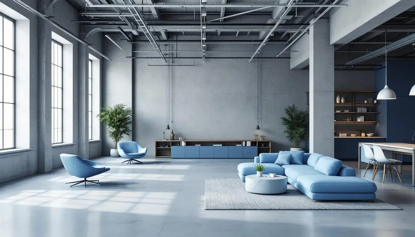
Corporate Blue 💧 presents a vision in sophisticated serenity. Pale Lavender casts a tranquil, airy beginning, creating a sense of elevated calm. Light Sky Blue offers a breath of fresh air, suggesting boundless possibility. Slate Gray provides a structured foundation, conjuring strong reliability. Dark Sapphire echoes depth and expertise, generating a sense of quiet power. Finally, Deep Black anchors the palette, giving clarity and definition. This is a palette that speaks of trust and reliability, qualities that underpin lasting success. To see how it works in Minimalist and Industrial themes, imagine a modern office space, where the coolness of the blues compliments exposed concrete and steel. It is a place where ideas float freely, while still being grounded in a culture of disciplined strategy. This palette is an embodiment of clean efficiency; the visual equivalent of a perfectly optimized system. Here, the Industrial aesthetic is softened by washes of restorative blue, creating an environment in which precision and peace coexist.
These color stories showcase the current landscape of design: blending the raw with the refined, the simple with the statement. They reveal how color, far from being just a decorative element, is a powerful tool for shaping experience. These colors remind us that Minimalism and Industrial design are not about deprivation, but about intention—about creating spaces that prioritize function and aesthetic in equal measure. They guide us toward creating spaces that not only look impressive but also feel restorative and inspiring. In a world craving authenticity, these palettes offer a roadmap for building environments that reflect the values of clarity, connection, and conscious design.