'%3e%3cpath%20fill-rule='evenodd'%20clip-rule='evenodd'%20d='M51.1303%2019.2492C50.7278%2019.913%2050.1346%2020.4426%2049.3508%2020.838C48.5669%2021.2335%2047.6172%2021.4312%2046.5014%2021.4312C44.8208%2021.4312%2043.4367%2021.0216%2042.3492%2020.2025C41.2617%2019.3833%2040.6686%2018.2394%2040.5697%2016.7706H44.4253C44.4818%2017.3355%2044.6831%2017.7804%2045.0291%2018.1052C45.3751%2018.43%2045.8164%2018.5924%2046.3531%2018.5924C46.8192%2018.5924%2047.1864%2018.4653%2047.4547%2018.2111C47.7231%2017.9569%2047.8572%2017.618%2047.8572%2017.1943C47.8572%2016.8129%2047.7337%2016.4952%2047.4865%2016.241C47.2393%2015.9867%2046.9322%2015.7784%2046.565%2015.616C46.1978%2015.4536%2045.6893%2015.2594%2045.0397%2015.0334C44.0934%2014.7086%2043.3202%2014.3944%2042.72%2014.0907C42.1197%2013.7871%2041.6042%2013.3351%2041.1735%2012.7349C40.7427%2012.1347%2040.5273%2011.3544%2040.5273%2010.394C40.5273%209.50418%2040.7533%208.73448%2041.2053%208.08481C41.6572%207.43515%2042.2821%206.93731%2043.0801%206.5913C43.8781%206.24528%2044.7925%206.07227%2045.8235%206.07227C47.49%206.07227%2048.8141%206.46771%2049.7956%207.25861C50.7772%208.04951%2051.3315%209.13698%2051.4586%2010.5211H47.5395C47.4689%2010.0268%2047.2888%209.63483%2046.9993%209.3453C46.7097%209.05578%2046.3178%208.91102%2045.8235%208.91102C45.3998%208.91102%2045.0573%209.024%2044.7961%209.24997C44.5348%209.47594%2044.4041%209.80783%2044.4041%2010.2457C44.4041%2010.5988%2044.5207%2010.8989%2044.7537%2011.146C44.9867%2011.3932%2045.2798%2011.5944%2045.6328%2011.7498C45.9859%2011.9052%2046.4944%2012.1029%2047.1581%2012.343C48.1185%2012.6678%2048.9023%2012.9891%2049.5096%2013.3069C50.1169%2013.6246%2050.6395%2014.0872%2051.0773%2014.6945C51.5151%2015.3018%2051.734%2016.0927%2051.734%2017.0672C51.734%2017.8581%2051.5328%2018.5854%2051.1303%2019.2492ZM59.0242%206.3053V21.2829H55.4016V6.3053H59.0242ZM73.9409%206.3053V9.18642H69.8734V21.2829H66.2296V9.18642H62.2046V6.3053H73.9409ZM80.7438%209.18642V12.3218H85.8069V15.0546H80.7438V18.3806H86.4425V21.2829H77.1212V6.3053H86.4425V9.18642H80.7438ZM99.667%2016.0291V21.2829H96.0444V6.3053H101.913C103.692%206.3053%20105.048%206.74665%20105.98%207.62934C106.912%208.51204%20107.378%209.7019%20107.378%2011.199C107.378%2012.1311%20107.17%2012.9609%20106.753%2013.6882C106.337%2014.4155%20105.719%2014.9875%20104.9%2015.4042C104.08%2015.8208%20103.085%2016.0291%20101.913%2016.0291H99.667ZM103.692%2011.199C103.692%209.8855%20102.965%209.22879%20101.51%209.22879H99.667V13.1268H101.51C102.965%2013.1268%20103.692%2012.4842%20103.692%2011.199ZM120.092%2018.5501H114.478L113.546%2021.2829H109.732L115.219%206.41123H119.393L124.879%2021.2829H121.024L120.092%2018.5501ZM119.16%2015.7961L117.295%2010.2881L115.41%2015.7961H119.16ZM131.555%2018.5077H136.385V21.2829H127.933V6.3053H131.555V18.5077ZM143.337%209.18642V12.3218H148.4V15.0546H143.337V18.3806H149.035V21.2829H139.714V6.3053H149.035V9.18642H143.337ZM163.507%206.3053V9.18642H159.44V21.2829H155.796V9.18642H151.771V6.3053H163.507ZM177.449%206.3053V9.18642H173.382V21.2829H169.738V9.18642H165.713V6.3053H177.449ZM184.252%209.18642V12.3218H189.315V15.0546H184.252V18.3806H189.951V21.2829H180.629V6.3053H189.951V9.18642H184.252Z'%20fill='%23EEF0ED'/%3e%3cmask%20id='mask0_3101_7327'%20style='mask-type:alpha'%20maskUnits='userSpaceOnUse'%20x='0'%20y='0'%20width='27'%20height='28'%3e%3cpath%20d='M23.8328%200.759766H2.64808C1.18559%200.759766%200%201.94535%200%203.40785V24.5925C0%2026.055%201.18559%2027.2406%202.64808%2027.2406H23.8328C25.2952%2027.2406%2026.4808%2026.055%2026.4808%2024.5925V3.40785C26.4808%201.94535%2025.2952%200.759766%2023.8328%200.759766Z'%20fill='white'/%3e%3c/mask%3e%3cg%20mask='url(%23mask0_3101_7327)'%3e%3cpath%20d='M23.8328%200.759766H2.64808C1.18559%200.759766%200%201.94535%200%203.40785V24.5925C0%2026.055%201.18559%2027.2406%202.64808%2027.2406H23.8328C25.2952%2027.2406%2026.4808%2026.055%2026.4808%2024.5925V3.40785C26.4808%201.94535%2025.2952%200.759766%2023.8328%200.759766Z'%20fill='%23D8D8D8'/%3e%3cpath%20d='M13.2404%200.759766H0V14.0001H13.2404V0.759766Z'%20fill='%238C61FF'/%3e%3cpath%20d='M13.2404%2014H0V27.2404H13.2404V14Z'%20fill='%2336C3FE'/%3e%3cpath%20d='M26.4806%2014H13.2402V27.2404H26.4806V14Z'%20fill='%236592FE'/%3e%3cpath%20d='M26.4806%200.759766H13.2402V14.0002H26.4806V0.759766Z'%20fill='%236059F7'/%3e%3c/g%3e%3c/g%3e%3cdefs%3e%3cclipPath%20id='clip0_3101_7327'%3e%3crect%20width='190'%20height='28'%20fill='white'/%3e%3c/clipPath%3e%3c/defs%3e%3c/svg%3e)
'%3e%3cpath%20d='M23.8328%200.759521H2.64808C1.18559%200.759521%200%201.94511%200%203.40761V24.5923C0%2026.0548%201.18559%2027.2404%202.64808%2027.2404H23.8328C25.2952%2027.2404%2026.4808%2026.0548%2026.4808%2024.5923V3.40761C26.4808%201.94511%2025.2952%200.759521%2023.8328%200.759521Z'%20fill='%23D8D8D8'/%3e%3cpath%20d='M13.2404%200.759521H0V13.9999H13.2404V0.759521Z'%20fill='%238C61FF'/%3e%3cpath%20d='M13.2404%2013.9998H0V27.2402H13.2404V13.9998Z'%20fill='%2336C3FE'/%3e%3cpath%20d='M26.4809%2013.9998H13.2405V27.2402H26.4809V13.9998Z'%20fill='%236592FE'/%3e%3cpath%20d='M26.4809%200.759277H13.2405V13.9997H26.4809V0.759277Z'%20fill='%236059F7'/%3e%3c/g%3e%3c/svg%3e)
Sophisticated Style Index: Palettes Most Suited for Autumn Formality
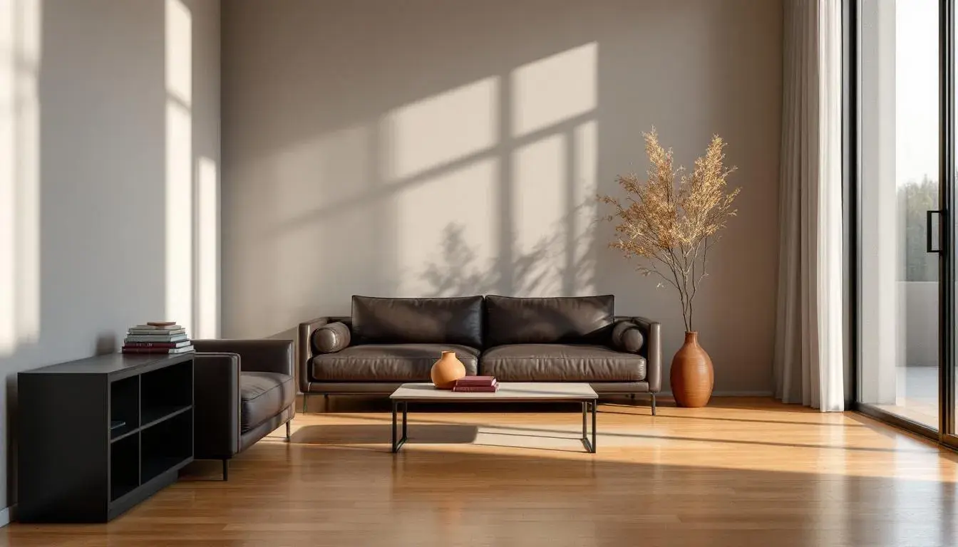
22 Jul 2025 · 5 min readThe turning leaves, the crisp air, the yearning for something solid and enduring as summer fades – autumn whispers of formality, not in a stiff, starched way, but with the grace of a perfectly tailored tweed suit and the gleam of well-worn leather. Color becomes the language of this shift, a sophisticated code that speaks of heritage, quiet confidence, and the comforting weight of tradition. It’s about translating the visual poetry of the season into spaces and presentations that echo its refined sensibility. These are not the boisterous shades of a harvest festival, but the considered hues of a well-appointed drawing room, the subtle glow of candlelight against polished wood, an invitation to gather and contemplate in style.
The Earthy Contrast palette orchestrates a scene of understated drama. Golden Yellow, like the last rays of sunshine filtering through the trees, holds its own against the tempered tones of Light Beige and Neutral Taupe, shades that wrap around you like a soft wool scarf. The Rusty Red adds a punctuation mark, a hint of autumnal spice, preventing the scheme from drifting into mere pleasantries. Dark Crimson grounds the composition, a deep, resonant note that suggests both strength and contained passion. Picture a library filled with antique books, the scent of beeswax and parchment in the air, a gathering of minds ignited by lively debate. This isn't a palette for the faint of heart; it demands a setting where ideas and individuals can truly stand out, where clarity of thought is paramount. It whispers of boardrooms illuminated by elegant chandeliers, of presentations delivered with quiet authority, and communications designed to convey a sense of timeless quality. It offers an environment that fosters contemplation and commands respect.
Earthy Elegance sings a quieter song, a hymn to hushed sophistication. Muted Gray sets the stage, the color of a misty morning shrouding ancient stone. Grayish Teal hints at secrets, like the hidden depths of a forest pool reflecting the sky, while Neutral Gray provides a grounding element, solid and dependable. Slate Blue lends an air of quiet authority, evoking images of tailored suits and whispered conversations, and the Dark Grey-Brown anchors the palette, as reliable as a well-worn leather briefcase. Imagine this adorning a stylish, minimal website design for a luxury brand where the content comes to life with the correct balance on the white space and with a readable and sophisticated typography. Think of muted gallery walls showcasing modern art, or a high-end fashion boutique where clothes hang like sculptures. No shouting here, only a confident, understated presence that speaks volumes to those who appreciate the finer things.
The very name, Academic Palette, conjures images of leather-bound books and hallowed halls, an environment ideal for Autumn formality. Mustard Yellow, like the aged pages of a treasured volume, adds a touch of intellectual warmth. Muted Gray brings a sense of calm deliberation, like a professor considering a complex theorem, while Tomato Red injects a spark of passionate discourse. The grounding force of Dark Chocolate evokes images of polished wooden desks and the aroma of aged tobacco, while Jet Black lends a sense of imposing authority, like the weighty pronouncements of a university president. Picture a website for an institution of higher learning, or the branding materials of a prestigious law firm. It suggests a commitment to knowledge, tradition, and the pursuit of excellence, inviting one to settle into deep thought and serious engagement.
With a name like Academic Authority, one correctly assumes a certain power and sophistication. Mustard Yellow, like a ray of sunshine cutting through a venerable library, immediately draws the eye. The Grayish Beige whispers of heritage, a neutral yet evocative foundation. Tomato Red, bold against its more reserved peers, speaks of courage and fierce convictions. Burnt Sienna, like the rich wood of an antique desk, grounds the combination, while Dark Gray lends gravitas, reminding one of stone buildings silhouetted against a stormy autumn sky. This suggests careful applications within a university setting, where the website reinforces a feeling of classicism and forward-thinking academia. It’s perfect for settings requiring a sophisticated authority, presentations that demand attention, and designs that suggest credibility and intelligence.
Dramatic Contrast introduces a spark, a frisson of excitement into the realm of autumn formality. Beige Sand brings a sense of understated grace, much like the soft light of an evening sun. Cool Gray offers a counterpoint, suggesting thoughtfulness and measured responses to situations. Bronze Tone brings a touch of muted gold to mind, providing depth and richness. Navy Midnight and Jet Black add an enigmatic sense of mystery to the overall style. This combination suggests serious application in creative fields. Imagine a film noir poster advertising an exclusive event that will be a can't miss opportunity. Or the landing page of a company that demands elegance. The effect is commanding and unforgettable.
The Warm Contrast brings a sense of comforting elegance, like sitting in front of a fireplace on a chilly autumn evening. Pale Peach offers a comforting presence. Mustard Yellow brings to mind the changing leave of the season. Dusty Rose and Olive Drab add a sense of maturity to the overall sensation. Onyx Black rounds out the palette with its grounding sophistication, creating a balanced visual experience. Picture the scene unfolding within the pages of a book, or the opening sequence of a pensive movie. These colors would naturally lend themselves to a spiritual website or set the tone for a book on mindfulness. The resulting experience is both contemplative and immersive.
Classic Elegance evokes the hushed reverence of a tradition passed down through generations. Ivory White, like aged parchment, whispers of timeless wisdom. Light Gray offers a softening counterpoint. Deep Green recalls the shaded recesses of a grand library. Slate Gray provides a grounding element. Dark Brown evokes a sense of quiet solemnity, binding the palette. Envision this color selection within the refined setting of a healthcare facility's website or throughout somber funeral pamphlets. The effect is one of dignified strength paired with understated refinement.
Taken together, these palettes paint a portrait of autumn formality that is rich in visual texture and emotional resonance. They are not simply about adhering to convention, but about curating an atmosphere, a feeling. They invite us to consider the subtle power of color to shape our perceptions, influence conversations, and transform the ordinary into the unforgettable. It’s a masterclass in sophistication that understands, sometimes, the softest statement makes the loudest impression.