'%3e%3cpath%20fill-rule='evenodd'%20clip-rule='evenodd'%20d='M51.1303%2019.2492C50.7278%2019.913%2050.1346%2020.4426%2049.3508%2020.838C48.5669%2021.2335%2047.6172%2021.4312%2046.5014%2021.4312C44.8208%2021.4312%2043.4367%2021.0216%2042.3492%2020.2025C41.2617%2019.3833%2040.6686%2018.2394%2040.5697%2016.7706H44.4253C44.4818%2017.3355%2044.6831%2017.7804%2045.0291%2018.1052C45.3751%2018.43%2045.8164%2018.5924%2046.3531%2018.5924C46.8192%2018.5924%2047.1864%2018.4653%2047.4547%2018.2111C47.7231%2017.9569%2047.8572%2017.618%2047.8572%2017.1943C47.8572%2016.8129%2047.7337%2016.4952%2047.4865%2016.241C47.2393%2015.9867%2046.9322%2015.7784%2046.565%2015.616C46.1978%2015.4536%2045.6893%2015.2594%2045.0397%2015.0334C44.0934%2014.7086%2043.3202%2014.3944%2042.72%2014.0907C42.1197%2013.7871%2041.6042%2013.3351%2041.1735%2012.7349C40.7427%2012.1347%2040.5273%2011.3544%2040.5273%2010.394C40.5273%209.50418%2040.7533%208.73448%2041.2053%208.08481C41.6572%207.43515%2042.2821%206.93731%2043.0801%206.5913C43.8781%206.24528%2044.7925%206.07227%2045.8235%206.07227C47.49%206.07227%2048.8141%206.46771%2049.7956%207.25861C50.7772%208.04951%2051.3315%209.13698%2051.4586%2010.5211H47.5395C47.4689%2010.0268%2047.2888%209.63483%2046.9993%209.3453C46.7097%209.05578%2046.3178%208.91102%2045.8235%208.91102C45.3998%208.91102%2045.0573%209.024%2044.7961%209.24997C44.5348%209.47594%2044.4041%209.80783%2044.4041%2010.2457C44.4041%2010.5988%2044.5207%2010.8989%2044.7537%2011.146C44.9867%2011.3932%2045.2798%2011.5944%2045.6328%2011.7498C45.9859%2011.9052%2046.4944%2012.1029%2047.1581%2012.343C48.1185%2012.6678%2048.9023%2012.9891%2049.5096%2013.3069C50.1169%2013.6246%2050.6395%2014.0872%2051.0773%2014.6945C51.5151%2015.3018%2051.734%2016.0927%2051.734%2017.0672C51.734%2017.8581%2051.5328%2018.5854%2051.1303%2019.2492ZM59.0242%206.3053V21.2829H55.4016V6.3053H59.0242ZM73.9409%206.3053V9.18642H69.8734V21.2829H66.2296V9.18642H62.2046V6.3053H73.9409ZM80.7438%209.18642V12.3218H85.8069V15.0546H80.7438V18.3806H86.4425V21.2829H77.1212V6.3053H86.4425V9.18642H80.7438ZM99.667%2016.0291V21.2829H96.0444V6.3053H101.913C103.692%206.3053%20105.048%206.74665%20105.98%207.62934C106.912%208.51204%20107.378%209.7019%20107.378%2011.199C107.378%2012.1311%20107.17%2012.9609%20106.753%2013.6882C106.337%2014.4155%20105.719%2014.9875%20104.9%2015.4042C104.08%2015.8208%20103.085%2016.0291%20101.913%2016.0291H99.667ZM103.692%2011.199C103.692%209.8855%20102.965%209.22879%20101.51%209.22879H99.667V13.1268H101.51C102.965%2013.1268%20103.692%2012.4842%20103.692%2011.199ZM120.092%2018.5501H114.478L113.546%2021.2829H109.732L115.219%206.41123H119.393L124.879%2021.2829H121.024L120.092%2018.5501ZM119.16%2015.7961L117.295%2010.2881L115.41%2015.7961H119.16ZM131.555%2018.5077H136.385V21.2829H127.933V6.3053H131.555V18.5077ZM143.337%209.18642V12.3218H148.4V15.0546H143.337V18.3806H149.035V21.2829H139.714V6.3053H149.035V9.18642H143.337ZM163.507%206.3053V9.18642H159.44V21.2829H155.796V9.18642H151.771V6.3053H163.507ZM177.449%206.3053V9.18642H173.382V21.2829H169.738V9.18642H165.713V6.3053H177.449ZM184.252%209.18642V12.3218H189.315V15.0546H184.252V18.3806H189.951V21.2829H180.629V6.3053H189.951V9.18642H184.252Z'%20fill='%23EEF0ED'/%3e%3cmask%20id='mask0_3101_7327'%20style='mask-type:alpha'%20maskUnits='userSpaceOnUse'%20x='0'%20y='0'%20width='27'%20height='28'%3e%3cpath%20d='M23.8328%200.759766H2.64808C1.18559%200.759766%200%201.94535%200%203.40785V24.5925C0%2026.055%201.18559%2027.2406%202.64808%2027.2406H23.8328C25.2952%2027.2406%2026.4808%2026.055%2026.4808%2024.5925V3.40785C26.4808%201.94535%2025.2952%200.759766%2023.8328%200.759766Z'%20fill='white'/%3e%3c/mask%3e%3cg%20mask='url(%23mask0_3101_7327)'%3e%3cpath%20d='M23.8328%200.759766H2.64808C1.18559%200.759766%200%201.94535%200%203.40785V24.5925C0%2026.055%201.18559%2027.2406%202.64808%2027.2406H23.8328C25.2952%2027.2406%2026.4808%2026.055%2026.4808%2024.5925V3.40785C26.4808%201.94535%2025.2952%200.759766%2023.8328%200.759766Z'%20fill='%23D8D8D8'/%3e%3cpath%20d='M13.2404%200.759766H0V14.0001H13.2404V0.759766Z'%20fill='%238C61FF'/%3e%3cpath%20d='M13.2404%2014H0V27.2404H13.2404V14Z'%20fill='%2336C3FE'/%3e%3cpath%20d='M26.4806%2014H13.2402V27.2404H26.4806V14Z'%20fill='%236592FE'/%3e%3cpath%20d='M26.4806%200.759766H13.2402V14.0002H26.4806V0.759766Z'%20fill='%236059F7'/%3e%3c/g%3e%3c/g%3e%3cdefs%3e%3cclipPath%20id='clip0_3101_7327'%3e%3crect%20width='190'%20height='28'%20fill='white'/%3e%3c/clipPath%3e%3c/defs%3e%3c/svg%3e)
'%3e%3cpath%20d='M23.8328%200.759521H2.64808C1.18559%200.759521%200%201.94511%200%203.40761V24.5923C0%2026.0548%201.18559%2027.2404%202.64808%2027.2404H23.8328C25.2952%2027.2404%2026.4808%2026.0548%2026.4808%2024.5923V3.40761C26.4808%201.94511%2025.2952%200.759521%2023.8328%200.759521Z'%20fill='%23D8D8D8'/%3e%3cpath%20d='M13.2404%200.759521H0V13.9999H13.2404V0.759521Z'%20fill='%238C61FF'/%3e%3cpath%20d='M13.2404%2013.9998H0V27.2402H13.2404V13.9998Z'%20fill='%2336C3FE'/%3e%3cpath%20d='M26.4809%2013.9998H13.2405V27.2402H26.4809V13.9998Z'%20fill='%236592FE'/%3e%3cpath%20d='M26.4809%200.759277H13.2405V13.9997H26.4809V0.759277Z'%20fill='%236059F7'/%3e%3c/g%3e%3c/svg%3e)
Embracing Autumnal Energy: The Complementary Rise of Bright Coral and Deep Indigo
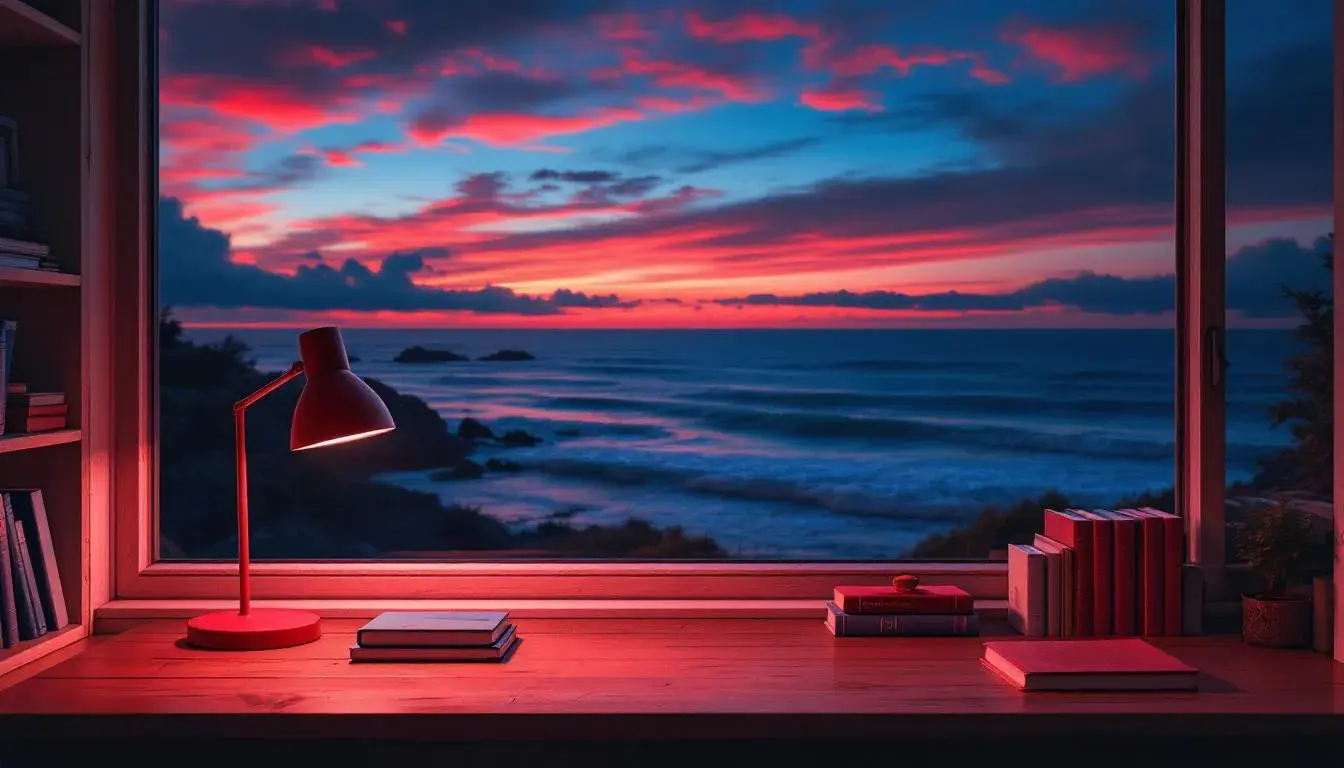
22 Jul 2025 · 5 min readThe year turns, and with it, our gaze shifts. The long days of summer, bleached and bright, give way to something richer, deeper. We seek comfort in crackling fireplaces, in the weight of wool, in colors that whisper of earth and sky at twilight. Coral, once a symbol of tropical exuberance, finds a new voice, muted by the season, tempered with shadow. Indigo, a color of limitless depth, echoes the lengthening nights. Together, they compose a story of transition, a visual poem of autumnal energy – warmth meeting the mysterious cool. Imagine a windswept coastline: coral-hued sunsets bleeding into a deep indigo sea. Or a cozy study, the warm glow of a coral lamp illuminating indigo-bound books. The dance between these shades reflects a season that is both vibrant and serene, familiar and ever-changing.
The "Awareness Palette" paints a picture of cultivated calm set against dynamic possibility. Muted Olive speaks of harvested fields, the last bounty before winter's slumber. Cerulean Blue hints at the crispness in the air, the clarity found in after-storm skies. Fiery Red is a reminder of passion, embers glowing beneath a layer of ash. Neutral Gray forms a grounded heart, lending stability to the composition. Midnight Blue suggests the secrets held within the season, the quiet introspection it inspires. The palette offers an autumnal interpretation that is both forward-thinking and deeply rooted. Imagine this palette adorning the walls of a writer's retreat: the neutrality allows for focused thought, while the hints of red and blue spur creativity, and that grounding olive hue reminds one of the natural world awaiting just outside the door. This combination could inform a brand identity for a sustainable tech company. "Awareness Palette" suggests a commitment to responsibility, creativity, and finding balance between nature and innovation. It suggests a sense of purpose aligned with the season's journey inward and onward. And, while neither bright coral nor deep indigo appear by name, this palette provides an essential context for understanding the season and the subtle shift in how colors are understood and experienced. It is a study in controlled energy—calmness and contemplation, shot through with the promise of forward movement.
"Vibrant Contrast" sets a stage where drama unfolds. Against the stark backdrop of Pure White and Jet Black, other hues emerge with greater strength. Grayish Taupe becomes more sophisticated, Bright Blue seems sharper, and Teal Green more refreshing. Crimson Red pulses with a hidden fire – a premonition of holiday cheer. Russet Brown evokes the comforting scent of decaying leaves, while Bright Red is a clarion call to embrace bold expression. But it is Deep Indigo that commands attention, lending an air of mystery. Picture the interior of a cutting-edge art gallery with White walls and Black accents. A single Russet sculpture stands in the center, illuminated by a soft Crimson glow. And in a small alcove, lit by a single spotlight, hangs a series of Deep Indigo canvases. The effect is one of understated luxury and intellectual curiosity. The palette creates a sense of tension and release, of pushing boundaries while still retaining a sense of control. The presence of Deep Indigo highlights how it balances and deepens more flamboyant shades. "Vibrant Contrast" suggests that autumnal energy is not about quiet contemplation, but about active exploration, a willingness to embrace the unexpected. The closest component to Bright Coral, Crimson Red, appears like a controlled flare. The "Vibrant Contrast" palette demonstrates that Autumn is indeed a canvas for drama and expression.
The "Modern Contrast" palette presents a narrative of refined restraint. Pale Beige serves as a quiet foundation, allowing other colors to subtly shine. Light Cyan breathes new life, while Mustard Yellow adds a touch of understated glamour. Peach Orange creates gentle warmth, while Dusty Gray offers a touch of somber reflection. Teal Blue is reminiscent of clear autumnal skies, and Burnt Sienna echoes the hues of fallen leaves. Olive Brown invites comfort, while Deep Indigo inspires contemplation of the season ahead. Dark Charcoal adds a sense of grounded weight. Imagine a modern office space where productivity blends seamlessly with peace. Pale Beige walls, Mustard Yellow accents, and Teal Blue chairs. Burnt Sienna leather desk accessories evoke a sense of heritage, and a single Dark Charcoal painting adds a touch of artistic tension. The presence of Deep Indigo infuses the space with depth. "Modern Contrast" provides an elegant translation for embracing Autumnal energy: beauty found in subtle shifts of tone. Peach Orange is a close relative to Bright Coral. It is no longer summer-fresh, but softened by the season's approach. The resulting atmosphere is one of understated sophistication and reflective elegance--a gentle move away from summer exuberance.
"Warm Contrast," a palette of quiet intensity presents Autumn’s energy through earthen shades. Pale Pink casts a nostalgic glow, like the memory of summer’s last blush. Dusty Sand provides a reassuring connection to the tactile, a grounding force. Deep Taupe anchors and adds depth while Fiery Red emerges with a controlled burn, a spark of life before the freeze. Forest Floor speaks of quiet decay, of the cycle of returning energy to the earth from which it came. Consider the palette within an intimate setting: the ambiance of a quiet wine bar, illuminated by candlelight. Walls painted in shades of Deep Taupe, furniture upholstered in Dusty Sand fabric, and Pale Pink glasses catching the light. A small, rustic vase holds a single Fiery Red bloom. The sense is that of a haven, a space in which to surrender to the shifting season. More than other palettes, "Warm Contrast" is primarily about texture and mood. The Fiery Red becomes more about contained warmth. A brighter Coral would disrupt this, but this shade works to support a story of sophistication and contained passion. All elements speak to transformation: vibrant life receding into the earth, while embers still glow.
"Energetic Stability" presents colors that find strength in equilibrium. Light Grayish White serves as a blank slate, promoting clarity. Light Slate Blue echoes the sky after rain, a sense of refreshed perspective. Medium Gray creates a calming influence; Vibrant Orange provides an unexpected thrill, a jolt of creative life. Dark Teal Blue is a solid anchor, suggesting dependability. The palette inspires balanced action, like a focused studio in Winter. Walls painted in Light Grayish White, the furniture is Light Slate Blue, and a Medium Gray rug anchors the space. Vases filled with bright foliage add a burst of energy as a Dark Teal Blue desk offers a dependable workspace where new ideas can begin. The palette speaks to finding vitality even as the environment quiets and calls inward. Orange serves as a substitute for Bright Coral. It is more approachable, and allows for a range of expression that Bright Coral might otherwise overwhelm. "Energetic Stability’s" overall message is one of embracing limitations and opportunity as Winter descends and invites introspection and innovation.
Across these palettes, a coherent narrative of autumn emerges. Bright Coral, or its warmer cousins, takes on a more subtle role, infusing spaces with heat rather than extroversion. When paired with the quiet confidence of Deep Indigo the effect is balanced: the energy of change, harnessed for creation and for contemplation. Each palette reveals a distinct vision for autumn, with coral and indigo acting as guides for emotional exploration and visual transformation.