'%3e%3cpath%20fill-rule='evenodd'%20clip-rule='evenodd'%20d='M51.1303%2019.2492C50.7278%2019.913%2050.1346%2020.4426%2049.3508%2020.838C48.5669%2021.2335%2047.6172%2021.4312%2046.5014%2021.4312C44.8208%2021.4312%2043.4367%2021.0216%2042.3492%2020.2025C41.2617%2019.3833%2040.6686%2018.2394%2040.5697%2016.7706H44.4253C44.4818%2017.3355%2044.6831%2017.7804%2045.0291%2018.1052C45.3751%2018.43%2045.8164%2018.5924%2046.3531%2018.5924C46.8192%2018.5924%2047.1864%2018.4653%2047.4547%2018.2111C47.7231%2017.9569%2047.8572%2017.618%2047.8572%2017.1943C47.8572%2016.8129%2047.7337%2016.4952%2047.4865%2016.241C47.2393%2015.9867%2046.9322%2015.7784%2046.565%2015.616C46.1978%2015.4536%2045.6893%2015.2594%2045.0397%2015.0334C44.0934%2014.7086%2043.3202%2014.3944%2042.72%2014.0907C42.1197%2013.7871%2041.6042%2013.3351%2041.1735%2012.7349C40.7427%2012.1347%2040.5273%2011.3544%2040.5273%2010.394C40.5273%209.50418%2040.7533%208.73448%2041.2053%208.08481C41.6572%207.43515%2042.2821%206.93731%2043.0801%206.5913C43.8781%206.24528%2044.7925%206.07227%2045.8235%206.07227C47.49%206.07227%2048.8141%206.46771%2049.7956%207.25861C50.7772%208.04951%2051.3315%209.13698%2051.4586%2010.5211H47.5395C47.4689%2010.0268%2047.2888%209.63483%2046.9993%209.3453C46.7097%209.05578%2046.3178%208.91102%2045.8235%208.91102C45.3998%208.91102%2045.0573%209.024%2044.7961%209.24997C44.5348%209.47594%2044.4041%209.80783%2044.4041%2010.2457C44.4041%2010.5988%2044.5207%2010.8989%2044.7537%2011.146C44.9867%2011.3932%2045.2798%2011.5944%2045.6328%2011.7498C45.9859%2011.9052%2046.4944%2012.1029%2047.1581%2012.343C48.1185%2012.6678%2048.9023%2012.9891%2049.5096%2013.3069C50.1169%2013.6246%2050.6395%2014.0872%2051.0773%2014.6945C51.5151%2015.3018%2051.734%2016.0927%2051.734%2017.0672C51.734%2017.8581%2051.5328%2018.5854%2051.1303%2019.2492ZM59.0242%206.3053V21.2829H55.4016V6.3053H59.0242ZM73.9409%206.3053V9.18642H69.8734V21.2829H66.2296V9.18642H62.2046V6.3053H73.9409ZM80.7438%209.18642V12.3218H85.8069V15.0546H80.7438V18.3806H86.4425V21.2829H77.1212V6.3053H86.4425V9.18642H80.7438ZM99.667%2016.0291V21.2829H96.0444V6.3053H101.913C103.692%206.3053%20105.048%206.74665%20105.98%207.62934C106.912%208.51204%20107.378%209.7019%20107.378%2011.199C107.378%2012.1311%20107.17%2012.9609%20106.753%2013.6882C106.337%2014.4155%20105.719%2014.9875%20104.9%2015.4042C104.08%2015.8208%20103.085%2016.0291%20101.913%2016.0291H99.667ZM103.692%2011.199C103.692%209.8855%20102.965%209.22879%20101.51%209.22879H99.667V13.1268H101.51C102.965%2013.1268%20103.692%2012.4842%20103.692%2011.199ZM120.092%2018.5501H114.478L113.546%2021.2829H109.732L115.219%206.41123H119.393L124.879%2021.2829H121.024L120.092%2018.5501ZM119.16%2015.7961L117.295%2010.2881L115.41%2015.7961H119.16ZM131.555%2018.5077H136.385V21.2829H127.933V6.3053H131.555V18.5077ZM143.337%209.18642V12.3218H148.4V15.0546H143.337V18.3806H149.035V21.2829H139.714V6.3053H149.035V9.18642H143.337ZM163.507%206.3053V9.18642H159.44V21.2829H155.796V9.18642H151.771V6.3053H163.507ZM177.449%206.3053V9.18642H173.382V21.2829H169.738V9.18642H165.713V6.3053H177.449ZM184.252%209.18642V12.3218H189.315V15.0546H184.252V18.3806H189.951V21.2829H180.629V6.3053H189.951V9.18642H184.252Z'%20fill='%23EEF0ED'/%3e%3cmask%20id='mask0_3101_7327'%20style='mask-type:alpha'%20maskUnits='userSpaceOnUse'%20x='0'%20y='0'%20width='27'%20height='28'%3e%3cpath%20d='M23.8328%200.759766H2.64808C1.18559%200.759766%200%201.94535%200%203.40785V24.5925C0%2026.055%201.18559%2027.2406%202.64808%2027.2406H23.8328C25.2952%2027.2406%2026.4808%2026.055%2026.4808%2024.5925V3.40785C26.4808%201.94535%2025.2952%200.759766%2023.8328%200.759766Z'%20fill='white'/%3e%3c/mask%3e%3cg%20mask='url(%23mask0_3101_7327)'%3e%3cpath%20d='M23.8328%200.759766H2.64808C1.18559%200.759766%200%201.94535%200%203.40785V24.5925C0%2026.055%201.18559%2027.2406%202.64808%2027.2406H23.8328C25.2952%2027.2406%2026.4808%2026.055%2026.4808%2024.5925V3.40785C26.4808%201.94535%2025.2952%200.759766%2023.8328%200.759766Z'%20fill='%23D8D8D8'/%3e%3cpath%20d='M13.2404%200.759766H0V14.0001H13.2404V0.759766Z'%20fill='%238C61FF'/%3e%3cpath%20d='M13.2404%2014H0V27.2404H13.2404V14Z'%20fill='%2336C3FE'/%3e%3cpath%20d='M26.4806%2014H13.2402V27.2404H26.4806V14Z'%20fill='%236592FE'/%3e%3cpath%20d='M26.4806%200.759766H13.2402V14.0002H26.4806V0.759766Z'%20fill='%236059F7'/%3e%3c/g%3e%3c/g%3e%3cdefs%3e%3cclipPath%20id='clip0_3101_7327'%3e%3crect%20width='190'%20height='28'%20fill='white'/%3e%3c/clipPath%3e%3c/defs%3e%3c/svg%3e)
'%3e%3cpath%20d='M23.8328%200.759521H2.64808C1.18559%200.759521%200%201.94511%200%203.40761V24.5923C0%2026.0548%201.18559%2027.2404%202.64808%2027.2404H23.8328C25.2952%2027.2404%2026.4808%2026.0548%2026.4808%2024.5923V3.40761C26.4808%201.94511%2025.2952%200.759521%2023.8328%200.759521Z'%20fill='%23D8D8D8'/%3e%3cpath%20d='M13.2404%200.759521H0V13.9999H13.2404V0.759521Z'%20fill='%238C61FF'/%3e%3cpath%20d='M13.2404%2013.9998H0V27.2402H13.2404V13.9998Z'%20fill='%2336C3FE'/%3e%3cpath%20d='M26.4809%2013.9998H13.2405V27.2402H26.4809V13.9998Z'%20fill='%236592FE'/%3e%3cpath%20d='M26.4809%200.759277H13.2405V13.9997H26.4809V0.759277Z'%20fill='%236059F7'/%3e%3c/g%3e%3c/svg%3e)
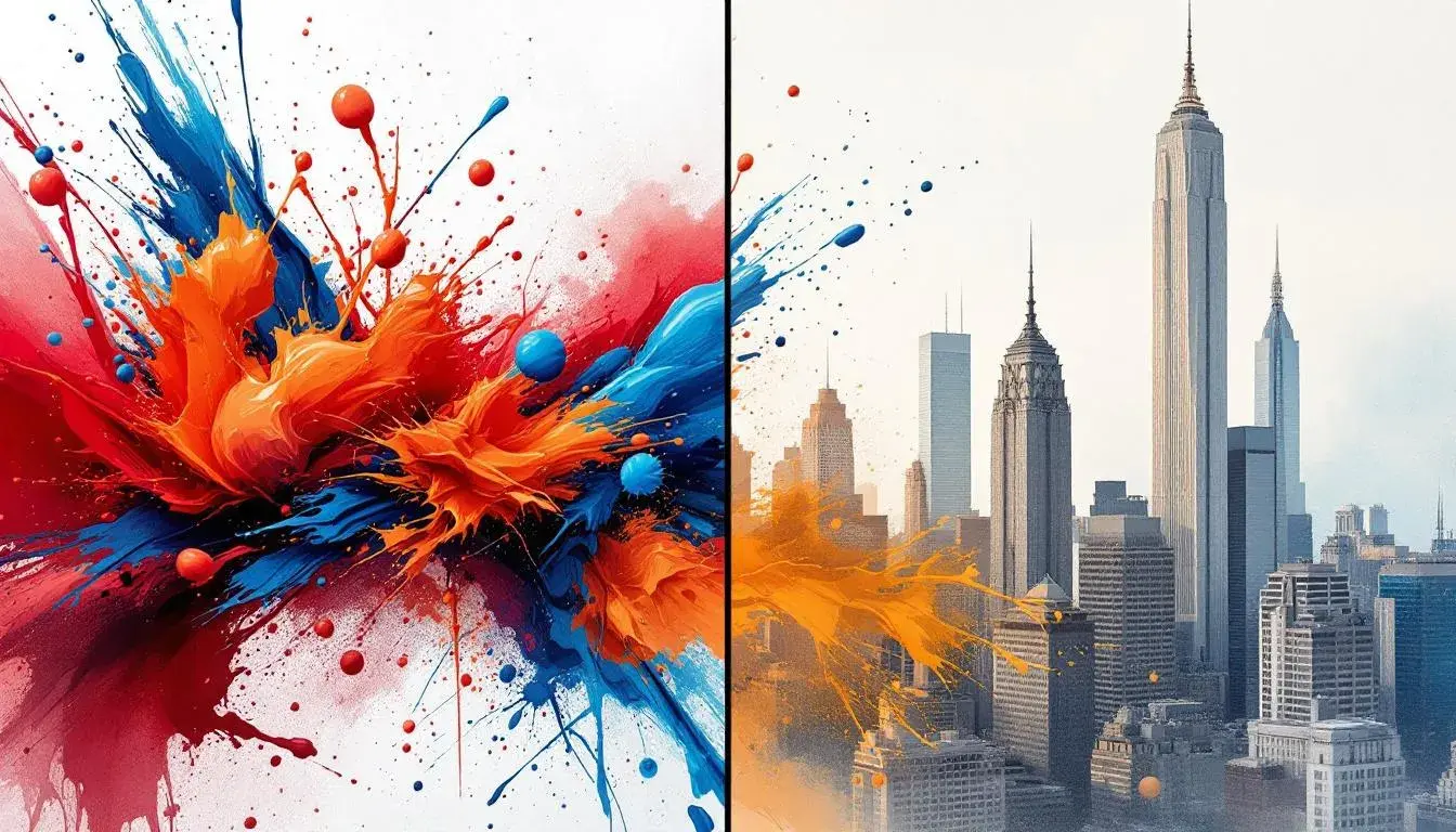
Design Styles divide on the Usage of Analogous Color Schemes between the Arts and Finance Industries
22 Jul 2025 · 5 min readColor, the silent language of design, speaks volumes about identity and intent. In the realm of aesthetics, it's the initial handshake, the lasting echo. But the vocabulary of color isn't universal; it cleaves along lines of industry, expectation, and even aspiration. Nowhere is this more evident than when contrasting the sensibilities of the Arts and Finance: two worlds driven by different currencies, each seeking to create distinct sensory experiences.
🎨 The palette named Youthful Vigor explodes onto the scene, a riot of creative energy. Off-White provides a grounding whisper, allowing Pale Lavender to bloom with an unexpected grace. Dusty Brown offers a whisper of earthiness, a counterpoint to the assertive Dark Sapphire. Brick Red injects drama; a splash of rebellion against the expected. This is not a palette afraid to make a statement; it’s best suited for ventures powered by passion. Youthful Vigor imagines start-ups bubbling with avant-garde thought. A modern art gallery splashed with its essence could become an incubator for raw ideas. Imagine a fashion editorial showcasing emerging designers – the hues capturing the spirit of innovation. The selection resonates with artistic ambition, ready to boldly explore uncharted creative territory. The palette shimmers, a declaration of freedom in a world often confined by repetition. Youthful Vigor acts as a visual prompt, a stirring reminder that invention thrives where the familiar is challenged. It thrives on an optimistic view, urging its audience to break from established convention, daring to paint outside the lines.
🏢 Corporate Serenity presents a measured exhale, a balm for the high-pressure theatre of finance. Pale Beige sets a stage of understated refinement, the perfect backdrop for measured discussion. Light Turquoise ripples with calm confidence, a refreshing twist to a sea of sober suits, while Medium Teal deepens the impact with steadfast assurance. Vibrant Teal brings depth and a tranquil focus. Deep Charcoal anchors the set with a sense of purpose and authority. The palette whispers sophistication in a boardroom. A high-end wealth management firm, hoping to project stability, benefits from this quiet confidence. Imagine a minimalist website for a boutique investment bank - the design reassuring clients that their assets are handled not with frantic risk, but with careful consideration. This selection cultivates an image of dependable competence, offering clients an atmosphere of controlled elegance. Corporate Serenity represents a quiet strength, a declaration of level-headed thinking in a world often defined by financial storms. It’s a visual reassurance, confirming to its beholders that intelligent precision leads to lasting prosperity.
🏦 Earthy Corporate is a study in quiet command. Off White establishes a foundation of subdued sophistication. Muted Beige adds a touch of restrained luxury, while Russet Brown echoes the strength of tradition. Emerald Green offers a glimpse of growth and prosperity. Dark Slate Gray contributes a composed stability. This muted arrangement would flourish in the corner office of a hedge fund, radiating dependable credibility. A sophisticated brokerage firm might use it to signal its long-term commitment. Picture the printed materials; the business cards and letterheads infused with the color; providing an unspoken promise of responsible execution. This palette is the image of cultivated expertise, reassuring stakeholders that astute insight guides every economic decision. Earthy Corporate delivers a reassuring sense of solid capability, assuring its audience that deep-rooted conviction brings about enduring success. It demonstrates the belief that grounded experience and thoughtful vision generates lasting value.
🎭 Artful Palette is an immersive venture, a canvas of captivating expression. Bright Chartreuse boldly awakens the senses. Vivid Coral radiates energy, while Mauve Brown speaks of contemplative depths. Deep Indigo conveys an air of mystery and imagination. Charcoal Black anchors with its timeless sophistication. Imagine this blend splashed across the walls of a cutting-edge design studio, radiating creativity and innovation. A theatre company could employ these to underscore the nuances of tragicomedy. Think of gallery invitations showcasing this palette hinting at the immersive art within. The colors encourage a sense of daring, fostering an atmosphere that allows exploration to flourish. Artful Palette represents an invitation to engage, serving as a vivid reminder that the path of artistic discovery invites you. It dares its admirers to let their intuition guide them.
🏛️ Scholarly Depth is a sophisticated narrative, each color lending itself to an intellectual environment. Pale Lavender casts a soft luminescence, evoking contemplation and quiet focus. Vivid Cornflower Blue conveys confidence and clarity. Slate Blue imparts a mature presence, suggesting wisdom. Dark Navy resonates with an accomplished sobriety. Near Black underscores gravity and the solemn pursuit of knowledge. Envision an academic journal with the arrangement splashed across the cover underscoring wisdom and discovery. Imagine a website for a prestigious university employing these to convey a sense of history and academic dedication. Imagine a scholar's elegant study, filled with volumes bound in hues mirroring the arrangement. This selection conveys a timeless sensibility, assuring scholars that intellect leads to a deep understanding. Scholarly Depth represents a quiet confidence in the pursuit of knowledge, confirming to its audience that reflection and wisdom lead to enlightened understanding. It stands as a visual testament to thoughtful analysis, urging its beholder to delve deeper, to ponder more fully.
🏢 Corporate Harmony brings a sense of measured power, combining both the stability and strength required in the world of high finance. Soft SteelBlue suggests intellect and quiet power. Bright Coral lends a surprising burst of confidence and insight. Deep Maroon evokes tradition, grounding the palette with purpose. Dark Charcoal echoes strength and composure. Almost Black underpins everything. Envision a modern financial institution employing the arrangement; hinting at both innovation and stability. An investment firm could weave these together across its branding, imparting a sense of reliability. Imagine a sleek, intuitive financial app, designed with the color scheme, reassuring users that while innovation drives them, security remains paramount. This palette signifies trusted expertise, reassuring partners that thoughtful progression steers every economic choice. Corporate Harmony evokes collaboration and reasoned action, confirming to its audience that the coming together of diverse thought empowers extraordinary accomplishment.
The analysis reveals a divergence of color stories. The Arts prioritize exuberance, creative disruption, and individual expression, while Finance favors stability, assurance, and a history of success. As for analogous palettes, they number one ("Artful Palette") for the Arts, and three ("Corporate Serenity", "Earthy Corporate", "Corporate Harmony") for Finance in 2025 -- showcasing an inclination towards harmonious color relationships in that industry. The color choices are not just visual aids, they are a form of communication; underscoring the intent and character of the industries they color. By recognizing color's powerful language, businesses, institutions, and artists can better express their identity, speak authentically to their intended audience, and shape narratives that inspire trust and capture attention.