'%3e%3cpath%20fill-rule='evenodd'%20clip-rule='evenodd'%20d='M51.1303%2019.2492C50.7278%2019.913%2050.1346%2020.4426%2049.3508%2020.838C48.5669%2021.2335%2047.6172%2021.4312%2046.5014%2021.4312C44.8208%2021.4312%2043.4367%2021.0216%2042.3492%2020.2025C41.2617%2019.3833%2040.6686%2018.2394%2040.5697%2016.7706H44.4253C44.4818%2017.3355%2044.6831%2017.7804%2045.0291%2018.1052C45.3751%2018.43%2045.8164%2018.5924%2046.3531%2018.5924C46.8192%2018.5924%2047.1864%2018.4653%2047.4547%2018.2111C47.7231%2017.9569%2047.8572%2017.618%2047.8572%2017.1943C47.8572%2016.8129%2047.7337%2016.4952%2047.4865%2016.241C47.2393%2015.9867%2046.9322%2015.7784%2046.565%2015.616C46.1978%2015.4536%2045.6893%2015.2594%2045.0397%2015.0334C44.0934%2014.7086%2043.3202%2014.3944%2042.72%2014.0907C42.1197%2013.7871%2041.6042%2013.3351%2041.1735%2012.7349C40.7427%2012.1347%2040.5273%2011.3544%2040.5273%2010.394C40.5273%209.50418%2040.7533%208.73448%2041.2053%208.08481C41.6572%207.43515%2042.2821%206.93731%2043.0801%206.5913C43.8781%206.24528%2044.7925%206.07227%2045.8235%206.07227C47.49%206.07227%2048.8141%206.46771%2049.7956%207.25861C50.7772%208.04951%2051.3315%209.13698%2051.4586%2010.5211H47.5395C47.4689%2010.0268%2047.2888%209.63483%2046.9993%209.3453C46.7097%209.05578%2046.3178%208.91102%2045.8235%208.91102C45.3998%208.91102%2045.0573%209.024%2044.7961%209.24997C44.5348%209.47594%2044.4041%209.80783%2044.4041%2010.2457C44.4041%2010.5988%2044.5207%2010.8989%2044.7537%2011.146C44.9867%2011.3932%2045.2798%2011.5944%2045.6328%2011.7498C45.9859%2011.9052%2046.4944%2012.1029%2047.1581%2012.343C48.1185%2012.6678%2048.9023%2012.9891%2049.5096%2013.3069C50.1169%2013.6246%2050.6395%2014.0872%2051.0773%2014.6945C51.5151%2015.3018%2051.734%2016.0927%2051.734%2017.0672C51.734%2017.8581%2051.5328%2018.5854%2051.1303%2019.2492ZM59.0242%206.3053V21.2829H55.4016V6.3053H59.0242ZM73.9409%206.3053V9.18642H69.8734V21.2829H66.2296V9.18642H62.2046V6.3053H73.9409ZM80.7438%209.18642V12.3218H85.8069V15.0546H80.7438V18.3806H86.4425V21.2829H77.1212V6.3053H86.4425V9.18642H80.7438ZM99.667%2016.0291V21.2829H96.0444V6.3053H101.913C103.692%206.3053%20105.048%206.74665%20105.98%207.62934C106.912%208.51204%20107.378%209.7019%20107.378%2011.199C107.378%2012.1311%20107.17%2012.9609%20106.753%2013.6882C106.337%2014.4155%20105.719%2014.9875%20104.9%2015.4042C104.08%2015.8208%20103.085%2016.0291%20101.913%2016.0291H99.667ZM103.692%2011.199C103.692%209.8855%20102.965%209.22879%20101.51%209.22879H99.667V13.1268H101.51C102.965%2013.1268%20103.692%2012.4842%20103.692%2011.199ZM120.092%2018.5501H114.478L113.546%2021.2829H109.732L115.219%206.41123H119.393L124.879%2021.2829H121.024L120.092%2018.5501ZM119.16%2015.7961L117.295%2010.2881L115.41%2015.7961H119.16ZM131.555%2018.5077H136.385V21.2829H127.933V6.3053H131.555V18.5077ZM143.337%209.18642V12.3218H148.4V15.0546H143.337V18.3806H149.035V21.2829H139.714V6.3053H149.035V9.18642H143.337ZM163.507%206.3053V9.18642H159.44V21.2829H155.796V9.18642H151.771V6.3053H163.507ZM177.449%206.3053V9.18642H173.382V21.2829H169.738V9.18642H165.713V6.3053H177.449ZM184.252%209.18642V12.3218H189.315V15.0546H184.252V18.3806H189.951V21.2829H180.629V6.3053H189.951V9.18642H184.252Z'%20fill='%23EEF0ED'/%3e%3cmask%20id='mask0_3101_7327'%20style='mask-type:alpha'%20maskUnits='userSpaceOnUse'%20x='0'%20y='0'%20width='27'%20height='28'%3e%3cpath%20d='M23.8328%200.759766H2.64808C1.18559%200.759766%200%201.94535%200%203.40785V24.5925C0%2026.055%201.18559%2027.2406%202.64808%2027.2406H23.8328C25.2952%2027.2406%2026.4808%2026.055%2026.4808%2024.5925V3.40785C26.4808%201.94535%2025.2952%200.759766%2023.8328%200.759766Z'%20fill='white'/%3e%3c/mask%3e%3cg%20mask='url(%23mask0_3101_7327)'%3e%3cpath%20d='M23.8328%200.759766H2.64808C1.18559%200.759766%200%201.94535%200%203.40785V24.5925C0%2026.055%201.18559%2027.2406%202.64808%2027.2406H23.8328C25.2952%2027.2406%2026.4808%2026.055%2026.4808%2024.5925V3.40785C26.4808%201.94535%2025.2952%200.759766%2023.8328%200.759766Z'%20fill='%23D8D8D8'/%3e%3cpath%20d='M13.2404%200.759766H0V14.0001H13.2404V0.759766Z'%20fill='%238C61FF'/%3e%3cpath%20d='M13.2404%2014H0V27.2404H13.2404V14Z'%20fill='%2336C3FE'/%3e%3cpath%20d='M26.4806%2014H13.2402V27.2404H26.4806V14Z'%20fill='%236592FE'/%3e%3cpath%20d='M26.4806%200.759766H13.2402V14.0002H26.4806V0.759766Z'%20fill='%236059F7'/%3e%3c/g%3e%3c/g%3e%3cdefs%3e%3cclipPath%20id='clip0_3101_7327'%3e%3crect%20width='190'%20height='28'%20fill='white'/%3e%3c/clipPath%3e%3c/defs%3e%3c/svg%3e)
'%3e%3cpath%20d='M23.8328%200.759521H2.64808C1.18559%200.759521%200%201.94511%200%203.40761V24.5923C0%2026.0548%201.18559%2027.2404%202.64808%2027.2404H23.8328C25.2952%2027.2404%2026.4808%2026.0548%2026.4808%2024.5923V3.40761C26.4808%201.94511%2025.2952%200.759521%2023.8328%200.759521Z'%20fill='%23D8D8D8'/%3e%3cpath%20d='M13.2404%200.759521H0V13.9999H13.2404V0.759521Z'%20fill='%238C61FF'/%3e%3cpath%20d='M13.2404%2013.9998H0V27.2402H13.2404V13.9998Z'%20fill='%2336C3FE'/%3e%3cpath%20d='M26.4809%2013.9998H13.2405V27.2402H26.4809V13.9998Z'%20fill='%236592FE'/%3e%3cpath%20d='M26.4809%200.759277H13.2405V13.9997H26.4809V0.759277Z'%20fill='%236059F7'/%3e%3c/g%3e%3c/svg%3e)
Triadic Temptation: Top Color Trios for Tech Branding
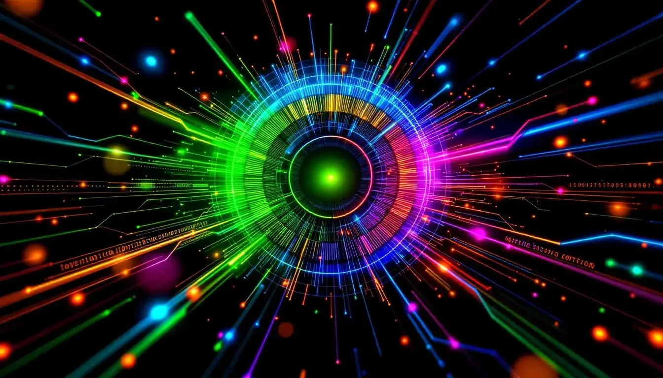
21 Jul 2025 · 3 min readColor, the silent language of brands, speaks volumes in the tech world. In a sector often perceived as sterile and functional, color wields the power to inject warmth, personality, and a sense of humanity. What was once a landscape of cold blues and stark whites, tech is now a playground of daring combinations, where clever color elevates function to art. The right trio can transform a simple interface into an immersive experience, a brand identity into a cultural touchstone. By carefully selecting and applying color strategically, one can forge a connection that can feel both utterly novel and deeply intuitive. Let's explore some carefully curated schemes that are defining the visual vocabulary of tomorrow's tech titans.
A cocktail of bold and grounded, the "Vibrant Contrast" \ud83c\udfa8 palette feels like a sun-drenched modernist painting. Lime Chartreuse positively zings with youthful energy, like the spark of a new idea or the thrill of a technological breakthrough. Juxtaposed with a Muted Green, it acquires an earthy maturity, a grounding force that speaks of stability and realism. The addition of Royal Blue deepens the narrative, lending an air of sophistication and trust. Dark Navy then pulls the palette into a comfortable gravity, adding a sense of authority without feeling overly corporate. The presence of Rustic Brown grounds the palette, giving the scheme a sense of organic warmth seldom seen in tech branding. This ensemble is surprisingly versatile. It works beautifully for apps seeking a playful yet professional feel, or for websites that want to feel both cutting-edge and reliable. Imagine a fintech app that uses Lime Chartreuse as an accent color to signify new features, balanced by a Royal Blue interface and grounding Rustic Brown sections. The result would be a brand identity that is eye-catching, yet reassuringly stable – perfect for inspiring confidence in digitally-driven commerce. It’s a signal of innovation tempered by experience, creativity that understands pragmatism.
Evoking a sense of academic familiarity, "School Palette" \ud83c\udfeb cultivates a reassuring and approachable atmosphere. Off-White Cream lays the foundation for a tranquil experience, while the understated Neutral Grey introduces a feeling of balance. Golden Brown brings touches of warmth and heritage – like a classic textbook or the glow of old lecture hall lights. The introduction of muted Dusty Rose offers a point of visual interest, adding a touch of complexity and subtle intrigue. The somber Steel Blue is an anchor, solidifying an aura of authority and quiet assurance. This palette would find a natural home in educational technology, from online learning platforms to interactive textbooks. Imagine a user interface where key features and options are highlighted in Golden Brown and accented by Steel Blue for a feeling of professionalism. Dusty Rose could then be used to add a subtle, engaging touch to highlight key areas, further enhanced by a Neutral Grey background. The goal is to feel informative, not overwhelming; professional, yet human. It's about building trust through familiarity, and communicating knowledge with clarity rather than extravagance.
"Energetic Stability" \ud83c\udf0a suggests a brand that is both dynamic and dependable. Light Grayish White offers a spacious field, while Light Slate Blue injects a clean, calming element. Combined with Medium Gray, the result is a palette that is both modern and quietly powerful. Vibrant Orange introduces an unexpected jolt, but its boldness is carefully balanced by the subdued shades around it. Dark Teal Blue provides a calming contrast, evoking serenity with its richness and depth. This pairing gives any tech brand an element of reliability. Think of a cybersecurity firm using Dark Teal Blue as its primary brand color, balanced by Light Slate Blue for accents and interactive elements. Light Grayish White would keep the overall feel clean and transparent, instilling confidence in users. The Vibrant Orange would then come in small doses to draw the eye to critical alerts or calls to action. The underlying message is clear: security that is both cutting-edge and comforting, innovation that isn't at the expense of peace of mind.
These are more than just collections of colors; they are carefully considered compositions of feeling. Each palette presented above offers a distinct pathway toward crafting brand narratives that speak directly to our emotions and shape how we experience the world of technology. Color, in the right hands, becomes a tool for connection, for clarity, and ultimately, for creating experiences that are as compelling as they are innovative. The potential is there for any company ready to dip into the palette and imagine what it wants to become.