'%3e%3cpath%20fill-rule='evenodd'%20clip-rule='evenodd'%20d='M51.1303%2019.2492C50.7278%2019.913%2050.1346%2020.4426%2049.3508%2020.838C48.5669%2021.2335%2047.6172%2021.4312%2046.5014%2021.4312C44.8208%2021.4312%2043.4367%2021.0216%2042.3492%2020.2025C41.2617%2019.3833%2040.6686%2018.2394%2040.5697%2016.7706H44.4253C44.4818%2017.3355%2044.6831%2017.7804%2045.0291%2018.1052C45.3751%2018.43%2045.8164%2018.5924%2046.3531%2018.5924C46.8192%2018.5924%2047.1864%2018.4653%2047.4547%2018.2111C47.7231%2017.9569%2047.8572%2017.618%2047.8572%2017.1943C47.8572%2016.8129%2047.7337%2016.4952%2047.4865%2016.241C47.2393%2015.9867%2046.9322%2015.7784%2046.565%2015.616C46.1978%2015.4536%2045.6893%2015.2594%2045.0397%2015.0334C44.0934%2014.7086%2043.3202%2014.3944%2042.72%2014.0907C42.1197%2013.7871%2041.6042%2013.3351%2041.1735%2012.7349C40.7427%2012.1347%2040.5273%2011.3544%2040.5273%2010.394C40.5273%209.50418%2040.7533%208.73448%2041.2053%208.08481C41.6572%207.43515%2042.2821%206.93731%2043.0801%206.5913C43.8781%206.24528%2044.7925%206.07227%2045.8235%206.07227C47.49%206.07227%2048.8141%206.46771%2049.7956%207.25861C50.7772%208.04951%2051.3315%209.13698%2051.4586%2010.5211H47.5395C47.4689%2010.0268%2047.2888%209.63483%2046.9993%209.3453C46.7097%209.05578%2046.3178%208.91102%2045.8235%208.91102C45.3998%208.91102%2045.0573%209.024%2044.7961%209.24997C44.5348%209.47594%2044.4041%209.80783%2044.4041%2010.2457C44.4041%2010.5988%2044.5207%2010.8989%2044.7537%2011.146C44.9867%2011.3932%2045.2798%2011.5944%2045.6328%2011.7498C45.9859%2011.9052%2046.4944%2012.1029%2047.1581%2012.343C48.1185%2012.6678%2048.9023%2012.9891%2049.5096%2013.3069C50.1169%2013.6246%2050.6395%2014.0872%2051.0773%2014.6945C51.5151%2015.3018%2051.734%2016.0927%2051.734%2017.0672C51.734%2017.8581%2051.5328%2018.5854%2051.1303%2019.2492ZM59.0242%206.3053V21.2829H55.4016V6.3053H59.0242ZM73.9409%206.3053V9.18642H69.8734V21.2829H66.2296V9.18642H62.2046V6.3053H73.9409ZM80.7438%209.18642V12.3218H85.8069V15.0546H80.7438V18.3806H86.4425V21.2829H77.1212V6.3053H86.4425V9.18642H80.7438ZM99.667%2016.0291V21.2829H96.0444V6.3053H101.913C103.692%206.3053%20105.048%206.74665%20105.98%207.62934C106.912%208.51204%20107.378%209.7019%20107.378%2011.199C107.378%2012.1311%20107.17%2012.9609%20106.753%2013.6882C106.337%2014.4155%20105.719%2014.9875%20104.9%2015.4042C104.08%2015.8208%20103.085%2016.0291%20101.913%2016.0291H99.667ZM103.692%2011.199C103.692%209.8855%20102.965%209.22879%20101.51%209.22879H99.667V13.1268H101.51C102.965%2013.1268%20103.692%2012.4842%20103.692%2011.199ZM120.092%2018.5501H114.478L113.546%2021.2829H109.732L115.219%206.41123H119.393L124.879%2021.2829H121.024L120.092%2018.5501ZM119.16%2015.7961L117.295%2010.2881L115.41%2015.7961H119.16ZM131.555%2018.5077H136.385V21.2829H127.933V6.3053H131.555V18.5077ZM143.337%209.18642V12.3218H148.4V15.0546H143.337V18.3806H149.035V21.2829H139.714V6.3053H149.035V9.18642H143.337ZM163.507%206.3053V9.18642H159.44V21.2829H155.796V9.18642H151.771V6.3053H163.507ZM177.449%206.3053V9.18642H173.382V21.2829H169.738V9.18642H165.713V6.3053H177.449ZM184.252%209.18642V12.3218H189.315V15.0546H184.252V18.3806H189.951V21.2829H180.629V6.3053H189.951V9.18642H184.252Z'%20fill='%23EEF0ED'/%3e%3cmask%20id='mask0_3101_7327'%20style='mask-type:alpha'%20maskUnits='userSpaceOnUse'%20x='0'%20y='0'%20width='27'%20height='28'%3e%3cpath%20d='M23.8328%200.759766H2.64808C1.18559%200.759766%200%201.94535%200%203.40785V24.5925C0%2026.055%201.18559%2027.2406%202.64808%2027.2406H23.8328C25.2952%2027.2406%2026.4808%2026.055%2026.4808%2024.5925V3.40785C26.4808%201.94535%2025.2952%200.759766%2023.8328%200.759766Z'%20fill='white'/%3e%3c/mask%3e%3cg%20mask='url(%23mask0_3101_7327)'%3e%3cpath%20d='M23.8328%200.759766H2.64808C1.18559%200.759766%200%201.94535%200%203.40785V24.5925C0%2026.055%201.18559%2027.2406%202.64808%2027.2406H23.8328C25.2952%2027.2406%2026.4808%2026.055%2026.4808%2024.5925V3.40785C26.4808%201.94535%2025.2952%200.759766%2023.8328%200.759766Z'%20fill='%23D8D8D8'/%3e%3cpath%20d='M13.2404%200.759766H0V14.0001H13.2404V0.759766Z'%20fill='%238C61FF'/%3e%3cpath%20d='M13.2404%2014H0V27.2404H13.2404V14Z'%20fill='%2336C3FE'/%3e%3cpath%20d='M26.4806%2014H13.2402V27.2404H26.4806V14Z'%20fill='%236592FE'/%3e%3cpath%20d='M26.4806%200.759766H13.2402V14.0002H26.4806V0.759766Z'%20fill='%236059F7'/%3e%3c/g%3e%3c/g%3e%3cdefs%3e%3cclipPath%20id='clip0_3101_7327'%3e%3crect%20width='190'%20height='28'%20fill='white'/%3e%3c/clipPath%3e%3c/defs%3e%3c/svg%3e)
'%3e%3cpath%20d='M23.8328%200.759521H2.64808C1.18559%200.759521%200%201.94511%200%203.40761V24.5923C0%2026.0548%201.18559%2027.2404%202.64808%2027.2404H23.8328C25.2952%2027.2404%2026.4808%2026.0548%2026.4808%2024.5923V3.40761C26.4808%201.94511%2025.2952%200.759521%2023.8328%200.759521Z'%20fill='%23D8D8D8'/%3e%3cpath%20d='M13.2404%200.759521H0V13.9999H13.2404V0.759521Z'%20fill='%238C61FF'/%3e%3cpath%20d='M13.2404%2013.9998H0V27.2402H13.2404V13.9998Z'%20fill='%2336C3FE'/%3e%3cpath%20d='M26.4809%2013.9998H13.2405V27.2402H26.4809V13.9998Z'%20fill='%236592FE'/%3e%3cpath%20d='M26.4809%200.759277H13.2405V13.9997H26.4809V0.759277Z'%20fill='%236059F7'/%3e%3c/g%3e%3c/svg%3e)
The Rise of Rutabaga: Unveiling Next Year's Unexpected Top 5%
21 Jul 2025 · 3 min readThe color of anticipation: as we crane our necks to see what crests the hill of next year's design landscape, a singular, surprising hue – Rutabaga – begins its ascent. Not quite mustard, not quite ochre, this earthy tone promises a grounding jolt to palettes previously dominated by cooler or more saccharine shades. It’s a reclamation of the natural, a nod to the harvest, and a suggestion of substantiality in a world often defined by the ephemeral. More than just a color, it is a signal: a shift toward considered consumption, a renewed appreciation for the unassuming beauty of the everyday. Consider these premonitions of the approaching sway of Rutabaga, each a discrete portrait framing its unexpected, inevitable rise.
"Modern Mystique" hints at the future with shadows and whispers. Soft Gray offers a clean foundation, while Pale Blue Gray suggests a quiet intelligence, a world observed with calm, rational eyes. Deep Teal Blue hints at hidden depths, like a forest lake reflecting a twilight sky. Bright Lavender arrives like a bolt of inspiration, its energy contained but undeniable, a spark of imagination in a world increasingly shaped by algorithms. And Nocturnal Indigo, the grounding force, speaks of a midnight sanctuary, a space for reflection and dreaming. The palette proposes a sleek, sophisticated world, a world where intuition and innovation dance a delicate tango. It is an embrace of the unknown, where the shadows hold secrets and the colors hint at untold stories, a narrative whispered in hushed tones. The cool-toned blend points to a technology that feels more human, to design that celebrates mystery and nuance rather than striving for stark, sterile perfection. Visualise a dimly lit gallery space, showcasing avant-garde sculptures cast in metal and glass, each piece a silent statement of contemporary artistry. This palette is the atmosphere itself, the unspoken language of creativity.
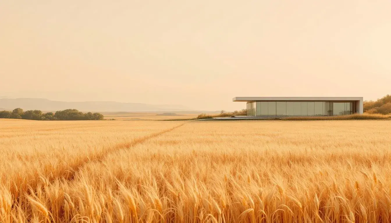
"Earthy Serenity" offers refuge. In a world consumed by the digital, it’s a call back to the tactile, to the comforting weight of the physical. Light Grayish Beige forms a gentle canvas, reminiscent of sun-bleached linen or aged paper, a backdrop for stories whispered over time. Rosy Brown brings warmth, the blush of a late afternoon sun warming ancient brick. Olive Brown suggests wild meadows and earthy vineyards, a return to rustic simplicity. Muted Red, the colour of autumn leaves clinging to branches, adds a touch of contemplative melancholy. Dark Taupe is the rich soil beneath our feet, solid and reassuring. Together, these hues evoke a yearning for simpler times. The palette isn’t loud or demanding; it's an ode to hushed mornings and worn textures. It paints a picture of slow living, of craftsmanship valued over mass production, of a deep connection to nature’s cycles. One could imagine a rustic farmhouse kitchen, its walls painted in Light Grayish Beige, adorned with hand-thrown pottery in Rosy Brown and Olive Brown, while a vase of Muted Red blooms sits on a weathered wooden table, all grounded by the solid presence of the Dark Taupe floor. It signals a return to honest materials, a slower pace, and spaces that prioritize well-being over ostentation.
"Hopeful Harmony" suggests innovation tempered by compassion. There's a lightness in Light Azure, reminiscent of cloudless skies after a spring rain. It’s a suggestion of endless potential, a sense of limitless possibility. Goldenrod brings a burst of optimism, the sun filtering through leaves, a promise of abundance and warmth. Khaki Green speaks of collaboration, of people working together to cultivate growth. Rose Violet softens the palette, adding a touch of empathy and understanding. Dark Charcoal anchors it, a reminder of the stability of the foundations built on honest work and unwavering principles. The palette captures the essence of a world striving for better, a place where technology serves humanity, and where design nurtures connection. Imagine a co-working space flooded with natural light, the walls painted in Light Azure, accented with furniture in Goldenrod and Khaki Green, while Rose Violet cushions soften the edges, and a Dark Charcoal accent wall provides focus and grounding. It speaks of spaces that are both functional and welcoming, fostering both productivity and a sense of community. Design here is not just about aesthetics; it's about creating environments that support well-being and collective progress.
"Earthy Contrast" showcases the verdant side to the Rutabaga story. Soft Mint arrives like an early spring breeze, hinting at renewal and freshness. Chartreuse Green echoes the vibrancy of new growth, a call to vitality and energy. Muted Taupe is the grounding force: sun-baked earth and quiet stone. Forest Green brings the deep, calming presence of nature and enduring wisdom. Dark Indigo offers a thoughtful, almost melancholic depth, like a twilight sky over a dense forest. The palette feels both invigorating and contemplative. It's a reminder that beauty can be found in the unexpected combinations: the sharp contrast between the bright greens and the darker blues creates a sense of depth and dynamism. Imagine a greenhouse filled with lush foliage, the walls painted in Soft Mint: Chartreuse Green accents pop from the planting pots scattered throughout the space. Muted Taupe stone pathways lead to Forest Green seating areas, all watched over by the deep Dark Indigo of the overhead sunshades. The palette speaks of conscious consumption, environmental awareness and a move towards simpler, more connected ways of living.
"Earthy Minimal" strips it back to the bedrock. Off-White acts as the blank page, the quiet space for ideas to breathe. Light Gray offers structure, the supporting beams of a well-considered design. Olive Green is the unexpected protagonist: the subtle hint of nature that brings life to the minimalist form. Dark Gray gives depth, the shadow that defines the shape. Black is the grounding force, the undeniable anchor that provides definition. The palette champions simplicity, speaking of a world where intention trumps excess. It's a visual poem to considered choices and mindful curation. Picture an architect's studio, pristine in its Off-White walls and Light Gray fixtures; the warmth of an Olive Green plant box sits alongside the dark Gray concrete floors and Black drafting tables. The palette suggests a conscious approach to design, valuing usefulness over needless adornment. It's about creating environments that foster focus, promoting a sense of refined stillness.
As we look toward a design future increasingly embracing Rutabaga, these palettes reveal the color's quiet strength. From the technological mystique offered by cool indigos and lavenders, to the serene comfort found in muted reds and earthy browns, the throughline remains the same: a return to the authentic, a celebration of substance. We anticipate design solutions that embrace both innovation and responsibility, hinting at a future not just of aesthetic pleasure, but of mindful creation.