'%3e%3cpath%20fill-rule='evenodd'%20clip-rule='evenodd'%20d='M51.1303%2019.2492C50.7278%2019.913%2050.1346%2020.4426%2049.3508%2020.838C48.5669%2021.2335%2047.6172%2021.4312%2046.5014%2021.4312C44.8208%2021.4312%2043.4367%2021.0216%2042.3492%2020.2025C41.2617%2019.3833%2040.6686%2018.2394%2040.5697%2016.7706H44.4253C44.4818%2017.3355%2044.6831%2017.7804%2045.0291%2018.1052C45.3751%2018.43%2045.8164%2018.5924%2046.3531%2018.5924C46.8192%2018.5924%2047.1864%2018.4653%2047.4547%2018.2111C47.7231%2017.9569%2047.8572%2017.618%2047.8572%2017.1943C47.8572%2016.8129%2047.7337%2016.4952%2047.4865%2016.241C47.2393%2015.9867%2046.9322%2015.7784%2046.565%2015.616C46.1978%2015.4536%2045.6893%2015.2594%2045.0397%2015.0334C44.0934%2014.7086%2043.3202%2014.3944%2042.72%2014.0907C42.1197%2013.7871%2041.6042%2013.3351%2041.1735%2012.7349C40.7427%2012.1347%2040.5273%2011.3544%2040.5273%2010.394C40.5273%209.50418%2040.7533%208.73448%2041.2053%208.08481C41.6572%207.43515%2042.2821%206.93731%2043.0801%206.5913C43.8781%206.24528%2044.7925%206.07227%2045.8235%206.07227C47.49%206.07227%2048.8141%206.46771%2049.7956%207.25861C50.7772%208.04951%2051.3315%209.13698%2051.4586%2010.5211H47.5395C47.4689%2010.0268%2047.2888%209.63483%2046.9993%209.3453C46.7097%209.05578%2046.3178%208.91102%2045.8235%208.91102C45.3998%208.91102%2045.0573%209.024%2044.7961%209.24997C44.5348%209.47594%2044.4041%209.80783%2044.4041%2010.2457C44.4041%2010.5988%2044.5207%2010.8989%2044.7537%2011.146C44.9867%2011.3932%2045.2798%2011.5944%2045.6328%2011.7498C45.9859%2011.9052%2046.4944%2012.1029%2047.1581%2012.343C48.1185%2012.6678%2048.9023%2012.9891%2049.5096%2013.3069C50.1169%2013.6246%2050.6395%2014.0872%2051.0773%2014.6945C51.5151%2015.3018%2051.734%2016.0927%2051.734%2017.0672C51.734%2017.8581%2051.5328%2018.5854%2051.1303%2019.2492ZM59.0242%206.3053V21.2829H55.4016V6.3053H59.0242ZM73.9409%206.3053V9.18642H69.8734V21.2829H66.2296V9.18642H62.2046V6.3053H73.9409ZM80.7438%209.18642V12.3218H85.8069V15.0546H80.7438V18.3806H86.4425V21.2829H77.1212V6.3053H86.4425V9.18642H80.7438ZM99.667%2016.0291V21.2829H96.0444V6.3053H101.913C103.692%206.3053%20105.048%206.74665%20105.98%207.62934C106.912%208.51204%20107.378%209.7019%20107.378%2011.199C107.378%2012.1311%20107.17%2012.9609%20106.753%2013.6882C106.337%2014.4155%20105.719%2014.9875%20104.9%2015.4042C104.08%2015.8208%20103.085%2016.0291%20101.913%2016.0291H99.667ZM103.692%2011.199C103.692%209.8855%20102.965%209.22879%20101.51%209.22879H99.667V13.1268H101.51C102.965%2013.1268%20103.692%2012.4842%20103.692%2011.199ZM120.092%2018.5501H114.478L113.546%2021.2829H109.732L115.219%206.41123H119.393L124.879%2021.2829H121.024L120.092%2018.5501ZM119.16%2015.7961L117.295%2010.2881L115.41%2015.7961H119.16ZM131.555%2018.5077H136.385V21.2829H127.933V6.3053H131.555V18.5077ZM143.337%209.18642V12.3218H148.4V15.0546H143.337V18.3806H149.035V21.2829H139.714V6.3053H149.035V9.18642H143.337ZM163.507%206.3053V9.18642H159.44V21.2829H155.796V9.18642H151.771V6.3053H163.507ZM177.449%206.3053V9.18642H173.382V21.2829H169.738V9.18642H165.713V6.3053H177.449ZM184.252%209.18642V12.3218H189.315V15.0546H184.252V18.3806H189.951V21.2829H180.629V6.3053H189.951V9.18642H184.252Z'%20fill='%23EEF0ED'/%3e%3cmask%20id='mask0_3101_7327'%20style='mask-type:alpha'%20maskUnits='userSpaceOnUse'%20x='0'%20y='0'%20width='27'%20height='28'%3e%3cpath%20d='M23.8328%200.759766H2.64808C1.18559%200.759766%200%201.94535%200%203.40785V24.5925C0%2026.055%201.18559%2027.2406%202.64808%2027.2406H23.8328C25.2952%2027.2406%2026.4808%2026.055%2026.4808%2024.5925V3.40785C26.4808%201.94535%2025.2952%200.759766%2023.8328%200.759766Z'%20fill='white'/%3e%3c/mask%3e%3cg%20mask='url(%23mask0_3101_7327)'%3e%3cpath%20d='M23.8328%200.759766H2.64808C1.18559%200.759766%200%201.94535%200%203.40785V24.5925C0%2026.055%201.18559%2027.2406%202.64808%2027.2406H23.8328C25.2952%2027.2406%2026.4808%2026.055%2026.4808%2024.5925V3.40785C26.4808%201.94535%2025.2952%200.759766%2023.8328%200.759766Z'%20fill='%23D8D8D8'/%3e%3cpath%20d='M13.2404%200.759766H0V14.0001H13.2404V0.759766Z'%20fill='%238C61FF'/%3e%3cpath%20d='M13.2404%2014H0V27.2404H13.2404V14Z'%20fill='%2336C3FE'/%3e%3cpath%20d='M26.4806%2014H13.2402V27.2404H26.4806V14Z'%20fill='%236592FE'/%3e%3cpath%20d='M26.4806%200.759766H13.2402V14.0002H26.4806V0.759766Z'%20fill='%236059F7'/%3e%3c/g%3e%3c/g%3e%3cdefs%3e%3cclipPath%20id='clip0_3101_7327'%3e%3crect%20width='190'%20height='28'%20fill='white'/%3e%3c/clipPath%3e%3c/defs%3e%3c/svg%3e)
'%3e%3cpath%20d='M23.8328%200.759521H2.64808C1.18559%200.759521%200%201.94511%200%203.40761V24.5923C0%2026.0548%201.18559%2027.2404%202.64808%2027.2404H23.8328C25.2952%2027.2404%2026.4808%2026.0548%2026.4808%2024.5923V3.40761C26.4808%201.94511%2025.2952%200.759521%2023.8328%200.759521Z'%20fill='%23D8D8D8'/%3e%3cpath%20d='M13.2404%200.759521H0V13.9999H13.2404V0.759521Z'%20fill='%238C61FF'/%3e%3cpath%20d='M13.2404%2013.9998H0V27.2402H13.2404V13.9998Z'%20fill='%2336C3FE'/%3e%3cpath%20d='M26.4809%2013.9998H13.2405V27.2402H26.4809V13.9998Z'%20fill='%236592FE'/%3e%3cpath%20d='M26.4809%200.759277H13.2405V13.9997H26.4809V0.759277Z'%20fill='%236059F7'/%3e%3c/g%3e%3c/svg%3e)
From Spring to Autumn: Shifting Seasonal Palette Preferences in Website Design
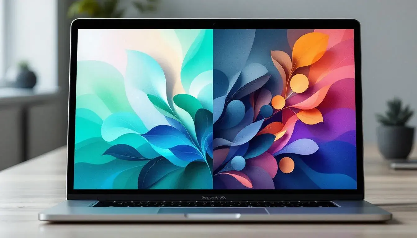
18 Jul 2025 · 5 min readThe shift from spring’s awakening to autumn's embrace mirrors a transformation in the palettes that capture our attention. Think of the crisp, clean light of a morning in late April, filtered through budding leaves – the world reborn in pastel promise. Then, picture the burnished glow of an October afternoon, the air thick with the scent of woodsmoke and the ground strewn with fiery hues. Websites, those virtual windows to our brands and ideas, must also adapt to this seasonal rhythm, reflecting the shifting emotional landscapes and visual desires of their users. A palette that sings of renewal in springtime may feel jarring and out of place as the year matures. The color choices we make online communicate more than just aesthetics. They whisper of mood, values, and connection to the turning of the earth. They are a silent language that speaks volumes about who we are and what we offer.
The "Modern Harmony" palette suggests a breath of fresh air, tinged with the promise of technology and care. Snow White forms a perfect, crisp canvas, suggestive of a freshly cleaned interface or the pristine simplicity of a well-designed app. Pastel Orange evokes feelings of optimistic energy without being overwhelming, like the subtle warmth of early sunlight. Emerald Green, a more grounded tone, speaks of nature and growth, fitting for businesses invested in lasting impact. The pairing of Vivid Blue and Orchid Purple introduces a dash of playful innovation to the mix. Light Grayish and Medium Gray offer balanced neutrality; a reassuring, soft background is critical for allowing focal colors to shine. Teal Green suggests forward thinking and clear communication and Bright Orange is an energetic tone providing a welcome invitation to a site or app. The grounding force of Deep Charcoal prevents the other hues from floating away, adding a sense of sophisticated weight and reliability. This palette could easily transition from a Spring-themed site promoting clean energy solutions to one advocating for mental health in early summer. Imagine a gentle interface, where prompts and buttons are highlighted in Teal and Orchid, while key information is presented with the clarity of Snow White. The overall effect is one of calm competence, inviting visitors to explore and engage without feeling rushed or overwhelmed and could easily carry into the brighter offerings of summer.
"Modern Mix" offers a bolder, more extroverted approach. Pure White and Neutral Gray act as quiet containers for the more assertive tones. But here, Sky Blue feels more like the vast expanse of a clear spring day, while Teal Green hints at hidden depths. Dusty Coral adds a touch of unexpected warmth, reminiscent of the first blooms daring to emerge from the earth. Vibrant Violet injects a sense of playful energy, like the buzzing of bees drawn to nectar-rich flowers. Deep Indigo suggests stability, providing a counterpoint to the more whimsical hues. Bright Red acts as a signal, drawing attention to key elements. Black Onyx anchors the palette in sophistication. Imagine a website for a digital art collective using this palette to arresting effect. The Sky Blue might form the background, allowing the artwork to pop, while Teal Green and Vibrant Violet highlight calls to action and interactive elements. The Dusty Coral adds a hint of human warmth, preventing the overall effect from feeling too sterile. This is a palette that suggests creativity, innovation, and a willingness to embrace the unexpected, perfect for capturing the revitalizing spirit of spring and summer innovation.
"Vibrant Spectrum" bursts forth with unadulterated energy. This palette doesn’t whisper; it shouts. Pure White provides essential breathing space, while Vibrant Yellow screams of sunny days and boundless optimism. Bright Cyan adds a cooling counterpoint, like a refreshing breeze on a warm afternoon. Gray Slate lends a touch of grounded practicality while Teal Green suggests natural growth and steady progress. Electric Violet vibrates with playful intensity and Crimson Red demands attention, like a bold statement. Deep Indigo adds a grounding depth. Charcoal Gray and Onyx Black act as firm boundaries, preventing the other colors from spiraling out of control. Imagine the website of a cutting-edge marketing agency using this palette to promote its services. Vibrant Yellow might draw attention to key offers, while Electric Violet brings a sense of youthful innovation and Teal Green suggests dependability and results. A website would be energized with a welcome splash of color and intrigue.
"Agile Palette" provides instant energetic vibes. A company website is only a click away from success when utilizing this range of tones. The range of greens - Pastel Green, Electric Lime, Vibrant Green - offer the instant association with growth and freshness while assuring the customer that their products or services are cutting edge. Bright Cyan offers balance, and is a perfect contrasting tone for calls to action. Set against the neutral Pure White, Light Gray, and Medium Gray, the tone options allow the website visitor to breathe. Dark Indigo and Jet Black ground the palette, assuring sophistication, while Bright Red offers an instant invitation.
As summer fades, "Earthy Contrast" arrives, bringing a feeling of warm shelter. Imagine the marketing materials of an autumnal spa weekend - a place that welcomes you with tones of acceptance and growth. The palette pulls back. Pure White offers calm, while Light Beige brings a gentle nostalgia; think of the scent of dried grasses and crisp breezes. Bright Apricot recalls the fiery colors of sunset, the promise of an evening gathering. Neutral Gray brings the steady calm of the coming winter while Burnt Sienna provides a grounded earthiness. Deep Sapphire, like the deepening twilight sky, hints at mystery and introspection. Crimson Red invokes the warmth of hearth fires and shared stories. Finally, Dark Charcoal anchors everything. This palette evokes a sense of lived experience, of comfort drawn from the changing world around us - perfect for capturing the spirit of fall.
These palettes reveal how subtly color can shape our experience, evoking specific emotions and associations tied to the seasons. The move from spring's bright optimism to autumn's richer, more grounded warmth mirrors a deeper shift in our own perceptions and desires. Where spring calls us to action and innovation, autumn invites us to reflect and connect. Understanding these seasonal nuances in color preferences allows designers to craft websites that truly resonate with their audiences, forging stronger emotional connections and creating more meaningful online experiences. The key is to use color with intention, recognizing it as a powerful language that speaks volumes about who we are and what we value in each changing season.