'%3e%3cpath%20fill-rule='evenodd'%20clip-rule='evenodd'%20d='M51.1303%2019.2492C50.7278%2019.913%2050.1346%2020.4426%2049.3508%2020.838C48.5669%2021.2335%2047.6172%2021.4312%2046.5014%2021.4312C44.8208%2021.4312%2043.4367%2021.0216%2042.3492%2020.2025C41.2617%2019.3833%2040.6686%2018.2394%2040.5697%2016.7706H44.4253C44.4818%2017.3355%2044.6831%2017.7804%2045.0291%2018.1052C45.3751%2018.43%2045.8164%2018.5924%2046.3531%2018.5924C46.8192%2018.5924%2047.1864%2018.4653%2047.4547%2018.2111C47.7231%2017.9569%2047.8572%2017.618%2047.8572%2017.1943C47.8572%2016.8129%2047.7337%2016.4952%2047.4865%2016.241C47.2393%2015.9867%2046.9322%2015.7784%2046.565%2015.616C46.1978%2015.4536%2045.6893%2015.2594%2045.0397%2015.0334C44.0934%2014.7086%2043.3202%2014.3944%2042.72%2014.0907C42.1197%2013.7871%2041.6042%2013.3351%2041.1735%2012.7349C40.7427%2012.1347%2040.5273%2011.3544%2040.5273%2010.394C40.5273%209.50418%2040.7533%208.73448%2041.2053%208.08481C41.6572%207.43515%2042.2821%206.93731%2043.0801%206.5913C43.8781%206.24528%2044.7925%206.07227%2045.8235%206.07227C47.49%206.07227%2048.8141%206.46771%2049.7956%207.25861C50.7772%208.04951%2051.3315%209.13698%2051.4586%2010.5211H47.5395C47.4689%2010.0268%2047.2888%209.63483%2046.9993%209.3453C46.7097%209.05578%2046.3178%208.91102%2045.8235%208.91102C45.3998%208.91102%2045.0573%209.024%2044.7961%209.24997C44.5348%209.47594%2044.4041%209.80783%2044.4041%2010.2457C44.4041%2010.5988%2044.5207%2010.8989%2044.7537%2011.146C44.9867%2011.3932%2045.2798%2011.5944%2045.6328%2011.7498C45.9859%2011.9052%2046.4944%2012.1029%2047.1581%2012.343C48.1185%2012.6678%2048.9023%2012.9891%2049.5096%2013.3069C50.1169%2013.6246%2050.6395%2014.0872%2051.0773%2014.6945C51.5151%2015.3018%2051.734%2016.0927%2051.734%2017.0672C51.734%2017.8581%2051.5328%2018.5854%2051.1303%2019.2492ZM59.0242%206.3053V21.2829H55.4016V6.3053H59.0242ZM73.9409%206.3053V9.18642H69.8734V21.2829H66.2296V9.18642H62.2046V6.3053H73.9409ZM80.7438%209.18642V12.3218H85.8069V15.0546H80.7438V18.3806H86.4425V21.2829H77.1212V6.3053H86.4425V9.18642H80.7438ZM99.667%2016.0291V21.2829H96.0444V6.3053H101.913C103.692%206.3053%20105.048%206.74665%20105.98%207.62934C106.912%208.51204%20107.378%209.7019%20107.378%2011.199C107.378%2012.1311%20107.17%2012.9609%20106.753%2013.6882C106.337%2014.4155%20105.719%2014.9875%20104.9%2015.4042C104.08%2015.8208%20103.085%2016.0291%20101.913%2016.0291H99.667ZM103.692%2011.199C103.692%209.8855%20102.965%209.22879%20101.51%209.22879H99.667V13.1268H101.51C102.965%2013.1268%20103.692%2012.4842%20103.692%2011.199ZM120.092%2018.5501H114.478L113.546%2021.2829H109.732L115.219%206.41123H119.393L124.879%2021.2829H121.024L120.092%2018.5501ZM119.16%2015.7961L117.295%2010.2881L115.41%2015.7961H119.16ZM131.555%2018.5077H136.385V21.2829H127.933V6.3053H131.555V18.5077ZM143.337%209.18642V12.3218H148.4V15.0546H143.337V18.3806H149.035V21.2829H139.714V6.3053H149.035V9.18642H143.337ZM163.507%206.3053V9.18642H159.44V21.2829H155.796V9.18642H151.771V6.3053H163.507ZM177.449%206.3053V9.18642H173.382V21.2829H169.738V9.18642H165.713V6.3053H177.449ZM184.252%209.18642V12.3218H189.315V15.0546H184.252V18.3806H189.951V21.2829H180.629V6.3053H189.951V9.18642H184.252Z'%20fill='%23EEF0ED'/%3e%3cmask%20id='mask0_3101_7327'%20style='mask-type:alpha'%20maskUnits='userSpaceOnUse'%20x='0'%20y='0'%20width='27'%20height='28'%3e%3cpath%20d='M23.8328%200.759766H2.64808C1.18559%200.759766%200%201.94535%200%203.40785V24.5925C0%2026.055%201.18559%2027.2406%202.64808%2027.2406H23.8328C25.2952%2027.2406%2026.4808%2026.055%2026.4808%2024.5925V3.40785C26.4808%201.94535%2025.2952%200.759766%2023.8328%200.759766Z'%20fill='white'/%3e%3c/mask%3e%3cg%20mask='url(%23mask0_3101_7327)'%3e%3cpath%20d='M23.8328%200.759766H2.64808C1.18559%200.759766%200%201.94535%200%203.40785V24.5925C0%2026.055%201.18559%2027.2406%202.64808%2027.2406H23.8328C25.2952%2027.2406%2026.4808%2026.055%2026.4808%2024.5925V3.40785C26.4808%201.94535%2025.2952%200.759766%2023.8328%200.759766Z'%20fill='%23D8D8D8'/%3e%3cpath%20d='M13.2404%200.759766H0V14.0001H13.2404V0.759766Z'%20fill='%238C61FF'/%3e%3cpath%20d='M13.2404%2014H0V27.2404H13.2404V14Z'%20fill='%2336C3FE'/%3e%3cpath%20d='M26.4806%2014H13.2402V27.2404H26.4806V14Z'%20fill='%236592FE'/%3e%3cpath%20d='M26.4806%200.759766H13.2402V14.0002H26.4806V0.759766Z'%20fill='%236059F7'/%3e%3c/g%3e%3c/g%3e%3cdefs%3e%3cclipPath%20id='clip0_3101_7327'%3e%3crect%20width='190'%20height='28'%20fill='white'/%3e%3c/clipPath%3e%3c/defs%3e%3c/svg%3e)
'%3e%3cpath%20d='M23.8328%200.759521H2.64808C1.18559%200.759521%200%201.94511%200%203.40761V24.5923C0%2026.0548%201.18559%2027.2404%202.64808%2027.2404H23.8328C25.2952%2027.2404%2026.4808%2026.0548%2026.4808%2024.5923V3.40761C26.4808%201.94511%2025.2952%200.759521%2023.8328%200.759521Z'%20fill='%23D8D8D8'/%3e%3cpath%20d='M13.2404%200.759521H0V13.9999H13.2404V0.759521Z'%20fill='%238C61FF'/%3e%3cpath%20d='M13.2404%2013.9998H0V27.2402H13.2404V13.9998Z'%20fill='%2336C3FE'/%3e%3cpath%20d='M26.4809%2013.9998H13.2405V27.2402H26.4809V13.9998Z'%20fill='%236592FE'/%3e%3cpath%20d='M26.4809%200.759277H13.2405V13.9997H26.4809V0.759277Z'%20fill='%236059F7'/%3e%3c/g%3e%3c/svg%3e)
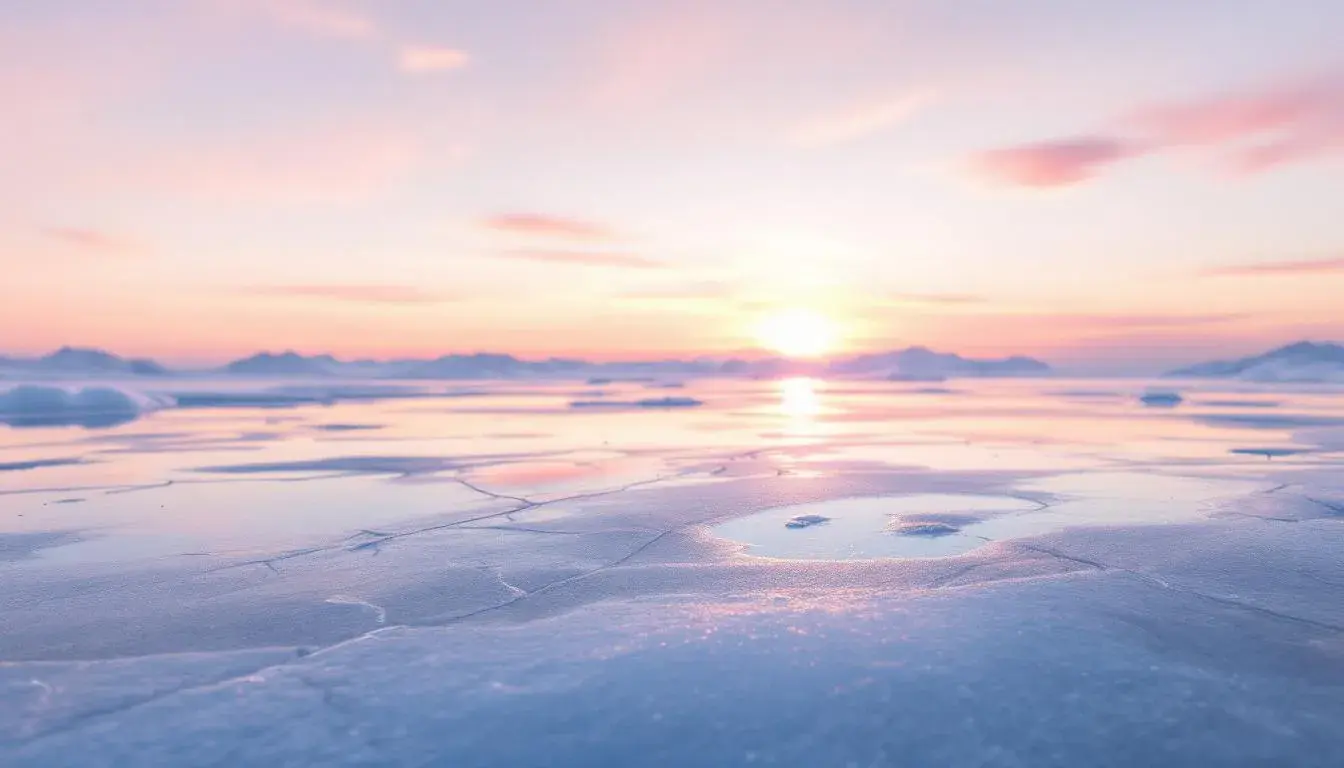
Cool as Ice: Winter Palettes Trending Towards Brightness
18 Jul 2025 · 4 min readThe chill of winter, once synonymous with stark landscapes and muted tones, is undergoing a vibrant transformation. No longer confined to the predictable shades of gray and deep blues, winter is awakening with a newfound luminosity. Imagine ice reflecting a brilliant sunrise, transforming the familiar frosty grip into a spectacle of light and color. This shift isn't just about aesthetics; it's about a change in perspective, an embrace of hope and clarity amidst the season's inherent stillness. It’s a rediscovery of winter’s potential for vibrancy, a move away from somber palettes toward those that capture the briskness and purity of a sun-drenched snowscape. Forget heavy, melancholic hues—think instead of the crisp air, the crystalline glint of icicles, and the invigorating feeling of a winter walk under a clear, bright sky. Winter's new palette is an invitation to see the world in a fresh, revitalizing light, pushing against the traditional constraints and celebrating a season of unexpected radiance.
Deep Serenity invites a feeling of tranquil expansiveness. The eye is immediately drawn to Pure White, a foundational color that speaks of cleanliness and clarity, reminiscent of freshly fallen snow untouched by footprints. Mint Green injects a breath of fresh air, like the subtle promise of spring beneath a winter sky. Dusty Rose introduces a gentle warmth, evoking the blush of dawn on a snow-covered mountain. Light Lavender adds a touch of ethereal beauty, reminiscent of the soft hues of twilight reflecting off ice crystals. Taupe Gray provides a grounding element, like the sturdy trunks of trees dusted with snow. Teal Blue deepens the complexity, hinting at the hidden depths of a frozen lake. Burgundy Brown offers a rich contrast, reminiscent of warm spices enjoyed indoors while a blizzard rages outside. Deep Indigo brings a sense of mystery and introspection, reflecting the long winter nights. Finally, Onyx Black anchors the palette, providing a stark contrast that accentuates the lightness and vibrancy of the other colors. This collection provides a balanced interplay of cool and warm tones, allowing for a calm atmosphere, reflecting a natural winter landscape. Consider how the palette could bring the feeling of a warm respite after a day in the winter landscape, bringing outdoor beauty inside. This palette encourages a sense of peace, making it perfect for spaces where one seeks a calming experience.
Neutral Grays presents a sleek and sophisticated image of winter, stripped down to its most essential elements. Off White provides a soft foundation, resembling the subtle sheen of frost on glass. Light Gray brings a sense of understated elegance, like the gentle shadows cast by bare winter branches. Medium Gray introduces depth and complexity, mimicking the changing shades of a cloudy winter sky. Dark Charcoal anchors the palette with a sense of quiet strength, reminiscent of the solid, enduring presence of rocks beneath a layer of snow. This palette evokes a feeling of calm minimalism. It feels like a modern interpretation of a winter landscape, one where the focus is on form and texture rather than overt color. This allows for quiet reflection in spaces, calling to mind a sense of serene isolation, perfect for unwinding after a busy day. The palette does not embrace the overt brightness of ice reflecting the sunlight, but captures the feeling of the winter season at its most quiet, suggesting a different interpretation of the season. The feeling is serene without being cold, allowing for the creation of sophisticated spaces.
Modern Blues captures the essence of a clear winter day with its refreshing and invigorating tones. Pale Blue evokes the crisp, clean air of a winter morning, like the feeling of the first breath taken outside. Steel Blue evokes a sense of strength and resilience, mimicking the icy grip of winter. Neutral Gray provides a grounding element, like the sight of bare trees against a bright blue sky. Cool Gray adds a calming touch, evoking the peacefulness of a snow-covered landscape. Dark Navy anchors the palette with a feeling of depth and sophistication, reminiscent of the long winter nights. The overall effect is an interplay of cool, calming tones that refresh and revitalize. Creating a sense of peace is at the heart of this palette, making it well-suited to unwinding. The hues suggest not only wintry scenes, but also a feeling of sophisticated design. The combination of cool and light colors allows for a feeling of brightness in the darkness, creating spaces that are comforting and yet invigorating. The effect is a modern reimagining of winter, one that celebrates its beauty and light.
Calm Clinic offers a surprisingly warm and inviting interpretation of winter, one that focuses on comfort and tranquility. Beige Rose brings a gentle warmth, like the soft glow of a fireplace on a snowy evening. Slate Blue introduces a calming coolness, evoking the serenity of a quiet winter morning. Muted Teal adds a touch of natural vibrancy, mimicking the subtle hues of winter foliage. Deep Indigo grounds the palette with depth and sophistication, like the dark shadows cast by trees in the snow. Dark Espresso provides a grounding element, like the feeling of a warm beverage on a cold day. The presence of these hues calls to mind a comforting image, evoking feelings of wellness. The palette suggests spaces of healing and revitalization, creating a place for reflection. Because of its gentle tones, this palette suggests a break from the harshness of winter, making it well-suited to spaces where one seeks solace and peace. The colors offer a subtle energy, balancing coolness and warmth and reflecting the rejuvenating power of winter.
Gray Scale presents a sophisticated take on the traditional winter palette, subverting expectations with subtle hints of brightness. Pale Ivory sets a gentle, luminous tone, reminiscent of the soft glow of snow under moonlight. Chartreuse Tint injects an unexpected jolt of energy, mimicking the subtle hints of green that can be found even in the coldest months. Granite Gray provides a grounded, earthy element, evoking the feeling of winter stone. Olive Drab further enriches the palette with a touch of nature, like the enduring presence of evergreens. Dark Asphalt anchors the palette with a sense of quiet strength, reminiscent of the solid earth beneath the snow. This palette delivers a calming and sophisticated feeling, steering away from overt wintry sentiments. It is a sophisticated take on a familiar landscape, showcasing a nuanced range of colors which are both natural and urban, hinting at life persisting even in the depths of winter. This collection creates environments for quiet contemplation, finding beauty in the subtle details of the winter season.
Nordea Palette calls to mind the feeling of brisk focus and quiet competence. The Off White delivers a foundation of lightness, creating a sense of open space, reminiscent of snowdrifts reflecting the sky. Light Blue Gray mirrors the crisp, clear air of a winter morning. Olive Drab injects a note of subtle warmth, representing the natural world’s quiet persistence, hinting at vitality even in the coldest months. Gray Brown provides solidity and grounding, like the sturdy branches of winter trees. Dark Indigo adds depth and intrigue, creating a feeling of professionalism. The combination of cool and grounded tones creates a feeling of quiet clarity, reflecting a bright focus. The palette finds brightness not in dazzling hues, but in a clean, sharp precision, making it ideal for spaces where one seeks clarity and productivity. As such, it echoes the crisp focus that the winter season can deliver.
Translation Interface evokes a feeling of calm and confident communication in the heart of winter. Off White sets a tone of openness and clarity, like the feeling of a fresh snowfall blanketing the landscape. Light Slate Gray brings a sense of measured stability, mirroring the quiet strength of winter stone. Salmon Pink gives a gentle warmth, resembling the light of dawn on a cold day. Slate Gray adds depth and complexity, like the shadows cast by winter trees. Steel Blue grounds the palette with a feeling of reliable strength, reminiscent of frozen water. The palette avoids the harshness often associated with winter, opting instead for soft, approachable tones. It calls to mind a sense of quiet strength capable of creating spaces for thought and understanding. The overall feeling is both calming and engaging, suggesting a focus on balance and growth, showcasing gentle confidence.
The shifting embrace of brightness in winter palettes reflects a broader cultural move towards optimism and clarity, even amidst the stillness of the season. The palettes showcase a desire is not necessarily for radical warmth or stark contrast, but rather a nuanced exploration of light and shadow. The emotional landscapes evoked range from the quiet serenity of a snow-covered forest to the uplifting energy of a clear winter sky. It is not merely shifting the aesthetic, but inviting us to reflect on winter differently, embracing its potential for beauty and connection. The trend towards brightness opens new possibilities for understanding and celebrating the unique qualities of winter, moving towards a season that is both cool and captivating.