'%3e%3cpath%20fill-rule='evenodd'%20clip-rule='evenodd'%20d='M51.1303%2019.2492C50.7278%2019.913%2050.1346%2020.4426%2049.3508%2020.838C48.5669%2021.2335%2047.6172%2021.4312%2046.5014%2021.4312C44.8208%2021.4312%2043.4367%2021.0216%2042.3492%2020.2025C41.2617%2019.3833%2040.6686%2018.2394%2040.5697%2016.7706H44.4253C44.4818%2017.3355%2044.6831%2017.7804%2045.0291%2018.1052C45.3751%2018.43%2045.8164%2018.5924%2046.3531%2018.5924C46.8192%2018.5924%2047.1864%2018.4653%2047.4547%2018.2111C47.7231%2017.9569%2047.8572%2017.618%2047.8572%2017.1943C47.8572%2016.8129%2047.7337%2016.4952%2047.4865%2016.241C47.2393%2015.9867%2046.9322%2015.7784%2046.565%2015.616C46.1978%2015.4536%2045.6893%2015.2594%2045.0397%2015.0334C44.0934%2014.7086%2043.3202%2014.3944%2042.72%2014.0907C42.1197%2013.7871%2041.6042%2013.3351%2041.1735%2012.7349C40.7427%2012.1347%2040.5273%2011.3544%2040.5273%2010.394C40.5273%209.50418%2040.7533%208.73448%2041.2053%208.08481C41.6572%207.43515%2042.2821%206.93731%2043.0801%206.5913C43.8781%206.24528%2044.7925%206.07227%2045.8235%206.07227C47.49%206.07227%2048.8141%206.46771%2049.7956%207.25861C50.7772%208.04951%2051.3315%209.13698%2051.4586%2010.5211H47.5395C47.4689%2010.0268%2047.2888%209.63483%2046.9993%209.3453C46.7097%209.05578%2046.3178%208.91102%2045.8235%208.91102C45.3998%208.91102%2045.0573%209.024%2044.7961%209.24997C44.5348%209.47594%2044.4041%209.80783%2044.4041%2010.2457C44.4041%2010.5988%2044.5207%2010.8989%2044.7537%2011.146C44.9867%2011.3932%2045.2798%2011.5944%2045.6328%2011.7498C45.9859%2011.9052%2046.4944%2012.1029%2047.1581%2012.343C48.1185%2012.6678%2048.9023%2012.9891%2049.5096%2013.3069C50.1169%2013.6246%2050.6395%2014.0872%2051.0773%2014.6945C51.5151%2015.3018%2051.734%2016.0927%2051.734%2017.0672C51.734%2017.8581%2051.5328%2018.5854%2051.1303%2019.2492ZM59.0242%206.3053V21.2829H55.4016V6.3053H59.0242ZM73.9409%206.3053V9.18642H69.8734V21.2829H66.2296V9.18642H62.2046V6.3053H73.9409ZM80.7438%209.18642V12.3218H85.8069V15.0546H80.7438V18.3806H86.4425V21.2829H77.1212V6.3053H86.4425V9.18642H80.7438ZM99.667%2016.0291V21.2829H96.0444V6.3053H101.913C103.692%206.3053%20105.048%206.74665%20105.98%207.62934C106.912%208.51204%20107.378%209.7019%20107.378%2011.199C107.378%2012.1311%20107.17%2012.9609%20106.753%2013.6882C106.337%2014.4155%20105.719%2014.9875%20104.9%2015.4042C104.08%2015.8208%20103.085%2016.0291%20101.913%2016.0291H99.667ZM103.692%2011.199C103.692%209.8855%20102.965%209.22879%20101.51%209.22879H99.667V13.1268H101.51C102.965%2013.1268%20103.692%2012.4842%20103.692%2011.199ZM120.092%2018.5501H114.478L113.546%2021.2829H109.732L115.219%206.41123H119.393L124.879%2021.2829H121.024L120.092%2018.5501ZM119.16%2015.7961L117.295%2010.2881L115.41%2015.7961H119.16ZM131.555%2018.5077H136.385V21.2829H127.933V6.3053H131.555V18.5077ZM143.337%209.18642V12.3218H148.4V15.0546H143.337V18.3806H149.035V21.2829H139.714V6.3053H149.035V9.18642H143.337ZM163.507%206.3053V9.18642H159.44V21.2829H155.796V9.18642H151.771V6.3053H163.507ZM177.449%206.3053V9.18642H173.382V21.2829H169.738V9.18642H165.713V6.3053H177.449ZM184.252%209.18642V12.3218H189.315V15.0546H184.252V18.3806H189.951V21.2829H180.629V6.3053H189.951V9.18642H184.252Z'%20fill='%23EEF0ED'/%3e%3cmask%20id='mask0_3101_7327'%20style='mask-type:alpha'%20maskUnits='userSpaceOnUse'%20x='0'%20y='0'%20width='27'%20height='28'%3e%3cpath%20d='M23.8328%200.759766H2.64808C1.18559%200.759766%200%201.94535%200%203.40785V24.5925C0%2026.055%201.18559%2027.2406%202.64808%2027.2406H23.8328C25.2952%2027.2406%2026.4808%2026.055%2026.4808%2024.5925V3.40785C26.4808%201.94535%2025.2952%200.759766%2023.8328%200.759766Z'%20fill='white'/%3e%3c/mask%3e%3cg%20mask='url(%23mask0_3101_7327)'%3e%3cpath%20d='M23.8328%200.759766H2.64808C1.18559%200.759766%200%201.94535%200%203.40785V24.5925C0%2026.055%201.18559%2027.2406%202.64808%2027.2406H23.8328C25.2952%2027.2406%2026.4808%2026.055%2026.4808%2024.5925V3.40785C26.4808%201.94535%2025.2952%200.759766%2023.8328%200.759766Z'%20fill='%23D8D8D8'/%3e%3cpath%20d='M13.2404%200.759766H0V14.0001H13.2404V0.759766Z'%20fill='%238C61FF'/%3e%3cpath%20d='M13.2404%2014H0V27.2404H13.2404V14Z'%20fill='%2336C3FE'/%3e%3cpath%20d='M26.4806%2014H13.2402V27.2404H26.4806V14Z'%20fill='%236592FE'/%3e%3cpath%20d='M26.4806%200.759766H13.2402V14.0002H26.4806V0.759766Z'%20fill='%236059F7'/%3e%3c/g%3e%3c/g%3e%3cdefs%3e%3cclipPath%20id='clip0_3101_7327'%3e%3crect%20width='190'%20height='28'%20fill='white'/%3e%3c/clipPath%3e%3c/defs%3e%3c/svg%3e)
'%3e%3cpath%20d='M23.8328%200.759521H2.64808C1.18559%200.759521%200%201.94511%200%203.40761V24.5923C0%2026.0548%201.18559%2027.2404%202.64808%2027.2404H23.8328C25.2952%2027.2404%2026.4808%2026.0548%2026.4808%2024.5923V3.40761C26.4808%201.94511%2025.2952%200.759521%2023.8328%200.759521Z'%20fill='%23D8D8D8'/%3e%3cpath%20d='M13.2404%200.759521H0V13.9999H13.2404V0.759521Z'%20fill='%238C61FF'/%3e%3cpath%20d='M13.2404%2013.9998H0V27.2402H13.2404V13.9998Z'%20fill='%2336C3FE'/%3e%3cpath%20d='M26.4809%2013.9998H13.2405V27.2402H26.4809V13.9998Z'%20fill='%236592FE'/%3e%3cpath%20d='M26.4809%200.759277H13.2405V13.9997H26.4809V0.759277Z'%20fill='%236059F7'/%3e%3c/g%3e%3c/svg%3e)
Contrast Levels by Project Type: Where is High Contrast Most Wanted?
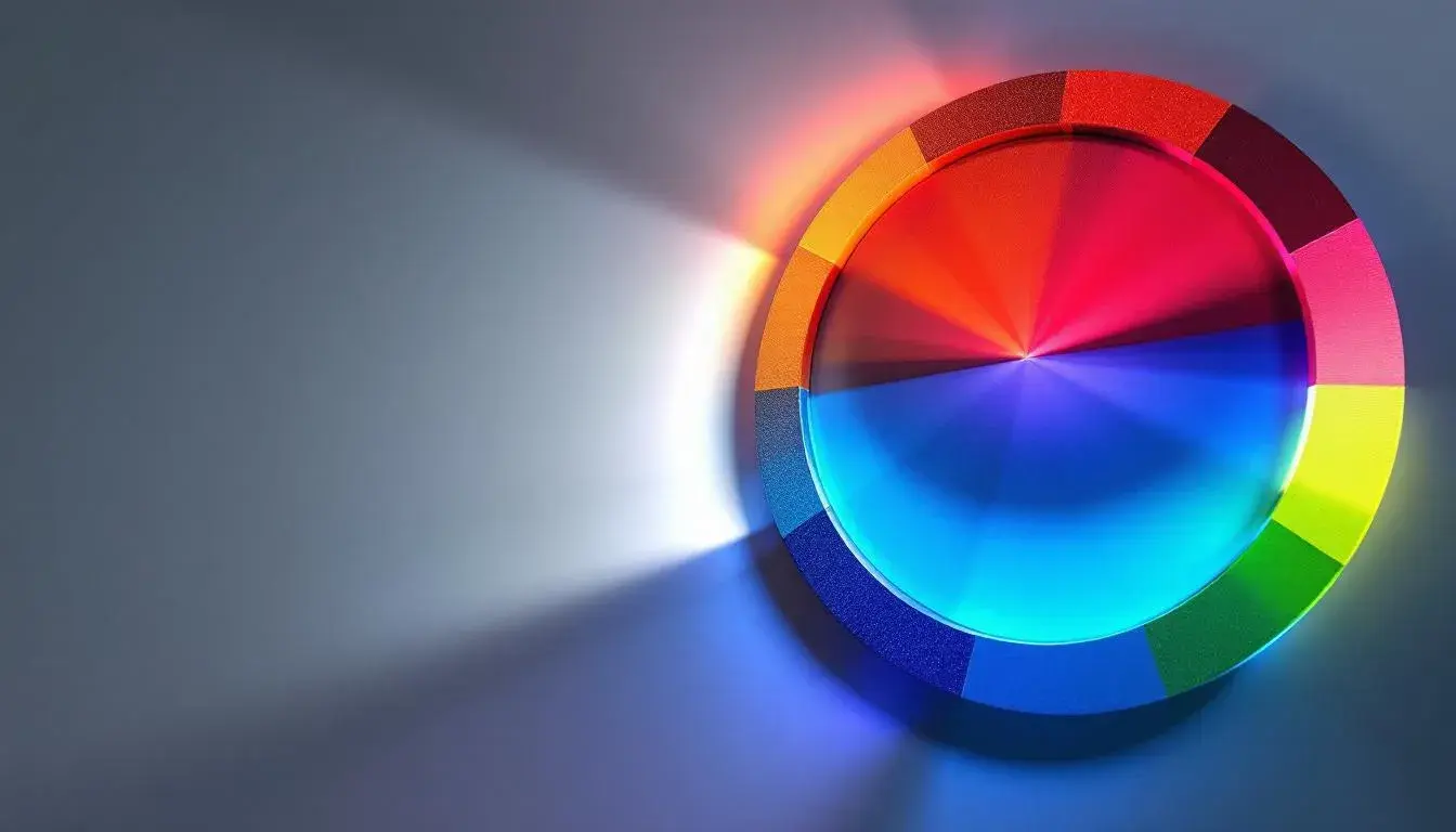
18 Jul 2025 · 5 min readColor is more than decoration; It is a fundamental language. Each carefully chosen hue and tone whispers stories, evokes emotion, and shapes perception. A spectrum, carefully assembled, builds immediate and powerful ties to memory and feeling. We navigate the world through contrast, the interplay of light and shadow informing depth, form, and legibility. Therefore, the challenge isn't simply about pretty colours, but asking what it takes to cut through the noise. Which hues shout the loudest, where do softer shades sing the sweetest, and when do discords create the most memorable impact? The answers are nuanced, shifting with each project like tides ebbing, pulling, and changing the shorelines of visual communication. A website promoting cutting-edge healthcare demands something distinct from marketing campaign for the latest travel hotspots. The right choices can ensure clarity and memorability, and the wrong ones can bury potentially brilliant visual concepts. We look to the world, both analog and pixelated, for insight where high contrast is most effective.
The Clean Tech palette whispers of sterile spaces and innovative solutions. Very Light Gray establishes a foundation of pristine clarity, the visual silence necessary for complex information to resonate. Steel Blue then emerges, suggesting scientific precision and the coolness of advanced technology. Light Blue Gray and Medium Gray deepen the visual plane, introducing quiet complexity without detracting from the overall cleanliness. Finally, Dark Gray anchors the composition, reminiscent of the fine print or essential data points – dependable and authoritative. This palette communicates trustworthiness. It speaks of labs and clinics, of controlled environments where accuracy cannot be compromised. Imagine a medical app interface where Steel Blue highlights key indicators against a Very Light Gray background. Or consider a brochure promoting sustainable energy, leveraging the palette to project both transparency and cutting-edge ingenuity. Its impact lies not in visual drama, but in its calculated understatement. It ensures vital content stands out with muted assurance. This balance is crucial in fields where clarity directly affects decision-making.
Azure Calm evokes a sense of spaciousness and confident ease. Light Lavender imparts a gentle touch, a foundation of subtle sophistication. Pale Yellow and Golden Khaki provide a whisper of warmth, suggesting stability and trust. The presence of Light Sky Blue brings a boundless horizon. The Cool Gray is a grounding element, like a smooth stone on a sandy beach. Vivid Azure and Steel Blue inject bursts of brilliance, mirroring the clarity of a cloudless sky reflected. Deep Charcoal and Deep Indigo add gravitas, offering a sense of depth. It leans towards an image of financial technology startup seeking connection and approachability blended with an air of digital innovation. Imagine a branding campaign for a company providing software solutions; The Light Lavender and Vivid Azure could be used to create an inviting website interface. Or, envision these shades incorporated a marketing presentation, projecting a mixture of optimism and calculated strategy. The success of this palette relies on its ability to communicate reliability without sacrificing a sense of open innovation.
Vibrant Contrast explodes with unrestrained energy; it's a joyous cacophony of color calculated to capture attention. Pure White acts as a stage upon which the other hues can dance. Vibrant Yellow offers a jolt of optimism. Aqua Turquoise beckons forth, cool and fresh. Light Lavender contributes to the playful, almost whimsical quality. Bright Pink electrifies the sensory experience. Dusty Rose and Dark Plum add a degree of sophistication, while Bright Red injects danger and passion. Deep Indigo, anchors the composition, preventing it from floating away on a cloud of cotton candy. Pitch Black gives definition. Its impact is immediate and unmissable. This palette feels at home on a website design for a fashion brand targeting a young, bold demographic – perhaps balanced by a more mature design to keep the contrasts visually appealing, or in the branding for an extravagant event. The challenge with a scheme so assertive lies in maintaining control and preventing sensory overload. It should be strategically deployed to highlight a key point or infuse a promotional campaign, adding a sense of unforgettable boldness rather than creating discord.
Zepbound Palette whispers of understated confidence and considered precision. Mint Cream provides a clean, airy foundation. Dusty Gray conveys a sense of reliability and dependability, echoing the seriousness of the healthcare world. Deeper tones in the form of Muted Green and Dark Olive evoke ideas of earth, life, and health, whilst Brick Red may symbolize blood; a sign of life. It's likely to be best applied to designs in the medical or pharmaceutical industries, especially in professional contexts like offices or waiting rooms. Consider a website for a new medicine. The overall visual impact should be calm and reassuring, yet sophisticated enough to inspire trust in the product's effectiveness. Imagine the same color story translated a series of marketing materials; their message would also be one of measured assurance rather than overblown promises. The power of this scheme relies on its ability to communicate integrity and create a sense of calm in situations that are often fraught with anxiousness.
Avianca Palette balances the call of adventure with grounded sophistication. Pale Blue suggests vast skies and boundless possibility, evoking the wonder of travel. Khaki Green hints at explorations of landscapes. Deep Teal adds depth and a sense of established reliability. Dark Taupe further grounds the composition in reality. The presence of Vivid Red, however, offers a flash of excitement, a symbol of daring flights into the unknown. The overall visual narrative feels sophisticated and confident. Envision an aviation company building an image as a world-class luxury service; they'd use this palette to signal both adventure and prestige, as well as modernity. A marketing campaign, perhaps, would balance the promise of carefree exploration and unwavering safety of travel. The success relies on the relationship between the promise of freedom and the peace of mind that will assuage any doubts.
Vibrant Spectrum radiates a sense of thoughtful optimism. Taupe Gray lends an air of sophistication. Light Blue Gray feels light and carefree. Emerald Green evokes a sense of vitality and growth, while Pale Violet hints at creativity. Dark Slate Gray establishes a subtle foundation, a sense of dependability. This collection leans towards a tech company's branding or advertising to position a product to be as both innovative and approachable. Envision how a website for a social media platform might incorporate these shades to project a sense of connection. Carefully consider a series of advertisements to emphasize user experience. While each color alone may appear simple, together they'll tell a story of technology and innovation.
Farm Fresh conjures up a sense of sun-drenched fields and artisanal craftsmanship. Light Almond whispers of rustic charm and homespun goodness. Neutral Silver hints at the polished simplicity of well-made tools, while Olive Drab anchors the palette in the earthy tones. Crimson Red suggests the ripeness of the harvest season, the abundance of nature's gifts, while Black Olive evokes the rich soil. The overall effect is one of quiet dignity. Imagine a food brand building its presence on the values of quality and tradition. Perhaps it's for a restaurant priding itself on dishes made with organic and local vegetables. A website would be filled with images from a quaint village far from the city. Each color conveys a message. Farm Fresh is where earth meets refinement.
These palettes unveil a striking truth: contrast isn't merely tonal, it is experiential. Each collection carries its own carefully weighted intent, its own set of unspoken rules. From the stark clarity of science to the boisterous energy of entertainment; the high-contrast can be both literal and figurative, a meeting of sensibilities as much as an interplay of light. The impact of each palette becomes clear: contrast isn't a universal constant, but rather a flexible tool fine-tuned to resonate with the soul of project. The more sensitive we are to these needs, the more beautifully we empower our communications.