'%3e%3cpath%20fill-rule='evenodd'%20clip-rule='evenodd'%20d='M51.1303%2019.2492C50.7278%2019.913%2050.1346%2020.4426%2049.3508%2020.838C48.5669%2021.2335%2047.6172%2021.4312%2046.5014%2021.4312C44.8208%2021.4312%2043.4367%2021.0216%2042.3492%2020.2025C41.2617%2019.3833%2040.6686%2018.2394%2040.5697%2016.7706H44.4253C44.4818%2017.3355%2044.6831%2017.7804%2045.0291%2018.1052C45.3751%2018.43%2045.8164%2018.5924%2046.3531%2018.5924C46.8192%2018.5924%2047.1864%2018.4653%2047.4547%2018.2111C47.7231%2017.9569%2047.8572%2017.618%2047.8572%2017.1943C47.8572%2016.8129%2047.7337%2016.4952%2047.4865%2016.241C47.2393%2015.9867%2046.9322%2015.7784%2046.565%2015.616C46.1978%2015.4536%2045.6893%2015.2594%2045.0397%2015.0334C44.0934%2014.7086%2043.3202%2014.3944%2042.72%2014.0907C42.1197%2013.7871%2041.6042%2013.3351%2041.1735%2012.7349C40.7427%2012.1347%2040.5273%2011.3544%2040.5273%2010.394C40.5273%209.50418%2040.7533%208.73448%2041.2053%208.08481C41.6572%207.43515%2042.2821%206.93731%2043.0801%206.5913C43.8781%206.24528%2044.7925%206.07227%2045.8235%206.07227C47.49%206.07227%2048.8141%206.46771%2049.7956%207.25861C50.7772%208.04951%2051.3315%209.13698%2051.4586%2010.5211H47.5395C47.4689%2010.0268%2047.2888%209.63483%2046.9993%209.3453C46.7097%209.05578%2046.3178%208.91102%2045.8235%208.91102C45.3998%208.91102%2045.0573%209.024%2044.7961%209.24997C44.5348%209.47594%2044.4041%209.80783%2044.4041%2010.2457C44.4041%2010.5988%2044.5207%2010.8989%2044.7537%2011.146C44.9867%2011.3932%2045.2798%2011.5944%2045.6328%2011.7498C45.9859%2011.9052%2046.4944%2012.1029%2047.1581%2012.343C48.1185%2012.6678%2048.9023%2012.9891%2049.5096%2013.3069C50.1169%2013.6246%2050.6395%2014.0872%2051.0773%2014.6945C51.5151%2015.3018%2051.734%2016.0927%2051.734%2017.0672C51.734%2017.8581%2051.5328%2018.5854%2051.1303%2019.2492ZM59.0242%206.3053V21.2829H55.4016V6.3053H59.0242ZM73.9409%206.3053V9.18642H69.8734V21.2829H66.2296V9.18642H62.2046V6.3053H73.9409ZM80.7438%209.18642V12.3218H85.8069V15.0546H80.7438V18.3806H86.4425V21.2829H77.1212V6.3053H86.4425V9.18642H80.7438ZM99.667%2016.0291V21.2829H96.0444V6.3053H101.913C103.692%206.3053%20105.048%206.74665%20105.98%207.62934C106.912%208.51204%20107.378%209.7019%20107.378%2011.199C107.378%2012.1311%20107.17%2012.9609%20106.753%2013.6882C106.337%2014.4155%20105.719%2014.9875%20104.9%2015.4042C104.08%2015.8208%20103.085%2016.0291%20101.913%2016.0291H99.667ZM103.692%2011.199C103.692%209.8855%20102.965%209.22879%20101.51%209.22879H99.667V13.1268H101.51C102.965%2013.1268%20103.692%2012.4842%20103.692%2011.199ZM120.092%2018.5501H114.478L113.546%2021.2829H109.732L115.219%206.41123H119.393L124.879%2021.2829H121.024L120.092%2018.5501ZM119.16%2015.7961L117.295%2010.2881L115.41%2015.7961H119.16ZM131.555%2018.5077H136.385V21.2829H127.933V6.3053H131.555V18.5077ZM143.337%209.18642V12.3218H148.4V15.0546H143.337V18.3806H149.035V21.2829H139.714V6.3053H149.035V9.18642H143.337ZM163.507%206.3053V9.18642H159.44V21.2829H155.796V9.18642H151.771V6.3053H163.507ZM177.449%206.3053V9.18642H173.382V21.2829H169.738V9.18642H165.713V6.3053H177.449ZM184.252%209.18642V12.3218H189.315V15.0546H184.252V18.3806H189.951V21.2829H180.629V6.3053H189.951V9.18642H184.252Z'%20fill='%23EEF0ED'/%3e%3cmask%20id='mask0_3101_7327'%20style='mask-type:alpha'%20maskUnits='userSpaceOnUse'%20x='0'%20y='0'%20width='27'%20height='28'%3e%3cpath%20d='M23.8328%200.759766H2.64808C1.18559%200.759766%200%201.94535%200%203.40785V24.5925C0%2026.055%201.18559%2027.2406%202.64808%2027.2406H23.8328C25.2952%2027.2406%2026.4808%2026.055%2026.4808%2024.5925V3.40785C26.4808%201.94535%2025.2952%200.759766%2023.8328%200.759766Z'%20fill='white'/%3e%3c/mask%3e%3cg%20mask='url(%23mask0_3101_7327)'%3e%3cpath%20d='M23.8328%200.759766H2.64808C1.18559%200.759766%200%201.94535%200%203.40785V24.5925C0%2026.055%201.18559%2027.2406%202.64808%2027.2406H23.8328C25.2952%2027.2406%2026.4808%2026.055%2026.4808%2024.5925V3.40785C26.4808%201.94535%2025.2952%200.759766%2023.8328%200.759766Z'%20fill='%23D8D8D8'/%3e%3cpath%20d='M13.2404%200.759766H0V14.0001H13.2404V0.759766Z'%20fill='%238C61FF'/%3e%3cpath%20d='M13.2404%2014H0V27.2404H13.2404V14Z'%20fill='%2336C3FE'/%3e%3cpath%20d='M26.4806%2014H13.2402V27.2404H26.4806V14Z'%20fill='%236592FE'/%3e%3cpath%20d='M26.4806%200.759766H13.2402V14.0002H26.4806V0.759766Z'%20fill='%236059F7'/%3e%3c/g%3e%3c/g%3e%3cdefs%3e%3cclipPath%20id='clip0_3101_7327'%3e%3crect%20width='190'%20height='28'%20fill='white'/%3e%3c/clipPath%3e%3c/defs%3e%3c/svg%3e)
'%3e%3cpath%20d='M23.8328%200.759521H2.64808C1.18559%200.759521%200%201.94511%200%203.40761V24.5923C0%2026.0548%201.18559%2027.2404%202.64808%2027.2404H23.8328C25.2952%2027.2404%2026.4808%2026.0548%2026.4808%2024.5923V3.40761C26.4808%201.94511%2025.2952%200.759521%2023.8328%200.759521Z'%20fill='%23D8D8D8'/%3e%3cpath%20d='M13.2404%200.759521H0V13.9999H13.2404V0.759521Z'%20fill='%238C61FF'/%3e%3cpath%20d='M13.2404%2013.9998H0V27.2402H13.2404V13.9998Z'%20fill='%2336C3FE'/%3e%3cpath%20d='M26.4809%2013.9998H13.2405V27.2402H26.4809V13.9998Z'%20fill='%236592FE'/%3e%3cpath%20d='M26.4809%200.759277H13.2405V13.9997H26.4809V0.759277Z'%20fill='%236059F7'/%3e%3c/g%3e%3c/svg%3e)
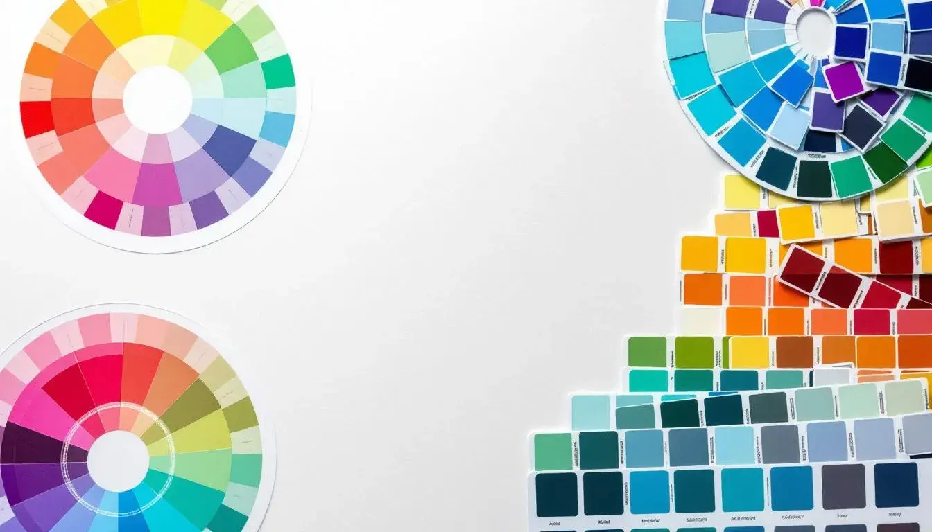
Analogous & Triadic Schemes: A Head-to-Head Comparison
18 Jul 2025 · 3 min readColor is more than meets the eye, isn't it? It ripples outwards, tugging at feelings we often can't name. A room painted the wrong shade can sour a mood, a website with clashing colours can repel at first glance. Color dictates taste and understanding. When a skilled eye orchestrates a palette, a symphony begins. Some prefer the comfort of harmony, colors whispering similar notes in a peaceful chord. Others crave the electric tension of contrast, hues colliding in a vibrant dance. The palettes here show how these two different approaches—the analogous and triadic—can inform a feeling, drive an aesthetic, shape the very air we breathe. They remind us that thoughtfully chosen colours are more than decoration; they orchestrate our experiences.
The Botanical Rebrand palette is a breath of fresh air, an early spring morning captured in pigment. Creamy White softens the edges, paving the way for Bright Lime Green to explode with youthful energy. Light Peach provides a counterpoint, like the sun filtering through leaves, warming the scene. The Muted Lavender is an unexpected guest, a reminder that even in the most vibrant garden, shadows play their part. The Dusty Olive Green and Dark Moss Green ground the palette, connecting it to earth, growth, and the quiet persistence of nature. Vibrant Coral and Deep Crimson introduce a daring element—the sudden flash of a hummingbird’s wing, the fiery heart of a flower. This palette feels alive, teeming with possibility. Its analogous and triadic schemes do not jar but rather enhance the natural rhythm, mimicking the way sunlight catches on foliage. One imagines it gracing a website for a sustainably-minded company, its colours whispering of responsibility and renewal. Or perhaps painting the walls of a sun-drenched office, where ideas blossom as freely as the imaginary blooms it conjures. The careful balance of colours within this palette makes it especially engaging. Dark and light, bold and subtle, they all work together in harmony.
Ethereal Harmony whispers a dream of serenity. Creamy White sets a calm foundation, while Sage Green introduces a gentle, grounding presence. Tangerine Orange glows softly, like the last light of sunset painting the sky, offering a warm touch without overwhelming. Soft Lavender Blue floats into focus like mist, suggesting restfulness and peace. The Teal Green extends a rich depth, reminiscent of cool springs, whileRustic Brown anchors the palette with grounding and a connection to the natural world. But it is the Deep Indigo that steals the show, adding an touch of the unexpected. The overall effect is calming, a refuge from the noise of the everyday. It mirrors that moment before sleep, when thoughts begin to soften, and the world fades into a watercolor wash of color. The combination of analogous and triadic schemes within this palette fosters balance. You can almost feel the softness in the colours. The palette suggests a sanctuary: a bedroom bathed in gentle light, a website dedicated to wellness. Consider a space designed with such a palette: uncluttered, peaceful, a space where the mind can wander.
Vibrant Fusion, in contrast, ignites a different kind of feeling. Off White sets the stage, but its role is merely to allow the other colours to shine more brightly. Lavender Gray offers a muted counterbalance, like a whisper of calm amidst the excitement. Neutral Beige adds a foundational moment. The Rustic Red pulses with raw energy, a spark of rebellion. Dark Espresso is the grounding force, tethering the palette back to sophistication even in moments of boldness. The palette is a study in controlled chaos, balancing a modern sensibility with a bohemian free spirit. The Analogous and Triadic color mixes add to the palette's interest. One feels the excitement of a creative studio, a space where ideas are encouraged to collide and merge. Or perhaps on a fashion label's website, where daring designs challenge the status quo.
The Playful Palette feels reminiscent of childhood memories: light, joyful, and uncomplicated. Light Gray and Slate Gray ground the palette, offering a versatile backdrop. Olive Khaki is the color of well-worn toys, carrying the spirit of nostalgic moments. Brick Red provides a cheerful and grounded visual, while Dark Charcoal acts as a subtle anchor, preventing the palette from floating away. It’s the palette of everyday joy, reminding us to find beauty in the mundane. With an equal play on analogous and triadic harmony, it can be applied to a child’s bedroom, fostering a sense of comfortable safety. Perhaps it serves branding for a company in the creative arts, where simplicity and authenticity are prized.
Faithful Palette carries a sense of heritage and reliability. Pale White forms a base with trust and hope, while Silver Gray adds maturity. Olive Drab indicates respect and devotion. Crimson Red gives passion and tradition, but it's the Deep Brown that truly solidifies the sentiment. Its presence communicates a sense of grounding, resilience, and unwavering commitment. The balanced warmth and coolness makes the palette feel enduring and adaptable. Its combination of triadic and analogous schemes doesn't overwhelm the eye, but rather makes for a sense of comfort. A library, a study, a place where contemplation takes precedence, comes to mind. Or perhaps the brand colors of an educational institute, where tradition and stability are key values.
Between the five palettes, Analogous and Triadic color schemes appeared with equal frequency. This means that neither scheme is technically more "preferred".
The journey through these diverse palettes reveals the power of colour choices. Botanical Rebrand bursts forth with the untamed energy of nature’s reawakening, while Ethereal Harmony soothes us with its dreamlike calm. Vibrant Fusion excites the spirit of creativity, just as Playful Palette invites fond reflection. Faithful Palette anchors us in stability and tradition. Each palette utilizes the principles of analogous and triadic color relationships to create a powerful atmosphere, proving that thoughtful application can turn simple color combinations into profound aesthetic statements, each suggesting a different path, a different experience, a different way of seeing the world.