'%3e%3cpath%20fill-rule='evenodd'%20clip-rule='evenodd'%20d='M51.1303%2019.2492C50.7278%2019.913%2050.1346%2020.4426%2049.3508%2020.838C48.5669%2021.2335%2047.6172%2021.4312%2046.5014%2021.4312C44.8208%2021.4312%2043.4367%2021.0216%2042.3492%2020.2025C41.2617%2019.3833%2040.6686%2018.2394%2040.5697%2016.7706H44.4253C44.4818%2017.3355%2044.6831%2017.7804%2045.0291%2018.1052C45.3751%2018.43%2045.8164%2018.5924%2046.3531%2018.5924C46.8192%2018.5924%2047.1864%2018.4653%2047.4547%2018.2111C47.7231%2017.9569%2047.8572%2017.618%2047.8572%2017.1943C47.8572%2016.8129%2047.7337%2016.4952%2047.4865%2016.241C47.2393%2015.9867%2046.9322%2015.7784%2046.565%2015.616C46.1978%2015.4536%2045.6893%2015.2594%2045.0397%2015.0334C44.0934%2014.7086%2043.3202%2014.3944%2042.72%2014.0907C42.1197%2013.7871%2041.6042%2013.3351%2041.1735%2012.7349C40.7427%2012.1347%2040.5273%2011.3544%2040.5273%2010.394C40.5273%209.50418%2040.7533%208.73448%2041.2053%208.08481C41.6572%207.43515%2042.2821%206.93731%2043.0801%206.5913C43.8781%206.24528%2044.7925%206.07227%2045.8235%206.07227C47.49%206.07227%2048.8141%206.46771%2049.7956%207.25861C50.7772%208.04951%2051.3315%209.13698%2051.4586%2010.5211H47.5395C47.4689%2010.0268%2047.2888%209.63483%2046.9993%209.3453C46.7097%209.05578%2046.3178%208.91102%2045.8235%208.91102C45.3998%208.91102%2045.0573%209.024%2044.7961%209.24997C44.5348%209.47594%2044.4041%209.80783%2044.4041%2010.2457C44.4041%2010.5988%2044.5207%2010.8989%2044.7537%2011.146C44.9867%2011.3932%2045.2798%2011.5944%2045.6328%2011.7498C45.9859%2011.9052%2046.4944%2012.1029%2047.1581%2012.343C48.1185%2012.6678%2048.9023%2012.9891%2049.5096%2013.3069C50.1169%2013.6246%2050.6395%2014.0872%2051.0773%2014.6945C51.5151%2015.3018%2051.734%2016.0927%2051.734%2017.0672C51.734%2017.8581%2051.5328%2018.5854%2051.1303%2019.2492ZM59.0242%206.3053V21.2829H55.4016V6.3053H59.0242ZM73.9409%206.3053V9.18642H69.8734V21.2829H66.2296V9.18642H62.2046V6.3053H73.9409ZM80.7438%209.18642V12.3218H85.8069V15.0546H80.7438V18.3806H86.4425V21.2829H77.1212V6.3053H86.4425V9.18642H80.7438ZM99.667%2016.0291V21.2829H96.0444V6.3053H101.913C103.692%206.3053%20105.048%206.74665%20105.98%207.62934C106.912%208.51204%20107.378%209.7019%20107.378%2011.199C107.378%2012.1311%20107.17%2012.9609%20106.753%2013.6882C106.337%2014.4155%20105.719%2014.9875%20104.9%2015.4042C104.08%2015.8208%20103.085%2016.0291%20101.913%2016.0291H99.667ZM103.692%2011.199C103.692%209.8855%20102.965%209.22879%20101.51%209.22879H99.667V13.1268H101.51C102.965%2013.1268%20103.692%2012.4842%20103.692%2011.199ZM120.092%2018.5501H114.478L113.546%2021.2829H109.732L115.219%206.41123H119.393L124.879%2021.2829H121.024L120.092%2018.5501ZM119.16%2015.7961L117.295%2010.2881L115.41%2015.7961H119.16ZM131.555%2018.5077H136.385V21.2829H127.933V6.3053H131.555V18.5077ZM143.337%209.18642V12.3218H148.4V15.0546H143.337V18.3806H149.035V21.2829H139.714V6.3053H149.035V9.18642H143.337ZM163.507%206.3053V9.18642H159.44V21.2829H155.796V9.18642H151.771V6.3053H163.507ZM177.449%206.3053V9.18642H173.382V21.2829H169.738V9.18642H165.713V6.3053H177.449ZM184.252%209.18642V12.3218H189.315V15.0546H184.252V18.3806H189.951V21.2829H180.629V6.3053H189.951V9.18642H184.252Z'%20fill='%23EEF0ED'/%3e%3cmask%20id='mask0_3101_7327'%20style='mask-type:alpha'%20maskUnits='userSpaceOnUse'%20x='0'%20y='0'%20width='27'%20height='28'%3e%3cpath%20d='M23.8328%200.759766H2.64808C1.18559%200.759766%200%201.94535%200%203.40785V24.5925C0%2026.055%201.18559%2027.2406%202.64808%2027.2406H23.8328C25.2952%2027.2406%2026.4808%2026.055%2026.4808%2024.5925V3.40785C26.4808%201.94535%2025.2952%200.759766%2023.8328%200.759766Z'%20fill='white'/%3e%3c/mask%3e%3cg%20mask='url(%23mask0_3101_7327)'%3e%3cpath%20d='M23.8328%200.759766H2.64808C1.18559%200.759766%200%201.94535%200%203.40785V24.5925C0%2026.055%201.18559%2027.2406%202.64808%2027.2406H23.8328C25.2952%2027.2406%2026.4808%2026.055%2026.4808%2024.5925V3.40785C26.4808%201.94535%2025.2952%200.759766%2023.8328%200.759766Z'%20fill='%23D8D8D8'/%3e%3cpath%20d='M13.2404%200.759766H0V14.0001H13.2404V0.759766Z'%20fill='%238C61FF'/%3e%3cpath%20d='M13.2404%2014H0V27.2404H13.2404V14Z'%20fill='%2336C3FE'/%3e%3cpath%20d='M26.4806%2014H13.2402V27.2404H26.4806V14Z'%20fill='%236592FE'/%3e%3cpath%20d='M26.4806%200.759766H13.2402V14.0002H26.4806V0.759766Z'%20fill='%236059F7'/%3e%3c/g%3e%3c/g%3e%3cdefs%3e%3cclipPath%20id='clip0_3101_7327'%3e%3crect%20width='190'%20height='28'%20fill='white'/%3e%3c/clipPath%3e%3c/defs%3e%3c/svg%3e)
'%3e%3cpath%20d='M23.8328%200.759521H2.64808C1.18559%200.759521%200%201.94511%200%203.40761V24.5923C0%2026.0548%201.18559%2027.2404%202.64808%2027.2404H23.8328C25.2952%2027.2404%2026.4808%2026.0548%2026.4808%2024.5923V3.40761C26.4808%201.94511%2025.2952%200.759521%2023.8328%200.759521Z'%20fill='%23D8D8D8'/%3e%3cpath%20d='M13.2404%200.759521H0V13.9999H13.2404V0.759521Z'%20fill='%238C61FF'/%3e%3cpath%20d='M13.2404%2013.9998H0V27.2402H13.2404V13.9998Z'%20fill='%2336C3FE'/%3e%3cpath%20d='M26.4809%2013.9998H13.2405V27.2402H26.4809V13.9998Z'%20fill='%236592FE'/%3e%3cpath%20d='M26.4809%200.759277H13.2405V13.9997H26.4809V0.759277Z'%20fill='%236059F7'/%3e%3c/g%3e%3c/svg%3e)
Unlocking Color Symbolism: What's Driving Black's Enduring Popularity? 🔮
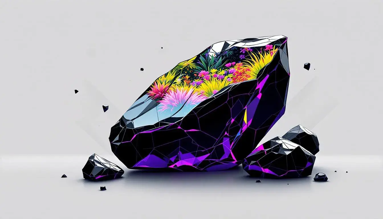
16 Jul 2025 · 3 min readBlack, in its profound absence of light, exerts a strange power. It’s the velvet curtain of night, the stark silhouette against dawn, the unwavering gaze of a predator. Not merely a color, it's a statement, a void pregnant with possibility. Consider the sleek, impenetrable obsidian—a natural glass forged in volcanic fire. It suggests impenetrable strength, a silent authority. Black conceals, it refines, and it projects an aura of sophistication that few other shades can achieve. From Coco Chanel's little black dress to the stark minimalism of modern architecture, its appeal transcends trends. It’s the color of rebellion, of artists, of quiet confidence. But what is it about this seemingly simple shade that continues to captivate? Let's consider a selection of palettes, each casting a different light on black’s persistent allure.
The "Conncat Colors" palette 🎨 presents black, here called Onyx Black, amidst a riot of life: the tender shoots of Chartreuse Green, the sturdy trunk of Forest Green, the blushing blossom of Vibrant Vermilion, the delicate Periwinkle Blue. Deep Sapphire and Indigo Depth provide a somber counterpoint to Pure White and Silver Gray. In this context, Onyx Black serves not as a symbol of mourning or fear, but as an anchor, a grounding force against the exuberance around it. It offers a moment of quiet contemplation, a space for the eye to rest before being drawn back into the effervescence. It suggests the hidden strengths found within calm and energ, a reminder that the most captivating stories often have moments of stillness. This palette highlights black’s capability to add seriousness and to ensure that even the most vivacious compositions maintain a sense of gravitas. Imagine a lush garden, the vibrant blooms all the more striking against the dark, fertile soil. Here, Onyx Black takes on a role of a strong foundation offering creative expression. This palette, suggesting the transition from Spring to Autumn, reveals the potential of black to act as a bridge between contrasting elements, providing depth and complexity to even the most clean and modern aesthetics.
The "Modern Contrast" palette 🎨 offers a dramatically different interpretation. The interplay of Bright Red and Light Blue with Slate Gray and Midnight Blue surrounds black—or rather, Charcoal—with a sense of edgy sophistication, but dynamism is present. It’s a palette built on tension, on the razor's edge between control and chaos. Charcoal, in its deep neutrality, acts as the perfect canvas for these contrasting elements. It elevates the Bright Red, making it appear more intentional and less impulsive. The Light Blue, against the near-black, gains an ethereal quality. With varied saturation the palette is modern and versatile. This combination suits branding projects in technological fields. The absence of color in Charcoal allows other vibrant colors a role to catch the observer's eye and provoke attention. This balance is evident in interior spaces that embrace this palette. The strong contrast is also useful in web design that is meant to catch the eye. As all seasons, it represents a style suitable for any formal occasion
"Swarm Colors" 🎨 places Dark Charcoal at the heart of a futuristic vision. Envision a drone taking flight, its dark form disappearing against a twilit sky; or the inky depths of a digital interface, punctuated by flashes of Electric Violet. Against the Cool Gray and Olive Taupe and the whisper of Light Lavender, Dark Charcoal feels less about austerity and more about potential. Here, black is less a solid block and more a field of infinite possibilities. It’s the darkness from which innovation springs, the quiet hum of circuits waiting to be activated, the space where new forms and functions can evolve. The overall effect is creative and modern, hinting at tech launches where the future is not something to be feared, but a landscape ready to be explored in websites and apps. The style is of course futuristic and most suited to the winter season.
Across these palettes, the symbolism of black reveals itself to be multifaceted. It’s not about a single meaning, but the power to shape and influence a range of moods and interpretations. From the energetic grounding of "Conncat Colors" to the edgy complexity of "Modern Contrast", and to the futuristic quietness of "Swarm Colors," black persists as a cornerstone of visual language, able to suggest the endless possibilities of the void, and provide depth of understanding. And with each new application, its enduring power will only be enhanced.