'%3e%3cpath%20fill-rule='evenodd'%20clip-rule='evenodd'%20d='M51.1303%2019.2492C50.7278%2019.913%2050.1346%2020.4426%2049.3508%2020.838C48.5669%2021.2335%2047.6172%2021.4312%2046.5014%2021.4312C44.8208%2021.4312%2043.4367%2021.0216%2042.3492%2020.2025C41.2617%2019.3833%2040.6686%2018.2394%2040.5697%2016.7706H44.4253C44.4818%2017.3355%2044.6831%2017.7804%2045.0291%2018.1052C45.3751%2018.43%2045.8164%2018.5924%2046.3531%2018.5924C46.8192%2018.5924%2047.1864%2018.4653%2047.4547%2018.2111C47.7231%2017.9569%2047.8572%2017.618%2047.8572%2017.1943C47.8572%2016.8129%2047.7337%2016.4952%2047.4865%2016.241C47.2393%2015.9867%2046.9322%2015.7784%2046.565%2015.616C46.1978%2015.4536%2045.6893%2015.2594%2045.0397%2015.0334C44.0934%2014.7086%2043.3202%2014.3944%2042.72%2014.0907C42.1197%2013.7871%2041.6042%2013.3351%2041.1735%2012.7349C40.7427%2012.1347%2040.5273%2011.3544%2040.5273%2010.394C40.5273%209.50418%2040.7533%208.73448%2041.2053%208.08481C41.6572%207.43515%2042.2821%206.93731%2043.0801%206.5913C43.8781%206.24528%2044.7925%206.07227%2045.8235%206.07227C47.49%206.07227%2048.8141%206.46771%2049.7956%207.25861C50.7772%208.04951%2051.3315%209.13698%2051.4586%2010.5211H47.5395C47.4689%2010.0268%2047.2888%209.63483%2046.9993%209.3453C46.7097%209.05578%2046.3178%208.91102%2045.8235%208.91102C45.3998%208.91102%2045.0573%209.024%2044.7961%209.24997C44.5348%209.47594%2044.4041%209.80783%2044.4041%2010.2457C44.4041%2010.5988%2044.5207%2010.8989%2044.7537%2011.146C44.9867%2011.3932%2045.2798%2011.5944%2045.6328%2011.7498C45.9859%2011.9052%2046.4944%2012.1029%2047.1581%2012.343C48.1185%2012.6678%2048.9023%2012.9891%2049.5096%2013.3069C50.1169%2013.6246%2050.6395%2014.0872%2051.0773%2014.6945C51.5151%2015.3018%2051.734%2016.0927%2051.734%2017.0672C51.734%2017.8581%2051.5328%2018.5854%2051.1303%2019.2492ZM59.0242%206.3053V21.2829H55.4016V6.3053H59.0242ZM73.9409%206.3053V9.18642H69.8734V21.2829H66.2296V9.18642H62.2046V6.3053H73.9409ZM80.7438%209.18642V12.3218H85.8069V15.0546H80.7438V18.3806H86.4425V21.2829H77.1212V6.3053H86.4425V9.18642H80.7438ZM99.667%2016.0291V21.2829H96.0444V6.3053H101.913C103.692%206.3053%20105.048%206.74665%20105.98%207.62934C106.912%208.51204%20107.378%209.7019%20107.378%2011.199C107.378%2012.1311%20107.17%2012.9609%20106.753%2013.6882C106.337%2014.4155%20105.719%2014.9875%20104.9%2015.4042C104.08%2015.8208%20103.085%2016.0291%20101.913%2016.0291H99.667ZM103.692%2011.199C103.692%209.8855%20102.965%209.22879%20101.51%209.22879H99.667V13.1268H101.51C102.965%2013.1268%20103.692%2012.4842%20103.692%2011.199ZM120.092%2018.5501H114.478L113.546%2021.2829H109.732L115.219%206.41123H119.393L124.879%2021.2829H121.024L120.092%2018.5501ZM119.16%2015.7961L117.295%2010.2881L115.41%2015.7961H119.16ZM131.555%2018.5077H136.385V21.2829H127.933V6.3053H131.555V18.5077ZM143.337%209.18642V12.3218H148.4V15.0546H143.337V18.3806H149.035V21.2829H139.714V6.3053H149.035V9.18642H143.337ZM163.507%206.3053V9.18642H159.44V21.2829H155.796V9.18642H151.771V6.3053H163.507ZM177.449%206.3053V9.18642H173.382V21.2829H169.738V9.18642H165.713V6.3053H177.449ZM184.252%209.18642V12.3218H189.315V15.0546H184.252V18.3806H189.951V21.2829H180.629V6.3053H189.951V9.18642H184.252Z'%20fill='%23EEF0ED'/%3e%3cmask%20id='mask0_3101_7327'%20style='mask-type:alpha'%20maskUnits='userSpaceOnUse'%20x='0'%20y='0'%20width='27'%20height='28'%3e%3cpath%20d='M23.8328%200.759766H2.64808C1.18559%200.759766%200%201.94535%200%203.40785V24.5925C0%2026.055%201.18559%2027.2406%202.64808%2027.2406H23.8328C25.2952%2027.2406%2026.4808%2026.055%2026.4808%2024.5925V3.40785C26.4808%201.94535%2025.2952%200.759766%2023.8328%200.759766Z'%20fill='white'/%3e%3c/mask%3e%3cg%20mask='url(%23mask0_3101_7327)'%3e%3cpath%20d='M23.8328%200.759766H2.64808C1.18559%200.759766%200%201.94535%200%203.40785V24.5925C0%2026.055%201.18559%2027.2406%202.64808%2027.2406H23.8328C25.2952%2027.2406%2026.4808%2026.055%2026.4808%2024.5925V3.40785C26.4808%201.94535%2025.2952%200.759766%2023.8328%200.759766Z'%20fill='%23D8D8D8'/%3e%3cpath%20d='M13.2404%200.759766H0V14.0001H13.2404V0.759766Z'%20fill='%238C61FF'/%3e%3cpath%20d='M13.2404%2014H0V27.2404H13.2404V14Z'%20fill='%2336C3FE'/%3e%3cpath%20d='M26.4806%2014H13.2402V27.2404H26.4806V14Z'%20fill='%236592FE'/%3e%3cpath%20d='M26.4806%200.759766H13.2402V14.0002H26.4806V0.759766Z'%20fill='%236059F7'/%3e%3c/g%3e%3c/g%3e%3cdefs%3e%3cclipPath%20id='clip0_3101_7327'%3e%3crect%20width='190'%20height='28'%20fill='white'/%3e%3c/clipPath%3e%3c/defs%3e%3c/svg%3e)
'%3e%3cpath%20d='M23.8328%200.759521H2.64808C1.18559%200.759521%200%201.94511%200%203.40761V24.5923C0%2026.0548%201.18559%2027.2404%202.64808%2027.2404H23.8328C25.2952%2027.2404%2026.4808%2026.0548%2026.4808%2024.5923V3.40761C26.4808%201.94511%2025.2952%200.759521%2023.8328%200.759521Z'%20fill='%23D8D8D8'/%3e%3cpath%20d='M13.2404%200.759521H0V13.9999H13.2404V0.759521Z'%20fill='%238C61FF'/%3e%3cpath%20d='M13.2404%2013.9998H0V27.2402H13.2404V13.9998Z'%20fill='%2336C3FE'/%3e%3cpath%20d='M26.4809%2013.9998H13.2405V27.2402H26.4809V13.9998Z'%20fill='%236592FE'/%3e%3cpath%20d='M26.4809%200.759277H13.2405V13.9997H26.4809V0.759277Z'%20fill='%236059F7'/%3e%3c/g%3e%3c/svg%3e)
Beyond the Rainbow: Exploring Unexpected Color Schemes
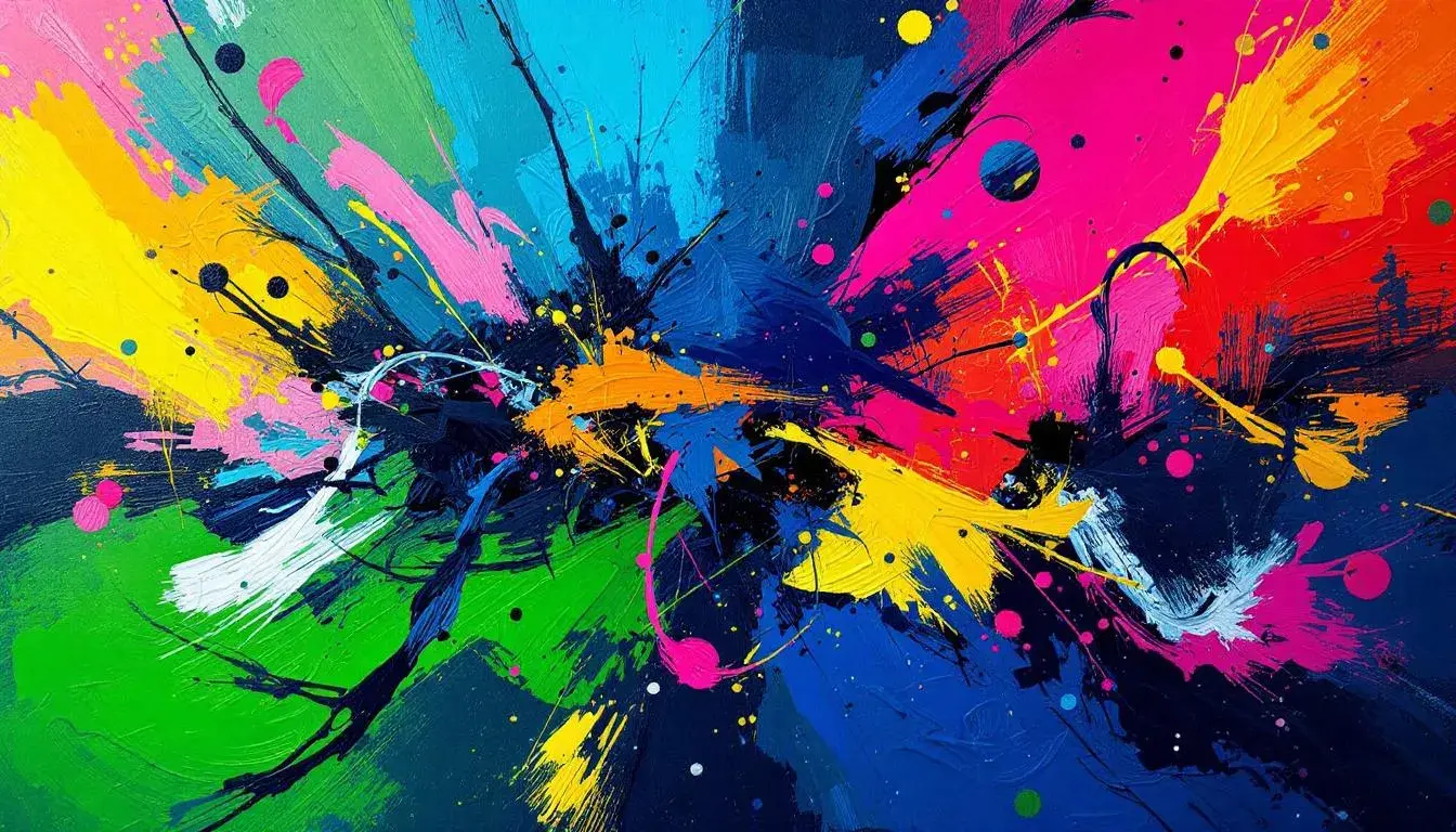
16 Jul 2025 · 3 min readColor does more than meets the eye. It whispers stories of emotion, bends perceptions of reality, and quietly shapes our experiences. Move past the predictable primaries and conventional pairings. There’s a profound world where color expresses itself beyond the expected – a chromatic rebellion, if you will, against the ordinary. Let us journey into the unexpected corners of the color wheel, where innovation meets visual pleasure. These are spaces where combinations that are both surprising and wonderfully effective are born, forging new emotional landscapes. Think of the twilight hour, where the sky bleeds from a passionate fuchsia to a serene indigo, an unlikely alliance of hues that nevertheless captures our imagination. Consider an artist's palette, where a daring brushstroke of chartreuse disrupts an otherwise somber composition, adding a jolt of energy. Or even a garden, where the quiet lavender of the flowerbeds clashes delightfully against the earthy ochre of the soil. These arrangements transcend simple aesthetics, offering bold statements about mood, identity, and the beauty found in unconventional choices.
The Power Palette vibrates with a peculiar tension. Imagine the crispness of Pure White meeting its polar opposite, the Dark Charcoal, in a visual standoff where light and shadow vie for dominance. But the drama doesn’t end there. A splash of Bright Crimson enters the scene, demanding attention and injecting a potent dose of raw energy. Golden Yellow lends an intellectual vitality that balances the stark contrast of the monochrome backdrop. Light Coral hints at approachability, while Teal Blue attempts to act as a mediator. Medium Gray acts a steadying presence, grounding the more dramatic elements. Dark Burgundy brings sophistication. This is not a playground dominated by pastels or predictable pigments, but rather a considered selection of tones engineered for impact. Its impact is akin to a precisely tailored suit paired with an unexpected pop of color in the lining: authoritative yet individualistic. Envision this arrangement in an entrepreneurial setting, where presentations require both assertiveness and approachability, where data is presented not as cold numbers but as a compelling narrative punctuated by carefully chosen accents. A website design comes to mind, with a clean, minimalist layout given life by interactive elements that use the Bright Crimson and Golden Yellow to draw the eye and communicate urgency. Imagine this applied to film, the stark contrasts used to create tension, broken by strategic use of warmer elements. Or perhaps in abstract art, the Power Palette could be a series of bold strokes creating a dynamic, emotional piece.
Storypark Palette presents a realm somewhere between clarity and exuberance. Consider the anchoring presence of Pure White, its untainted surface allowing the other, more daring players to shine. Vibrant Blue, assertive without being overwhelming, serves as a central point, a call to attention amidst quieter influences. Bright Coral ignites an unexpected spark, infusing the arrangement with a playful warmth that hints at summer sunsets and blooming flora. Golden Yellow introduces optimism, like sunlight streaming through cloud cover. Cool Gray provides a subtle counterbalance, offering a sense of groundedness and quiet confidence. Emerald Green evokes vitality. The appearance of Dark Charcoal brings contrast. Imagine this palette dressing an environment designed to stimulate creativity, but not in a way that overwhelms the senses. Envision artwork featuring geometric shapes and dynamic brushwork, utilizing shades of Bright Coral and Emerald Green against the backdrop of Pure White. A presentation deck comes to life, using Vibrant Blue to highlight crucial data points while the other components add layers of informational depth. This is about capturing attention, yes, but with a gentle, sophisticated nudge that respects the viewer's sensitivity. It reminds us that visual impact doesn't always need to shout; sometimes, a carefully whispered combination speaks far more profoundly.
The Diverse Palette is a balancing act between vibrancy and serenity. Creamy Beige acts as a tranquil foundation, the gentle whisper that allows the other components to make themselves heard. Mellow Yellow is more of a playful ray of sunshine. Vibrant Lime offers a jolt of botanical energy, an electrifying spark that enlivens the ensemble. Light Blue gives a delicate coolness. Dusty Rose introduces a nostalgic warmth, like memories of a blooming orchard. Forest Green injects a note of serenity, like a quiet walk through the trees. The impact of Bright Red brings passion. Deep Blue lends its weight and significance to the composition. And Dark Charcoal pulls the shades toward seriousness. Picture this palette in a design setting, where innovation is prized and individuality celebrated. It could dress a creative workspace, with areas defined by distinct chromatic themes. Digital designs come alive with this palette, balancing the need for accessibility with a touch of artistic flair. Imagine an animated short that uses these elements to transport the viewer to a realm where innovation and aesthetic beauty meet effortlessly. These colors are a rebellion against the stark, corporate aesthetic, a powerful reminder that visual communication can be both effective and deeply expressive.
These color combinations challenge conventions, inviting us to abandon predetermined notions of how hues should relate and to embrace the beauty born from chromatic defiance. Each palette presents a unique emotional landscape, suggesting how unexpected pairings can provoke new responses, ignite fresh perspectives, and make a lasting impact. They offer us more than mere aesthetic satisfaction; they give us tools to express ourselves, to forge deeper connections with those around us, and to reimagine the world through a lens of fearless originality. Embracing such palettes means embracing creativity, a rejection of the mundane.