'%3e%3cpath%20fill-rule='evenodd'%20clip-rule='evenodd'%20d='M51.1303%2019.2492C50.7278%2019.913%2050.1346%2020.4426%2049.3508%2020.838C48.5669%2021.2335%2047.6172%2021.4312%2046.5014%2021.4312C44.8208%2021.4312%2043.4367%2021.0216%2042.3492%2020.2025C41.2617%2019.3833%2040.6686%2018.2394%2040.5697%2016.7706H44.4253C44.4818%2017.3355%2044.6831%2017.7804%2045.0291%2018.1052C45.3751%2018.43%2045.8164%2018.5924%2046.3531%2018.5924C46.8192%2018.5924%2047.1864%2018.4653%2047.4547%2018.2111C47.7231%2017.9569%2047.8572%2017.618%2047.8572%2017.1943C47.8572%2016.8129%2047.7337%2016.4952%2047.4865%2016.241C47.2393%2015.9867%2046.9322%2015.7784%2046.565%2015.616C46.1978%2015.4536%2045.6893%2015.2594%2045.0397%2015.0334C44.0934%2014.7086%2043.3202%2014.3944%2042.72%2014.0907C42.1197%2013.7871%2041.6042%2013.3351%2041.1735%2012.7349C40.7427%2012.1347%2040.5273%2011.3544%2040.5273%2010.394C40.5273%209.50418%2040.7533%208.73448%2041.2053%208.08481C41.6572%207.43515%2042.2821%206.93731%2043.0801%206.5913C43.8781%206.24528%2044.7925%206.07227%2045.8235%206.07227C47.49%206.07227%2048.8141%206.46771%2049.7956%207.25861C50.7772%208.04951%2051.3315%209.13698%2051.4586%2010.5211H47.5395C47.4689%2010.0268%2047.2888%209.63483%2046.9993%209.3453C46.7097%209.05578%2046.3178%208.91102%2045.8235%208.91102C45.3998%208.91102%2045.0573%209.024%2044.7961%209.24997C44.5348%209.47594%2044.4041%209.80783%2044.4041%2010.2457C44.4041%2010.5988%2044.5207%2010.8989%2044.7537%2011.146C44.9867%2011.3932%2045.2798%2011.5944%2045.6328%2011.7498C45.9859%2011.9052%2046.4944%2012.1029%2047.1581%2012.343C48.1185%2012.6678%2048.9023%2012.9891%2049.5096%2013.3069C50.1169%2013.6246%2050.6395%2014.0872%2051.0773%2014.6945C51.5151%2015.3018%2051.734%2016.0927%2051.734%2017.0672C51.734%2017.8581%2051.5328%2018.5854%2051.1303%2019.2492ZM59.0242%206.3053V21.2829H55.4016V6.3053H59.0242ZM73.9409%206.3053V9.18642H69.8734V21.2829H66.2296V9.18642H62.2046V6.3053H73.9409ZM80.7438%209.18642V12.3218H85.8069V15.0546H80.7438V18.3806H86.4425V21.2829H77.1212V6.3053H86.4425V9.18642H80.7438ZM99.667%2016.0291V21.2829H96.0444V6.3053H101.913C103.692%206.3053%20105.048%206.74665%20105.98%207.62934C106.912%208.51204%20107.378%209.7019%20107.378%2011.199C107.378%2012.1311%20107.17%2012.9609%20106.753%2013.6882C106.337%2014.4155%20105.719%2014.9875%20104.9%2015.4042C104.08%2015.8208%20103.085%2016.0291%20101.913%2016.0291H99.667ZM103.692%2011.199C103.692%209.8855%20102.965%209.22879%20101.51%209.22879H99.667V13.1268H101.51C102.965%2013.1268%20103.692%2012.4842%20103.692%2011.199ZM120.092%2018.5501H114.478L113.546%2021.2829H109.732L115.219%206.41123H119.393L124.879%2021.2829H121.024L120.092%2018.5501ZM119.16%2015.7961L117.295%2010.2881L115.41%2015.7961H119.16ZM131.555%2018.5077H136.385V21.2829H127.933V6.3053H131.555V18.5077ZM143.337%209.18642V12.3218H148.4V15.0546H143.337V18.3806H149.035V21.2829H139.714V6.3053H149.035V9.18642H143.337ZM163.507%206.3053V9.18642H159.44V21.2829H155.796V9.18642H151.771V6.3053H163.507ZM177.449%206.3053V9.18642H173.382V21.2829H169.738V9.18642H165.713V6.3053H177.449ZM184.252%209.18642V12.3218H189.315V15.0546H184.252V18.3806H189.951V21.2829H180.629V6.3053H189.951V9.18642H184.252Z'%20fill='%23EEF0ED'/%3e%3cmask%20id='mask0_3101_7327'%20style='mask-type:alpha'%20maskUnits='userSpaceOnUse'%20x='0'%20y='0'%20width='27'%20height='28'%3e%3cpath%20d='M23.8328%200.759766H2.64808C1.18559%200.759766%200%201.94535%200%203.40785V24.5925C0%2026.055%201.18559%2027.2406%202.64808%2027.2406H23.8328C25.2952%2027.2406%2026.4808%2026.055%2026.4808%2024.5925V3.40785C26.4808%201.94535%2025.2952%200.759766%2023.8328%200.759766Z'%20fill='white'/%3e%3c/mask%3e%3cg%20mask='url(%23mask0_3101_7327)'%3e%3cpath%20d='M23.8328%200.759766H2.64808C1.18559%200.759766%200%201.94535%200%203.40785V24.5925C0%2026.055%201.18559%2027.2406%202.64808%2027.2406H23.8328C25.2952%2027.2406%2026.4808%2026.055%2026.4808%2024.5925V3.40785C26.4808%201.94535%2025.2952%200.759766%2023.8328%200.759766Z'%20fill='%23D8D8D8'/%3e%3cpath%20d='M13.2404%200.759766H0V14.0001H13.2404V0.759766Z'%20fill='%238C61FF'/%3e%3cpath%20d='M13.2404%2014H0V27.2404H13.2404V14Z'%20fill='%2336C3FE'/%3e%3cpath%20d='M26.4806%2014H13.2402V27.2404H26.4806V14Z'%20fill='%236592FE'/%3e%3cpath%20d='M26.4806%200.759766H13.2402V14.0002H26.4806V0.759766Z'%20fill='%236059F7'/%3e%3c/g%3e%3c/g%3e%3cdefs%3e%3cclipPath%20id='clip0_3101_7327'%3e%3crect%20width='190'%20height='28'%20fill='white'/%3e%3c/clipPath%3e%3c/defs%3e%3c/svg%3e)
'%3e%3cpath%20d='M23.8328%200.759521H2.64808C1.18559%200.759521%200%201.94511%200%203.40761V24.5923C0%2026.0548%201.18559%2027.2404%202.64808%2027.2404H23.8328C25.2952%2027.2404%2026.4808%2026.0548%2026.4808%2024.5923V3.40761C26.4808%201.94511%2025.2952%200.759521%2023.8328%200.759521Z'%20fill='%23D8D8D8'/%3e%3cpath%20d='M13.2404%200.759521H0V13.9999H13.2404V0.759521Z'%20fill='%238C61FF'/%3e%3cpath%20d='M13.2404%2013.9998H0V27.2402H13.2404V13.9998Z'%20fill='%2336C3FE'/%3e%3cpath%20d='M26.4809%2013.9998H13.2405V27.2402H26.4809V13.9998Z'%20fill='%236592FE'/%3e%3cpath%20d='M26.4809%200.759277H13.2405V13.9997H26.4809V0.759277Z'%20fill='%236059F7'/%3e%3c/g%3e%3c/svg%3e)
The Pantone Power: Chartreuse Green's Surprise Surge in Marketing 📊
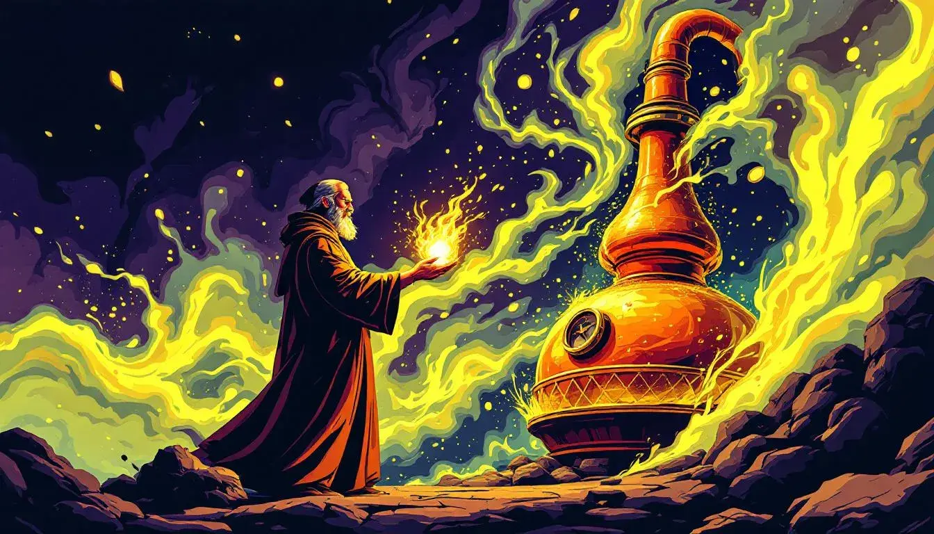
14 Jul 2025 · 3 min readChartreuse. The name alone conjures images of monks distilling liqueurs in sun-drenched cloisters, a secret recipe passed down through centuries. It's a color that has, until recently, lurked in the background – a supporting note in a vibrant symphony. Now, it's taking center stage, particularly within the visual language of marketing. This isn't your grandmother's avocado green; this is a bold, confident, almost assertive shade that demands attention. These color palettes, each a unique exploration of visual storytelling, reveal the surprising power and versatility of chartreuse, showcasing its abilities to energize, soothe, or even unsettle. They demonstrate how this once-understated hue can shape brand identity, influence consumer perception, and ultimately, drive engagement.
The "Earthy Greens" palette evokes a sense of grounded serenity. Picture a lush, untouched forest at the first blush of spring. Bright Chartreuse sings with youthful energy, a promise of new growth, softened by the quiet neutrality of Light Gray. It’s a visual whisper of a dawn chorus, a scene painted with gentle light. Emerald Green lends a sense of established wisdom, of ancient trees rooted deep in the earth, a heritage of verdant life. Vibrant Lime pulses with a playful exuberance, while Electric Teal adds a contemporary twist, mirroring the shimmering surface of a pristine lake. Harvest Green and Muted Olive bring a comforting, almost nostalgic quality, like fields ripening under a warm sun. Burnt Sienna introduces a subtle contrast, conjuring thoughts of sun-baked earth and autumnal leaves. Deep Forest Green acts as an anchor, a reminder of the quiet strength of nature’s depths. This palette speaks of sustainability, of mindful living, and the inherent beauty of the natural world. It's a compelling choice for messaging that prioritizes authenticity and wellbeing, offering a reassuring visual landscape in a world often saturated with noise. It creates an experience where calmness prevails, a soothing balm for the visually fatigued.
The "Resonance Palette" presents a more complex and intriguing story. Electric Lime bursts forth, a jolt of pure, undiluted energy, a spark in an otherwise muted landscape. It's a color that refuses to be ignored, demanding attention and sparking curiosity. Mustard Brown provides a grounding counterpoint, bringing in a sense of warmth and earthiness. It's the scent of old books and sun-drenched leather, a tactile sensation translated into color. Greyish Green adds a touch of mystery and intrigue, like a hidden path winding through a shadowy forest. Eggplant Purple introduces an element of sophistication and drama, suggesting hidden depths and untold stories. Dark Sienna anchors the palette, lending a sense of weight and stability, like the foundation of a grand old building. This palette conveys a sense of originality, embracing individuality and creative expression. It’s a visual invitation to explore the unexpected, to delve into realms beyond the ordinary. The combination of Electric Lime with earthier tones creates a memorable tension, perfect for brands seeking to disrupt and challenge conventional norms. It sparks inspiration, promotes self-expression, and appeals to those who value authenticity and originality.
"Vibrant Mix" is a visual feast, a kaleidoscope of colors that somehow manages to feel both chaotic and harmonious. Forest Green nestled amongst these hues lends a touch of groundedness to this joyful uproar. Pure White and Deep Black act as bookends, providing structure and balance to the composition. Golden Yellow bursts with optimism, like a ray of sunshine on a cloudy day, while Gray Slate adds a touch of sophistication and restraint. Salmon Red injects a sense of warmth and energy, hinting at passion and excitement. Teal Blue offers a refreshing coolness, reminiscent of clear skies and tranquil waters. Mustard Brown provides an earthy anchor, evoking feelings of comfort and nostalgia. Charcoal Gray adds depth and mystery, while Bright Crimson pulsates with raw intensity and bold emotion. This palette is perfectly suited for those who embrace maximalism and aren't afraid to make a statement. It's an ode to creativity, encouraging experimentation and self-expression. The inclusion of Forest Green ensures that the vibrancy remains grounded, reflecting a return to nature as a source of inspiration. Its multifaceted nature allows it to be used for various applications, from bold, attention-grabbing campaigns to more nuanced visual narratives.
Chartreuse, far from simply being a color, emerges as a connector, a bridge between the familiar and the unexpected. Through "Earthy Greens," it whispers of natural harmony, in "Resonance Palette" it sparks curiosity alongside Mustard Brown and Greyish Green, and within the "Vibrant Mix," it tempers the explosion of color with its grounding presence. These palettes reveal that the surge of chartreuse is not merely a fleeting trend, but a reflection of something deeper: a craving for authenticity, a celebration of individuality, and a renewed appreciation for the simple, yet profound, power of the natural world. The way it is used in the marketing landscape points to an awakening – a shift towards bolder, more honest visual communication.