'%3e%3cpath%20fill-rule='evenodd'%20clip-rule='evenodd'%20d='M51.1303%2019.2492C50.7278%2019.913%2050.1346%2020.4426%2049.3508%2020.838C48.5669%2021.2335%2047.6172%2021.4312%2046.5014%2021.4312C44.8208%2021.4312%2043.4367%2021.0216%2042.3492%2020.2025C41.2617%2019.3833%2040.6686%2018.2394%2040.5697%2016.7706H44.4253C44.4818%2017.3355%2044.6831%2017.7804%2045.0291%2018.1052C45.3751%2018.43%2045.8164%2018.5924%2046.3531%2018.5924C46.8192%2018.5924%2047.1864%2018.4653%2047.4547%2018.2111C47.7231%2017.9569%2047.8572%2017.618%2047.8572%2017.1943C47.8572%2016.8129%2047.7337%2016.4952%2047.4865%2016.241C47.2393%2015.9867%2046.9322%2015.7784%2046.565%2015.616C46.1978%2015.4536%2045.6893%2015.2594%2045.0397%2015.0334C44.0934%2014.7086%2043.3202%2014.3944%2042.72%2014.0907C42.1197%2013.7871%2041.6042%2013.3351%2041.1735%2012.7349C40.7427%2012.1347%2040.5273%2011.3544%2040.5273%2010.394C40.5273%209.50418%2040.7533%208.73448%2041.2053%208.08481C41.6572%207.43515%2042.2821%206.93731%2043.0801%206.5913C43.8781%206.24528%2044.7925%206.07227%2045.8235%206.07227C47.49%206.07227%2048.8141%206.46771%2049.7956%207.25861C50.7772%208.04951%2051.3315%209.13698%2051.4586%2010.5211H47.5395C47.4689%2010.0268%2047.2888%209.63483%2046.9993%209.3453C46.7097%209.05578%2046.3178%208.91102%2045.8235%208.91102C45.3998%208.91102%2045.0573%209.024%2044.7961%209.24997C44.5348%209.47594%2044.4041%209.80783%2044.4041%2010.2457C44.4041%2010.5988%2044.5207%2010.8989%2044.7537%2011.146C44.9867%2011.3932%2045.2798%2011.5944%2045.6328%2011.7498C45.9859%2011.9052%2046.4944%2012.1029%2047.1581%2012.343C48.1185%2012.6678%2048.9023%2012.9891%2049.5096%2013.3069C50.1169%2013.6246%2050.6395%2014.0872%2051.0773%2014.6945C51.5151%2015.3018%2051.734%2016.0927%2051.734%2017.0672C51.734%2017.8581%2051.5328%2018.5854%2051.1303%2019.2492ZM59.0242%206.3053V21.2829H55.4016V6.3053H59.0242ZM73.9409%206.3053V9.18642H69.8734V21.2829H66.2296V9.18642H62.2046V6.3053H73.9409ZM80.7438%209.18642V12.3218H85.8069V15.0546H80.7438V18.3806H86.4425V21.2829H77.1212V6.3053H86.4425V9.18642H80.7438ZM99.667%2016.0291V21.2829H96.0444V6.3053H101.913C103.692%206.3053%20105.048%206.74665%20105.98%207.62934C106.912%208.51204%20107.378%209.7019%20107.378%2011.199C107.378%2012.1311%20107.17%2012.9609%20106.753%2013.6882C106.337%2014.4155%20105.719%2014.9875%20104.9%2015.4042C104.08%2015.8208%20103.085%2016.0291%20101.913%2016.0291H99.667ZM103.692%2011.199C103.692%209.8855%20102.965%209.22879%20101.51%209.22879H99.667V13.1268H101.51C102.965%2013.1268%20103.692%2012.4842%20103.692%2011.199ZM120.092%2018.5501H114.478L113.546%2021.2829H109.732L115.219%206.41123H119.393L124.879%2021.2829H121.024L120.092%2018.5501ZM119.16%2015.7961L117.295%2010.2881L115.41%2015.7961H119.16ZM131.555%2018.5077H136.385V21.2829H127.933V6.3053H131.555V18.5077ZM143.337%209.18642V12.3218H148.4V15.0546H143.337V18.3806H149.035V21.2829H139.714V6.3053H149.035V9.18642H143.337ZM163.507%206.3053V9.18642H159.44V21.2829H155.796V9.18642H151.771V6.3053H163.507ZM177.449%206.3053V9.18642H173.382V21.2829H169.738V9.18642H165.713V6.3053H177.449ZM184.252%209.18642V12.3218H189.315V15.0546H184.252V18.3806H189.951V21.2829H180.629V6.3053H189.951V9.18642H184.252Z'%20fill='%23EEF0ED'/%3e%3cmask%20id='mask0_3101_7327'%20style='mask-type:alpha'%20maskUnits='userSpaceOnUse'%20x='0'%20y='0'%20width='27'%20height='28'%3e%3cpath%20d='M23.8328%200.759766H2.64808C1.18559%200.759766%200%201.94535%200%203.40785V24.5925C0%2026.055%201.18559%2027.2406%202.64808%2027.2406H23.8328C25.2952%2027.2406%2026.4808%2026.055%2026.4808%2024.5925V3.40785C26.4808%201.94535%2025.2952%200.759766%2023.8328%200.759766Z'%20fill='white'/%3e%3c/mask%3e%3cg%20mask='url(%23mask0_3101_7327)'%3e%3cpath%20d='M23.8328%200.759766H2.64808C1.18559%200.759766%200%201.94535%200%203.40785V24.5925C0%2026.055%201.18559%2027.2406%202.64808%2027.2406H23.8328C25.2952%2027.2406%2026.4808%2026.055%2026.4808%2024.5925V3.40785C26.4808%201.94535%2025.2952%200.759766%2023.8328%200.759766Z'%20fill='%23D8D8D8'/%3e%3cpath%20d='M13.2404%200.759766H0V14.0001H13.2404V0.759766Z'%20fill='%238C61FF'/%3e%3cpath%20d='M13.2404%2014H0V27.2404H13.2404V14Z'%20fill='%2336C3FE'/%3e%3cpath%20d='M26.4806%2014H13.2402V27.2404H26.4806V14Z'%20fill='%236592FE'/%3e%3cpath%20d='M26.4806%200.759766H13.2402V14.0002H26.4806V0.759766Z'%20fill='%236059F7'/%3e%3c/g%3e%3c/g%3e%3cdefs%3e%3cclipPath%20id='clip0_3101_7327'%3e%3crect%20width='190'%20height='28'%20fill='white'/%3e%3c/clipPath%3e%3c/defs%3e%3c/svg%3e)
'%3e%3cpath%20d='M23.8328%200.759521H2.64808C1.18559%200.759521%200%201.94511%200%203.40761V24.5923C0%2026.0548%201.18559%2027.2404%202.64808%2027.2404H23.8328C25.2952%2027.2404%2026.4808%2026.0548%2026.4808%2024.5923V3.40761C26.4808%201.94511%2025.2952%200.759521%2023.8328%200.759521Z'%20fill='%23D8D8D8'/%3e%3cpath%20d='M13.2404%200.759521H0V13.9999H13.2404V0.759521Z'%20fill='%238C61FF'/%3e%3cpath%20d='M13.2404%2013.9998H0V27.2402H13.2404V13.9998Z'%20fill='%2336C3FE'/%3e%3cpath%20d='M26.4809%2013.9998H13.2405V27.2402H26.4809V13.9998Z'%20fill='%236592FE'/%3e%3cpath%20d='M26.4809%200.759277H13.2405V13.9997H26.4809V0.759277Z'%20fill='%236059F7'/%3e%3c/g%3e%3c/svg%3e)
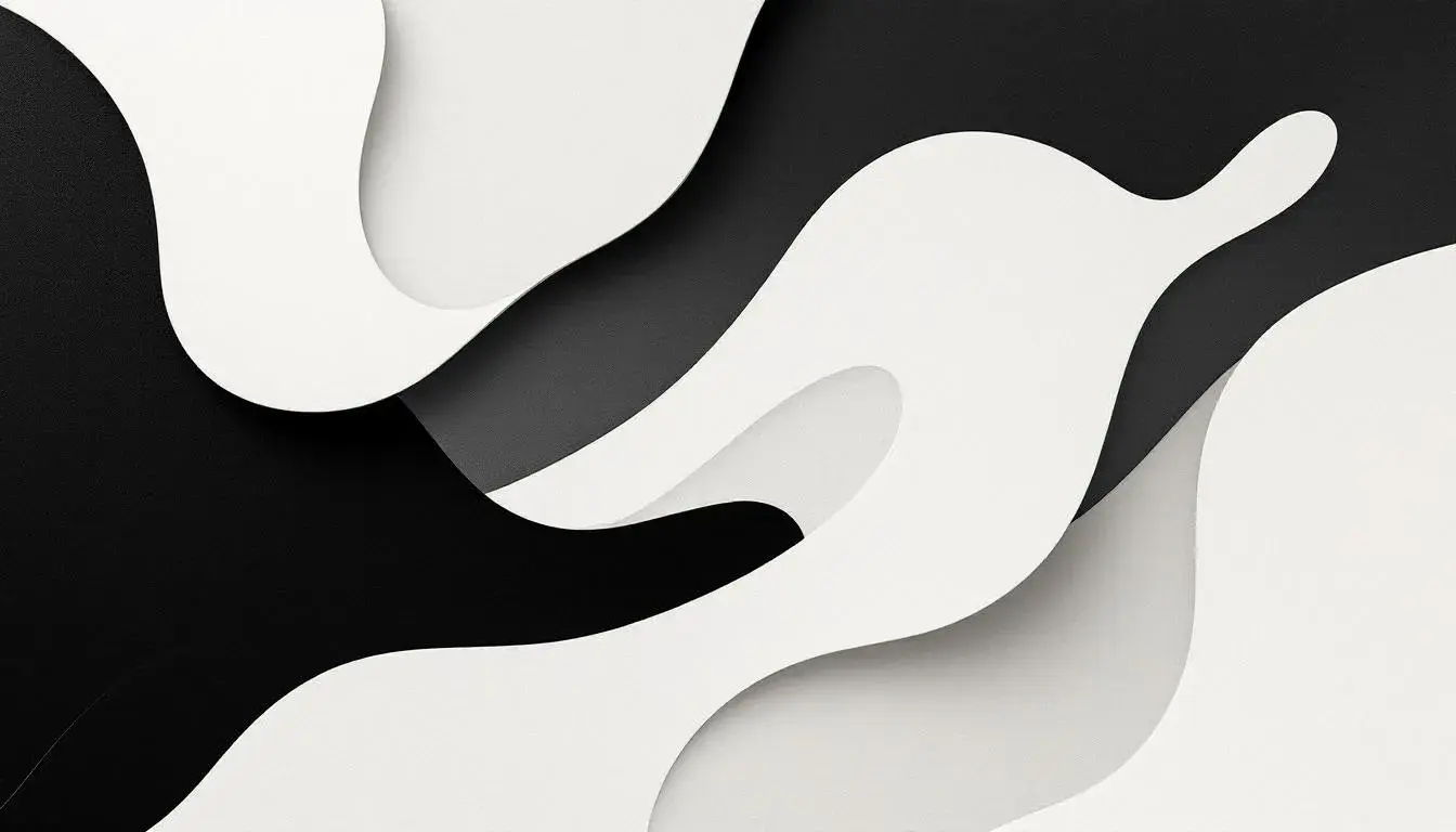
Onyx and Off-White: The Unbreakable Bond of Dominant Colors
14 Jul 2025 · 3 min readThe pull of the dark and the allure of something just shy of pure – this is where design begins. Not with a shout, but a whisper; an understanding. Black, absolute and final. Off-white, suggestive, hinting at light and shadow. These aren't merely colors; they're foundations. A stage set for the drama of daily life. The tension they create is not conflict, but anticipation. Imagine a gallery: stark white walls throwing the art into sharp relief, the flooring polished obsidian echoing the shapes above. Or consider the comfort of a cashmere sweater, not bleached but softly, organically light, paired with the assertive cut of a black wool coat. The pairing speaks of intent, grounding exuberance, and softening severity. These tonal relatives create visual depth, a promise of stories untold. Their relationship is silent authority, a visual contract, assuring simplicity and allowing creative space.
The palette, Earthy Contrast, proposes a landscape just after dusk. Pure White, like the last light catching on a distant peak, meets Jet Black, the encroaching night in the valleys below. Brick Red and Dark Maroon offer the glow remaining, a warm ember against the cool. Grayish Silver and Charcoal Gray feel like granite; ancient, immovable. Steel Blue becomes a trickling stream, cold and clear. Pale Yellow is the echo of sunlight. Consider a room built on these lines. White walls allow the eye to travel, while black anchors the space, offering a counterpoint. A scattering of deep red cushions on a silver-gray sofa; a pale yellow lamp throwing light against an expanse of black wall – this isn’t a retreat from drama; it’s an invitation. It creates the feeling of stability, an earthy foundation upon which to build. There's a rawness to this collection, an honesty. The dark asserts its presence, not as a void, but as a firm statement around the lighter, more delicate elements. This palette brings gravity allowing other colors to exist comfortably, without feeling as though they’ll float away.
Insurance Palette offers a sophisticated take on the pair. Pale Gold softens the edges, creating the feeling of heritage and quality, while Grayish Teal adds an unexpected touch of depth. Mid Gray and Dark Brown give weight, creating a sense of established confidence. The very near-white and near-black work together to create assurance without shouting it from the rooftops. Visualize this sequence playing out in design: a website for a financial institution, perhaps. An off-white background lends an air of openness, while shades of dark gray underscore the text, conveying reliability and trust. The addition of a muted gold allows warmth, providing a sense of comfort. It is the shade of safety; of calm competence in a storm. The near black acts as a strong frame to hold everything together. Use it to create a zone of professionalism.
The drama of Bold Palette arises from the stark contrast of Deep Black and Pure White, allowing the other colors to detonate and stand apart. Bright Lime screams of spring, fighting for attention, while Electric Magenta vibrates intensely, offering a playful burst of energy that is balanced by the more serene Light Lavender. Royal Purple pulls you into contemplative space and Crimson Red simmers with barely controlled power. Dark Charcoal, neutral by nature, adds a touch on sophistication while Burnt Sienna pulls us in. Imagine these colors used to re-create an impression of a busy city: neon lights reflecting on rain-slicked streets, the black of the night sky enveloping the scene, and the white of streetlights cutting through the darkness. Here, it is about energy and excitement but all anchored on the back and white.
Vibrant Contrast, presents a sophisticated reading of this classic interaction, taking it away from assertive and pushing it toward understated elegance. The Light Grey creates a canvas for the remaining colors while the Dark Olive grounds the palette. The marriage of Pure White and Deep Black gives focus, like spotlight illuminating a masterpiece. Picture them framing a collection of cool, toned colored objects – a Golden Yellow vase catching the light, an arrangement of Dried Rose petals casting subtle shadows, a Cool Grey-Blue painting creating depth. These are not colors fighting to be noticed, but rather a subtle conversation, each playing its role in a wider narrative.
There's a subtle story told within Earthy Elegance, a study in texture and quiet impact. Consider how Pure White softens into Light Gray, before gradually darkening into Taupe Gray and Dark Gray, creating a feeling of depth. The introduction of Burnt Sienna into the mix provides a lift, preventing the design from sinking into neutral monotony. Deep Black anchors the palette, forming a grounding moment. Imagine a room decorated with this in mind: White walls provide a gallery-like setting, while black accents, like the frame of a mirror or the legs of a side table, underscore the design. A taupe woolen sofa provides a cozy seating area, while Burnt Sienna leather cushions offer a contrasting spark. It is these small, thoughtful touches that transforms a space to a statement of elegant simplicity. This is about stillness; about creating an environment where the mind can come to rest.
Modern Contrast has sophistication; a dance between near-white and near-black that allows a full spectrum of other colors to sing. Forest Green and Steel Blue add depth, offering a cool, calming counterpoint to the warmth of Mustard Yellow and Crimson Red. Grayish Taupe pulls the palette together and acts as a buffer, allowing the individual hues to exist without feeling chaotic. Consider design anchored on this palette in mind: the near-white backdrop showcasing the rich colors. Imagine a gallery space, bathed in natural light, where a sculpture made of deep-red painted steel stands against a wall. The black of the skirting balances the piece, grounding it in the space. This is about creating an environment where art interacts with architecture.
Across these varying palettes, a narrative forms. Black and (off-)white do not simply exist; they participate. They shift, adapt, and ground wilder flights of imagination. This alliance, this visual partnership, is a silent assurance, allowing creative exploration, and shaping the spaces we inhabit. The frequency of this pairing suggests a fundamental truth: sometimes, the most powerful statements are whispered – not shouted. Occurrences of ('#fefefe', '#000000') or near matches:
- Earthy Contrast: ('#ffffff', '#010101') - Match
- Insurance Palette: ('#fefefe', '#090909') - Near Match
- Bold Palette: ('#ffffff', '#010101') - Match
- Vibrant Contrast: ('#fdfdfd', '#010101') - Near Match
- Earthy Elegance: ('#ffffff', '#010101') - Match
- Modern Contrast: ('#fefefe', '#020202') - Near Match
Total Palettes: 6 Matches: 3 Near Matches: 3
Percentage: Matches: (3 / 6) * 100 = 50% Near Matches: (3 / 6) * 100 = 50%