'%3e%3cpath%20fill-rule='evenodd'%20clip-rule='evenodd'%20d='M51.1303%2019.2492C50.7278%2019.913%2050.1346%2020.4426%2049.3508%2020.838C48.5669%2021.2335%2047.6172%2021.4312%2046.5014%2021.4312C44.8208%2021.4312%2043.4367%2021.0216%2042.3492%2020.2025C41.2617%2019.3833%2040.6686%2018.2394%2040.5697%2016.7706H44.4253C44.4818%2017.3355%2044.6831%2017.7804%2045.0291%2018.1052C45.3751%2018.43%2045.8164%2018.5924%2046.3531%2018.5924C46.8192%2018.5924%2047.1864%2018.4653%2047.4547%2018.2111C47.7231%2017.9569%2047.8572%2017.618%2047.8572%2017.1943C47.8572%2016.8129%2047.7337%2016.4952%2047.4865%2016.241C47.2393%2015.9867%2046.9322%2015.7784%2046.565%2015.616C46.1978%2015.4536%2045.6893%2015.2594%2045.0397%2015.0334C44.0934%2014.7086%2043.3202%2014.3944%2042.72%2014.0907C42.1197%2013.7871%2041.6042%2013.3351%2041.1735%2012.7349C40.7427%2012.1347%2040.5273%2011.3544%2040.5273%2010.394C40.5273%209.50418%2040.7533%208.73448%2041.2053%208.08481C41.6572%207.43515%2042.2821%206.93731%2043.0801%206.5913C43.8781%206.24528%2044.7925%206.07227%2045.8235%206.07227C47.49%206.07227%2048.8141%206.46771%2049.7956%207.25861C50.7772%208.04951%2051.3315%209.13698%2051.4586%2010.5211H47.5395C47.4689%2010.0268%2047.2888%209.63483%2046.9993%209.3453C46.7097%209.05578%2046.3178%208.91102%2045.8235%208.91102C45.3998%208.91102%2045.0573%209.024%2044.7961%209.24997C44.5348%209.47594%2044.4041%209.80783%2044.4041%2010.2457C44.4041%2010.5988%2044.5207%2010.8989%2044.7537%2011.146C44.9867%2011.3932%2045.2798%2011.5944%2045.6328%2011.7498C45.9859%2011.9052%2046.4944%2012.1029%2047.1581%2012.343C48.1185%2012.6678%2048.9023%2012.9891%2049.5096%2013.3069C50.1169%2013.6246%2050.6395%2014.0872%2051.0773%2014.6945C51.5151%2015.3018%2051.734%2016.0927%2051.734%2017.0672C51.734%2017.8581%2051.5328%2018.5854%2051.1303%2019.2492ZM59.0242%206.3053V21.2829H55.4016V6.3053H59.0242ZM73.9409%206.3053V9.18642H69.8734V21.2829H66.2296V9.18642H62.2046V6.3053H73.9409ZM80.7438%209.18642V12.3218H85.8069V15.0546H80.7438V18.3806H86.4425V21.2829H77.1212V6.3053H86.4425V9.18642H80.7438ZM99.667%2016.0291V21.2829H96.0444V6.3053H101.913C103.692%206.3053%20105.048%206.74665%20105.98%207.62934C106.912%208.51204%20107.378%209.7019%20107.378%2011.199C107.378%2012.1311%20107.17%2012.9609%20106.753%2013.6882C106.337%2014.4155%20105.719%2014.9875%20104.9%2015.4042C104.08%2015.8208%20103.085%2016.0291%20101.913%2016.0291H99.667ZM103.692%2011.199C103.692%209.8855%20102.965%209.22879%20101.51%209.22879H99.667V13.1268H101.51C102.965%2013.1268%20103.692%2012.4842%20103.692%2011.199ZM120.092%2018.5501H114.478L113.546%2021.2829H109.732L115.219%206.41123H119.393L124.879%2021.2829H121.024L120.092%2018.5501ZM119.16%2015.7961L117.295%2010.2881L115.41%2015.7961H119.16ZM131.555%2018.5077H136.385V21.2829H127.933V6.3053H131.555V18.5077ZM143.337%209.18642V12.3218H148.4V15.0546H143.337V18.3806H149.035V21.2829H139.714V6.3053H149.035V9.18642H143.337ZM163.507%206.3053V9.18642H159.44V21.2829H155.796V9.18642H151.771V6.3053H163.507ZM177.449%206.3053V9.18642H173.382V21.2829H169.738V9.18642H165.713V6.3053H177.449ZM184.252%209.18642V12.3218H189.315V15.0546H184.252V18.3806H189.951V21.2829H180.629V6.3053H189.951V9.18642H184.252Z'%20fill='%23EEF0ED'/%3e%3cmask%20id='mask0_3101_7327'%20style='mask-type:alpha'%20maskUnits='userSpaceOnUse'%20x='0'%20y='0'%20width='27'%20height='28'%3e%3cpath%20d='M23.8328%200.759766H2.64808C1.18559%200.759766%200%201.94535%200%203.40785V24.5925C0%2026.055%201.18559%2027.2406%202.64808%2027.2406H23.8328C25.2952%2027.2406%2026.4808%2026.055%2026.4808%2024.5925V3.40785C26.4808%201.94535%2025.2952%200.759766%2023.8328%200.759766Z'%20fill='white'/%3e%3c/mask%3e%3cg%20mask='url(%23mask0_3101_7327)'%3e%3cpath%20d='M23.8328%200.759766H2.64808C1.18559%200.759766%200%201.94535%200%203.40785V24.5925C0%2026.055%201.18559%2027.2406%202.64808%2027.2406H23.8328C25.2952%2027.2406%2026.4808%2026.055%2026.4808%2024.5925V3.40785C26.4808%201.94535%2025.2952%200.759766%2023.8328%200.759766Z'%20fill='%23D8D8D8'/%3e%3cpath%20d='M13.2404%200.759766H0V14.0001H13.2404V0.759766Z'%20fill='%238C61FF'/%3e%3cpath%20d='M13.2404%2014H0V27.2404H13.2404V14Z'%20fill='%2336C3FE'/%3e%3cpath%20d='M26.4806%2014H13.2402V27.2404H26.4806V14Z'%20fill='%236592FE'/%3e%3cpath%20d='M26.4806%200.759766H13.2402V14.0002H26.4806V0.759766Z'%20fill='%236059F7'/%3e%3c/g%3e%3c/g%3e%3cdefs%3e%3cclipPath%20id='clip0_3101_7327'%3e%3crect%20width='190'%20height='28'%20fill='white'/%3e%3c/clipPath%3e%3c/defs%3e%3c/svg%3e)
'%3e%3cpath%20d='M23.8328%200.759521H2.64808C1.18559%200.759521%200%201.94511%200%203.40761V24.5923C0%2026.0548%201.18559%2027.2404%202.64808%2027.2404H23.8328C25.2952%2027.2404%2026.4808%2026.0548%2026.4808%2024.5923V3.40761C26.4808%201.94511%2025.2952%200.759521%2023.8328%200.759521Z'%20fill='%23D8D8D8'/%3e%3cpath%20d='M13.2404%200.759521H0V13.9999H13.2404V0.759521Z'%20fill='%238C61FF'/%3e%3cpath%20d='M13.2404%2013.9998H0V27.2402H13.2404V13.9998Z'%20fill='%2336C3FE'/%3e%3cpath%20d='M26.4809%2013.9998H13.2405V27.2402H26.4809V13.9998Z'%20fill='%236592FE'/%3e%3cpath%20d='M26.4809%200.759277H13.2405V13.9997H26.4809V0.759277Z'%20fill='%236059F7'/%3e%3c/g%3e%3c/svg%3e)
From Boardroom to Bedroom: Palettes Transitioning Across Spaces 🎨
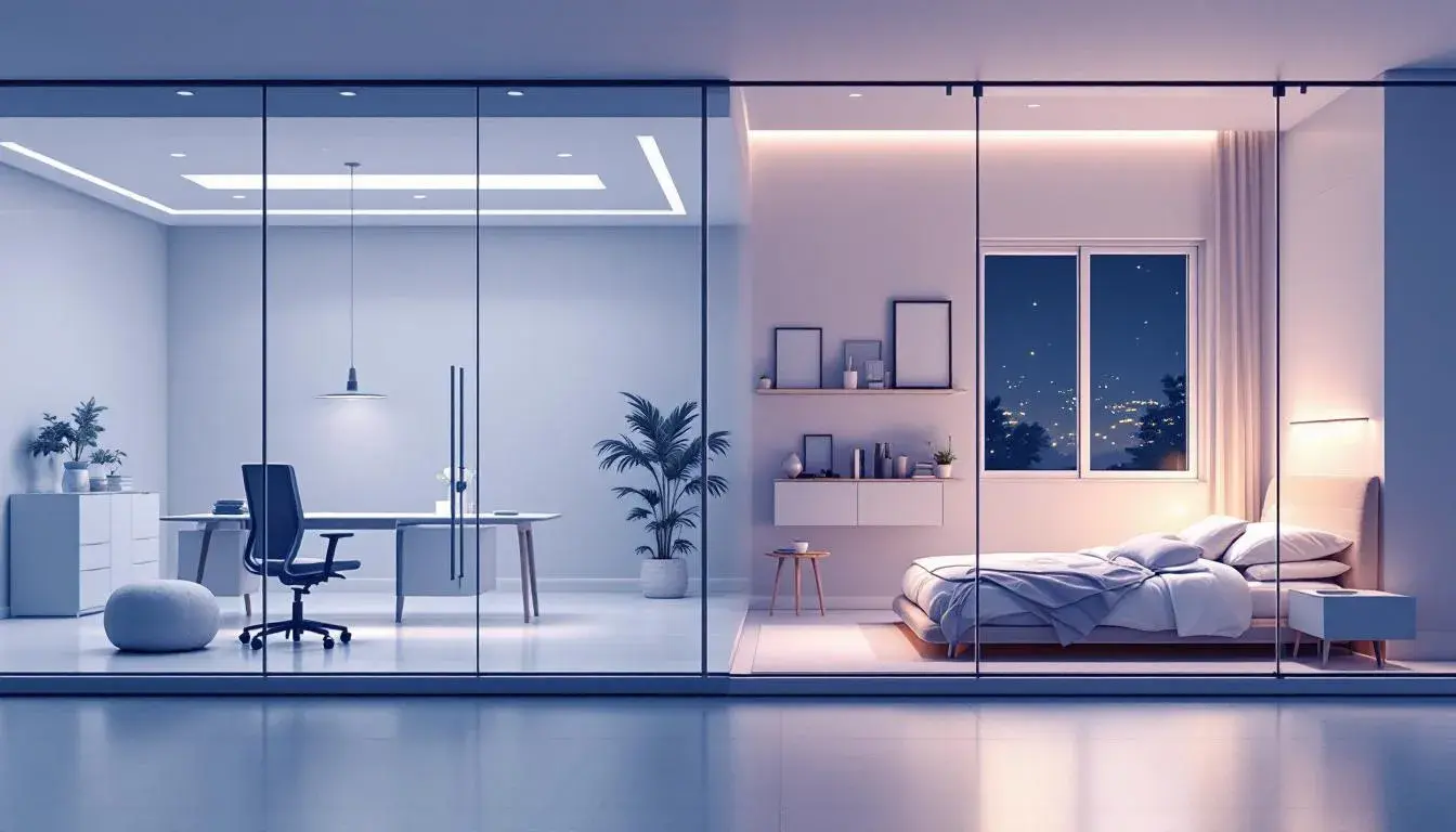
14 Jul 2025 · 3 min readColor holds power; it whispers secrets, evokes memories, and dictates how we feel within a space. Consider the transition from the sharp, focused energy of the office to the soft, embracing comfort of home. Can color palettes bridge this divide, offering a visual language that speaks of both professionalism and personal quietude? Moving beyond the stark minimalism or vibrant chaos often associated with these environments, we look for palettes that offer something more: fluid adaptability, an emotional understanding of diverse needs, and a design DNA capable of inhabiting both worlds with equal grace. The following palettes offer a sophisticated response to this challenge, proving that a carefully curated selection can transform the way we experience space. These palettes transcend the purely decorative, becoming tools for creating consistent, emotionally intelligent environments.
The "Tech Serenity" palette projects a grounded sense of calm, perfectly suited for environments where focus is key, but anxiety must be kept at bay. Imagine this wash of colors over a collaborative workspace: the Light Grayish Blue offering a backdrop of clean efficiency, while Sea Green hints at growth and innovation. This is not the sterile white of a generic office, but a space where ideas can truly flourish, reflecting the natural world even in a technologically driven setting. Transitioning to the bedroom, the same palette provides the foundation for a restful sanctuary. Dark Indigo anchors the space, promoting restful sleep; the Slate Gray adds sophistication without clamoring for attention; while the Vivid Blue adds an accent of clarity, reminiscent of a clear morning sky, encouraging mindful reflection. It's a palette for simplification, editing out the visual clutter of the day. This offers consistency, creating a smooth flow from the professional to the personal, where the emphasis is always on productivity married with essential restoration.
"Oceanic Depth" presents a color scheme centered in stillness and quiet contemplation. Pale Grey provides a foundation of calm, mirroring the diffused light of dawn, while deeper currents of Muted Blue invoke focus and composure. Picture this palette in a modern office: perhaps the Dark Teal on accent walls creating zones of concentration. This isn't about shouting for attention; it's about creating an atmosphere of considered thought. Moving into the bedroom, these same shades become a haven for relaxation. Olive Green brings in a breath of nature, while Rustic Red adds a touch of warmth, a grounded invitation to slow down. The palette shifts effortlessly, transitioning from the focused energy of the workplace to the restorative calm of the bedroom. It whispers of coastlines, the quiet murmur of tides, and a sense of expansiveness that offers respite from the confines of daily life. It is not merely about aesthetics, but about creating spaces that nurture distinct yet complementary needs.
The "Aqua Accent" palette is a study in balance, bringing a subtle vibrance. Imagine walking into an office designed with this arrangement: walls cast in Cool Gray, creating a sense of open space and clarity. A splash of Steel Blue in the furniture or fixtures injects a measured level of professionalism. A dash of Emerald Green hints at growth and sustainability, important values for the modern workplace. This is a palette intended to promote focus without sacrificing warmth. Now picture this: the same colors transposed to the bedroom. The Midnight Blue enveloping walls invoke the night sky, fostering a sense of profound calm. A soft glow of Vibrant Red could appear a subtle accent such as the bedside lamps, grounding the space and ensuring an inviting air, while the remaining shades create a tranquil canvas for restful sleep. This palette is equally at ease during meetings or moments of solace.
"Cool Serenity" offers a soothing visual experience, appropriate to both work and rest. Light Ice lays the foundation, reflective of a winter sky, for open, calm, collaborative work. Imagine this tone on office walls, creating airiness. Soft Lavender accents, perhaps in textiles or artwork, introduce just enough visual interest. The grounding presence of Cool Gray, acting as a visual anchor, ensures focus. This isn't a place of flamboyant excess, but one where purpose is paramount. Transitioning into the bedroom, the same color selections become a tool for unwinding. Medium Gray is suggestive of twilight, with Dark Teal walls wrapping the space in nighttime quiet. The palette encourages the release of daytime tensions, offering a seamless migration from focused engagement to peaceful solitude. It is a reminder that serenity does not require deprivation.
Ultimately, the successful transition 'From Boardroom to Bedroom' depends on understanding how color impacts both the professional and personal psyche. Each of these palettes offers a unique interpretation, demonstrating how thoughtful curation creates environments that support productivity, wellness, and a sense of comfortable elegance, regardless of the space. They share a commitment to creating spaces that are visually appealing and emotionally supportive, proving that color is a powerful tool for achieving balance in a complex world.