'%3e%3cpath%20fill-rule='evenodd'%20clip-rule='evenodd'%20d='M51.1303%2019.2492C50.7278%2019.913%2050.1346%2020.4426%2049.3508%2020.838C48.5669%2021.2335%2047.6172%2021.4312%2046.5014%2021.4312C44.8208%2021.4312%2043.4367%2021.0216%2042.3492%2020.2025C41.2617%2019.3833%2040.6686%2018.2394%2040.5697%2016.7706H44.4253C44.4818%2017.3355%2044.6831%2017.7804%2045.0291%2018.1052C45.3751%2018.43%2045.8164%2018.5924%2046.3531%2018.5924C46.8192%2018.5924%2047.1864%2018.4653%2047.4547%2018.2111C47.7231%2017.9569%2047.8572%2017.618%2047.8572%2017.1943C47.8572%2016.8129%2047.7337%2016.4952%2047.4865%2016.241C47.2393%2015.9867%2046.9322%2015.7784%2046.565%2015.616C46.1978%2015.4536%2045.6893%2015.2594%2045.0397%2015.0334C44.0934%2014.7086%2043.3202%2014.3944%2042.72%2014.0907C42.1197%2013.7871%2041.6042%2013.3351%2041.1735%2012.7349C40.7427%2012.1347%2040.5273%2011.3544%2040.5273%2010.394C40.5273%209.50418%2040.7533%208.73448%2041.2053%208.08481C41.6572%207.43515%2042.2821%206.93731%2043.0801%206.5913C43.8781%206.24528%2044.7925%206.07227%2045.8235%206.07227C47.49%206.07227%2048.8141%206.46771%2049.7956%207.25861C50.7772%208.04951%2051.3315%209.13698%2051.4586%2010.5211H47.5395C47.4689%2010.0268%2047.2888%209.63483%2046.9993%209.3453C46.7097%209.05578%2046.3178%208.91102%2045.8235%208.91102C45.3998%208.91102%2045.0573%209.024%2044.7961%209.24997C44.5348%209.47594%2044.4041%209.80783%2044.4041%2010.2457C44.4041%2010.5988%2044.5207%2010.8989%2044.7537%2011.146C44.9867%2011.3932%2045.2798%2011.5944%2045.6328%2011.7498C45.9859%2011.9052%2046.4944%2012.1029%2047.1581%2012.343C48.1185%2012.6678%2048.9023%2012.9891%2049.5096%2013.3069C50.1169%2013.6246%2050.6395%2014.0872%2051.0773%2014.6945C51.5151%2015.3018%2051.734%2016.0927%2051.734%2017.0672C51.734%2017.8581%2051.5328%2018.5854%2051.1303%2019.2492ZM59.0242%206.3053V21.2829H55.4016V6.3053H59.0242ZM73.9409%206.3053V9.18642H69.8734V21.2829H66.2296V9.18642H62.2046V6.3053H73.9409ZM80.7438%209.18642V12.3218H85.8069V15.0546H80.7438V18.3806H86.4425V21.2829H77.1212V6.3053H86.4425V9.18642H80.7438ZM99.667%2016.0291V21.2829H96.0444V6.3053H101.913C103.692%206.3053%20105.048%206.74665%20105.98%207.62934C106.912%208.51204%20107.378%209.7019%20107.378%2011.199C107.378%2012.1311%20107.17%2012.9609%20106.753%2013.6882C106.337%2014.4155%20105.719%2014.9875%20104.9%2015.4042C104.08%2015.8208%20103.085%2016.0291%20101.913%2016.0291H99.667ZM103.692%2011.199C103.692%209.8855%20102.965%209.22879%20101.51%209.22879H99.667V13.1268H101.51C102.965%2013.1268%20103.692%2012.4842%20103.692%2011.199ZM120.092%2018.5501H114.478L113.546%2021.2829H109.732L115.219%206.41123H119.393L124.879%2021.2829H121.024L120.092%2018.5501ZM119.16%2015.7961L117.295%2010.2881L115.41%2015.7961H119.16ZM131.555%2018.5077H136.385V21.2829H127.933V6.3053H131.555V18.5077ZM143.337%209.18642V12.3218H148.4V15.0546H143.337V18.3806H149.035V21.2829H139.714V6.3053H149.035V9.18642H143.337ZM163.507%206.3053V9.18642H159.44V21.2829H155.796V9.18642H151.771V6.3053H163.507ZM177.449%206.3053V9.18642H173.382V21.2829H169.738V9.18642H165.713V6.3053H177.449ZM184.252%209.18642V12.3218H189.315V15.0546H184.252V18.3806H189.951V21.2829H180.629V6.3053H189.951V9.18642H184.252Z'%20fill='%23EEF0ED'/%3e%3cmask%20id='mask0_3101_7327'%20style='mask-type:alpha'%20maskUnits='userSpaceOnUse'%20x='0'%20y='0'%20width='27'%20height='28'%3e%3cpath%20d='M23.8328%200.759766H2.64808C1.18559%200.759766%200%201.94535%200%203.40785V24.5925C0%2026.055%201.18559%2027.2406%202.64808%2027.2406H23.8328C25.2952%2027.2406%2026.4808%2026.055%2026.4808%2024.5925V3.40785C26.4808%201.94535%2025.2952%200.759766%2023.8328%200.759766Z'%20fill='white'/%3e%3c/mask%3e%3cg%20mask='url(%23mask0_3101_7327)'%3e%3cpath%20d='M23.8328%200.759766H2.64808C1.18559%200.759766%200%201.94535%200%203.40785V24.5925C0%2026.055%201.18559%2027.2406%202.64808%2027.2406H23.8328C25.2952%2027.2406%2026.4808%2026.055%2026.4808%2024.5925V3.40785C26.4808%201.94535%2025.2952%200.759766%2023.8328%200.759766Z'%20fill='%23D8D8D8'/%3e%3cpath%20d='M13.2404%200.759766H0V14.0001H13.2404V0.759766Z'%20fill='%238C61FF'/%3e%3cpath%20d='M13.2404%2014H0V27.2404H13.2404V14Z'%20fill='%2336C3FE'/%3e%3cpath%20d='M26.4806%2014H13.2402V27.2404H26.4806V14Z'%20fill='%236592FE'/%3e%3cpath%20d='M26.4806%200.759766H13.2402V14.0002H26.4806V0.759766Z'%20fill='%236059F7'/%3e%3c/g%3e%3c/g%3e%3cdefs%3e%3cclipPath%20id='clip0_3101_7327'%3e%3crect%20width='190'%20height='28'%20fill='white'/%3e%3c/clipPath%3e%3c/defs%3e%3c/svg%3e)
'%3e%3cpath%20d='M23.8328%200.759521H2.64808C1.18559%200.759521%200%201.94511%200%203.40761V24.5923C0%2026.0548%201.18559%2027.2404%202.64808%2027.2404H23.8328C25.2952%2027.2404%2026.4808%2026.0548%2026.4808%2024.5923V3.40761C26.4808%201.94511%2025.2952%200.759521%2023.8328%200.759521Z'%20fill='%23D8D8D8'/%3e%3cpath%20d='M13.2404%200.759521H0V13.9999H13.2404V0.759521Z'%20fill='%238C61FF'/%3e%3cpath%20d='M13.2404%2013.9998H0V27.2402H13.2404V13.9998Z'%20fill='%2336C3FE'/%3e%3cpath%20d='M26.4809%2013.9998H13.2405V27.2402H26.4809V13.9998Z'%20fill='%236592FE'/%3e%3cpath%20d='M26.4809%200.759277H13.2405V13.9997H26.4809V0.759277Z'%20fill='%236059F7'/%3e%3c/g%3e%3c/svg%3e)
The Rise of Burnt Sienna in Design: An Industry-Specific Study
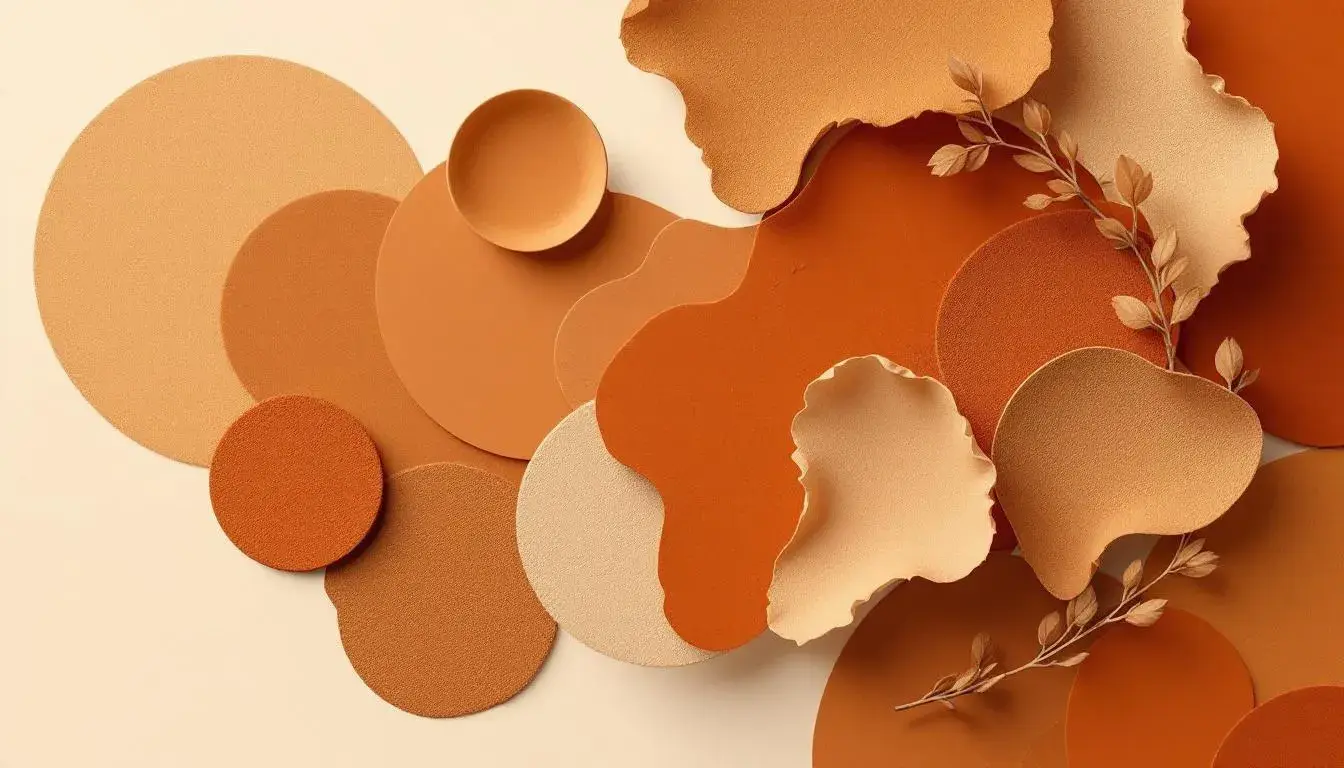
09 Jul 2025 · 4 min readColor, more than mere decoration, is the silent language of intention. It whispers mood, suggests quality, and evokes feeling before a single word is read or a product felt. Nowhere perhaps is this more crucial than in the landscape of design, an arena where competition for attention is ceaseless. The careful curation of color palettes is what separates the memorable from the mundane, the trustworthy from the transparent. Nowhere is there a better example of a color making a comeback than Burnt Sienna–a warming, earthy hue that is becoming increasingly popular with designers in a number of industries and applications. A color that calls to mind sun-baked earth, autumnal leaves, and the comforting feeling of home, Burnt Sienna is finding new life as an anchor for modern design. Its versatility lies in its ability to appear both grounded and sophisticated, contemporary and timeless. An exploration into specific palettes reveals unexpected partnerships and creative expressions.
The "Modern Business" 💼 palette introduces a unique slant on professional aesthetics. It moves beyond the stark, cold steel and grayscale expected in corporate environments and brings in organic hues that suggest approachability and innovation, most notably Rust Brown nestled between Teal Green and Dark Slate. Light Coral introduces a sense of youthful exuberance, while Neutral Gray provides a grounded visual anchor. This is the palette of a company that wants to be taken seriously but also wants to be seen as progressive. Imagine this combination applied to a financial tech company's website; the Teal Green could highlight cutting-edge features, while Rust Brown instills confidence and dependability in a way stark black never could. The Light Coral could be a call-to-action button, inviting users to join a refreshing, forward-thinking movement. Consider also the branding for a modern co-working space. The overall impression is one of openness and collaboration, where ideas circulate as freely as the air. The selection of colors speaks to a new generation of entrepreneurs, ones who value sustainability, community, and human connection, even in the digital sphere. The palette hints at a commitment to both tradition and innovation.
In the "Elegant Contrast" 🎨 palette, Burnt Sienna occupies a distinguished position, radiating understated luxury. It interplays with Pale Beige and Olive Drab to create a world that feels simultaneously timeless and on-trend. Teal Blue introduces a refreshing coolness, preventing the palette from becoming overly warm or stuffy, while Dark Olive further grounds the composition in its natural appeal. Imagine this palette adorning the website of a high-end technology firm. The Burnt Sienna becomes an accent, a mark of quality and sophistication used sparingly yet effectively behind stark white space. It could add texture to a minimalist website and could also inform the design of a contemporary office. Leather chairs in Burnt Sienna sit alongside concrete walls and steel accents, creating a warm and inviting atmosphere without sacrificing a modern edge. It paints a narrative of careful curation and timeless appeal, communicating that even in the fast-paced world of technology, beauty and design still matter. The palette also evokes a sense of trust. The Olive Drab and Burnt Sienna suggest a company that is reliable and established, while the Teal Blue hints at innovation and forward-thinking.
The "Automotive Palette" 🚘 presents a starker vision, rooted in the industrial but softened by natural undertones. Light Sienna, a gentler relative of Burnt Sienna, comes forward as a visual bridge between the mechanical and the organic. Light Grayish and Neutral Gray are the backbone of the palette, referencing the sleek metal of cars and concrete of urban landscapes. Tomato Red delivers a bolt of energy, a sporty accent that catches the eye. Dark Grayish Brown anchors the palette with quiet strength. Picture this color combination within a car showroom. The Light Sienna highlights the curves and lines of a newly designed vehicle, while the Tomato Red draws attention to its performance capabilities. Imagine this palette informing a brand’s website. The site doesn’t just sell cars but a lifestyle of freedom and adventure, where power meets nature. The colors combine to suggest reliability and innovation. The presence of Light Sienna humanizes the brand, reminding clients to consider not just what it can do, but how it makes them feel.
Within the "Modern Harmony" 🎨 palette, Sunset Orange appears as a vibrant nod to warmth and approachability, creating a sense of balance with the cooler, more subdued tones. Sandy Beige provides a soft, welcoming backdrop, while Emerald Green injects a refreshing touch of nature. Slate Blue and Midnight Gray ground the palette, giving it a sense of depth and sophistication. This combination speaks of a modern sensibility with a touch of classic charm. Envision applying this palette to the branding of a tech startup focused on sustainable practices. The Sunset Orange could be used to highlight the company's commitment to renewable energy. The colors create a space that feels both professional and inviting. Consider the design of a modern office space. The goal is to foster creativity and innovation, where employees feel both inspired and relaxed. The visual impression is one of balance and harmony. The colors remind the user of nature, and reflect a brand that is both forward-thinking and environmentally conscious.
Ultimately, the story of Burnt Sienna’s ascendance is more than a trend; it showcases a shift in values. We are, perhaps, drawn back to colors that remind us of nature, stability, and authenticity in a world increasingly dominated by the artificial and fleeting. Each palette unveils a new way in which this essential hue can be understood and used. From its careful integration into the technology and financial sectors, the rise of Burnt Sienna embodies a greater movement to seek comfort and connection in design.