'%3e%3cpath%20fill-rule='evenodd'%20clip-rule='evenodd'%20d='M51.1303%2019.2492C50.7278%2019.913%2050.1346%2020.4426%2049.3508%2020.838C48.5669%2021.2335%2047.6172%2021.4312%2046.5014%2021.4312C44.8208%2021.4312%2043.4367%2021.0216%2042.3492%2020.2025C41.2617%2019.3833%2040.6686%2018.2394%2040.5697%2016.7706H44.4253C44.4818%2017.3355%2044.6831%2017.7804%2045.0291%2018.1052C45.3751%2018.43%2045.8164%2018.5924%2046.3531%2018.5924C46.8192%2018.5924%2047.1864%2018.4653%2047.4547%2018.2111C47.7231%2017.9569%2047.8572%2017.618%2047.8572%2017.1943C47.8572%2016.8129%2047.7337%2016.4952%2047.4865%2016.241C47.2393%2015.9867%2046.9322%2015.7784%2046.565%2015.616C46.1978%2015.4536%2045.6893%2015.2594%2045.0397%2015.0334C44.0934%2014.7086%2043.3202%2014.3944%2042.72%2014.0907C42.1197%2013.7871%2041.6042%2013.3351%2041.1735%2012.7349C40.7427%2012.1347%2040.5273%2011.3544%2040.5273%2010.394C40.5273%209.50418%2040.7533%208.73448%2041.2053%208.08481C41.6572%207.43515%2042.2821%206.93731%2043.0801%206.5913C43.8781%206.24528%2044.7925%206.07227%2045.8235%206.07227C47.49%206.07227%2048.8141%206.46771%2049.7956%207.25861C50.7772%208.04951%2051.3315%209.13698%2051.4586%2010.5211H47.5395C47.4689%2010.0268%2047.2888%209.63483%2046.9993%209.3453C46.7097%209.05578%2046.3178%208.91102%2045.8235%208.91102C45.3998%208.91102%2045.0573%209.024%2044.7961%209.24997C44.5348%209.47594%2044.4041%209.80783%2044.4041%2010.2457C44.4041%2010.5988%2044.5207%2010.8989%2044.7537%2011.146C44.9867%2011.3932%2045.2798%2011.5944%2045.6328%2011.7498C45.9859%2011.9052%2046.4944%2012.1029%2047.1581%2012.343C48.1185%2012.6678%2048.9023%2012.9891%2049.5096%2013.3069C50.1169%2013.6246%2050.6395%2014.0872%2051.0773%2014.6945C51.5151%2015.3018%2051.734%2016.0927%2051.734%2017.0672C51.734%2017.8581%2051.5328%2018.5854%2051.1303%2019.2492ZM59.0242%206.3053V21.2829H55.4016V6.3053H59.0242ZM73.9409%206.3053V9.18642H69.8734V21.2829H66.2296V9.18642H62.2046V6.3053H73.9409ZM80.7438%209.18642V12.3218H85.8069V15.0546H80.7438V18.3806H86.4425V21.2829H77.1212V6.3053H86.4425V9.18642H80.7438ZM99.667%2016.0291V21.2829H96.0444V6.3053H101.913C103.692%206.3053%20105.048%206.74665%20105.98%207.62934C106.912%208.51204%20107.378%209.7019%20107.378%2011.199C107.378%2012.1311%20107.17%2012.9609%20106.753%2013.6882C106.337%2014.4155%20105.719%2014.9875%20104.9%2015.4042C104.08%2015.8208%20103.085%2016.0291%20101.913%2016.0291H99.667ZM103.692%2011.199C103.692%209.8855%20102.965%209.22879%20101.51%209.22879H99.667V13.1268H101.51C102.965%2013.1268%20103.692%2012.4842%20103.692%2011.199ZM120.092%2018.5501H114.478L113.546%2021.2829H109.732L115.219%206.41123H119.393L124.879%2021.2829H121.024L120.092%2018.5501ZM119.16%2015.7961L117.295%2010.2881L115.41%2015.7961H119.16ZM131.555%2018.5077H136.385V21.2829H127.933V6.3053H131.555V18.5077ZM143.337%209.18642V12.3218H148.4V15.0546H143.337V18.3806H149.035V21.2829H139.714V6.3053H149.035V9.18642H143.337ZM163.507%206.3053V9.18642H159.44V21.2829H155.796V9.18642H151.771V6.3053H163.507ZM177.449%206.3053V9.18642H173.382V21.2829H169.738V9.18642H165.713V6.3053H177.449ZM184.252%209.18642V12.3218H189.315V15.0546H184.252V18.3806H189.951V21.2829H180.629V6.3053H189.951V9.18642H184.252Z'%20fill='%23EEF0ED'/%3e%3cmask%20id='mask0_3101_7327'%20style='mask-type:alpha'%20maskUnits='userSpaceOnUse'%20x='0'%20y='0'%20width='27'%20height='28'%3e%3cpath%20d='M23.8328%200.759766H2.64808C1.18559%200.759766%200%201.94535%200%203.40785V24.5925C0%2026.055%201.18559%2027.2406%202.64808%2027.2406H23.8328C25.2952%2027.2406%2026.4808%2026.055%2026.4808%2024.5925V3.40785C26.4808%201.94535%2025.2952%200.759766%2023.8328%200.759766Z'%20fill='white'/%3e%3c/mask%3e%3cg%20mask='url(%23mask0_3101_7327)'%3e%3cpath%20d='M23.8328%200.759766H2.64808C1.18559%200.759766%200%201.94535%200%203.40785V24.5925C0%2026.055%201.18559%2027.2406%202.64808%2027.2406H23.8328C25.2952%2027.2406%2026.4808%2026.055%2026.4808%2024.5925V3.40785C26.4808%201.94535%2025.2952%200.759766%2023.8328%200.759766Z'%20fill='%23D8D8D8'/%3e%3cpath%20d='M13.2404%200.759766H0V14.0001H13.2404V0.759766Z'%20fill='%238C61FF'/%3e%3cpath%20d='M13.2404%2014H0V27.2404H13.2404V14Z'%20fill='%2336C3FE'/%3e%3cpath%20d='M26.4806%2014H13.2402V27.2404H26.4806V14Z'%20fill='%236592FE'/%3e%3cpath%20d='M26.4806%200.759766H13.2402V14.0002H26.4806V0.759766Z'%20fill='%236059F7'/%3e%3c/g%3e%3c/g%3e%3cdefs%3e%3cclipPath%20id='clip0_3101_7327'%3e%3crect%20width='190'%20height='28'%20fill='white'/%3e%3c/clipPath%3e%3c/defs%3e%3c/svg%3e)
'%3e%3cpath%20d='M23.8328%200.759521H2.64808C1.18559%200.759521%200%201.94511%200%203.40761V24.5923C0%2026.0548%201.18559%2027.2404%202.64808%2027.2404H23.8328C25.2952%2027.2404%2026.4808%2026.0548%2026.4808%2024.5923V3.40761C26.4808%201.94511%2025.2952%200.759521%2023.8328%200.759521Z'%20fill='%23D8D8D8'/%3e%3cpath%20d='M13.2404%200.759521H0V13.9999H13.2404V0.759521Z'%20fill='%238C61FF'/%3e%3cpath%20d='M13.2404%2013.9998H0V27.2402H13.2404V13.9998Z'%20fill='%2336C3FE'/%3e%3cpath%20d='M26.4809%2013.9998H13.2405V27.2402H26.4809V13.9998Z'%20fill='%236592FE'/%3e%3cpath%20d='M26.4809%200.759277H13.2405V13.9997H26.4809V0.759277Z'%20fill='%236059F7'/%3e%3c/g%3e%3c/svg%3e)
The Most Used Interior Design Style of 2025: A Palette Perspective
09 Jul 2025 · 5 min readThe color of a year is no longer a singular decree from the high priests of Pantone. It's a conversation, whispered between algorithms, dreamt up by trend forecasters, and finally, splashed across our walls. As we gaze into 2025, the most used interior design style isn't about rigid rules, but rather a feeling – a serenity found in curated imperfection, sustainable choices, and spaces that whisper stories of our lives. The palettes that will shape our homes reflect this shift, moving away from stark minimalism and embracing depth, texture, and a touch of the unexpected. Colors aren't just decorative; they are building blocks for creating environments that nurture, inspire, and ground us in an increasingly chaotic world. The selection reflects a desire for calm and productivity without sacrificing character. From the hushed elegance of refined neutrals to the bold declarations of deep jewel tones, these are the colors that will define the spaces where we live, work, and dream.
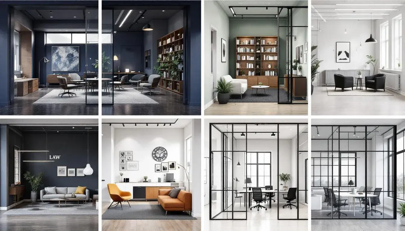
The Law Palette ⚖️ speaks of considered restraint, a quiet confidence that transcends fleeting trends. Imagine an oak-paneled library bathed in the soft glow of twilight, where the scent of aged paper mingles with the crisp air. Light Green, reminiscent of spring foliage just unfurling, offers a subtle counterpoint to the grounding force of Charcoal Gray. The inclusion of Light Blue evokes a sense of clarity and open skies, promoting focus without feeling sterile. Dark Slate anchors the composition, like the sturdy foundation of a grand building. This palette isn't about ostentation; it's about enduring style. Think of textured linen sofas, hand-thrown pottery, and artwork that whispers rather than shouts. The design style it cultivates draws on Scandinavian influences, with its emphasis on natural materials and simple forms, elevated by sophisticated color choices. Spaces designed with this palette offer a haven from the outside world, a place where one can reflect, create, and find solace in the beauty of understated design. It is about more than mere aesthetics, it is about crafting a sanctuary. The interplay between these hues creates a restful, intellectual atmosphere, the sort where one can ponder the complexities of the modern world, and perhaps even find some solutions. The Black adds a grounding influence, like the ink on parchment. This approach to color fosters a sense of security and timelessness, elements highly prized in interior spaces meant for contemplation, or creative work.
The Academic Palette 🧑🎓 brings forth an aura of scholarly sophistication, suggesting rooms filled with well-worn books and the quiet hum of intellectual activity. Olive Drab, like the spines of antique volumes, sits alongside Dark Gray Green, a color that echoes the calming presence of natural foliage. Crimson Red adds a burst of invigorating energy, a reminder of passionate debate and new discoveries. Deep Sapphire evokes a sense of depth and wisdom, inviting contemplation and focused thought. Charcoal Black provides a solid foundation, grounding the space and lending gravitas. This combination speaks to a desire for interiors that are both stimulating and serene. Think of handcrafted wooden desks, leather armchairs worn soft with age, and walls adorned with maps and charts. It's a style that celebrates history and learning, creating spaces that feel both comfortable and inspiring. The color combination suggests a blend of classic library hues mixed with modern updates; spaces that function as both an educational and inspirational environment. It rejects the transient trends in favor of lasting quality. The effect is a space that encourages focus and creativity, where ideas flourish, and knowledge is revered. The subtle interplay between the colors creates areas that feel both authentic and aesthetically pleasing.
MIT Palette 🏛️ offers a vision of sophisticated innovation, environments where creativity and precision intertwine. Sky Blue reflects an ambitious spirit and a vast, boundless future. Grayish Brown lends an element of grounded practicality, like the workshop where dreams take shape. The deep Dark Teal whispers of hidden depths of knowledge. Balancing this intellectual trio is Dusty Rose, a reminder that even in the most cutting-edge spaces, human touch and empathy are vital. Midnight Blue grounds the palette with a touch of enduring, quiet strength. This palette lends itself to spaces where ideas are forged, where the future is being built, and where innovation intertwines with design. The overall design suggests minimalist aesthetics, where form follows function, and spaces are designed with purpose. Furnishings are comfortable and functional, and the colors create a balance between stimulating creativity and grounded calm. The feel is a mixture of inspiration and comfort, where one can get comfortable while solving problems. The inclusion of natural elements softens the harder edges of a tech-forward design plan. Ultimately, the colors evoke a sense of optimism and innovation, reminding us that the solutions of the future, and their spaces, are being built now.
The Office Palette 🏢 encapsulates a modern, confident aesthetic, hinting at spaces designed for productivity and collaboration with a touch of warmth. Light Mauve creates a sense of ease and openness, promoting a welcoming atmosphere amid the hustle. Grayish Beige fosters focus and tranquility, providing a subtle backdrop for busy minds. Dusty Red and Dark Crimson infuse a sense of energy and passion, suggesting bold ideas and creative solutions. This carefully curated intensity is grounded by Jet Black, which adds a touch of boldness and sophistication. Envision open-plan workspaces filled with natural light, accented by sleek furniture and carefully chosen artwork. The colors suggest a contemporary design plan, where comfort and functionality coexist. Texture, carefully chosen, keeps the neutral palette from feeling too sterile or impersonal. The effect is a design that sparks creativity. Spaces designed with this palette would foster a positive and collaborative environment, where ideas flow freely. With its subtle harmonies and bold contrasts, the Office Palette transcends the mundane, delivering a design experience that is both inspiring and effective for the future of work.
The design landscape of 2025 is shaping into a collection of curated experiences that resonate with intention and beauty. Each palette offers a unique lens to envision our surroundings. The Law Palette’s promise of quiet sophistication, the Academic Palette’s embrace of intellectual curiosity, the MIT Palette’s call for measured innovation, and the Office Palette’s vision of future-forward productivity each contributes to a dynamic, yet comforting style. These directions, when considered together, reveal a desire for balance. As we approach a new era of design, the colors and textures will continue to reflect our desire to create authentic, inspiring, and truly livable spaces. It's an era where your color palette is your narrative.