'%3e%3cpath%20fill-rule='evenodd'%20clip-rule='evenodd'%20d='M51.1303%2019.2492C50.7278%2019.913%2050.1346%2020.4426%2049.3508%2020.838C48.5669%2021.2335%2047.6172%2021.4312%2046.5014%2021.4312C44.8208%2021.4312%2043.4367%2021.0216%2042.3492%2020.2025C41.2617%2019.3833%2040.6686%2018.2394%2040.5697%2016.7706H44.4253C44.4818%2017.3355%2044.6831%2017.7804%2045.0291%2018.1052C45.3751%2018.43%2045.8164%2018.5924%2046.3531%2018.5924C46.8192%2018.5924%2047.1864%2018.4653%2047.4547%2018.2111C47.7231%2017.9569%2047.8572%2017.618%2047.8572%2017.1943C47.8572%2016.8129%2047.7337%2016.4952%2047.4865%2016.241C47.2393%2015.9867%2046.9322%2015.7784%2046.565%2015.616C46.1978%2015.4536%2045.6893%2015.2594%2045.0397%2015.0334C44.0934%2014.7086%2043.3202%2014.3944%2042.72%2014.0907C42.1197%2013.7871%2041.6042%2013.3351%2041.1735%2012.7349C40.7427%2012.1347%2040.5273%2011.3544%2040.5273%2010.394C40.5273%209.50418%2040.7533%208.73448%2041.2053%208.08481C41.6572%207.43515%2042.2821%206.93731%2043.0801%206.5913C43.8781%206.24528%2044.7925%206.07227%2045.8235%206.07227C47.49%206.07227%2048.8141%206.46771%2049.7956%207.25861C50.7772%208.04951%2051.3315%209.13698%2051.4586%2010.5211H47.5395C47.4689%2010.0268%2047.2888%209.63483%2046.9993%209.3453C46.7097%209.05578%2046.3178%208.91102%2045.8235%208.91102C45.3998%208.91102%2045.0573%209.024%2044.7961%209.24997C44.5348%209.47594%2044.4041%209.80783%2044.4041%2010.2457C44.4041%2010.5988%2044.5207%2010.8989%2044.7537%2011.146C44.9867%2011.3932%2045.2798%2011.5944%2045.6328%2011.7498C45.9859%2011.9052%2046.4944%2012.1029%2047.1581%2012.343C48.1185%2012.6678%2048.9023%2012.9891%2049.5096%2013.3069C50.1169%2013.6246%2050.6395%2014.0872%2051.0773%2014.6945C51.5151%2015.3018%2051.734%2016.0927%2051.734%2017.0672C51.734%2017.8581%2051.5328%2018.5854%2051.1303%2019.2492ZM59.0242%206.3053V21.2829H55.4016V6.3053H59.0242ZM73.9409%206.3053V9.18642H69.8734V21.2829H66.2296V9.18642H62.2046V6.3053H73.9409ZM80.7438%209.18642V12.3218H85.8069V15.0546H80.7438V18.3806H86.4425V21.2829H77.1212V6.3053H86.4425V9.18642H80.7438ZM99.667%2016.0291V21.2829H96.0444V6.3053H101.913C103.692%206.3053%20105.048%206.74665%20105.98%207.62934C106.912%208.51204%20107.378%209.7019%20107.378%2011.199C107.378%2012.1311%20107.17%2012.9609%20106.753%2013.6882C106.337%2014.4155%20105.719%2014.9875%20104.9%2015.4042C104.08%2015.8208%20103.085%2016.0291%20101.913%2016.0291H99.667ZM103.692%2011.199C103.692%209.8855%20102.965%209.22879%20101.51%209.22879H99.667V13.1268H101.51C102.965%2013.1268%20103.692%2012.4842%20103.692%2011.199ZM120.092%2018.5501H114.478L113.546%2021.2829H109.732L115.219%206.41123H119.393L124.879%2021.2829H121.024L120.092%2018.5501ZM119.16%2015.7961L117.295%2010.2881L115.41%2015.7961H119.16ZM131.555%2018.5077H136.385V21.2829H127.933V6.3053H131.555V18.5077ZM143.337%209.18642V12.3218H148.4V15.0546H143.337V18.3806H149.035V21.2829H139.714V6.3053H149.035V9.18642H143.337ZM163.507%206.3053V9.18642H159.44V21.2829H155.796V9.18642H151.771V6.3053H163.507ZM177.449%206.3053V9.18642H173.382V21.2829H169.738V9.18642H165.713V6.3053H177.449ZM184.252%209.18642V12.3218H189.315V15.0546H184.252V18.3806H189.951V21.2829H180.629V6.3053H189.951V9.18642H184.252Z'%20fill='%23EEF0ED'/%3e%3cmask%20id='mask0_3101_7327'%20style='mask-type:alpha'%20maskUnits='userSpaceOnUse'%20x='0'%20y='0'%20width='27'%20height='28'%3e%3cpath%20d='M23.8328%200.759766H2.64808C1.18559%200.759766%200%201.94535%200%203.40785V24.5925C0%2026.055%201.18559%2027.2406%202.64808%2027.2406H23.8328C25.2952%2027.2406%2026.4808%2026.055%2026.4808%2024.5925V3.40785C26.4808%201.94535%2025.2952%200.759766%2023.8328%200.759766Z'%20fill='white'/%3e%3c/mask%3e%3cg%20mask='url(%23mask0_3101_7327)'%3e%3cpath%20d='M23.8328%200.759766H2.64808C1.18559%200.759766%200%201.94535%200%203.40785V24.5925C0%2026.055%201.18559%2027.2406%202.64808%2027.2406H23.8328C25.2952%2027.2406%2026.4808%2026.055%2026.4808%2024.5925V3.40785C26.4808%201.94535%2025.2952%200.759766%2023.8328%200.759766Z'%20fill='%23D8D8D8'/%3e%3cpath%20d='M13.2404%200.759766H0V14.0001H13.2404V0.759766Z'%20fill='%238C61FF'/%3e%3cpath%20d='M13.2404%2014H0V27.2404H13.2404V14Z'%20fill='%2336C3FE'/%3e%3cpath%20d='M26.4806%2014H13.2402V27.2404H26.4806V14Z'%20fill='%236592FE'/%3e%3cpath%20d='M26.4806%200.759766H13.2402V14.0002H26.4806V0.759766Z'%20fill='%236059F7'/%3e%3c/g%3e%3c/g%3e%3cdefs%3e%3cclipPath%20id='clip0_3101_7327'%3e%3crect%20width='190'%20height='28'%20fill='white'/%3e%3c/clipPath%3e%3c/defs%3e%3c/svg%3e)
'%3e%3cpath%20d='M23.8328%200.759521H2.64808C1.18559%200.759521%200%201.94511%200%203.40761V24.5923C0%2026.0548%201.18559%2027.2404%202.64808%2027.2404H23.8328C25.2952%2027.2404%2026.4808%2026.0548%2026.4808%2024.5923V3.40761C26.4808%201.94511%2025.2952%200.759521%2023.8328%200.759521Z'%20fill='%23D8D8D8'/%3e%3cpath%20d='M13.2404%200.759521H0V13.9999H13.2404V0.759521Z'%20fill='%238C61FF'/%3e%3cpath%20d='M13.2404%2013.9998H0V27.2402H13.2404V13.9998Z'%20fill='%2336C3FE'/%3e%3cpath%20d='M26.4809%2013.9998H13.2405V27.2402H26.4809V13.9998Z'%20fill='%236592FE'/%3e%3cpath%20d='M26.4809%200.759277H13.2405V13.9997H26.4809V0.759277Z'%20fill='%236059F7'/%3e%3c/g%3e%3c/svg%3e)
The Modern Revolution: Exploring Trends in Palette Style
09 Jul 2025 · 3 min readThe way we perceive and interact with the world is profoundly shaped by color. Consider the silent language of interiors, the unspoken promises of a brand, or the stirring of emotion when viewing art. Color elevates the mundane into the meaningful, transforming the functional into something deeply felt. In the domain of "Modern" aesthetics, color palettes push beyond mere decoration into creating experiences, and environments that subtly guide our feelings and actions. Modern palettes become not just arrangements of color, but quiet pronouncements about the present and the future. They are tools for shaping not only what we see, but how we feel, work, and live. How do these palettes speak to our ever-evolving sensibilities?
"Modern Energy" bursts forth with the zeal of a new dawn. Imagine a workspace that does not merely contain activity, but sparks it. Off-White acts as a canvas, a grounding force for more assertive shades. Slate Gray introduces a note of quiet professionalism, while Muted Olive offers a glimpse of organic vitality. Russet Brown brings earthiness, a sense of heritage reinvented for a faster age. Steel Blue provides depth, like peering into the screen of a cutting-edge device. It is a collection for those who seek to inject life into the structured environment of work. It creates spaces that reflect vitality and dynamism. Picture a startup office, invigorated with these colors, where the weight of responsibility is tempered by an air of spirited collaboration. Visualize a healthcare setting, where moments of brightness offer solace among clinical necessities. If energy can be bottled, or projected, this particular arrangement dares to be it, fostering a connection between the tangible and inspirational. Consider the psychological impact: muted greens and earthy browns creating a sense of groundedness, even as the blues and grays echo the cool logic of technological advancement. It is a palette of calculated risk, of measured optimism, of embracing the present in full force.
With "Modern Contrast", the world sheds its superfluous details, leaving behind pure form and function. This palette breathes the air of quiet confidence, perfect for everyday use, as comfortable in a sleek urban apartment as in a forward-thinking office. Light Gray floats as the subtle backdrop to more commanding tones. Pale Teal adds a refreshing touch, evoking the serenity of water rippling within glass. Steel Blue introduces a layer of considered depth. Slate Gray brings a touch of urbanity, like the skyline against a clouded sky. Charcoal Black completes the circle, grounding the airy qualities of the other shades. Consider how it translates to brand design: logos rendered in these colors suggest reliability, forward-thinking, and unfailing sophistication. Imagine it upon the face of a webpage, creating layers that are inviting but not overwhelming, guiding the consumer through information with sleek, intuitive ease. This is the art of restraint - a celebration of modern life stripped bare, showcasing its inherent power in its purest state. It doesn't shout; it whispers, allowing spaces and structures to articulate with strength.
"Modern Edge" slices through the conventional with assurance. The combination speaks of subtle rebellion, aimed towards those who subtly question the status quo. Off White establishes a foundation of contemporary neutrality. Lime Yellow sparks a sense of daring innovation. Muted Gray acts as a bridge between tradition and the avant-garde. Dusty Brown has grounding qualities, giving a sense of heritage reimagined for the contemporary world. Dark Charcoal sets the tone for strength, like the steel beams of a daring building. Picture this used in marketing; a website promoting creative services. It whispers innovation and forward-thinking ideas. Imagine it used for interior design, with daring art highlighting the edge. Those with a distinct aesthetic and those who choose to display their edginess will find inspiration to work with, create with, and even live with. It’s a palette that dares to be noticed, yet isn't screaming for attention.
"Modern Harmony" achieves a difficult balance, conveying both creativity and grounded sophistication. It is a palette best suited for those in search of equilibrium, those seeking to infuse their spaces with both inspiration and comfort. Pale Ivory sets forth an understated elegance, allowing the other colors to breathe. Turquoise Teal brings a vibrant freshness reminiscent of spring. Fiery Red adds warmth, like the glow of artistic spirit. Steel Blue conveys depth, the realm of imagination made concrete. Deep Indigo holds them all together, like the calm after the storm. Picture this in living spaces, offering both invigoration and relaxation. Or perhaps for a tech company, where it merges creativity with efficiency and expertise. As a website color scheme, one is led with effortless direction, subconsciously guided to their destination without being overwhelmed. It represents the modern world stripped of excesses, but not artistry, where one can reach for the new with the wisdom of the past.
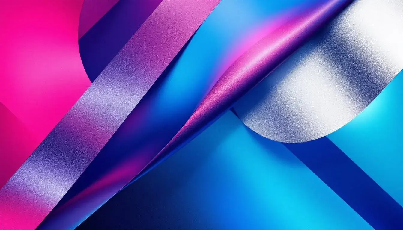
"Tech Modern" is bold, confident, and assertive, capturing the energy of innovation and the edge of a digital landscape. Medium Gray provides a solid, dependable foundation. Bright Magenta injects a powerful, almost electric spark, while Vivid Crimson commands attention with its intensity. Deep Maroon brings a touch of gravitas, offering a sense of stability and thoughtful consideration. Dark Charcoal provides a sense of timeless simplicity. This arrangement provides a vibrant background with the balance and grounded tones that inspire trust. It could work well in website presentations, for example. It provides a striking and engaging visual experience. Consider its potential use in conference settings, where clear design captures the zeitgeist of advancement, of technological power paired with human ingenuity, and where these colors are not just style, but an expression of conviction, where the meeting place is the future.
In reviewing these "Modern" palettes, one perceives a desire for harmony and strength. From the energetic vibes, to the striking contrasts, each palette showcases the push and pull that encompasses the modern experience. Whether through the inclusion of organic tones to temper the harsh lines of technology or a bold infusion of vibrant color into a minimalist backdrop, the thread of considered intention is ever-present. They offer a chance to transform the environments we inhabit and the screens we engage, allowing each choice to be a purposeful step toward a more dynamic, more evocative future.