'%3e%3cpath%20fill-rule='evenodd'%20clip-rule='evenodd'%20d='M51.1303%2019.2492C50.7278%2019.913%2050.1346%2020.4426%2049.3508%2020.838C48.5669%2021.2335%2047.6172%2021.4312%2046.5014%2021.4312C44.8208%2021.4312%2043.4367%2021.0216%2042.3492%2020.2025C41.2617%2019.3833%2040.6686%2018.2394%2040.5697%2016.7706H44.4253C44.4818%2017.3355%2044.6831%2017.7804%2045.0291%2018.1052C45.3751%2018.43%2045.8164%2018.5924%2046.3531%2018.5924C46.8192%2018.5924%2047.1864%2018.4653%2047.4547%2018.2111C47.7231%2017.9569%2047.8572%2017.618%2047.8572%2017.1943C47.8572%2016.8129%2047.7337%2016.4952%2047.4865%2016.241C47.2393%2015.9867%2046.9322%2015.7784%2046.565%2015.616C46.1978%2015.4536%2045.6893%2015.2594%2045.0397%2015.0334C44.0934%2014.7086%2043.3202%2014.3944%2042.72%2014.0907C42.1197%2013.7871%2041.6042%2013.3351%2041.1735%2012.7349C40.7427%2012.1347%2040.5273%2011.3544%2040.5273%2010.394C40.5273%209.50418%2040.7533%208.73448%2041.2053%208.08481C41.6572%207.43515%2042.2821%206.93731%2043.0801%206.5913C43.8781%206.24528%2044.7925%206.07227%2045.8235%206.07227C47.49%206.07227%2048.8141%206.46771%2049.7956%207.25861C50.7772%208.04951%2051.3315%209.13698%2051.4586%2010.5211H47.5395C47.4689%2010.0268%2047.2888%209.63483%2046.9993%209.3453C46.7097%209.05578%2046.3178%208.91102%2045.8235%208.91102C45.3998%208.91102%2045.0573%209.024%2044.7961%209.24997C44.5348%209.47594%2044.4041%209.80783%2044.4041%2010.2457C44.4041%2010.5988%2044.5207%2010.8989%2044.7537%2011.146C44.9867%2011.3932%2045.2798%2011.5944%2045.6328%2011.7498C45.9859%2011.9052%2046.4944%2012.1029%2047.1581%2012.343C48.1185%2012.6678%2048.9023%2012.9891%2049.5096%2013.3069C50.1169%2013.6246%2050.6395%2014.0872%2051.0773%2014.6945C51.5151%2015.3018%2051.734%2016.0927%2051.734%2017.0672C51.734%2017.8581%2051.5328%2018.5854%2051.1303%2019.2492ZM59.0242%206.3053V21.2829H55.4016V6.3053H59.0242ZM73.9409%206.3053V9.18642H69.8734V21.2829H66.2296V9.18642H62.2046V6.3053H73.9409ZM80.7438%209.18642V12.3218H85.8069V15.0546H80.7438V18.3806H86.4425V21.2829H77.1212V6.3053H86.4425V9.18642H80.7438ZM99.667%2016.0291V21.2829H96.0444V6.3053H101.913C103.692%206.3053%20105.048%206.74665%20105.98%207.62934C106.912%208.51204%20107.378%209.7019%20107.378%2011.199C107.378%2012.1311%20107.17%2012.9609%20106.753%2013.6882C106.337%2014.4155%20105.719%2014.9875%20104.9%2015.4042C104.08%2015.8208%20103.085%2016.0291%20101.913%2016.0291H99.667ZM103.692%2011.199C103.692%209.8855%20102.965%209.22879%20101.51%209.22879H99.667V13.1268H101.51C102.965%2013.1268%20103.692%2012.4842%20103.692%2011.199ZM120.092%2018.5501H114.478L113.546%2021.2829H109.732L115.219%206.41123H119.393L124.879%2021.2829H121.024L120.092%2018.5501ZM119.16%2015.7961L117.295%2010.2881L115.41%2015.7961H119.16ZM131.555%2018.5077H136.385V21.2829H127.933V6.3053H131.555V18.5077ZM143.337%209.18642V12.3218H148.4V15.0546H143.337V18.3806H149.035V21.2829H139.714V6.3053H149.035V9.18642H143.337ZM163.507%206.3053V9.18642H159.44V21.2829H155.796V9.18642H151.771V6.3053H163.507ZM177.449%206.3053V9.18642H173.382V21.2829H169.738V9.18642H165.713V6.3053H177.449ZM184.252%209.18642V12.3218H189.315V15.0546H184.252V18.3806H189.951V21.2829H180.629V6.3053H189.951V9.18642H184.252Z'%20fill='%23EEF0ED'/%3e%3cmask%20id='mask0_3101_7327'%20style='mask-type:alpha'%20maskUnits='userSpaceOnUse'%20x='0'%20y='0'%20width='27'%20height='28'%3e%3cpath%20d='M23.8328%200.759766H2.64808C1.18559%200.759766%200%201.94535%200%203.40785V24.5925C0%2026.055%201.18559%2027.2406%202.64808%2027.2406H23.8328C25.2952%2027.2406%2026.4808%2026.055%2026.4808%2024.5925V3.40785C26.4808%201.94535%2025.2952%200.759766%2023.8328%200.759766Z'%20fill='white'/%3e%3c/mask%3e%3cg%20mask='url(%23mask0_3101_7327)'%3e%3cpath%20d='M23.8328%200.759766H2.64808C1.18559%200.759766%200%201.94535%200%203.40785V24.5925C0%2026.055%201.18559%2027.2406%202.64808%2027.2406H23.8328C25.2952%2027.2406%2026.4808%2026.055%2026.4808%2024.5925V3.40785C26.4808%201.94535%2025.2952%200.759766%2023.8328%200.759766Z'%20fill='%23D8D8D8'/%3e%3cpath%20d='M13.2404%200.759766H0V14.0001H13.2404V0.759766Z'%20fill='%238C61FF'/%3e%3cpath%20d='M13.2404%2014H0V27.2404H13.2404V14Z'%20fill='%2336C3FE'/%3e%3cpath%20d='M26.4806%2014H13.2402V27.2404H26.4806V14Z'%20fill='%236592FE'/%3e%3cpath%20d='M26.4806%200.759766H13.2402V14.0002H26.4806V0.759766Z'%20fill='%236059F7'/%3e%3c/g%3e%3c/g%3e%3cdefs%3e%3cclipPath%20id='clip0_3101_7327'%3e%3crect%20width='190'%20height='28'%20fill='white'/%3e%3c/clipPath%3e%3c/defs%3e%3c/svg%3e)
'%3e%3cpath%20d='M23.8328%200.759521H2.64808C1.18559%200.759521%200%201.94511%200%203.40761V24.5923C0%2026.0548%201.18559%2027.2404%202.64808%2027.2404H23.8328C25.2952%2027.2404%2026.4808%2026.0548%2026.4808%2024.5923V3.40761C26.4808%201.94511%2025.2952%200.759521%2023.8328%200.759521Z'%20fill='%23D8D8D8'/%3e%3cpath%20d='M13.2404%200.759521H0V13.9999H13.2404V0.759521Z'%20fill='%238C61FF'/%3e%3cpath%20d='M13.2404%2013.9998H0V27.2402H13.2404V13.9998Z'%20fill='%2336C3FE'/%3e%3cpath%20d='M26.4809%2013.9998H13.2405V27.2402H26.4809V13.9998Z'%20fill='%236592FE'/%3e%3cpath%20d='M26.4809%200.759277H13.2405V13.9997H26.4809V0.759277Z'%20fill='%236059F7'/%3e%3c/g%3e%3c/svg%3e)
Branding Boom: Industries Dominating Color Palette Creation in 2025
09 Jul 2025 · 3 min readIt’s not merely selecting a color; it’s conjuring an atmosphere, whispering a feeling, and sketching a world with pigments. Imagine a brand, not only seen, but felt – its identity bleeding from the screen with the weight of a chosen hue. A generation raised on screens understands this language implicitly. Colors now function as instant shorthand, mood indicators, and cultural identifiers. From the hushed greens of sustainable tech to the vibrant pinks of disruptive beauty, businesses are investing in palettes that breathe their values. These aren’t just aesthetic choices; they're strategic whispers attempting to define which conversations they want to be a part of, to draw closer to their audience through shared sensibility. Because above algorithms and analytics, a perfectly pitched palette can command attention, create intrigue, and ultimately, convert fleeting interest into lasting loyalty.
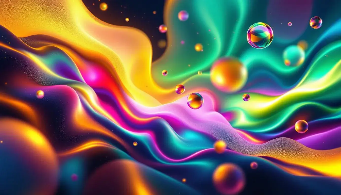
Mystic Hues conjures the midnight glow of a cityscape reflected on wet asphalt, the electric pulse felt in crowded arcades. Imagine an experience that wraps you in an aura, a space where reality softens at the edges. Vibrant Turquoise suggests the cool promise of rain after a long drought, while Radiant Orchid hints at an underlying passion, carefully controlled. This palette is like a meticulously crafted illusion, pulling you in closer until you find yourself at a precipice, unsure of what’s real and what’s manufactured. The inclusion of Deep Grape and Slate Blue provides a grounding effect, suggesting something more substantial beneath all the gleam. This is a brand that understands the allure of mystery, offering escapism with a touch of sophistication. Visualize it: sleek interfaces that seem to anticipate your desires, products that whisper of otherworldly origins. Businesses aiming to capture the zeitgeist of digital intrigue, those building empires of the mind, will seek this look. The final touch, Dark Olive, suggests an ancient knowledge. This palette, far from being frivolous, signals an understanding of the deep past as an important part of future innovation.
Faithful Palette recalls stained glass catching the morning light, old books bound in leather, the hushed reverence of a cathedral. It speaks of stories passed down through generations, of wisdom etched in stone. Imagine services that feel both timeless and timely, spaces that inspire contemplation and connection. The combination of Light Gray and Dusty Blue creates an environment of quiet calm, of deep thought. The presence of Golden Yellow hints at the preciousness of knowledge, adding a touch of optimism to the somber tones. It is a palette that does not scream for attention but instead invites quiet consideration, a brand confident in its authority. Think of a school whose classrooms hum with focused curiosity, or a community center that feels like a sanctuary. The weight of Navy Blue suggests reliability, while Burgundy indicates a deep understanding of the past. It evokes traditions and ceremonies, and a desire to bring people together in meaningful ways. The Faithful Palette is not just about the past, but about how lessons learned can carry us gently into the future. The emotional impact is both familiar and timeless allowing for a feeling of coming home, wherever you are.
Earthy Elegance whispers of sandy beaches at sunset, of linen sheets and rough-hewn wood, a feeling of being grounded. It evokes the scent of wildflowers and the quiet rustle of dry leaves. Picture a calm atmosphere that invites relaxation and rejuvenation, promising understated luxury found in simplicity. Very Pale Beige suggests purity and cleanliness, while Soft Yellow hints at a warmth that is gentle not intense. This combination creates a welcoming embrace. The subdued strength of Muted Beige and Grayish Brown offers sophistication without being ostentatious, appealing to a clientele that values environmental awareness. Envision boutiques filled with handcrafted goods or eco-resorts nestled in tranquil landscapes where Almost Black adds drama and provides solid footing. It is a subtle statement, a declaration of values whispered quietly but definitely. A brand choosing this palette wants to convey a sense of responsibility towards both its craft and its consumers. It's a look that suggests a slowing down, inviting us to appreciate the small moments and the beauty of natural forms.
Law Palette evokes the weighty feel of legal documents, the hushed atmosphere of a courtroom, and the precision demanded by law. It exudes trust, stability, and unwavering integrity. Imagine offices steeped in calm formality, where important decisions are made with clarity. The cool restraint of Off White and Pale Cyan creates an environment of impartiality. Lime Green, used sparingly, suggests growth and innovation, suggesting a modern outlook. The presence of Dim Gray creates an air of quiet confidence, while Onyx anchors the palette in unwavering gravitas. It’s a clear message and conveys seriousness and reliability. Think of financial institutions that need to instill trust, or legal firms promising diligent and ethical service. This is a color scheme that does not rely on visual tricks, but on a direct communication of facts. It evokes a commitment to reason and a dedication to upholding standards. Law Palette aims toward competence.
Eclectic Energy suggests the bustling atmosphere of an artist’s studio, the invigorating scent of fresh paint, and the thrill of experimentation. It pulses with creative intent, sparking ideas and encouraging improvisation. Picture a space of vibrant activity where boundaries are blurred and new possibilities are born. Pale Beige provides a grounding, a canvas on which to experiment. Grayish Blue and Deep Teal work together harmoniously to offer a sense of both serenity and depth setting the perfect stage for Burnt Red and Dark Charcoal. It is bold, a touch rebellious. This palette is a daring invitation to see things differently, to challenge conventions and inspire unexpected connections. Consider a creative agency pushing the limits of their art, or a marketing firm challenging customers to reconsider their expectations. There is a kineticism that draws the eye and an underlying sophistication that doesn't feel overwhelming or childish.
Each palette paints a fragment of the future, signaling the evolution of branding beyond mere aesthetics. "Mystic Hues" captures the allure of tech-infused escapism; "Faithful Palette" speaks to the enduring importance of tradition and community; "Earthy Elegance" embodies both luxury and environmental sensitivity; the 'Law Palette' offers steadfast reassurance in a world demanding transparency; and "Eclectic Energy" represents the bold creative spirit of 2025. These are far beyond color choices; they are projections of values, promises of belonging, and ultimately, silent guides towards the new narratives being composed. In a market overflowing with noise, capturing these carefully curated voices may be the thing that truly makes a brand visible.