'%3e%3cpath%20fill-rule='evenodd'%20clip-rule='evenodd'%20d='M51.1303%2019.2492C50.7278%2019.913%2050.1346%2020.4426%2049.3508%2020.838C48.5669%2021.2335%2047.6172%2021.4312%2046.5014%2021.4312C44.8208%2021.4312%2043.4367%2021.0216%2042.3492%2020.2025C41.2617%2019.3833%2040.6686%2018.2394%2040.5697%2016.7706H44.4253C44.4818%2017.3355%2044.6831%2017.7804%2045.0291%2018.1052C45.3751%2018.43%2045.8164%2018.5924%2046.3531%2018.5924C46.8192%2018.5924%2047.1864%2018.4653%2047.4547%2018.2111C47.7231%2017.9569%2047.8572%2017.618%2047.8572%2017.1943C47.8572%2016.8129%2047.7337%2016.4952%2047.4865%2016.241C47.2393%2015.9867%2046.9322%2015.7784%2046.565%2015.616C46.1978%2015.4536%2045.6893%2015.2594%2045.0397%2015.0334C44.0934%2014.7086%2043.3202%2014.3944%2042.72%2014.0907C42.1197%2013.7871%2041.6042%2013.3351%2041.1735%2012.7349C40.7427%2012.1347%2040.5273%2011.3544%2040.5273%2010.394C40.5273%209.50418%2040.7533%208.73448%2041.2053%208.08481C41.6572%207.43515%2042.2821%206.93731%2043.0801%206.5913C43.8781%206.24528%2044.7925%206.07227%2045.8235%206.07227C47.49%206.07227%2048.8141%206.46771%2049.7956%207.25861C50.7772%208.04951%2051.3315%209.13698%2051.4586%2010.5211H47.5395C47.4689%2010.0268%2047.2888%209.63483%2046.9993%209.3453C46.7097%209.05578%2046.3178%208.91102%2045.8235%208.91102C45.3998%208.91102%2045.0573%209.024%2044.7961%209.24997C44.5348%209.47594%2044.4041%209.80783%2044.4041%2010.2457C44.4041%2010.5988%2044.5207%2010.8989%2044.7537%2011.146C44.9867%2011.3932%2045.2798%2011.5944%2045.6328%2011.7498C45.9859%2011.9052%2046.4944%2012.1029%2047.1581%2012.343C48.1185%2012.6678%2048.9023%2012.9891%2049.5096%2013.3069C50.1169%2013.6246%2050.6395%2014.0872%2051.0773%2014.6945C51.5151%2015.3018%2051.734%2016.0927%2051.734%2017.0672C51.734%2017.8581%2051.5328%2018.5854%2051.1303%2019.2492ZM59.0242%206.3053V21.2829H55.4016V6.3053H59.0242ZM73.9409%206.3053V9.18642H69.8734V21.2829H66.2296V9.18642H62.2046V6.3053H73.9409ZM80.7438%209.18642V12.3218H85.8069V15.0546H80.7438V18.3806H86.4425V21.2829H77.1212V6.3053H86.4425V9.18642H80.7438ZM99.667%2016.0291V21.2829H96.0444V6.3053H101.913C103.692%206.3053%20105.048%206.74665%20105.98%207.62934C106.912%208.51204%20107.378%209.7019%20107.378%2011.199C107.378%2012.1311%20107.17%2012.9609%20106.753%2013.6882C106.337%2014.4155%20105.719%2014.9875%20104.9%2015.4042C104.08%2015.8208%20103.085%2016.0291%20101.913%2016.0291H99.667ZM103.692%2011.199C103.692%209.8855%20102.965%209.22879%20101.51%209.22879H99.667V13.1268H101.51C102.965%2013.1268%20103.692%2012.4842%20103.692%2011.199ZM120.092%2018.5501H114.478L113.546%2021.2829H109.732L115.219%206.41123H119.393L124.879%2021.2829H121.024L120.092%2018.5501ZM119.16%2015.7961L117.295%2010.2881L115.41%2015.7961H119.16ZM131.555%2018.5077H136.385V21.2829H127.933V6.3053H131.555V18.5077ZM143.337%209.18642V12.3218H148.4V15.0546H143.337V18.3806H149.035V21.2829H139.714V6.3053H149.035V9.18642H143.337ZM163.507%206.3053V9.18642H159.44V21.2829H155.796V9.18642H151.771V6.3053H163.507ZM177.449%206.3053V9.18642H173.382V21.2829H169.738V9.18642H165.713V6.3053H177.449ZM184.252%209.18642V12.3218H189.315V15.0546H184.252V18.3806H189.951V21.2829H180.629V6.3053H189.951V9.18642H184.252Z'%20fill='%23EEF0ED'/%3e%3cmask%20id='mask0_3101_7327'%20style='mask-type:alpha'%20maskUnits='userSpaceOnUse'%20x='0'%20y='0'%20width='27'%20height='28'%3e%3cpath%20d='M23.8328%200.759766H2.64808C1.18559%200.759766%200%201.94535%200%203.40785V24.5925C0%2026.055%201.18559%2027.2406%202.64808%2027.2406H23.8328C25.2952%2027.2406%2026.4808%2026.055%2026.4808%2024.5925V3.40785C26.4808%201.94535%2025.2952%200.759766%2023.8328%200.759766Z'%20fill='white'/%3e%3c/mask%3e%3cg%20mask='url(%23mask0_3101_7327)'%3e%3cpath%20d='M23.8328%200.759766H2.64808C1.18559%200.759766%200%201.94535%200%203.40785V24.5925C0%2026.055%201.18559%2027.2406%202.64808%2027.2406H23.8328C25.2952%2027.2406%2026.4808%2026.055%2026.4808%2024.5925V3.40785C26.4808%201.94535%2025.2952%200.759766%2023.8328%200.759766Z'%20fill='%23D8D8D8'/%3e%3cpath%20d='M13.2404%200.759766H0V14.0001H13.2404V0.759766Z'%20fill='%238C61FF'/%3e%3cpath%20d='M13.2404%2014H0V27.2404H13.2404V14Z'%20fill='%2336C3FE'/%3e%3cpath%20d='M26.4806%2014H13.2402V27.2404H26.4806V14Z'%20fill='%236592FE'/%3e%3cpath%20d='M26.4806%200.759766H13.2402V14.0002H26.4806V0.759766Z'%20fill='%236059F7'/%3e%3c/g%3e%3c/g%3e%3cdefs%3e%3cclipPath%20id='clip0_3101_7327'%3e%3crect%20width='190'%20height='28'%20fill='white'/%3e%3c/clipPath%3e%3c/defs%3e%3c/svg%3e)
'%3e%3cpath%20d='M23.8328%200.759521H2.64808C1.18559%200.759521%200%201.94511%200%203.40761V24.5923C0%2026.0548%201.18559%2027.2404%202.64808%2027.2404H23.8328C25.2952%2027.2404%2026.4808%2026.0548%2026.4808%2024.5923V3.40761C26.4808%201.94511%2025.2952%200.759521%2023.8328%200.759521Z'%20fill='%23D8D8D8'/%3e%3cpath%20d='M13.2404%200.759521H0V13.9999H13.2404V0.759521Z'%20fill='%238C61FF'/%3e%3cpath%20d='M13.2404%2013.9998H0V27.2402H13.2404V13.9998Z'%20fill='%2336C3FE'/%3e%3cpath%20d='M26.4809%2013.9998H13.2405V27.2402H26.4809V13.9998Z'%20fill='%236592FE'/%3e%3cpath%20d='M26.4809%200.759277H13.2405V13.9997H26.4809V0.759277Z'%20fill='%236059F7'/%3e%3c/g%3e%3c/svg%3e)
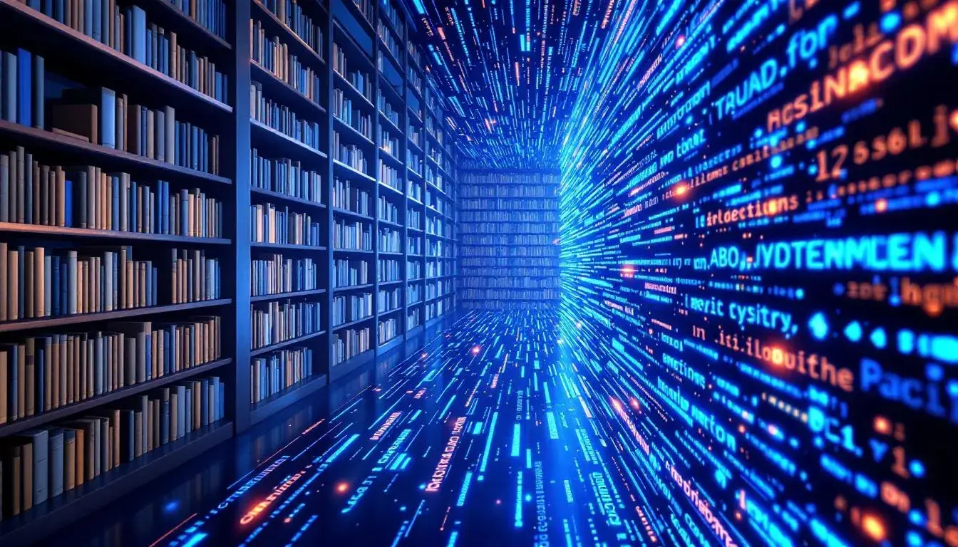
From Library to Website: The Expanding Horizons of Academic Color Use 🏫
07 Jul 2025 · 5 min readColor bleeds into the academic world, it moves the soul, and stirs the mind. The hushed halls of libraries, once defined by rows of sepia-toned spines and the quiet scratch of pens on paper, are now expanding. Websites and online learning platforms seek to capture the same sense of focused learning, but in a medium that pulsates with light and color. But can the considered environment of a traditional institution be replicated, perhaps, improved on, in the brave new world of remote studies? The challenge is making that transition successful by creating an atmosphere that is both engaging and conducive to study. As education embraces the digital age, color becomes a crucial tool in shaping the user experience, conveying institutional values, and fostering a sense of intellectual curiosity. From the careful selection of background tones to the strategic use of accent shades, the conscious application of color can build an interactive, friendly, and inspiring educational environment whether in person or online. How can a color palette translate the gravitas and reliability of an institution while simultaneously encouraging exploration and dynamism? It is a new, unfolding chapter in how learning occurs, and, importantly, how it feels.
The "Corporate Training" 🏫 palette whispers of knowledge imparted not through dusty tomes, but through interactive modules and virtual conference rooms. Off White lays a foundation of calm neutrality, its presence felt like the reassuring absence of distracting clutter. Imagine that backdrop, supporting, rather than competing with, vibrant displays of information. Olive Drab hints at established wisdom, a sense of history viewed through a contemporary lens. Perhaps it is a subtle nod to the long tradition of academic inquiry, while Teal Blue injects a note of innovation, mirroring the forward-thinking approach of modern education. Rusty Red carries a weight of authority, suggesting the rigor and discipline of the subject matter. It might be used sparingly—a highlight here, an emphatic detail there—to draw attention to essential components. These are the colours that guide the eye, signaling levels of accomplishment and areas needing further attention. Dark Slate anchors the scheme, providing a grounding element that conveys stability and dependability. Together, these shades are a visual representation of a learning environment that prioritizes clarity, engagement, and effective knowledge transfer. The selection mirrors the transition from the traditional classroom to a dynamic, tech-savvy training space, where learning is seen as an active, ongoing process, not merely the passive absorption of facts. This palette communicates a promise: progress is possible, growth is achievable, and learning can be both intellectually stimulating and deeply practical.
The "Academic Palette" 📚 carries the serenity of a time-worn institution married with the sleekness befitting a website. Light Beige brings to mind the gentle patina of aged parchment, the weight of accumulated wisdom etched onto every page. Imagine this color as the backdrop for an online journal, the subtle visual cue grounding the information being provided. Next, Seafoam Green offers a breath of fresh air, a counterpoint to the potential stuffiness of formal learning. It mirrors a renewed focus on green spaces on campus, or the digital green spaces where students and educators gather today. Light Blue Gray suggests clear skies, open space, and the boundless possibilities of intellectual exploration, a virtual horizon of knowledge to be attained. It speaks of reason and clarity. Dark Indigo, a hue resonant with tradition, hints at the deep, contemplative work that forms the bedrock of academia. This is a color that evokes the hush of a library, the seriousness of purpose found in quiet study. Lastly, Dark Olive adds a layer of organic depth, grounding the intellectual pursuits in the tangible world. It is a color that may be associated with the environment, with the ongoing need for research and stewardship. All of this suggests both experience and hope. Together, these colors evoke the core values of an educational institution: knowledge, growth, and the pursuit of truth. The palette captures the shift from libraries to websites, translating the trusted atmosphere of learning into a digital context. It builds a space that is timeless, dependable, and ready for exploration.
The "Scholarly Dusk" 📒 palette recalls that moment in the library when the fading light outside filters through the massive windows, casting long shadows across the reading room. Light Grayish-Khaki is like the soft glow of aged paper under lamplight, inviting quiet contemplation. The scene suggests a well-worn text opened at a pivotal chapter. Light Slate Gray hints at the intellectual rigor, of complex ideas taking form through careful study. The subtle coolness brings a sense of control and collected thought. Pale Cornflower Blue opens up the palette as the digital learning experience offers students the ability to see new perspectives. It speaks of connection, innovation, and the collaborative spirit that thrives in contemporary education. Dark Sapphire suggests the weight of tradition, the centuries of knowledge and inquiry that underpin academic institutions. This may serve to deepen trust in the information being shared. Dark Olive Green, the shade of the leaves rustling outside the library window, anchors the palette in nature, a gentle reminder of the world beyond the books. It is a gentle reminder of the importance of nature, science, and discovery in a new world of exploration. Together, these colors evoke the quiet intensity of academic life, the pursuit of knowledge as twilight descends. This palette transfers the traditional atmosphere of a scholarly environment into the digital space, offering a design that creates an introspective atmosphere.
The "MIT Palette" 🏛️ transmits the aura of one of the world's leading institutions. Not simply in brand association, but in how it reflects rigorous thought. The Light Gray provides a neutral foundation that is a blank canvas for complex problem-solving. It suggests a place of openness, where ideas can be freely explored without visual distraction. Steel Blue speaks of technical prowess and innovation, symbolizing the university's commitment to cutting-edge research. It is a forward-facing hue. Olive Drab suggests the heritage of the institution, the years of academic tradition and scholarly pursuit. This color hints at the established reputation and long-standing credibility that students and researchers value. Deep Sapphire hints at the in-depth exploration and deep thinking. It evokes the dedication and attention to detail that drives advances in study and research. Dark Burgundy might be an unexpected colour in this particular palette, injecting unexpected heat, and inspiring intensity in learning. It is a subtle burst of courage, and inspiration. Collectively, these colors create a sense of intellectual rigor, technical expertise, and institutional prestige. The palette captures the movement from libraries to digital platforms, offering a brand identity that will inspire the next generation of groundbreaking discoveries.
The "Tech Education" 💻 palette seems to signal a shift in higher learning to tech-heavy education streams. There is a sense of possibility, of looking to the horizon. The Soft Beige speaks to approachability. Instead of being an unachievable, untouchable establishment, here is education for everyone. Mustard Yellow inspires a note of curiosity, and experimentation; ideas that the tech-focused education strives to deliver. Light Steel Blue evokes trust, and clear understanding. Especially useful in digital spaces, using these tones to create interfaces will aid learning. Burnt Sienna presents the warmth, and groundedness that helps to invite human connection, and prevent people from feeling overwhelmed. Deep Teal adds depth that creates a layer of authority without becoming overbearing. This is the color of knowledge sharing, and it suggests the user is in good hands. This palette, collectively, suggests possibility. The proportional change from libraries to websites is calculated as follows: in the provided data, "Library" appears 0 times in "application_contexts":"suitable_rooms," and "Websites" appears 5 times in "application_contexts":"projects." The shift highlights a substantial increase (from 0 to 5), indicating a large proportional change from library-centric to website-centric applications.
The transition from physical libraries to digital platforms represents a revolution in education. These color palettes reflect that transition, each offering a unique lens through which to view the evolving landscape of learning. "Corporate Training" speaks of knowledge imparted through digital interaction, while "Academic Palette" evokes the serene atmosphere of a physical library translated to a digital space. "Scholarly Dusk" hints at the quiet intensity of focused study, while "MIT Palette" embodies the prestige and innovation of a leading institution. "Tech Education" suggests the human connection now available in technical learning. As education expands its reach into the digital sphere, color becomes an even more important tool for cultivating intuitive, and inspiring spaces for the next generation of learners.