'%3e%3cpath%20fill-rule='evenodd'%20clip-rule='evenodd'%20d='M51.1303%2019.2492C50.7278%2019.913%2050.1346%2020.4426%2049.3508%2020.838C48.5669%2021.2335%2047.6172%2021.4312%2046.5014%2021.4312C44.8208%2021.4312%2043.4367%2021.0216%2042.3492%2020.2025C41.2617%2019.3833%2040.6686%2018.2394%2040.5697%2016.7706H44.4253C44.4818%2017.3355%2044.6831%2017.7804%2045.0291%2018.1052C45.3751%2018.43%2045.8164%2018.5924%2046.3531%2018.5924C46.8192%2018.5924%2047.1864%2018.4653%2047.4547%2018.2111C47.7231%2017.9569%2047.8572%2017.618%2047.8572%2017.1943C47.8572%2016.8129%2047.7337%2016.4952%2047.4865%2016.241C47.2393%2015.9867%2046.9322%2015.7784%2046.565%2015.616C46.1978%2015.4536%2045.6893%2015.2594%2045.0397%2015.0334C44.0934%2014.7086%2043.3202%2014.3944%2042.72%2014.0907C42.1197%2013.7871%2041.6042%2013.3351%2041.1735%2012.7349C40.7427%2012.1347%2040.5273%2011.3544%2040.5273%2010.394C40.5273%209.50418%2040.7533%208.73448%2041.2053%208.08481C41.6572%207.43515%2042.2821%206.93731%2043.0801%206.5913C43.8781%206.24528%2044.7925%206.07227%2045.8235%206.07227C47.49%206.07227%2048.8141%206.46771%2049.7956%207.25861C50.7772%208.04951%2051.3315%209.13698%2051.4586%2010.5211H47.5395C47.4689%2010.0268%2047.2888%209.63483%2046.9993%209.3453C46.7097%209.05578%2046.3178%208.91102%2045.8235%208.91102C45.3998%208.91102%2045.0573%209.024%2044.7961%209.24997C44.5348%209.47594%2044.4041%209.80783%2044.4041%2010.2457C44.4041%2010.5988%2044.5207%2010.8989%2044.7537%2011.146C44.9867%2011.3932%2045.2798%2011.5944%2045.6328%2011.7498C45.9859%2011.9052%2046.4944%2012.1029%2047.1581%2012.343C48.1185%2012.6678%2048.9023%2012.9891%2049.5096%2013.3069C50.1169%2013.6246%2050.6395%2014.0872%2051.0773%2014.6945C51.5151%2015.3018%2051.734%2016.0927%2051.734%2017.0672C51.734%2017.8581%2051.5328%2018.5854%2051.1303%2019.2492ZM59.0242%206.3053V21.2829H55.4016V6.3053H59.0242ZM73.9409%206.3053V9.18642H69.8734V21.2829H66.2296V9.18642H62.2046V6.3053H73.9409ZM80.7438%209.18642V12.3218H85.8069V15.0546H80.7438V18.3806H86.4425V21.2829H77.1212V6.3053H86.4425V9.18642H80.7438ZM99.667%2016.0291V21.2829H96.0444V6.3053H101.913C103.692%206.3053%20105.048%206.74665%20105.98%207.62934C106.912%208.51204%20107.378%209.7019%20107.378%2011.199C107.378%2012.1311%20107.17%2012.9609%20106.753%2013.6882C106.337%2014.4155%20105.719%2014.9875%20104.9%2015.4042C104.08%2015.8208%20103.085%2016.0291%20101.913%2016.0291H99.667ZM103.692%2011.199C103.692%209.8855%20102.965%209.22879%20101.51%209.22879H99.667V13.1268H101.51C102.965%2013.1268%20103.692%2012.4842%20103.692%2011.199ZM120.092%2018.5501H114.478L113.546%2021.2829H109.732L115.219%206.41123H119.393L124.879%2021.2829H121.024L120.092%2018.5501ZM119.16%2015.7961L117.295%2010.2881L115.41%2015.7961H119.16ZM131.555%2018.5077H136.385V21.2829H127.933V6.3053H131.555V18.5077ZM143.337%209.18642V12.3218H148.4V15.0546H143.337V18.3806H149.035V21.2829H139.714V6.3053H149.035V9.18642H143.337ZM163.507%206.3053V9.18642H159.44V21.2829H155.796V9.18642H151.771V6.3053H163.507ZM177.449%206.3053V9.18642H173.382V21.2829H169.738V9.18642H165.713V6.3053H177.449ZM184.252%209.18642V12.3218H189.315V15.0546H184.252V18.3806H189.951V21.2829H180.629V6.3053H189.951V9.18642H184.252Z'%20fill='%23EEF0ED'/%3e%3cmask%20id='mask0_3101_7327'%20style='mask-type:alpha'%20maskUnits='userSpaceOnUse'%20x='0'%20y='0'%20width='27'%20height='28'%3e%3cpath%20d='M23.8328%200.759766H2.64808C1.18559%200.759766%200%201.94535%200%203.40785V24.5925C0%2026.055%201.18559%2027.2406%202.64808%2027.2406H23.8328C25.2952%2027.2406%2026.4808%2026.055%2026.4808%2024.5925V3.40785C26.4808%201.94535%2025.2952%200.759766%2023.8328%200.759766Z'%20fill='white'/%3e%3c/mask%3e%3cg%20mask='url(%23mask0_3101_7327)'%3e%3cpath%20d='M23.8328%200.759766H2.64808C1.18559%200.759766%200%201.94535%200%203.40785V24.5925C0%2026.055%201.18559%2027.2406%202.64808%2027.2406H23.8328C25.2952%2027.2406%2026.4808%2026.055%2026.4808%2024.5925V3.40785C26.4808%201.94535%2025.2952%200.759766%2023.8328%200.759766Z'%20fill='%23D8D8D8'/%3e%3cpath%20d='M13.2404%200.759766H0V14.0001H13.2404V0.759766Z'%20fill='%238C61FF'/%3e%3cpath%20d='M13.2404%2014H0V27.2404H13.2404V14Z'%20fill='%2336C3FE'/%3e%3cpath%20d='M26.4806%2014H13.2402V27.2404H26.4806V14Z'%20fill='%236592FE'/%3e%3cpath%20d='M26.4806%200.759766H13.2402V14.0002H26.4806V0.759766Z'%20fill='%236059F7'/%3e%3c/g%3e%3c/g%3e%3cdefs%3e%3cclipPath%20id='clip0_3101_7327'%3e%3crect%20width='190'%20height='28'%20fill='white'/%3e%3c/clipPath%3e%3c/defs%3e%3c/svg%3e)
'%3e%3cpath%20d='M23.8328%200.759521H2.64808C1.18559%200.759521%200%201.94511%200%203.40761V24.5923C0%2026.0548%201.18559%2027.2404%202.64808%2027.2404H23.8328C25.2952%2027.2404%2026.4808%2026.0548%2026.4808%2024.5923V3.40761C26.4808%201.94511%2025.2952%200.759521%2023.8328%200.759521Z'%20fill='%23D8D8D8'/%3e%3cpath%20d='M13.2404%200.759521H0V13.9999H13.2404V0.759521Z'%20fill='%238C61FF'/%3e%3cpath%20d='M13.2404%2013.9998H0V27.2402H13.2404V13.9998Z'%20fill='%2336C3FE'/%3e%3cpath%20d='M26.4809%2013.9998H13.2405V27.2402H26.4809V13.9998Z'%20fill='%236592FE'/%3e%3cpath%20d='M26.4809%200.759277H13.2405V13.9997H26.4809V0.759277Z'%20fill='%236059F7'/%3e%3c/g%3e%3c/svg%3e)
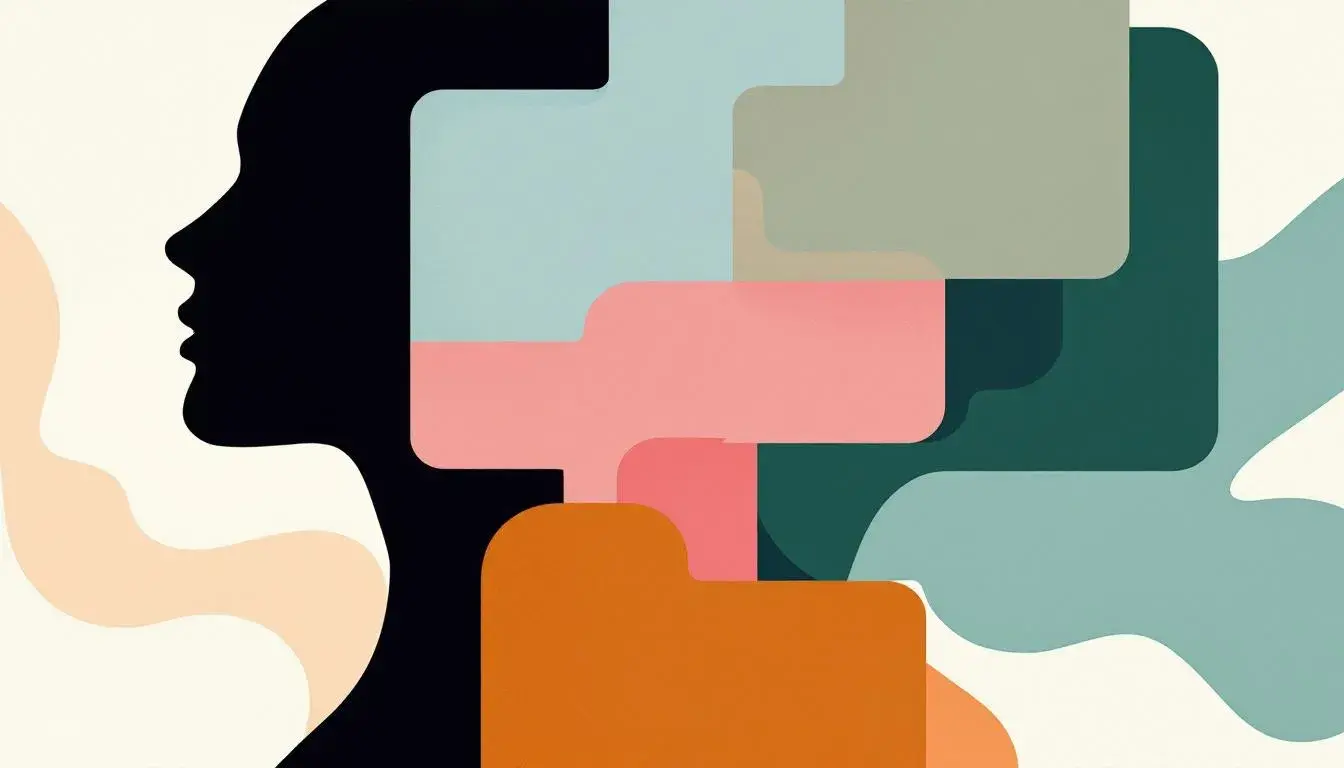
Analyzing Emotional Color: A Color Psychology Dive Into Moods in Palettes
18 Jun 2025 · 5 min readThe perception of color, like emotion, is a profoundly subjective experience. Certain hues whisper of tranquility, while others shout of vibrant unrest. The careful orchestration of a color palette is more than just aesthetics; it is an intentional crafting of atmosphere, a conscious decision about the emotional landscape we wish to inhabit. The right combination can conjure memories, spark imagination, and ultimately shape how we perceive the world and our place within it. Color informs our choices, influences our feelings, and subtly guides us through every moment. The following palettes represent distinct approaches for guiding these emotional journeys, each with their own power to shape perception.
Earthy Elegance presents a world softened at the edges. It speaks of quiet mornings and the gentle patter of rain on fallen leaves. Pale Beige lays the foundation, a silent whisper of serenity. Soft Blue evokes wide, open skies, the cool touch of porcelain, a breathable calm. Neutral Gray brings a grounding element, a sense of steadfastness and timelessness. The unexpected thrill of Vibrant Pink—a flash of wild berries beneath the canopy—prevents any descent into monotony. Burnt Sienna, the color of sun-baked earth, imparts a sense of homecoming, of belonging. Dark Forest Green anchors the palette in the natural world, hinting at fertile depths and the quiet wisdom of old growth forests. The overall effect is one of understated luxury; a conscious choice to embrace the raw beauty of the natural world, artfully composed to evoke a sense of peaceful sophistication. Imagine a room bathed in the soft, diffused light of late afternoon, a space where conversations flow easily and time seems to slow its relentless march. It’s a palette for those who seek solace in the simple, authentic elegance of the earth, where the natural colors comfort and nurture.
Vibrant Mix is a clarion call to action, a celebration of bold expression. Pure White offers a blank canvas, a stage set for the drama to unfold. Pale Yellow feels like sunlight on skin, a gentle warmth that promises joy. Sky Blue evokes optimism and freedom, the boundless potential of a clear summer day. Neutral Gray provides a necessary counterbalance, preventing the palette from spiraling into chaos. Olive Drab brings a touch of earthiness, a grounding element amidst the exuberance. Teal Green is a breath of fresh air, a revitalizing force that awakens the senses. Bright Lavender hints at magic and mystery, a touch of the surreal. Deep Indigo speaks of intellectual curiosity and boundless imagination, an invitation to explore the depths of creativity. Vivid Red is a bolt of pure energy, a passionate declaration of intent. Dark Charcoal anchors the palette, adding a sense of gravitas and sophistication. Together, these colors create a dynamic tension; a space where innovation thrives and boundaries are meant to be broken. Imagine a bustling urban landscape, filled with art installations and impromptu performances, a place where individuality is celebrated and self-expression knows no bounds. It's a palette for those who dare to stand out, who embrace the thrill of the unexpected, and who believe that life should be lived in full color.
Odoo Palette whispers of discretion and efficiency. White offers purity and clarity, a clean slate for focused work. Light Gray provides a subtle sophistication, a backdrop that doesn’t distract. The gentle wash of Light Blue suggests calm competence, a reliable presence in demanding situations. Gray brings neutrality and level-headedness, a reminder of considered judgment. Teal evokes productivity with a touch of quiet creativity, the gentle hum of innovation. Bright Blue offers a spark, an acknowledgement of aspiration and new ideas. Dark Gray provides the grounded confidence to build upon. Together, these hues shape a world of refined intention; a space where clarity of thought promotes success. See clean lines and considered spaces, a sanctuary for those seeking order. It’s a palette for those who value structure and who find beauty in simplicity.
Warmth & Trust generates a cultivated ease, a space that invites intimate sharing. Cream offers the comfort of a loved object, well-worn but treasured. Golden Yellow feels like a sunlit room, or the cozy scent of baked bread. Grey gives grounding, a connection between warm comfort and reliability. Pink hints at health, the glow of robust relationships and gentle conversation. Blue breathes openness, the call to look beyond and invite new perspectives. Adding to dimension, Red indicates action, the passion behind meaningful connection. Brown whispers of earth, shared meals, and honest intentions. Deep Blue represents thought, building safety, and a measured confidence. Black gives strength to the palette, an edge to the quiet sharing. Together, these tones create a balanced experience. Think of a favorite chair and a crackling fireplace, a moment of deep connection, a respite from the world. This palette embraces honesty and allows vulnerability to blossom. It cultivates trust and builds intimacy.
Turf Colors recalls playful days beneath open skies, a celebration of community and togetherness. White is the expansive invitation of shared potential. Pale Yellow, like sun-warmed grass, feels like the first spark of energy. Light Gray offers a quiet foundation. Playful Orange brings enthusiasm, adventure, and discovery. Lime Green sings with freshness, a feeling of growth that inspires a sense of welcome. Medium Gray connects to a love of nature: a pebble smoothed by water and wind. Red offers an invigorating boost, bringing passion into the experience. Blue creates an appetite to explore, to push boundaries and think beyond the expected. Forest Green encourages grounded presence, to bring joy through comfort and nature. Dark Gray lends strength to the palette. Close your eyes and think of a well-loved yard, shared with generations, a space where memories are made and joy comes easily. This palette welcomes playfulness, encourages exploration, and creates a space of belonging.
Cool Vibrance creates a feeling of contained chaos, inviting freedom and innovation while nurturing focus. off-white builds a space of potential, bringing a clarity that encourages expansive thinking. light-gray gives focus, a gentle nudge to stay on your course. bright-pink is a spark that makes others sit up, an invitation to create an experience. orange brings a bold freedom, a shout of excitement and curiosity. teal feels creative. Together, magenta and slate build cohesion. charcoal grounds the palette, inviting a feeling of sophisticated innovation. Close your eyes and think of a clean creative space, with bold splashes of color and innovative moments. This palette invites playful dedication and inspires thoughtful creations.
Ultimately, the power of a color palette rests not just in the individual shades, but in the way they interact. Each palette evokes a specific mood and provides a lens through which we experience the world. From the meditative calm of earthy tones to the energetic buzz of vivid hues, these carefully constructed arrangements offer an opportunity to shape our emotional experiences, to cultivate environments that inspire, comfort, and challenge us. They demonstrate how color, when thoughtfully applied, can become a powerful tool for communication.