'%3e%3cpath%20fill-rule='evenodd'%20clip-rule='evenodd'%20d='M51.1303%2019.2492C50.7278%2019.913%2050.1346%2020.4426%2049.3508%2020.838C48.5669%2021.2335%2047.6172%2021.4312%2046.5014%2021.4312C44.8208%2021.4312%2043.4367%2021.0216%2042.3492%2020.2025C41.2617%2019.3833%2040.6686%2018.2394%2040.5697%2016.7706H44.4253C44.4818%2017.3355%2044.6831%2017.7804%2045.0291%2018.1052C45.3751%2018.43%2045.8164%2018.5924%2046.3531%2018.5924C46.8192%2018.5924%2047.1864%2018.4653%2047.4547%2018.2111C47.7231%2017.9569%2047.8572%2017.618%2047.8572%2017.1943C47.8572%2016.8129%2047.7337%2016.4952%2047.4865%2016.241C47.2393%2015.9867%2046.9322%2015.7784%2046.565%2015.616C46.1978%2015.4536%2045.6893%2015.2594%2045.0397%2015.0334C44.0934%2014.7086%2043.3202%2014.3944%2042.72%2014.0907C42.1197%2013.7871%2041.6042%2013.3351%2041.1735%2012.7349C40.7427%2012.1347%2040.5273%2011.3544%2040.5273%2010.394C40.5273%209.50418%2040.7533%208.73448%2041.2053%208.08481C41.6572%207.43515%2042.2821%206.93731%2043.0801%206.5913C43.8781%206.24528%2044.7925%206.07227%2045.8235%206.07227C47.49%206.07227%2048.8141%206.46771%2049.7956%207.25861C50.7772%208.04951%2051.3315%209.13698%2051.4586%2010.5211H47.5395C47.4689%2010.0268%2047.2888%209.63483%2046.9993%209.3453C46.7097%209.05578%2046.3178%208.91102%2045.8235%208.91102C45.3998%208.91102%2045.0573%209.024%2044.7961%209.24997C44.5348%209.47594%2044.4041%209.80783%2044.4041%2010.2457C44.4041%2010.5988%2044.5207%2010.8989%2044.7537%2011.146C44.9867%2011.3932%2045.2798%2011.5944%2045.6328%2011.7498C45.9859%2011.9052%2046.4944%2012.1029%2047.1581%2012.343C48.1185%2012.6678%2048.9023%2012.9891%2049.5096%2013.3069C50.1169%2013.6246%2050.6395%2014.0872%2051.0773%2014.6945C51.5151%2015.3018%2051.734%2016.0927%2051.734%2017.0672C51.734%2017.8581%2051.5328%2018.5854%2051.1303%2019.2492ZM59.0242%206.3053V21.2829H55.4016V6.3053H59.0242ZM73.9409%206.3053V9.18642H69.8734V21.2829H66.2296V9.18642H62.2046V6.3053H73.9409ZM80.7438%209.18642V12.3218H85.8069V15.0546H80.7438V18.3806H86.4425V21.2829H77.1212V6.3053H86.4425V9.18642H80.7438ZM99.667%2016.0291V21.2829H96.0444V6.3053H101.913C103.692%206.3053%20105.048%206.74665%20105.98%207.62934C106.912%208.51204%20107.378%209.7019%20107.378%2011.199C107.378%2012.1311%20107.17%2012.9609%20106.753%2013.6882C106.337%2014.4155%20105.719%2014.9875%20104.9%2015.4042C104.08%2015.8208%20103.085%2016.0291%20101.913%2016.0291H99.667ZM103.692%2011.199C103.692%209.8855%20102.965%209.22879%20101.51%209.22879H99.667V13.1268H101.51C102.965%2013.1268%20103.692%2012.4842%20103.692%2011.199ZM120.092%2018.5501H114.478L113.546%2021.2829H109.732L115.219%206.41123H119.393L124.879%2021.2829H121.024L120.092%2018.5501ZM119.16%2015.7961L117.295%2010.2881L115.41%2015.7961H119.16ZM131.555%2018.5077H136.385V21.2829H127.933V6.3053H131.555V18.5077ZM143.337%209.18642V12.3218H148.4V15.0546H143.337V18.3806H149.035V21.2829H139.714V6.3053H149.035V9.18642H143.337ZM163.507%206.3053V9.18642H159.44V21.2829H155.796V9.18642H151.771V6.3053H163.507ZM177.449%206.3053V9.18642H173.382V21.2829H169.738V9.18642H165.713V6.3053H177.449ZM184.252%209.18642V12.3218H189.315V15.0546H184.252V18.3806H189.951V21.2829H180.629V6.3053H189.951V9.18642H184.252Z'%20fill='%23EEF0ED'/%3e%3cmask%20id='mask0_3101_7327'%20style='mask-type:alpha'%20maskUnits='userSpaceOnUse'%20x='0'%20y='0'%20width='27'%20height='28'%3e%3cpath%20d='M23.8328%200.759766H2.64808C1.18559%200.759766%200%201.94535%200%203.40785V24.5925C0%2026.055%201.18559%2027.2406%202.64808%2027.2406H23.8328C25.2952%2027.2406%2026.4808%2026.055%2026.4808%2024.5925V3.40785C26.4808%201.94535%2025.2952%200.759766%2023.8328%200.759766Z'%20fill='white'/%3e%3c/mask%3e%3cg%20mask='url(%23mask0_3101_7327)'%3e%3cpath%20d='M23.8328%200.759766H2.64808C1.18559%200.759766%200%201.94535%200%203.40785V24.5925C0%2026.055%201.18559%2027.2406%202.64808%2027.2406H23.8328C25.2952%2027.2406%2026.4808%2026.055%2026.4808%2024.5925V3.40785C26.4808%201.94535%2025.2952%200.759766%2023.8328%200.759766Z'%20fill='%23D8D8D8'/%3e%3cpath%20d='M13.2404%200.759766H0V14.0001H13.2404V0.759766Z'%20fill='%238C61FF'/%3e%3cpath%20d='M13.2404%2014H0V27.2404H13.2404V14Z'%20fill='%2336C3FE'/%3e%3cpath%20d='M26.4806%2014H13.2402V27.2404H26.4806V14Z'%20fill='%236592FE'/%3e%3cpath%20d='M26.4806%200.759766H13.2402V14.0002H26.4806V0.759766Z'%20fill='%236059F7'/%3e%3c/g%3e%3c/g%3e%3cdefs%3e%3cclipPath%20id='clip0_3101_7327'%3e%3crect%20width='190'%20height='28'%20fill='white'/%3e%3c/clipPath%3e%3c/defs%3e%3c/svg%3e)
'%3e%3cpath%20d='M23.8328%200.759521H2.64808C1.18559%200.759521%200%201.94511%200%203.40761V24.5923C0%2026.0548%201.18559%2027.2404%202.64808%2027.2404H23.8328C25.2952%2027.2404%2026.4808%2026.0548%2026.4808%2024.5923V3.40761C26.4808%201.94511%2025.2952%200.759521%2023.8328%200.759521Z'%20fill='%23D8D8D8'/%3e%3cpath%20d='M13.2404%200.759521H0V13.9999H13.2404V0.759521Z'%20fill='%238C61FF'/%3e%3cpath%20d='M13.2404%2013.9998H0V27.2402H13.2404V13.9998Z'%20fill='%2336C3FE'/%3e%3cpath%20d='M26.4809%2013.9998H13.2405V27.2402H26.4809V13.9998Z'%20fill='%236592FE'/%3e%3cpath%20d='M26.4809%200.759277H13.2405V13.9997H26.4809V0.759277Z'%20fill='%236059F7'/%3e%3c/g%3e%3c/svg%3e)
Industrial Revolution: Mapping Industries to Colors 📈
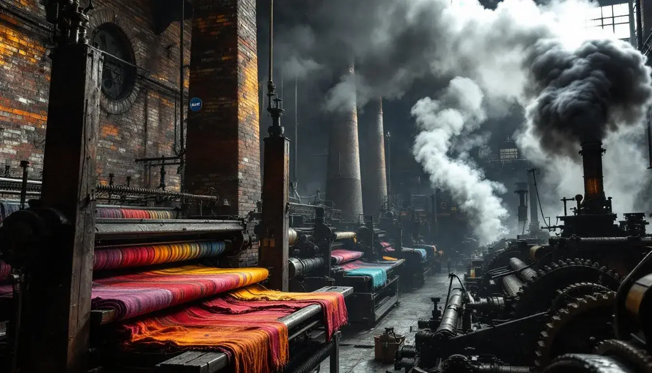
17 Jun 2025 · 5 min readThe Industrial Revolution: a period of relentless innovation – of steam, steel, and smoke. But beyond the clatter of machinery and the stark geometries of factories, an invisible world was being forged: the very color of progress. Colors seeped into the fabric of society, not merely as decoration, but as indicators of status, harbingers of change, and silent witnesses to the dawn of a new era. Imagine the sooty skies of Manchester rendered in shades of gray, the vibrant hues of newly synthesized dyes transforming textiles, the deep blues of corporate identity finding their foothold. We explore how the palettes of today echo those transformative times, painting a compelling portrait of industry through pigment and tone.
Doc Approvals possesses a certain bureaucratic charm, a muted symphony of beige, gray, and hesitant colors. It's a palette that seems to thrive in the realm of official documents, where the whisper of paper and the click of keyboard keys form the soundtrack. Pale Beige evokes the aged parchment of historical records, bearing the weight of decisions made and paths forged during times of rapid industrial expansion. Neutral Gray suggests the impartial judgment of auditors poring over ledgers, illuminated by the flickering gaslight of late-night offices. Olive Green hints at the verdant landscapes disrupted, then reshaped, by steel mills and railways—a reminder that progress often comes at a price. Dusty Rose whispers of the human element amid the machinery, perhaps the lingering scent of perfume in a factory owner's office as he navigates the changing world. And Deep Indigo speaks to long nights spent drafting agreements that laid the framework for empires built on progress. This palette, rather than screaming innovation, carries the weighty history of the systems and approvals that oiled the gears of industry. It feels like the hushed atmosphere of a library filled with the blueprints of dreams and the meticulous records of their sometimes-harsh realities. Approvals don't happen in a void; they are the considered response to bold actions in a world undergoing momentous change.
The Renault Palette speaks of motion, of engines firing and wheels churning. It's a grounded, earthy set of hues, reflecting the grit and glamour of the automotive age. Light Beige brings forth the memory of sun-baked clay, the very earth from which the raw materials of early automobiles were extracted. Grayish Green suggests the forests bordering factory towns, a connection to the natural world even as it was being transformed. Slate Gray evokes images of assembly lines, where automobiles were pieced together with precision and unwavering determination. Terracotta Brown offers the essence of raw materials, the earthiness of leather seating, and the nascent aspirations of drivers heading toward the horizon. Deep Charcoal calls to mind the coal that fueled the early factories, the exhaust fumes that marked progress, and the bold ambition to power the industrial age. This range of colors carries the excitement of engineering and transport, but it also reminds us of the environmental impact of these innovations. Think of it as the colors of both the open road and the factories producing these vehicles, the thrill of movement intertwined with the knowledge of its implications. Renault Palette brings to mind classic vehicles on a newly built highway.
Modern Edge presents a striking panorama, the intersection of technology and manufacturing at the height of the Industrial Revolution. Light Silver evokes the sleek, polished surfaces of new machinery, reflecting the ambition and optimism of the age. Olive Green brings an element of organic richness. The contrast between this element and the metallic feel of industry shows an appreciation for the environment. Steel Blue evokes the structures that defined the era. Imagine towering factories and bridges made of iron. Dark Teal lends a sense of depth. Crimson Red feels like the embers of blast furnaces, and represents the potential energy of this era. It's evocative of fire that drives innovation and transforms society. Modern Edge is a palette that doesn't shy away from the boldness of its vision, but it also carries the gravitas of a legacy that continues to shape our world. It represents the spirit of design, innovation, and ambition from the factories of the revolution.
Energy Palette thrums with vitality. White signifies the potential for a fresh start, representing the vast opportunities of new technologies. Deep Blue evokes a sense of power and depth, reminiscent of hydroelectric projects built to harness the environment's power. Forest Green suggests a commitment to a sustainable energy future. These color selections serve as a reminder that we can learn from and improve upon the ways of the past. This combination has been utilized in fields as wide-ranging as manufacturing, transportation and communications – painting a comprehensive image of advancement. If these colors could speak, they would share the story from a factory floor, a testing lab or the boardroom. A vision of what's possible and a reminder that progress can happen when a dedication to new ideals are combined with the best nature has to offer. The Energy Palette is a celebration of our ingenuity and a challenge to keep innovating responsibility.
Vodafone Business presents a straightforward, no-nonsense approach befitting the era of mass communication. Light Gray suggests the cool neutrality of technological infrastructure, the unseen networks that facilitate the rapid transfer of information. Dark Gray calls gives off a sense that innovation is consistent, and technology always aims for progress. Bright Red bursts with a call for immediate attention, reminiscent of the breakthroughs that revolutionized communication during the revolution. Together, these colors convey a focus on efficiency, reliability, and impact. While this particular palette brings to mind phone lines and satellites, one might also view it through the lens of telegraph wires stretching across nations. Or maybe the printed broadsides spreading news across a growing industrial city. A reminder that every major transformation has required connection and communication.
The colors we choose are never neutral. They carry stories, reflect values, and shape our perceptions. The palettes each cast a distinctive hue on the story by evoking different sensations. From the hushed tones of approval to the vibrant possibilities of progress, and the exciting potential of energy to the bold declarations of telecom, each selection offers insight and encourages a fresh perspective. Each palette tells a story, but as a collection, they create a visual dialogue that is both thought provoking and informative. As we move forward, may these colors guide, inspire, and remind us of the enduring human spirit that drives progress. They remind us that progress isn't just built of stone and steel, but also the hues that color our journey.