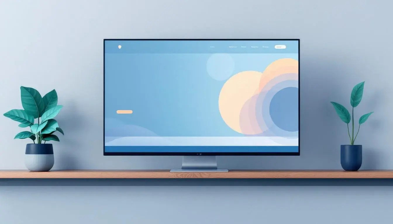
Finding the Business Edge In Blue, Most Used Color By Industry
17 Jun 2025 · 3 min readThe color blue, often associated with vast oceans and clear skies, has long been a staple in the professional world. Its pervasive presence isn't merely coincidental but rather a carefully considered choice, a strategic maneuver to project dependability, foster trust, and cultivate a sense of calm assurance. Consider the visual landscape of leading financial institutions or prominent government agencies: blue consistently anchors their brand identities, coloring logos, websites, and even interior spaces. It speaks of stability, a beacon in uncertain times, an unspoken promise of reliability that subtly influences perception and shapes client relationships. But how can designers thoughtfully use this ubiquitous tool? Let's explore the variations in its effect.
The "American Palette" 🇺🇸 presents a studied interpretation of trust. A Pale Sky Blue washes over like a tranquil morning, suggesting openness and clarity. A stark contrast is made with a Golden Yellow. This particular group of colors isn't an immediate statement, but rather a layered narrative. The Periwinkle Blue acts as a bridge, connecting the lighter and darker shades, insinuating intellect and sophistication. Further anchored are Dark Steel Gray and Dark Sapphire, serious and unwavering. One can easily imagine this set in reports, offering confidence amidst the constant volatility of the market. It implies a steady hand, reliable judgment, suggesting a commitment to enduring values while remaining adaptable. The balance it strikes is one of grounded optimism, offering a future of measured progress.
"EasyGo Product"🎨 speaks to a different kind of assurance. Light Gray offers a clean slate, a sense of seamless progress, while Teal Green adds a note of innovation. The effect is one a sense of well-managed complexity, creating intuitive experiences. It's a move away from traditional notions, where the subtle Slate Gray serves as a quiet foundation. The Royal Blue injects creativity and vision, suggesting smart solutions and forward-thinking design. Finally, Dark Coal anchors the palette -- a testament to technical proficiency and long-term value. Its appeal lies in the promise of simplicity achieved through sophisticated engineering. It communicates reliability without sacrificing creativity, fostering a sense of ease and accessibility in a fast-moving world. One imagines it being used for an app delivering a product.
"Serene Tech" 🌐 leans into a confident, almost ethereal atmosphere. Pale Blue gives the impression of open communication. Light Steel Blue appears strong and reliable, like a team is ready. Neutral Gray and Slate Gray further create a calming backdrop, enabling the Electric Blue to appear as innovative and approachable. It's a balance of practicality and imagination, suggesting a product that is both user-friendly and cutting-edge. Visualizing presentations and web interfaces adopting this particular arrangement, a feeling of professional expertise and a human touch is created. It whispers rather than shouts, relying on subtlety to express a thoughtful approach. Overall, the effect results in user experiences marked by a sense of efficiency and confidence.
"Official Site" 🇮🇪 anchors itself in formality. Light gray creates an air of neutrality. Airy blue brings a sense of openness and transparency, inviting connection. Steel blue creates a stable base and trustworthy experience, an important visual function. Slate gray expresses strength and competence. Deep olive at the end creates an earthy, honest feel. Thinking of official websites or the internal branding of large entities, one can picture the palette in use. The experience is one of structured authority, relying on an understated approach to ensure clarity and ease of navigation. It creates a space that is secure and predictable, fostering a sense of trust.
"Oceanic Calm" 🌊 presents an opportunity for a more relaxed approach. Pale Ivory casts a welcoming light, while Light Azure adds a breath of fresh air. Soft Blue Haze creates an uplifting mood. Misty Blue and Dark Indigo add a layer of depth, with the overall effect creating a visual that is immediately soothing. It's like the end of a long work day, the cool breeze on the skin. In this configuration, branding and websites associated with Healthcare or Technology would benefit from Oceanic Calm, as users will have a heightened sense of confidence and tranquility. It promotes a visual language of ease.
"Serene Blue" 🟦 is a simple choice, a commitment to uncomplicated reliability. Pale Blue feels open and approachable. Grayish Blue enhances with sophistication. Intense Blue creates impact and trust. Navy Blue is conservative and reliable. As a whole, the user benefits from visual experience with calm and professional communication. Thinking of platforms where financial discussions are present, the use of Serene Blue is a well-considered technique to instill confidence and serenity to the user.
The enduring appeal of blue lies not in any single shade but rather in its remarkable capacity to adapt and express a spectrum of professional values. From the understated confidence of "Official Site" to the innovative spirit of "EasyGo Product," each palette underscores the strategic potential when blue is wielded with intent. The visual language created by these color combinations goes beyond mere aesthetics: fostering trust, inspiring confidence, and ultimately shaping perception. As these arrangements suggest, thoughtfully executed blue shades can provide the business edge, connecting with different audiences in profound ways. The user experience remains the priority in an ever-changing world.