'%3e%3cpath%20fill-rule='evenodd'%20clip-rule='evenodd'%20d='M51.1303%2019.2492C50.7278%2019.913%2050.1346%2020.4426%2049.3508%2020.838C48.5669%2021.2335%2047.6172%2021.4312%2046.5014%2021.4312C44.8208%2021.4312%2043.4367%2021.0216%2042.3492%2020.2025C41.2617%2019.3833%2040.6686%2018.2394%2040.5697%2016.7706H44.4253C44.4818%2017.3355%2044.6831%2017.7804%2045.0291%2018.1052C45.3751%2018.43%2045.8164%2018.5924%2046.3531%2018.5924C46.8192%2018.5924%2047.1864%2018.4653%2047.4547%2018.2111C47.7231%2017.9569%2047.8572%2017.618%2047.8572%2017.1943C47.8572%2016.8129%2047.7337%2016.4952%2047.4865%2016.241C47.2393%2015.9867%2046.9322%2015.7784%2046.565%2015.616C46.1978%2015.4536%2045.6893%2015.2594%2045.0397%2015.0334C44.0934%2014.7086%2043.3202%2014.3944%2042.72%2014.0907C42.1197%2013.7871%2041.6042%2013.3351%2041.1735%2012.7349C40.7427%2012.1347%2040.5273%2011.3544%2040.5273%2010.394C40.5273%209.50418%2040.7533%208.73448%2041.2053%208.08481C41.6572%207.43515%2042.2821%206.93731%2043.0801%206.5913C43.8781%206.24528%2044.7925%206.07227%2045.8235%206.07227C47.49%206.07227%2048.8141%206.46771%2049.7956%207.25861C50.7772%208.04951%2051.3315%209.13698%2051.4586%2010.5211H47.5395C47.4689%2010.0268%2047.2888%209.63483%2046.9993%209.3453C46.7097%209.05578%2046.3178%208.91102%2045.8235%208.91102C45.3998%208.91102%2045.0573%209.024%2044.7961%209.24997C44.5348%209.47594%2044.4041%209.80783%2044.4041%2010.2457C44.4041%2010.5988%2044.5207%2010.8989%2044.7537%2011.146C44.9867%2011.3932%2045.2798%2011.5944%2045.6328%2011.7498C45.9859%2011.9052%2046.4944%2012.1029%2047.1581%2012.343C48.1185%2012.6678%2048.9023%2012.9891%2049.5096%2013.3069C50.1169%2013.6246%2050.6395%2014.0872%2051.0773%2014.6945C51.5151%2015.3018%2051.734%2016.0927%2051.734%2017.0672C51.734%2017.8581%2051.5328%2018.5854%2051.1303%2019.2492ZM59.0242%206.3053V21.2829H55.4016V6.3053H59.0242ZM73.9409%206.3053V9.18642H69.8734V21.2829H66.2296V9.18642H62.2046V6.3053H73.9409ZM80.7438%209.18642V12.3218H85.8069V15.0546H80.7438V18.3806H86.4425V21.2829H77.1212V6.3053H86.4425V9.18642H80.7438ZM99.667%2016.0291V21.2829H96.0444V6.3053H101.913C103.692%206.3053%20105.048%206.74665%20105.98%207.62934C106.912%208.51204%20107.378%209.7019%20107.378%2011.199C107.378%2012.1311%20107.17%2012.9609%20106.753%2013.6882C106.337%2014.4155%20105.719%2014.9875%20104.9%2015.4042C104.08%2015.8208%20103.085%2016.0291%20101.913%2016.0291H99.667ZM103.692%2011.199C103.692%209.8855%20102.965%209.22879%20101.51%209.22879H99.667V13.1268H101.51C102.965%2013.1268%20103.692%2012.4842%20103.692%2011.199ZM120.092%2018.5501H114.478L113.546%2021.2829H109.732L115.219%206.41123H119.393L124.879%2021.2829H121.024L120.092%2018.5501ZM119.16%2015.7961L117.295%2010.2881L115.41%2015.7961H119.16ZM131.555%2018.5077H136.385V21.2829H127.933V6.3053H131.555V18.5077ZM143.337%209.18642V12.3218H148.4V15.0546H143.337V18.3806H149.035V21.2829H139.714V6.3053H149.035V9.18642H143.337ZM163.507%206.3053V9.18642H159.44V21.2829H155.796V9.18642H151.771V6.3053H163.507ZM177.449%206.3053V9.18642H173.382V21.2829H169.738V9.18642H165.713V6.3053H177.449ZM184.252%209.18642V12.3218H189.315V15.0546H184.252V18.3806H189.951V21.2829H180.629V6.3053H189.951V9.18642H184.252Z'%20fill='%23EEF0ED'/%3e%3cmask%20id='mask0_3101_7327'%20style='mask-type:alpha'%20maskUnits='userSpaceOnUse'%20x='0'%20y='0'%20width='27'%20height='28'%3e%3cpath%20d='M23.8328%200.759766H2.64808C1.18559%200.759766%200%201.94535%200%203.40785V24.5925C0%2026.055%201.18559%2027.2406%202.64808%2027.2406H23.8328C25.2952%2027.2406%2026.4808%2026.055%2026.4808%2024.5925V3.40785C26.4808%201.94535%2025.2952%200.759766%2023.8328%200.759766Z'%20fill='white'/%3e%3c/mask%3e%3cg%20mask='url(%23mask0_3101_7327)'%3e%3cpath%20d='M23.8328%200.759766H2.64808C1.18559%200.759766%200%201.94535%200%203.40785V24.5925C0%2026.055%201.18559%2027.2406%202.64808%2027.2406H23.8328C25.2952%2027.2406%2026.4808%2026.055%2026.4808%2024.5925V3.40785C26.4808%201.94535%2025.2952%200.759766%2023.8328%200.759766Z'%20fill='%23D8D8D8'/%3e%3cpath%20d='M13.2404%200.759766H0V14.0001H13.2404V0.759766Z'%20fill='%238C61FF'/%3e%3cpath%20d='M13.2404%2014H0V27.2404H13.2404V14Z'%20fill='%2336C3FE'/%3e%3cpath%20d='M26.4806%2014H13.2402V27.2404H26.4806V14Z'%20fill='%236592FE'/%3e%3cpath%20d='M26.4806%200.759766H13.2402V14.0002H26.4806V0.759766Z'%20fill='%236059F7'/%3e%3c/g%3e%3c/g%3e%3cdefs%3e%3cclipPath%20id='clip0_3101_7327'%3e%3crect%20width='190'%20height='28'%20fill='white'/%3e%3c/clipPath%3e%3c/defs%3e%3c/svg%3e)
'%3e%3cpath%20d='M23.8328%200.759521H2.64808C1.18559%200.759521%200%201.94511%200%203.40761V24.5923C0%2026.0548%201.18559%2027.2404%202.64808%2027.2404H23.8328C25.2952%2027.2404%2026.4808%2026.0548%2026.4808%2024.5923V3.40761C26.4808%201.94511%2025.2952%200.759521%2023.8328%200.759521Z'%20fill='%23D8D8D8'/%3e%3cpath%20d='M13.2404%200.759521H0V13.9999H13.2404V0.759521Z'%20fill='%238C61FF'/%3e%3cpath%20d='M13.2404%2013.9998H0V27.2402H13.2404V13.9998Z'%20fill='%2336C3FE'/%3e%3cpath%20d='M26.4809%2013.9998H13.2405V27.2402H26.4809V13.9998Z'%20fill='%236592FE'/%3e%3cpath%20d='M26.4809%200.759277H13.2405V13.9997H26.4809V0.759277Z'%20fill='%236059F7'/%3e%3c/g%3e%3c/svg%3e)
The Dominant Darks: Unveiling the Most Used Dark Colors in 2025
16 Jun 2025 · 3 min readThe allure of darkness has always held a certain mystique, a pull towards the unknown where light struggles to penetrate. In 2025, this fascination deepens, translating into a sophisticated embrace of deeper tones within our designed spaces. This isn't about mere gloom, it's about crafting environments that evoke a sense of grounded elegance, quiet confidence, and thoughtful contemplation. Colors move beyond purely aesthetic choices; they become tools to shape emotion, define experience, and subtly influence the rhythms of our daily lives. From the comforting embrace of a dimly lit room to the compelling intrigue of a darkly themed brand aesthetic, these are the hues that set the stage. They carry a particular gravity, becoming the foundation upon which lighter, brighter accents can truly shine. Through these shades, the familiar becomes remarkable, the ordinary elevated. The journey into these dominant darks is a journey into mood, atmosphere, and the artistry of subtle impressions.
Ethereal Harmony paints a world where darkness provides a backdrop for softer moments. Pale Gray and Cool Gray whisper of half-lit rooms, of shadows lengthening across smooth surfaces. There's a sense of understated luxury in these neutral hues, a quiet acknowledgment of time passing. The inclusion of Khaki Green introduces an organic element, a reminder of nature even within the most deliberately designed spaces. It’s the color of twilight woods. But beyond the immediate comfort, Steel Blue and Violet Indigo beckon. They hint at an adventurous spirit, a willingness to delve beneath the surface. These blues and violets evoke both open skies and the mysteries of the deep sea. Imagine a library late at night, illuminated only by the soft glow of a reading lamp. The walls, a shade of Pale Gray, provide a grounding influence as the mind wanders among thrilling stories and intriguing theories. It suits those who choose to slow down and savor moments of rest. This is a space where thoughts can unravel, and inspiration can take flight. It's a study in contrasts, a balance between the restful and the revitalizing. The violet notes add a touch of the unexpected, as if a hidden garden blooms just beyond the edge of darkness.
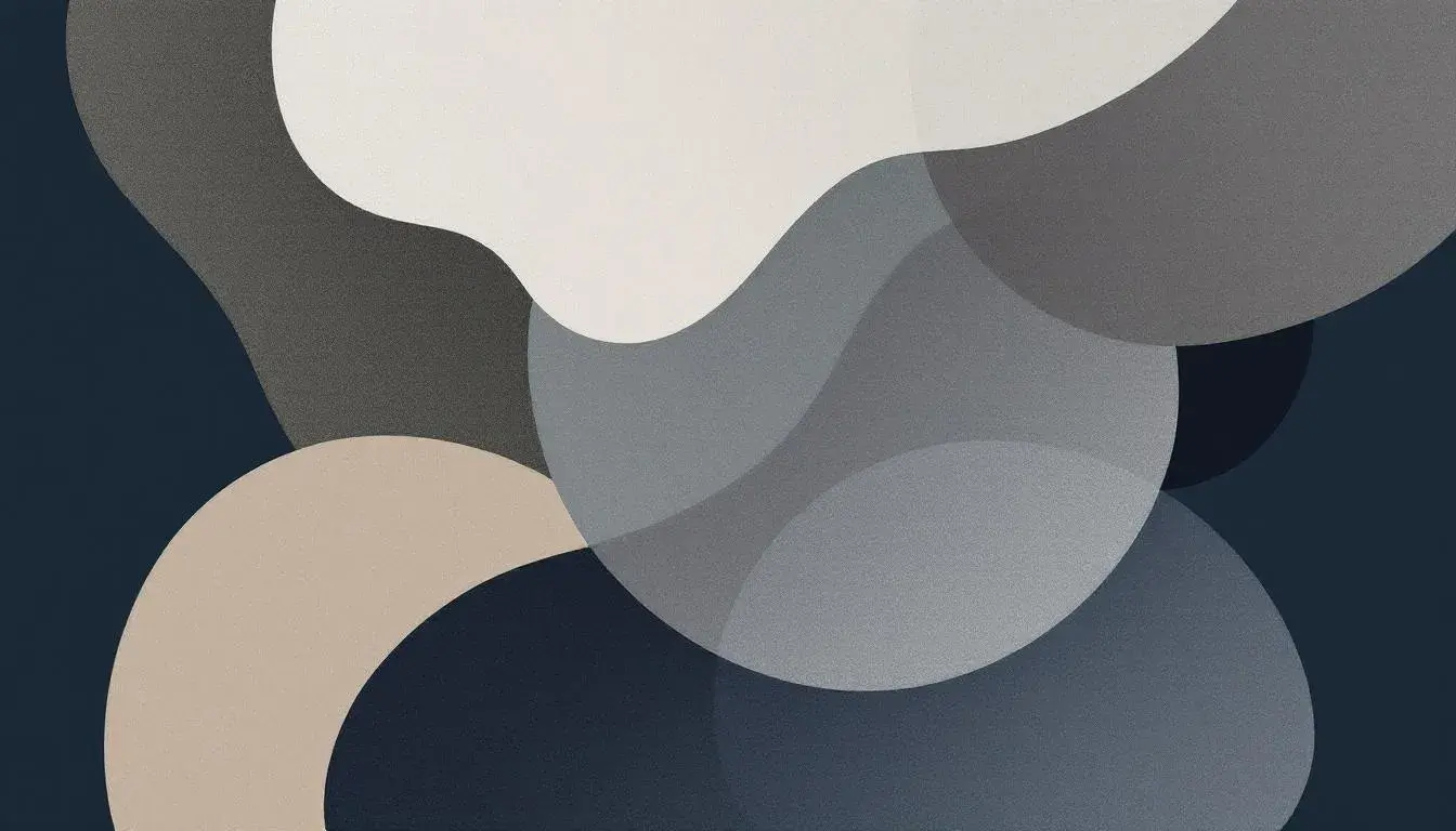
Ethereal Balance approaches darkness with more gravity. It isn't a whisper, but a statement. Here, Deep Black acts as the anchor, a grounding force that allows other hues to shimmer. Dark Taupe adds a layer of sophisticated neutrality, the color of rich soil after a rain. Sage Green lends a touch of grounded comfort, like a comforting blanket, while Sky Blue provides a moment of airy release. The presence of Mauve Rose disrupts the expected, lending an artistic touch to the scene. Envision a modern city apartment at night. The lights of the city stretch out below as the subtle sounds of quiet life fill the apartment. Here, colors are designed to support moments of concentration, to craft a refuge after a long day. It's a palette of textures, capable of feeling tactile even on the most streamlined surfaces. The sky blue provides relief against shadows, like the first hint of light on a stormy horizon. It is a place to replenish the spirit, a comforting embrace, a sanctuary where the complexities of day are quieted by the stillness of night. These colors are the quiet luxury that speaks of considered choices, of an understanding of how the subtle can be most powerful.
Ethereal Dusk embraces a more dramatic interpretation of darkness. Deep Indigo establishes a sense of depth and mystery, like a starless sky. Light Lavender offers a touch of ephemeral beauty as a counterpoint. Shadow Gray brings a grounding element, like aged stone softened by time. Then, Dusty Teal adds a layer of complexity, suggesting both the coolness of water and the richness of ancient patina. Electric Indigo is the surprise, a bold accent that elevates the entire composition. Imagine a fashionable boutique, bathed in the fading light of evening. The walls, painted in deep tones, showcase art in surprising ways. Here is a place to see and be seen, where the shadows themselves become part of the display. The unexpected purple adds an aura like a rare gem. It’s the kind of space that lingers in the memory, a reminder that beauty can be found even in the deepest shadows. It is evocative, intriguing, and memorable. This arrangement has a strong appeal, creating a dynamic tension that resonates with strength and subtle mystery.
Auction Aesthetics brings hints of darkness to a world of subtle luxury. Forest Green roots the arrangement in stability - a sign of thriving life. Off-White is an airy counterpoint. Pale Yellow offers warmth, like sunlight streaming through a window. Tangerine adds a layer of zest, reflecting good taste and boldness. Brick Red anchors the arrangement with subtle strength. Picture a high-end auction preparing for its grand event. Subdued lighting bathes the space to allow pieces in the foreground to come alive. These colors are more than just decoration; they are a way of creating an atmosphere of anticipation. The Forest Green offers confidence and assurance, speaking to the knowledge inherent in the space. This palette understands the power of understated elegance, revealing subtle layers that are quietly compelling. It is an invitation to step into a world where beauty is savored, not shouted.
In 2025, the dominant darks are about more than just shadows. They are about creating environments that nourish, invigorate, and allow us to engage with the world in a more meaningful way. They offer a counterbalance to the relentless pace of modern life - soft, grounding, and profound. They are a reminder of the power of simplicity, the beauty of subtlety, and the ability of carefully chosen colors to shape our perceptions and experiences. From the quiet contemplation of a dimly lit room to the eye-catching intrigue of a darkly colored ad campaign, they set the stage for a future crafted in beauty and deep intention.