'%3e%3cpath%20fill-rule='evenodd'%20clip-rule='evenodd'%20d='M51.1303%2019.2492C50.7278%2019.913%2050.1346%2020.4426%2049.3508%2020.838C48.5669%2021.2335%2047.6172%2021.4312%2046.5014%2021.4312C44.8208%2021.4312%2043.4367%2021.0216%2042.3492%2020.2025C41.2617%2019.3833%2040.6686%2018.2394%2040.5697%2016.7706H44.4253C44.4818%2017.3355%2044.6831%2017.7804%2045.0291%2018.1052C45.3751%2018.43%2045.8164%2018.5924%2046.3531%2018.5924C46.8192%2018.5924%2047.1864%2018.4653%2047.4547%2018.2111C47.7231%2017.9569%2047.8572%2017.618%2047.8572%2017.1943C47.8572%2016.8129%2047.7337%2016.4952%2047.4865%2016.241C47.2393%2015.9867%2046.9322%2015.7784%2046.565%2015.616C46.1978%2015.4536%2045.6893%2015.2594%2045.0397%2015.0334C44.0934%2014.7086%2043.3202%2014.3944%2042.72%2014.0907C42.1197%2013.7871%2041.6042%2013.3351%2041.1735%2012.7349C40.7427%2012.1347%2040.5273%2011.3544%2040.5273%2010.394C40.5273%209.50418%2040.7533%208.73448%2041.2053%208.08481C41.6572%207.43515%2042.2821%206.93731%2043.0801%206.5913C43.8781%206.24528%2044.7925%206.07227%2045.8235%206.07227C47.49%206.07227%2048.8141%206.46771%2049.7956%207.25861C50.7772%208.04951%2051.3315%209.13698%2051.4586%2010.5211H47.5395C47.4689%2010.0268%2047.2888%209.63483%2046.9993%209.3453C46.7097%209.05578%2046.3178%208.91102%2045.8235%208.91102C45.3998%208.91102%2045.0573%209.024%2044.7961%209.24997C44.5348%209.47594%2044.4041%209.80783%2044.4041%2010.2457C44.4041%2010.5988%2044.5207%2010.8989%2044.7537%2011.146C44.9867%2011.3932%2045.2798%2011.5944%2045.6328%2011.7498C45.9859%2011.9052%2046.4944%2012.1029%2047.1581%2012.343C48.1185%2012.6678%2048.9023%2012.9891%2049.5096%2013.3069C50.1169%2013.6246%2050.6395%2014.0872%2051.0773%2014.6945C51.5151%2015.3018%2051.734%2016.0927%2051.734%2017.0672C51.734%2017.8581%2051.5328%2018.5854%2051.1303%2019.2492ZM59.0242%206.3053V21.2829H55.4016V6.3053H59.0242ZM73.9409%206.3053V9.18642H69.8734V21.2829H66.2296V9.18642H62.2046V6.3053H73.9409ZM80.7438%209.18642V12.3218H85.8069V15.0546H80.7438V18.3806H86.4425V21.2829H77.1212V6.3053H86.4425V9.18642H80.7438ZM99.667%2016.0291V21.2829H96.0444V6.3053H101.913C103.692%206.3053%20105.048%206.74665%20105.98%207.62934C106.912%208.51204%20107.378%209.7019%20107.378%2011.199C107.378%2012.1311%20107.17%2012.9609%20106.753%2013.6882C106.337%2014.4155%20105.719%2014.9875%20104.9%2015.4042C104.08%2015.8208%20103.085%2016.0291%20101.913%2016.0291H99.667ZM103.692%2011.199C103.692%209.8855%20102.965%209.22879%20101.51%209.22879H99.667V13.1268H101.51C102.965%2013.1268%20103.692%2012.4842%20103.692%2011.199ZM120.092%2018.5501H114.478L113.546%2021.2829H109.732L115.219%206.41123H119.393L124.879%2021.2829H121.024L120.092%2018.5501ZM119.16%2015.7961L117.295%2010.2881L115.41%2015.7961H119.16ZM131.555%2018.5077H136.385V21.2829H127.933V6.3053H131.555V18.5077ZM143.337%209.18642V12.3218H148.4V15.0546H143.337V18.3806H149.035V21.2829H139.714V6.3053H149.035V9.18642H143.337ZM163.507%206.3053V9.18642H159.44V21.2829H155.796V9.18642H151.771V6.3053H163.507ZM177.449%206.3053V9.18642H173.382V21.2829H169.738V9.18642H165.713V6.3053H177.449ZM184.252%209.18642V12.3218H189.315V15.0546H184.252V18.3806H189.951V21.2829H180.629V6.3053H189.951V9.18642H184.252Z'%20fill='%23EEF0ED'/%3e%3cmask%20id='mask0_3101_7327'%20style='mask-type:alpha'%20maskUnits='userSpaceOnUse'%20x='0'%20y='0'%20width='27'%20height='28'%3e%3cpath%20d='M23.8328%200.759766H2.64808C1.18559%200.759766%200%201.94535%200%203.40785V24.5925C0%2026.055%201.18559%2027.2406%202.64808%2027.2406H23.8328C25.2952%2027.2406%2026.4808%2026.055%2026.4808%2024.5925V3.40785C26.4808%201.94535%2025.2952%200.759766%2023.8328%200.759766Z'%20fill='white'/%3e%3c/mask%3e%3cg%20mask='url(%23mask0_3101_7327)'%3e%3cpath%20d='M23.8328%200.759766H2.64808C1.18559%200.759766%200%201.94535%200%203.40785V24.5925C0%2026.055%201.18559%2027.2406%202.64808%2027.2406H23.8328C25.2952%2027.2406%2026.4808%2026.055%2026.4808%2024.5925V3.40785C26.4808%201.94535%2025.2952%200.759766%2023.8328%200.759766Z'%20fill='%23D8D8D8'/%3e%3cpath%20d='M13.2404%200.759766H0V14.0001H13.2404V0.759766Z'%20fill='%238C61FF'/%3e%3cpath%20d='M13.2404%2014H0V27.2404H13.2404V14Z'%20fill='%2336C3FE'/%3e%3cpath%20d='M26.4806%2014H13.2402V27.2404H26.4806V14Z'%20fill='%236592FE'/%3e%3cpath%20d='M26.4806%200.759766H13.2402V14.0002H26.4806V0.759766Z'%20fill='%236059F7'/%3e%3c/g%3e%3c/g%3e%3cdefs%3e%3cclipPath%20id='clip0_3101_7327'%3e%3crect%20width='190'%20height='28'%20fill='white'/%3e%3c/clipPath%3e%3c/defs%3e%3c/svg%3e)
'%3e%3cpath%20d='M23.8328%200.759521H2.64808C1.18559%200.759521%200%201.94511%200%203.40761V24.5923C0%2026.0548%201.18559%2027.2404%202.64808%2027.2404H23.8328C25.2952%2027.2404%2026.4808%2026.0548%2026.4808%2024.5923V3.40761C26.4808%201.94511%2025.2952%200.759521%2023.8328%200.759521Z'%20fill='%23D8D8D8'/%3e%3cpath%20d='M13.2404%200.759521H0V13.9999H13.2404V0.759521Z'%20fill='%238C61FF'/%3e%3cpath%20d='M13.2404%2013.9998H0V27.2402H13.2404V13.9998Z'%20fill='%2336C3FE'/%3e%3cpath%20d='M26.4809%2013.9998H13.2405V27.2402H26.4809V13.9998Z'%20fill='%236592FE'/%3e%3cpath%20d='M26.4809%200.759277H13.2405V13.9997H26.4809V0.759277Z'%20fill='%236059F7'/%3e%3c/g%3e%3c/svg%3e)
Spring Awakening: Hottest Seasonal Palette Trends 🌸
12 Jun 2025 · 3 min readThe thaw goes beyond temperature; it’s a shift in how we perceive the world. After months cloaked in monochrome, color floods back, not just as a visual phenomenon, but as a sensory awakening. Think of the first forsythia blooming against a bruised winter sky, or the verdant hum of new grass pushing through the earth. This annual spectacle demands a recalibration – a shift in the palettes that shape our interior landscapes. Color becomes a messenger, whispering of renewal and optimism, informing design choices with a lightness of touch and an eagerness for the revitalizing energy of the season. More than mere aesthetics are at play; these shades shape mood, influence well-being, and provide the gentle nudge that guides us out of hibernation and into the vibrant embrace of spring. It’s about capturing the effervescence of the season and translating it into spaces that breathe with life.
The Eco Modern palette conjures images of sun-drenched mornings filtering through sheer linen curtains. It’s the essence of a mindful existence, where simplicity meets sophistication. Imagine spaces filled with the scent of freshly cut grass, punctuated by the cool touch of stone and the warm glow of beeswax candles. Pure White provides a luminous foundation, like a blank canvas awaiting the artist’s touch. Pale Gold hints at the promise of sunny afternoons, while Vibrant Turquoise echoes the crystalline clarity of a mountain stream. Lime Green explodes with the vitality of new growth, softened by the grounding presence of Neutral Gray. Think of an urban apartment transformed into an indoor garden, where potted herbs thrive beneath skylights and raw wood furniture provides a tactile connection to the natural world. Bright Cyan injects a bolt of energy, like a crisp spring breeze through open windows. Charcoal Gray anchors the palette with a sophisticated depth, its presence like rich soil ready to nurture new life. Ultimately, Deep Black provides contrast. This is a space for contemplation, for quiet moments of reflection, for embracing the beauty of imperfections. The Eco Modern palette isn’t just a color scheme; it’s a lifestyle choice, a commitment to sustainability and serenity. It's a room that says 'welcome' and 'breathe', inviting moments of tranquility amid the bustle of everyday life.
Fresh Data pulses with the optimism of a new venture, a sense of clarity and purpose that mirrors the season’s own rebirth. Its Pure White foundation suggests a space scrubbed clean, ready to embrace change. Golden Yellow sprinkles a bit of jovial energy throughout, like forsythia against a gray wall. Light Sky Blue mimics the color of spring days, full of openness and potential. Pale Pink introduces a gentle breath into the blend, an intimation of blossoms yet to come. It's a setting where ideas take flight, fostering collaboration and innovation. Imagine exposed brick illuminated by natural light, large digital displays showcasing evolving concepts, and collaborative tables buzzing with activity. The Bright Teal offers a splash of vibrancy, a call to action. Meanwhile, Medium Gray stabilizes the palette; it's thoughtful and observant. Vivid Blue adds a layer of stability, a nod to trustworthiness, while Dark Teal Gray gives way to modern depth. Lastly, Dark Charcoal anchors the space and reminds everyone to be humble. This palette is for those who dare to dream and have the courage to turn that dream into reality.
Vibrant Contrast explodes with audacious energy, a jubilant fanfare announcing the season's arrival. Taking cues from fields of wildflowers popping up amidst the early blooms, Creamy White acts as a backdrop to allow the bolder accents to make a statement. Chartreuse Yellow and Vivid Lavender dance together, a reminder that sometimes the most unexpected pairings create the most spectacular effects. Olive Drab tempers the flamboyance, while Fiery Orange adds a touch of daring. Visualize a living room where statement art clashes beautifully against minimalist furniture, or a garden bursting with exotic flowers from every possible locale. Bright Emerald is the true essence of spring, new and bold. A touch of Forest Green and Raspberry Red reminds us that there is a balance between the soft and the strong. It is complemented by Deep Indigo and Deep Charcoal that ground the palette with a sense of timeless sophistication. This palette wants to be seen, demands to be noticed, and welcomes a lifestyle of experimentation and joyful self-expression.
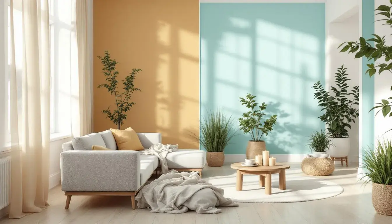
Modern Pop captures the playful spirit of a city park in full bloom. Off White sets the tone as unassuming but stylish. Amber Gold radiates warmth, like the early light of morning, with Teal Green reminiscent of budding leaves and the clear, sparkling water of a fountain. It's a place that encourages creativity and celebrates individuality. Envision loft spaces with exposed brick, filled with vintage furniture and quirky accessories. The Dusty Rose brings a delicate, feminine touch that balances well with the Deep Sapphire, calling to mind a sky after a rain shower. A celebration of optimistic individualism, Modern Pop is ideal for those who are not afraid to stand out and embrace the beauty of the moment.
These palettes are not mere trends; they are invitations. Invitations to reimagine our spaces as reflections of the season's transformative power. Eco Modern beckons us toward mindful simplicity, while Fresh Data inspires bold creation. Vibrant Contrast dares us to embrace joyful expression, and Modern Pop celebrates playful individuality. Each palette offers a distinct lens through which to experience spring, translating its ephemeral beauty into environments that nurture our well-being and ignite our imaginations. They are a gentle reminder that color, like the season itself, has the power to awaken the senses, uplift the spirit, and transform the ordinary into the extraordinary. They are not just colors, but experiences waiting to unfold within the spaces we inhabit.