'%3e%3cpath%20fill-rule='evenodd'%20clip-rule='evenodd'%20d='M51.1303%2019.2492C50.7278%2019.913%2050.1346%2020.4426%2049.3508%2020.838C48.5669%2021.2335%2047.6172%2021.4312%2046.5014%2021.4312C44.8208%2021.4312%2043.4367%2021.0216%2042.3492%2020.2025C41.2617%2019.3833%2040.6686%2018.2394%2040.5697%2016.7706H44.4253C44.4818%2017.3355%2044.6831%2017.7804%2045.0291%2018.1052C45.3751%2018.43%2045.8164%2018.5924%2046.3531%2018.5924C46.8192%2018.5924%2047.1864%2018.4653%2047.4547%2018.2111C47.7231%2017.9569%2047.8572%2017.618%2047.8572%2017.1943C47.8572%2016.8129%2047.7337%2016.4952%2047.4865%2016.241C47.2393%2015.9867%2046.9322%2015.7784%2046.565%2015.616C46.1978%2015.4536%2045.6893%2015.2594%2045.0397%2015.0334C44.0934%2014.7086%2043.3202%2014.3944%2042.72%2014.0907C42.1197%2013.7871%2041.6042%2013.3351%2041.1735%2012.7349C40.7427%2012.1347%2040.5273%2011.3544%2040.5273%2010.394C40.5273%209.50418%2040.7533%208.73448%2041.2053%208.08481C41.6572%207.43515%2042.2821%206.93731%2043.0801%206.5913C43.8781%206.24528%2044.7925%206.07227%2045.8235%206.07227C47.49%206.07227%2048.8141%206.46771%2049.7956%207.25861C50.7772%208.04951%2051.3315%209.13698%2051.4586%2010.5211H47.5395C47.4689%2010.0268%2047.2888%209.63483%2046.9993%209.3453C46.7097%209.05578%2046.3178%208.91102%2045.8235%208.91102C45.3998%208.91102%2045.0573%209.024%2044.7961%209.24997C44.5348%209.47594%2044.4041%209.80783%2044.4041%2010.2457C44.4041%2010.5988%2044.5207%2010.8989%2044.7537%2011.146C44.9867%2011.3932%2045.2798%2011.5944%2045.6328%2011.7498C45.9859%2011.9052%2046.4944%2012.1029%2047.1581%2012.343C48.1185%2012.6678%2048.9023%2012.9891%2049.5096%2013.3069C50.1169%2013.6246%2050.6395%2014.0872%2051.0773%2014.6945C51.5151%2015.3018%2051.734%2016.0927%2051.734%2017.0672C51.734%2017.8581%2051.5328%2018.5854%2051.1303%2019.2492ZM59.0242%206.3053V21.2829H55.4016V6.3053H59.0242ZM73.9409%206.3053V9.18642H69.8734V21.2829H66.2296V9.18642H62.2046V6.3053H73.9409ZM80.7438%209.18642V12.3218H85.8069V15.0546H80.7438V18.3806H86.4425V21.2829H77.1212V6.3053H86.4425V9.18642H80.7438ZM99.667%2016.0291V21.2829H96.0444V6.3053H101.913C103.692%206.3053%20105.048%206.74665%20105.98%207.62934C106.912%208.51204%20107.378%209.7019%20107.378%2011.199C107.378%2012.1311%20107.17%2012.9609%20106.753%2013.6882C106.337%2014.4155%20105.719%2014.9875%20104.9%2015.4042C104.08%2015.8208%20103.085%2016.0291%20101.913%2016.0291H99.667ZM103.692%2011.199C103.692%209.8855%20102.965%209.22879%20101.51%209.22879H99.667V13.1268H101.51C102.965%2013.1268%20103.692%2012.4842%20103.692%2011.199ZM120.092%2018.5501H114.478L113.546%2021.2829H109.732L115.219%206.41123H119.393L124.879%2021.2829H121.024L120.092%2018.5501ZM119.16%2015.7961L117.295%2010.2881L115.41%2015.7961H119.16ZM131.555%2018.5077H136.385V21.2829H127.933V6.3053H131.555V18.5077ZM143.337%209.18642V12.3218H148.4V15.0546H143.337V18.3806H149.035V21.2829H139.714V6.3053H149.035V9.18642H143.337ZM163.507%206.3053V9.18642H159.44V21.2829H155.796V9.18642H151.771V6.3053H163.507ZM177.449%206.3053V9.18642H173.382V21.2829H169.738V9.18642H165.713V6.3053H177.449ZM184.252%209.18642V12.3218H189.315V15.0546H184.252V18.3806H189.951V21.2829H180.629V6.3053H189.951V9.18642H184.252Z'%20fill='%23EEF0ED'/%3e%3cmask%20id='mask0_3101_7327'%20style='mask-type:alpha'%20maskUnits='userSpaceOnUse'%20x='0'%20y='0'%20width='27'%20height='28'%3e%3cpath%20d='M23.8328%200.759766H2.64808C1.18559%200.759766%200%201.94535%200%203.40785V24.5925C0%2026.055%201.18559%2027.2406%202.64808%2027.2406H23.8328C25.2952%2027.2406%2026.4808%2026.055%2026.4808%2024.5925V3.40785C26.4808%201.94535%2025.2952%200.759766%2023.8328%200.759766Z'%20fill='white'/%3e%3c/mask%3e%3cg%20mask='url(%23mask0_3101_7327)'%3e%3cpath%20d='M23.8328%200.759766H2.64808C1.18559%200.759766%200%201.94535%200%203.40785V24.5925C0%2026.055%201.18559%2027.2406%202.64808%2027.2406H23.8328C25.2952%2027.2406%2026.4808%2026.055%2026.4808%2024.5925V3.40785C26.4808%201.94535%2025.2952%200.759766%2023.8328%200.759766Z'%20fill='%23D8D8D8'/%3e%3cpath%20d='M13.2404%200.759766H0V14.0001H13.2404V0.759766Z'%20fill='%238C61FF'/%3e%3cpath%20d='M13.2404%2014H0V27.2404H13.2404V14Z'%20fill='%2336C3FE'/%3e%3cpath%20d='M26.4806%2014H13.2402V27.2404H26.4806V14Z'%20fill='%236592FE'/%3e%3cpath%20d='M26.4806%200.759766H13.2402V14.0002H26.4806V0.759766Z'%20fill='%236059F7'/%3e%3c/g%3e%3c/g%3e%3cdefs%3e%3cclipPath%20id='clip0_3101_7327'%3e%3crect%20width='190'%20height='28'%20fill='white'/%3e%3c/clipPath%3e%3c/defs%3e%3c/svg%3e)
'%3e%3cpath%20d='M23.8328%200.759521H2.64808C1.18559%200.759521%200%201.94511%200%203.40761V24.5923C0%2026.0548%201.18559%2027.2404%202.64808%2027.2404H23.8328C25.2952%2027.2404%2026.4808%2026.0548%2026.4808%2024.5923V3.40761C26.4808%201.94511%2025.2952%200.759521%2023.8328%200.759521Z'%20fill='%23D8D8D8'/%3e%3cpath%20d='M13.2404%200.759521H0V13.9999H13.2404V0.759521Z'%20fill='%238C61FF'/%3e%3cpath%20d='M13.2404%2013.9998H0V27.2402H13.2404V13.9998Z'%20fill='%2336C3FE'/%3e%3cpath%20d='M26.4809%2013.9998H13.2405V27.2402H26.4809V13.9998Z'%20fill='%236592FE'/%3e%3cpath%20d='M26.4809%200.759277H13.2405V13.9997H26.4809V0.759277Z'%20fill='%236059F7'/%3e%3c/g%3e%3c/svg%3e)
May Flowers 🌸: Spring Color Mood Dominance
11 Jun 2025 · 3 min readMay arrives, and with it, an awakening. Not just of buds, but of feeling. Color breathes again, bolder yet softer, sharper with a memory of winter's grey. Light dances different, casting earlier shadows, and holding longer in the evening glow. The world shifts – wardrobes brighten, gardens explode. But below that surface frenzy, spring offers something more: an invitation inward. What emotions are mirrored in these re-emerging hues? What moods take root alongside bluebells and burgeoning leaves? It's not simply about pretty pastels; it's about finding how delicate strength, new-found clarity, and reflective joy grow together. These carefully chosen color stories capture that unique promise of May, whispering sentiments that will flower in our own spaces and selves.
Serene Learning 📚
"Serene Learning" evokes the quiet corners of a library bathed in the soft afternoon sun. The feeling is one of gentle focus, a place where thoughts can settle and expand. It is a palette of hushed tones, like aged parchment and worn leather. Off White offers a backdrop of calm possibility. Light Beige, a wisp of comfort, brings a sense of familiarity, like turning the pages of a well-loved book. Dusty Mauve hints at reflection, a space for quiet contemplation. Slate Blue suggests depth, the vastness of knowledge waiting to be explored. Taupe Brown, grounding and reassuring, anchors the mind and fosters concentration. This is not about bright inspiration but steady growth, a quiet immersion in new ideas. Think of a sketchbook filled with pressed spring blooms, each discovery methodically noted, classified, drawing on nature for insight. These earthy tones create a space for considered thought, a mental refuge to encourage a deeper understanding. The palette feels suited to a quiet study, a space designed for patient exploration, where ideas can blossom in their own time.
Slate Colors 🎭
"Slate Colors" presents a study in contrasts, muted strength alongside vibrant energy. It speaks of resilience breaking through a cool exterior. Off White layers the foundation with subtle dimension, like the first light breaking through morning fog. Mustard Yellow, a spark of unexpected joy, injects a jolt of optimism that cuts through the calm. Cool Gray grounds the palette, lending an air of seriousness. Teal Blue suggests thoughtful depth, an emotional undercurrent that flows beneath the surface. Tomato Red flashes with daring, a challenge and a reminder of life's passions. Picture newly seeded earth pushing through cracked pavement, the promise of growth against the odds. It's a reminder that strength doesn't always come from brightness, but from the quiet power of determination. This palette invites us to embrace our own complexities, finding beauty in the interplay of seemingly oppositional forces.
Subtle Serenity 🌿
"Subtle Serenity" evokes the quiet hush of a woodland after a light rain. The air is damp and sweet, a blanket of calm envelops everything. The feeling is one of restoration, a chance to reconnect with the earth and oneself. Silver Gray, like mist clinging to the trees, adds a touch of mystery. Steel Blue hints at expansive skies after the storm has passed, like reflections in a still pool. Bright Coral, unexpectedly vibrant, is the first wildflower blooming amongst the leaves. Deep Teal conjures up the depths of the forest, protective and cool. Army Green grounds the palette, the solid earth underfoot. Imagine a moss-covered stone warmed by a ray of sunshine, bringing moments of light and balance to a shady spot. This palette invites a gentle pause, an opportunity to shed the day's tensions and find peace in the natural world. It is a balm for the spirit, offering a place to breathe and simply be.
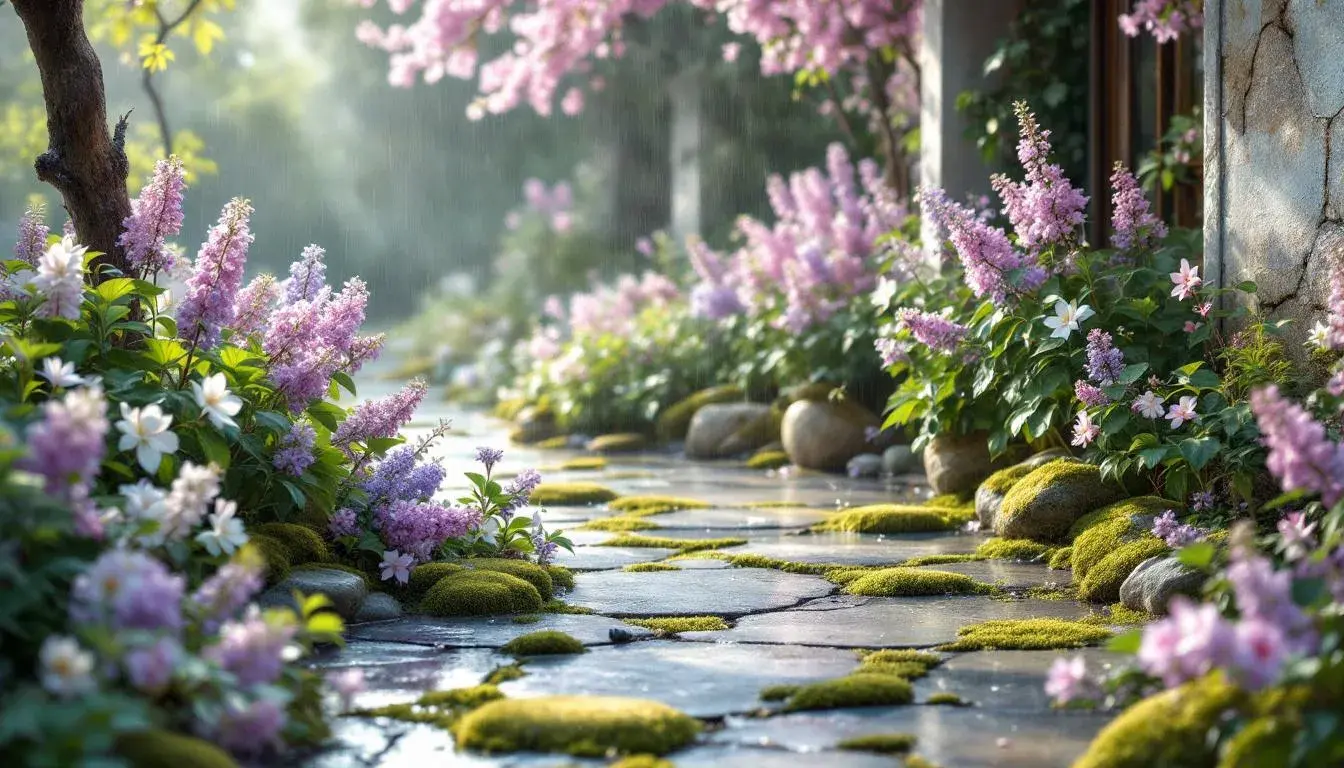
Modern Lavender 💜
"Modern Lavender" offers a contemporary twist on a classic spring theme. This palette feels fresh and clean with gentle undertones. Light Lavender Mist is like a lavender field after a rain shower, the air sweet and clean. Vibrant Periwinkle suggests a touch of dreaminess, creating a serene backdrop. Misty Blue-Gray acts as a gentle calming agent. Deep Grey is unexpectedly solid, proving that darkness can indeed hold light. Radiant Purple adds an element of mystery or magic, an enchanting addition that's welcome in all spaces. Think of the first blooms of a lilac bush, their delicate petals opening to the soft morning light. It's a space where ingenuity and peace can coexist. It's a reminder of the potential each day holds, of creativity's unfolding, guided by the gentle strength of renewal.
May's colors are far from simply decorative; they are a conversation. Each palette presented revealed a different aspect of spring's revitalizing force. "Serene Learning's" grounding earth tones provide a visual sanctuary for inner contemplation. "Slate Colors" suggests the quiet strength found in unexpected places, urging us to embrace the beauty of contrasts. "Subtle Serenity" whispers of healing, offering a peaceful refuge found in the natural world. While "Modern Lavender" gives a contemporary touch, that brings clarity, magic, and thoughtfulness.
These are not fleeting trends; they are echoes of something far older. The colors of May speak of patience, resilience, and the joy of rediscovering the world, and ourselves, with fresh eyes.