'%3e%3cpath%20fill-rule='evenodd'%20clip-rule='evenodd'%20d='M51.1303%2019.2492C50.7278%2019.913%2050.1346%2020.4426%2049.3508%2020.838C48.5669%2021.2335%2047.6172%2021.4312%2046.5014%2021.4312C44.8208%2021.4312%2043.4367%2021.0216%2042.3492%2020.2025C41.2617%2019.3833%2040.6686%2018.2394%2040.5697%2016.7706H44.4253C44.4818%2017.3355%2044.6831%2017.7804%2045.0291%2018.1052C45.3751%2018.43%2045.8164%2018.5924%2046.3531%2018.5924C46.8192%2018.5924%2047.1864%2018.4653%2047.4547%2018.2111C47.7231%2017.9569%2047.8572%2017.618%2047.8572%2017.1943C47.8572%2016.8129%2047.7337%2016.4952%2047.4865%2016.241C47.2393%2015.9867%2046.9322%2015.7784%2046.565%2015.616C46.1978%2015.4536%2045.6893%2015.2594%2045.0397%2015.0334C44.0934%2014.7086%2043.3202%2014.3944%2042.72%2014.0907C42.1197%2013.7871%2041.6042%2013.3351%2041.1735%2012.7349C40.7427%2012.1347%2040.5273%2011.3544%2040.5273%2010.394C40.5273%209.50418%2040.7533%208.73448%2041.2053%208.08481C41.6572%207.43515%2042.2821%206.93731%2043.0801%206.5913C43.8781%206.24528%2044.7925%206.07227%2045.8235%206.07227C47.49%206.07227%2048.8141%206.46771%2049.7956%207.25861C50.7772%208.04951%2051.3315%209.13698%2051.4586%2010.5211H47.5395C47.4689%2010.0268%2047.2888%209.63483%2046.9993%209.3453C46.7097%209.05578%2046.3178%208.91102%2045.8235%208.91102C45.3998%208.91102%2045.0573%209.024%2044.7961%209.24997C44.5348%209.47594%2044.4041%209.80783%2044.4041%2010.2457C44.4041%2010.5988%2044.5207%2010.8989%2044.7537%2011.146C44.9867%2011.3932%2045.2798%2011.5944%2045.6328%2011.7498C45.9859%2011.9052%2046.4944%2012.1029%2047.1581%2012.343C48.1185%2012.6678%2048.9023%2012.9891%2049.5096%2013.3069C50.1169%2013.6246%2050.6395%2014.0872%2051.0773%2014.6945C51.5151%2015.3018%2051.734%2016.0927%2051.734%2017.0672C51.734%2017.8581%2051.5328%2018.5854%2051.1303%2019.2492ZM59.0242%206.3053V21.2829H55.4016V6.3053H59.0242ZM73.9409%206.3053V9.18642H69.8734V21.2829H66.2296V9.18642H62.2046V6.3053H73.9409ZM80.7438%209.18642V12.3218H85.8069V15.0546H80.7438V18.3806H86.4425V21.2829H77.1212V6.3053H86.4425V9.18642H80.7438ZM99.667%2016.0291V21.2829H96.0444V6.3053H101.913C103.692%206.3053%20105.048%206.74665%20105.98%207.62934C106.912%208.51204%20107.378%209.7019%20107.378%2011.199C107.378%2012.1311%20107.17%2012.9609%20106.753%2013.6882C106.337%2014.4155%20105.719%2014.9875%20104.9%2015.4042C104.08%2015.8208%20103.085%2016.0291%20101.913%2016.0291H99.667ZM103.692%2011.199C103.692%209.8855%20102.965%209.22879%20101.51%209.22879H99.667V13.1268H101.51C102.965%2013.1268%20103.692%2012.4842%20103.692%2011.199ZM120.092%2018.5501H114.478L113.546%2021.2829H109.732L115.219%206.41123H119.393L124.879%2021.2829H121.024L120.092%2018.5501ZM119.16%2015.7961L117.295%2010.2881L115.41%2015.7961H119.16ZM131.555%2018.5077H136.385V21.2829H127.933V6.3053H131.555V18.5077ZM143.337%209.18642V12.3218H148.4V15.0546H143.337V18.3806H149.035V21.2829H139.714V6.3053H149.035V9.18642H143.337ZM163.507%206.3053V9.18642H159.44V21.2829H155.796V9.18642H151.771V6.3053H163.507ZM177.449%206.3053V9.18642H173.382V21.2829H169.738V9.18642H165.713V6.3053H177.449ZM184.252%209.18642V12.3218H189.315V15.0546H184.252V18.3806H189.951V21.2829H180.629V6.3053H189.951V9.18642H184.252Z'%20fill='%23EEF0ED'/%3e%3cmask%20id='mask0_3101_7327'%20style='mask-type:alpha'%20maskUnits='userSpaceOnUse'%20x='0'%20y='0'%20width='27'%20height='28'%3e%3cpath%20d='M23.8328%200.759766H2.64808C1.18559%200.759766%200%201.94535%200%203.40785V24.5925C0%2026.055%201.18559%2027.2406%202.64808%2027.2406H23.8328C25.2952%2027.2406%2026.4808%2026.055%2026.4808%2024.5925V3.40785C26.4808%201.94535%2025.2952%200.759766%2023.8328%200.759766Z'%20fill='white'/%3e%3c/mask%3e%3cg%20mask='url(%23mask0_3101_7327)'%3e%3cpath%20d='M23.8328%200.759766H2.64808C1.18559%200.759766%200%201.94535%200%203.40785V24.5925C0%2026.055%201.18559%2027.2406%202.64808%2027.2406H23.8328C25.2952%2027.2406%2026.4808%2026.055%2026.4808%2024.5925V3.40785C26.4808%201.94535%2025.2952%200.759766%2023.8328%200.759766Z'%20fill='%23D8D8D8'/%3e%3cpath%20d='M13.2404%200.759766H0V14.0001H13.2404V0.759766Z'%20fill='%238C61FF'/%3e%3cpath%20d='M13.2404%2014H0V27.2404H13.2404V14Z'%20fill='%2336C3FE'/%3e%3cpath%20d='M26.4806%2014H13.2402V27.2404H26.4806V14Z'%20fill='%236592FE'/%3e%3cpath%20d='M26.4806%200.759766H13.2402V14.0002H26.4806V0.759766Z'%20fill='%236059F7'/%3e%3c/g%3e%3c/g%3e%3cdefs%3e%3cclipPath%20id='clip0_3101_7327'%3e%3crect%20width='190'%20height='28'%20fill='white'/%3e%3c/clipPath%3e%3c/defs%3e%3c/svg%3e)
'%3e%3cpath%20d='M23.8328%200.759521H2.64808C1.18559%200.759521%200%201.94511%200%203.40761V24.5923C0%2026.0548%201.18559%2027.2404%202.64808%2027.2404H23.8328C25.2952%2027.2404%2026.4808%2026.0548%2026.4808%2024.5923V3.40761C26.4808%201.94511%2025.2952%200.759521%2023.8328%200.759521Z'%20fill='%23D8D8D8'/%3e%3cpath%20d='M13.2404%200.759521H0V13.9999H13.2404V0.759521Z'%20fill='%238C61FF'/%3e%3cpath%20d='M13.2404%2013.9998H0V27.2402H13.2404V13.9998Z'%20fill='%2336C3FE'/%3e%3cpath%20d='M26.4809%2013.9998H13.2405V27.2402H26.4809V13.9998Z'%20fill='%236592FE'/%3e%3cpath%20d='M26.4809%200.759277H13.2405V13.9997H26.4809V0.759277Z'%20fill='%236059F7'/%3e%3c/g%3e%3c/svg%3e)
The Rise of Teal: A Deep Dive into 2025's Most Popular Color 🌊
09 Jun 2025 · 7 min readColor whispers secrets. It shapes our perception, dictates our mood, and silently guides our gaze. In the sprawling landscape of design, the right palette can define an era. As we approach 2025, one color family is poised to dominate the visual sphere: Teal. More than a simple hue, teal represents a confluence of serenity and strength, a calming presence in a world demanding our constant attention. It's the quiet confidence of nature, the cool depths of the ocean, and the promise of innovation merging into a single, evocative tone. This is not merely a trend; it is a reflection of our collective yearning for balance and authenticity. The selected palettes illustrate just how deeply teal's influence is taking root and sprouting into a thousand different applications. In offices, it hints at forward-thinking stability. In living rooms, it suggests tranquil refuge. On websites, it conveys dependability. From the lightest seafoam to the darkest ocean depths, teal is prepared to be a foundational element of the visual landscape, a color that reflects the dreams, aspirations, and the evolving aesthetic sensibilities. Teal is a promise, a direction, a story told in color, and it's quickly becoming everyone's favorite story to read.
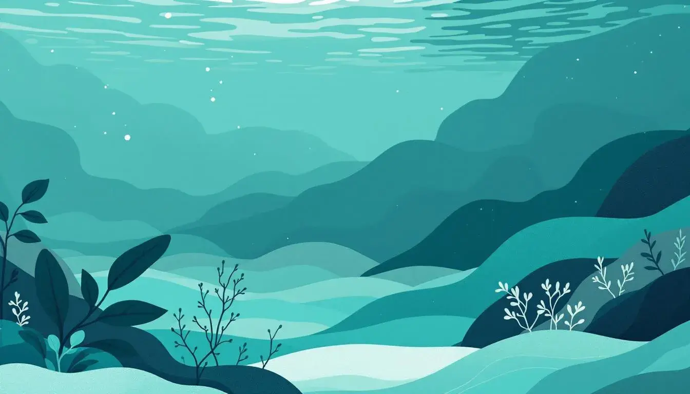
Elicit Palette 🎨
The Elicit Palette offers a compelling introduction to teal's quiet power. This particular arrangement pulls you inward, like a coastal current navigating through shadowy kelp forests. The gradient progresses smoothly, beginning with the freshness of light seafoam green, reminiscent of sunlight dappling the water's surface. It swiftly moves toward deeper, more contemplative shades, culminating in touches of very dark green, like the heart of an ancient rainforest. Dark teal anchors the palette, evoking a sense of steadfastness and deep-rooted assurance. Deep teal gray acts as a bridge, leading the eye smoothly between the brightness and the depth. The experience is one of understated calm, perfectly suited to spaces designed for focus and contemplation. Imagine this palette applied to a streamlined website, or adapted to the soothing environment of a healthcare clinic. The visual narrative offers an impression of gentle competence, reassuring clients with its quiet assertion. This palette doesn't shout for attention; instead, it draws you into a world of mindful poise. It is a promise of stability, a whisper of quiet confidence in a world of unrelenting noise. The greens remind you of the natural world, and the teals ground that natural world, while elevating human endeavor.
Earthy Fresh 🌿
Earthy Fresh offers a glimpse into teal's more grounded possibilities. It paints a picture of a serene landscape, a place where cool waters meet sunbaked earth. The bright green offers a burst of springtime energy, tempered by the anchoring presence of grayish teal and very dark teal. The brownish sienna brings a touch of warmth, a reminder of the sun-drenched soil where new life begins. Light lime brings thoughts of revitalization and the start of summer. Think of entering a living room designed around this palette: the interplay of cool and warm tones creates a sense of balance, inviting relaxation and contemplation. This composition would equally suit a website for an eco-friendly brand, communicating values of sustainability and natural beauty. The experience is less about making a bold statement and more about creating a sense of harmonious connection with the environment. Earthy Fresh speaks of roots, growth, and the simple pleasure of finding peace in the natural world. The colors are reminiscent of a verdant forest in the early morning, with sunlight filtering through the trees and the murmur of water in the distance. It whispers a promise of sustainable serenity.
Teal Appeal 🎨
Teal Appeal takes a bold turn, revealing teal's capacity to energize and enliven. This palette combines the soothing depth of muted teal and deep teal with vibrant pops of golden yellow, and bright red. The result is not necessarily serene, but undeniably compelling. The tawny brown and dark olive offer a grounding counterpoint to the intensity of the other hues, maintaining a sense of balance within the lively composition. Imagine walking into an office space adorned with Teal Appeal. The visual effect is instantly uplifting, stimulating imagination. This daring composition works perfectly on a website for a technology company, signaling both innovation and reliability. White and light gray allow the color palette to breathe. The experience offered here is dynamic and engaging, promising innovation tempered by reliability. The colors evoke a feeling of optimism and forward momentum, suggesting a brand that is not afraid to embrace a challenge. The palette doesn't whisper; it sings, a confident anthem that blends creativity with unwavering purpose.
Modern Teal 🎨
Modern Teal gracefully showcases teal's ability to blend sophistication and approachability. Light turquoise, a gentle, almost luminous variation of its dominant hue, opens the door to a refreshing visual experience. Bright teal anchors the collection, providing a solid yet inviting base. This core color is then tempered by the inclusion of deep teal green and dark teal gray, ensuring that the brighter elements never overwhelm. Dark grey provides quiet contrast and reinforces the palette's contemporary appeal. Walking into a space utilizing this palette feels akin to discovering a hidden oasis. The ambiance strikes a precise balance between comfort, efficiency and inspiring peace. It would be quite effective on a website for a tech company or a financial institution. The experience is both reassuring and forward-thinking, implying a business that is equally grounded in tradition and ready to meet the challenges of the future. Modern Teal whispers assurance, its subtle variations a symphony of quiet confidence. This palette is not a shout; it is a carefully reasoned conversation, a subtle exploration of possibility.
Conclusion
As we look toward 2025, these four palettes paint a compelling picture of teal's rise to prominence as the defining color of our era. Elicit Palette demonstrates teal's power to instill peace, whispering of serene stability. Earthy Fresh reveals teal's grounding potential, evoking images of natural beauty and sustainable tranquility. Teal Appeal boldly declares teal's capacity to energize and engage, promising a spirited approach to innovation. Finally, Modern Teal illustrates teal's unique ability to blend sophistication with accessibility, creating a visual experience that is reassuringly contemporary. It's clear that teal is more than just a fleeting fad; it is a dynamic, multifaceted color that can adapt to a wide array of contexts, offering aesthetic resonance in every application. It transcends simple aesthetics, acting as a visual shorthand for the dreams, ideas and aspirations that will shape the coming year. Whether it is used to create a sense of calm professionalism, celebrate the beauty of the natural world, inspire creativity, or promise technological advancement, teal is poised to take center stage, a color perfectly suited to express the evolving values of an era in transition.