Year-End Review: Dominant Colors by Creation Time Analysis
06 Jun 2025 · 5 min readColor surrounds us, unseen yet profoundly felt. It influences mood, shapes perception, and whispers stories without words. As another year nears its close, it's captivating to pause and consider the colors that have defined our recent design sensibilities, the shades that have painted our screens and spaces. More than mere aesthetics, these palettes reflect evolving tastes, fleeting trends, and perhaps, even unspoken cultural shifts. A look at the dominant color choices offers a unique lens through which to examine the prevailing spirit of the times, the visual textures that have subtly colored our world. What feelings do they stir? What emotions do they conjure? How might these shades narrate our collective experiences, our shared and shifting aesthetic consciousness in the year nearing its end? The selection and arrangement of colors reveal intentions, a carefully orchestrated attempt to speak to those who experience them. Considering color palettes is an exercise in noticing what those intentions might be, and what they ultimately reveal. It’s a visual archaeology, a way of excavating meaning from the choices we make, both those conscious and those less so. This review will showcase how certain collections of hues have punctuated the continuum of time, each assemblage a distinct echo of its era, a chromatic signature, and a quiet declaration of preference. And as preferences come and go, they are invariably replaced by newer ones. Perhaps the exploration of dominant colors is nothing less than the unfolding of our own history in delicate, painted strokes.
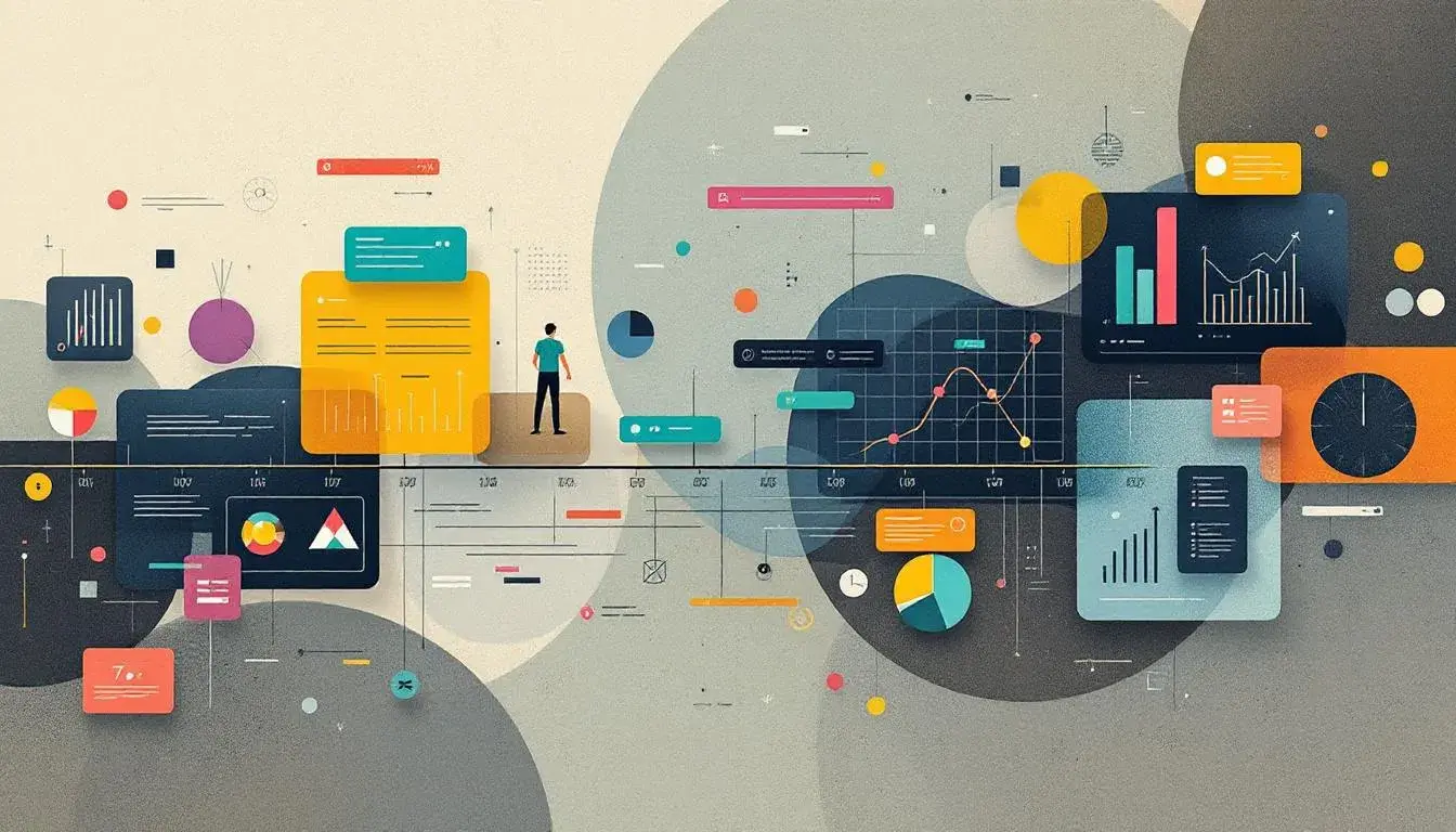
The "Modern Interface" 💻 palette evokes the hush of a sophisticated control room, a space where information flows seamlessly and distractions fade into the background. Off White provides a calming foundation, reminiscent of textured paper, while the unexpected burst of Mustard Yellow acts as a focal point, drawing the eye with its restrained energy. Slate Gray, with its cool and collected demeanor, suggests precision and order, attributes essential to a well-functioning digital landscape. Dark Gray adds a touch of quiet assertiveness, like a well-tailored suit. And then there's Onyx, a grounding presence that anchors the lighter tones in a sea of clarity. Together, these colors create a feeling of quiet competence, a sense of confidence without ostentation. Imagine interacting with this palette as a user: the experience would likely be efficient, almost seamless, allowing the complexity of the information to rest assured that it is communicated with a sense of elegance. A "Year-End Review," when presented with this palette, feels controlled and precise, data and findings visualized in a framework of quiet sophistication. It doesn’t overwhelm; it informs. The result is an impression of authority, a measured account of the months gone by, presented with a contemporary sensibility.
With "Refero Design" 🎨, there’s a muted story unfolding. Off White, again providing a gentle starting point, creates a mood of softness, like filtered sunlight falling on a pristine surface. Mustard Yellow, in a subtly different tone this time, offers a hint of vintage charm, a call-back to traditional craftsmanship. Cool Gray brings a reassuring stability, the dependable shade of well-honed tools and time-tested methods. Plum Purple unexpectedly enters the picture adding a layer of complexity and perhaps even a touch of creative whimsy. Dark Charcoal, deep and intense, adds contrast; it’s the grounding force that protects the palette from floating away into the pastel stratosphere. Picture perusing a "Year-End Review" rendered with this color story. It promises not just information, but reflection. The aesthetic suggests design with soul, with the human experience carefully considered. Each page would feel curated, deliberate, as though the report isn't just about data, but the people behind them. What does this emotional narrative suggest? Perhaps a company valuing its history along with a keen eye on the future.
"Modern Contrast" 🎨 presents a more assertive statement. Off White, slightly cooler than the previous palettes, acts as a muted stage. Steel Blue Gray offers stability, but with a hint of forward motion, like the calm sea before a storm. Medium Gray serves as a neutral bridge, a safe place for the eye to rest before the excitement of Electric Indigo arrives. This bold choice infuses a digital space with a palpable sense of innovation. Dark Charcoal, the final touch, lends an overall effect of undeniable sharpness. Envision this palette gracing a "Year-End Review". The feeling is bold, and perhaps even slightly futuristic: This company embraces modernity, is not afraid to make a statement. The high contrast would make the information rendered feel particularly engaging on any display, whether phone, tablet, screensaver, or laptop. It's a palette for those who want to stand out, who see the past year not as a period of stagnation, but as a catapult toward even greater heights.
In the end, these three palettes, seemingly distinct, each point to the multifaceted nature of the year we've just experienced, a collection of colors that mirrors an array of aspirations. The "Modern Interface" speaks of efficiency, precision, a world streamlined for optimal performance. "Refero Design" whispers of thoughtful creation, emphasizing humanity and heritage amid inevitable change. And "Modern Contrast" shouts forward with a daring, innovative spirit.
Viewing the "Year-End Review" through these color stories provides a richer, more resonant experience than mere numbers and charts could ever convey. They remind us that behind every statistic, every innovation, there exists a spectrum of aesthetic feeling, guiding our choices, shaping our understanding, and subtly influencing the world around us. What are the colors of yesterday being discarded? What are the colors of today being embraced? And even more interestingly, what are the colors of tomorrow promising to be? By tracing these chromatic changes, this exercise allows us to view the continuum of time in beautiful, painted strokes.