'%3e%3cpath%20fill-rule='evenodd'%20clip-rule='evenodd'%20d='M51.1303%2019.2492C50.7278%2019.913%2050.1346%2020.4426%2049.3508%2020.838C48.5669%2021.2335%2047.6172%2021.4312%2046.5014%2021.4312C44.8208%2021.4312%2043.4367%2021.0216%2042.3492%2020.2025C41.2617%2019.3833%2040.6686%2018.2394%2040.5697%2016.7706H44.4253C44.4818%2017.3355%2044.6831%2017.7804%2045.0291%2018.1052C45.3751%2018.43%2045.8164%2018.5924%2046.3531%2018.5924C46.8192%2018.5924%2047.1864%2018.4653%2047.4547%2018.2111C47.7231%2017.9569%2047.8572%2017.618%2047.8572%2017.1943C47.8572%2016.8129%2047.7337%2016.4952%2047.4865%2016.241C47.2393%2015.9867%2046.9322%2015.7784%2046.565%2015.616C46.1978%2015.4536%2045.6893%2015.2594%2045.0397%2015.0334C44.0934%2014.7086%2043.3202%2014.3944%2042.72%2014.0907C42.1197%2013.7871%2041.6042%2013.3351%2041.1735%2012.7349C40.7427%2012.1347%2040.5273%2011.3544%2040.5273%2010.394C40.5273%209.50418%2040.7533%208.73448%2041.2053%208.08481C41.6572%207.43515%2042.2821%206.93731%2043.0801%206.5913C43.8781%206.24528%2044.7925%206.07227%2045.8235%206.07227C47.49%206.07227%2048.8141%206.46771%2049.7956%207.25861C50.7772%208.04951%2051.3315%209.13698%2051.4586%2010.5211H47.5395C47.4689%2010.0268%2047.2888%209.63483%2046.9993%209.3453C46.7097%209.05578%2046.3178%208.91102%2045.8235%208.91102C45.3998%208.91102%2045.0573%209.024%2044.7961%209.24997C44.5348%209.47594%2044.4041%209.80783%2044.4041%2010.2457C44.4041%2010.5988%2044.5207%2010.8989%2044.7537%2011.146C44.9867%2011.3932%2045.2798%2011.5944%2045.6328%2011.7498C45.9859%2011.9052%2046.4944%2012.1029%2047.1581%2012.343C48.1185%2012.6678%2048.9023%2012.9891%2049.5096%2013.3069C50.1169%2013.6246%2050.6395%2014.0872%2051.0773%2014.6945C51.5151%2015.3018%2051.734%2016.0927%2051.734%2017.0672C51.734%2017.8581%2051.5328%2018.5854%2051.1303%2019.2492ZM59.0242%206.3053V21.2829H55.4016V6.3053H59.0242ZM73.9409%206.3053V9.18642H69.8734V21.2829H66.2296V9.18642H62.2046V6.3053H73.9409ZM80.7438%209.18642V12.3218H85.8069V15.0546H80.7438V18.3806H86.4425V21.2829H77.1212V6.3053H86.4425V9.18642H80.7438ZM99.667%2016.0291V21.2829H96.0444V6.3053H101.913C103.692%206.3053%20105.048%206.74665%20105.98%207.62934C106.912%208.51204%20107.378%209.7019%20107.378%2011.199C107.378%2012.1311%20107.17%2012.9609%20106.753%2013.6882C106.337%2014.4155%20105.719%2014.9875%20104.9%2015.4042C104.08%2015.8208%20103.085%2016.0291%20101.913%2016.0291H99.667ZM103.692%2011.199C103.692%209.8855%20102.965%209.22879%20101.51%209.22879H99.667V13.1268H101.51C102.965%2013.1268%20103.692%2012.4842%20103.692%2011.199ZM120.092%2018.5501H114.478L113.546%2021.2829H109.732L115.219%206.41123H119.393L124.879%2021.2829H121.024L120.092%2018.5501ZM119.16%2015.7961L117.295%2010.2881L115.41%2015.7961H119.16ZM131.555%2018.5077H136.385V21.2829H127.933V6.3053H131.555V18.5077ZM143.337%209.18642V12.3218H148.4V15.0546H143.337V18.3806H149.035V21.2829H139.714V6.3053H149.035V9.18642H143.337ZM163.507%206.3053V9.18642H159.44V21.2829H155.796V9.18642H151.771V6.3053H163.507ZM177.449%206.3053V9.18642H173.382V21.2829H169.738V9.18642H165.713V6.3053H177.449ZM184.252%209.18642V12.3218H189.315V15.0546H184.252V18.3806H189.951V21.2829H180.629V6.3053H189.951V9.18642H184.252Z'%20fill='%23EEF0ED'/%3e%3cmask%20id='mask0_3101_7327'%20style='mask-type:alpha'%20maskUnits='userSpaceOnUse'%20x='0'%20y='0'%20width='27'%20height='28'%3e%3cpath%20d='M23.8328%200.759766H2.64808C1.18559%200.759766%200%201.94535%200%203.40785V24.5925C0%2026.055%201.18559%2027.2406%202.64808%2027.2406H23.8328C25.2952%2027.2406%2026.4808%2026.055%2026.4808%2024.5925V3.40785C26.4808%201.94535%2025.2952%200.759766%2023.8328%200.759766Z'%20fill='white'/%3e%3c/mask%3e%3cg%20mask='url(%23mask0_3101_7327)'%3e%3cpath%20d='M23.8328%200.759766H2.64808C1.18559%200.759766%200%201.94535%200%203.40785V24.5925C0%2026.055%201.18559%2027.2406%202.64808%2027.2406H23.8328C25.2952%2027.2406%2026.4808%2026.055%2026.4808%2024.5925V3.40785C26.4808%201.94535%2025.2952%200.759766%2023.8328%200.759766Z'%20fill='%23D8D8D8'/%3e%3cpath%20d='M13.2404%200.759766H0V14.0001H13.2404V0.759766Z'%20fill='%238C61FF'/%3e%3cpath%20d='M13.2404%2014H0V27.2404H13.2404V14Z'%20fill='%2336C3FE'/%3e%3cpath%20d='M26.4806%2014H13.2402V27.2404H26.4806V14Z'%20fill='%236592FE'/%3e%3cpath%20d='M26.4806%200.759766H13.2402V14.0002H26.4806V0.759766Z'%20fill='%236059F7'/%3e%3c/g%3e%3c/g%3e%3cdefs%3e%3cclipPath%20id='clip0_3101_7327'%3e%3crect%20width='190'%20height='28'%20fill='white'/%3e%3c/clipPath%3e%3c/defs%3e%3c/svg%3e)
'%3e%3cpath%20d='M23.8328%200.759521H2.64808C1.18559%200.759521%200%201.94511%200%203.40761V24.5923C0%2026.0548%201.18559%2027.2404%202.64808%2027.2404H23.8328C25.2952%2027.2404%2026.4808%2026.0548%2026.4808%2024.5923V3.40761C26.4808%201.94511%2025.2952%200.759521%2023.8328%200.759521Z'%20fill='%23D8D8D8'/%3e%3cpath%20d='M13.2404%200.759521H0V13.9999H13.2404V0.759521Z'%20fill='%238C61FF'/%3e%3cpath%20d='M13.2404%2013.9998H0V27.2402H13.2404V13.9998Z'%20fill='%2336C3FE'/%3e%3cpath%20d='M26.4809%2013.9998H13.2405V27.2402H26.4809V13.9998Z'%20fill='%236592FE'/%3e%3cpath%20d='M26.4809%200.759277H13.2405V13.9997H26.4809V0.759277Z'%20fill='%236059F7'/%3e%3c/g%3e%3c/svg%3e)
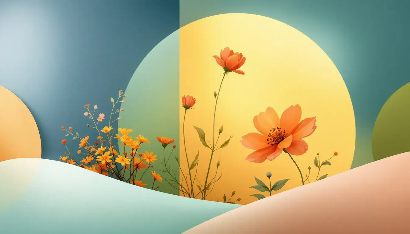
Season's Spectrum: Unveiling the Most Popular Palette for Spring 2025
24 May 2025 · 7 min readColor is more than just decoration; it's a form of immediate communication, influencing our perceptions and emotions. It sets moods. Considering Spring 2025, understanding the dominant color trends gets important. These palettes are not arbitrary choices; they reflect the collective mood, cultural shifts, and aspirations of a time. A good example is how the push for sustainability is reflected in designs with earthy tone combinations. How technology influences design is important, too, with brighter tone ranges that evoke futuristic moods. In this article, we look at several color concepts designed during the month of May of 2025, seeing what patterns they reveal, and which one looks most likely to capture the season. By understanding the different themes that are likely to be used, designers will make informed choices. The effect of these palettes could be used from fashion to interiors, from branding to digital art. By thinking about this colour information, one can consider both the current market context and future possibilities. Color palettes are the silent language of our world. Let's see which hues are expected to color Spring in 2025.
Earthy Fresh
The "Earthy Fresh" palette, with its grounding shades, makes a connection to nature and a promise of new beginnings. Using tones such as Off-White, Golden Yellow, and Lime Green, along with hints of Salmon Red and Forest Green, one evokes a clean, refreshing environment. It has a balanced profile, with moderate colour saturation and a brightness that is both inviting and grounding. Suitable for a range of applications, its influence will be felt in both kitchens and dining rooms, specifically suiting design themes from Farmhouse to refined Minimalist layouts. The industries following this pattern in its branding include Food and Wellness. It will be seen on websites. The overall mood is Calm. It makes this tone selection suitable for projects aiming to create a tranquil, healthy environment. This palette creates the season of Spring through an impression of life, with the forest and farm life tones combining to deliver a vivid freshness. This will be the palette used for branding of fresh produce. The key characteristic of all tone selections is to emphasize the value of sustainable living. The "Earthy Fresh" palette is an example of how color choices tell about our relationship with the natural sphere through subtle suggestion.
Global Grocer
The Global Grocer palette stands out by capturing international food markets, as signified by its name. It has shades such as Off White, Light Peach and Light Teal, together with accents of Golden Orange, Steel Blue, Bright Red and Forest Green. This blend creates an array of visual effects, balancing the warm and cool colours, with medium-high brightness. It creates a fresh, everyday feeling, suiting the season. One can expect to see this used heavily in Kitchen and Dining Room interiors, with Mininalist or Scandinavian designs. The colours are a suggestion of a balanced and healthy food plate. Industries such as Food and Retail are likely to pick this up in their branding. The color harmonies make it suited for all kinds of webpage design as well as branding guidelines. The emphasis on freshness with this palette is particularly suited to representing produce. The color choices show international appeal, hinting at the exotic tastes from food markets across the globe. The “Global Grocer” palette is a celebration of international culture. The palette's colours invite the consumer to experience the cultural variety of flavours.
Teal Harmony
The "Teal Harmony" palette provides a sense of relaxation and brings forth calmness, as it has shades of Pale Aqua, Vibrant Orange and Bright Cyan, with Teal Green and Tan Brown accents. Suited for spring, it emphasizes a sense of freshness with its aqua shades. Given a cool tone balance with a reasonable saturation, it will suit brands and interior design that aim for relaxation during times of stress. The interior designs may contain Coastal and Scandinavian styles, fitting the colour moods to give a more comprehensive outlook. It is likely that healthcare and wellness brands will pick up the "Teal Harmony" for projects such as rebranding or websites. The selected colours will particularly suit web design given the harmony and relaxed appearance. Colour arrangement aims for a balance where one feels fresh during times of stress. Its "calm" mood will suit bedrooms and bathrooms, inviting one to unwind from their daily concerns. The palette creates an environment where one feels the sea, inviting peace and clarity. Overall, the tone selection speaks of both peace and vibrancy, suiting the new growth that epitomises the season .
Ethereal Harmony
The "Ethereal Harmony" palette brings a mix of airy calmness with modern taste, as can be seen with its shades of Light Grayish White, Electric Cyan, and Mustard Yellow. Its inclusion of Dusty Gray, Vivid Cyan, and Olive Drab brings a full colour range to suit all kinds of art and tech projects. Given the relatively desaturated shades, with medium-bright lighting, this palette will be suitable for making relaxed moods. Its themes – “Calm Serene” and “Minimalist Modern” – makes it an option for application in Living Rooms and Bedrooms, emphasizing both Scandinavian and Contemporary designs. The colour design suits both Spring and Summer. Given the palette's relaxed moods, health and tech industries are likely to adapt it for web designs and branding. The "Ethereal harmony" evokes a clean and peaceful environment, promoting creativity. With a balanced tone and freshness in the Electric Cyan, this palette suits all kinds of applications. The design emphasizes our digital world with its clean colours.
Conclusion
As we face the changing seasons of 2025, the color spectrum tells a larger story about cultural shifts, environmental consciousness, and our technology. The palettes we see will have an effect on design and reflect consumer preferences. The emphasis on Earthy Fresh and Global Grocer shows how important it is to be aware of sustainability and the impact of international culture. The fact that Teal Harmony and Ethereal Harmony are used means people have a need for calm. In this analysis, Spring leans towards those colours that balance peace and invigoration. These colour trends provide a window into the general direction that can be used in interior design and branding, reflecting the cultural attitudes during that season. As we understand, color affects more than just the aesthetic factors. The language of colours allows us to reflect the mood of society.