'%3e%3cpath%20fill-rule='evenodd'%20clip-rule='evenodd'%20d='M51.1303%2019.2492C50.7278%2019.913%2050.1346%2020.4426%2049.3508%2020.838C48.5669%2021.2335%2047.6172%2021.4312%2046.5014%2021.4312C44.8208%2021.4312%2043.4367%2021.0216%2042.3492%2020.2025C41.2617%2019.3833%2040.6686%2018.2394%2040.5697%2016.7706H44.4253C44.4818%2017.3355%2044.6831%2017.7804%2045.0291%2018.1052C45.3751%2018.43%2045.8164%2018.5924%2046.3531%2018.5924C46.8192%2018.5924%2047.1864%2018.4653%2047.4547%2018.2111C47.7231%2017.9569%2047.8572%2017.618%2047.8572%2017.1943C47.8572%2016.8129%2047.7337%2016.4952%2047.4865%2016.241C47.2393%2015.9867%2046.9322%2015.7784%2046.565%2015.616C46.1978%2015.4536%2045.6893%2015.2594%2045.0397%2015.0334C44.0934%2014.7086%2043.3202%2014.3944%2042.72%2014.0907C42.1197%2013.7871%2041.6042%2013.3351%2041.1735%2012.7349C40.7427%2012.1347%2040.5273%2011.3544%2040.5273%2010.394C40.5273%209.50418%2040.7533%208.73448%2041.2053%208.08481C41.6572%207.43515%2042.2821%206.93731%2043.0801%206.5913C43.8781%206.24528%2044.7925%206.07227%2045.8235%206.07227C47.49%206.07227%2048.8141%206.46771%2049.7956%207.25861C50.7772%208.04951%2051.3315%209.13698%2051.4586%2010.5211H47.5395C47.4689%2010.0268%2047.2888%209.63483%2046.9993%209.3453C46.7097%209.05578%2046.3178%208.91102%2045.8235%208.91102C45.3998%208.91102%2045.0573%209.024%2044.7961%209.24997C44.5348%209.47594%2044.4041%209.80783%2044.4041%2010.2457C44.4041%2010.5988%2044.5207%2010.8989%2044.7537%2011.146C44.9867%2011.3932%2045.2798%2011.5944%2045.6328%2011.7498C45.9859%2011.9052%2046.4944%2012.1029%2047.1581%2012.343C48.1185%2012.6678%2048.9023%2012.9891%2049.5096%2013.3069C50.1169%2013.6246%2050.6395%2014.0872%2051.0773%2014.6945C51.5151%2015.3018%2051.734%2016.0927%2051.734%2017.0672C51.734%2017.8581%2051.5328%2018.5854%2051.1303%2019.2492ZM59.0242%206.3053V21.2829H55.4016V6.3053H59.0242ZM73.9409%206.3053V9.18642H69.8734V21.2829H66.2296V9.18642H62.2046V6.3053H73.9409ZM80.7438%209.18642V12.3218H85.8069V15.0546H80.7438V18.3806H86.4425V21.2829H77.1212V6.3053H86.4425V9.18642H80.7438ZM99.667%2016.0291V21.2829H96.0444V6.3053H101.913C103.692%206.3053%20105.048%206.74665%20105.98%207.62934C106.912%208.51204%20107.378%209.7019%20107.378%2011.199C107.378%2012.1311%20107.17%2012.9609%20106.753%2013.6882C106.337%2014.4155%20105.719%2014.9875%20104.9%2015.4042C104.08%2015.8208%20103.085%2016.0291%20101.913%2016.0291H99.667ZM103.692%2011.199C103.692%209.8855%20102.965%209.22879%20101.51%209.22879H99.667V13.1268H101.51C102.965%2013.1268%20103.692%2012.4842%20103.692%2011.199ZM120.092%2018.5501H114.478L113.546%2021.2829H109.732L115.219%206.41123H119.393L124.879%2021.2829H121.024L120.092%2018.5501ZM119.16%2015.7961L117.295%2010.2881L115.41%2015.7961H119.16ZM131.555%2018.5077H136.385V21.2829H127.933V6.3053H131.555V18.5077ZM143.337%209.18642V12.3218H148.4V15.0546H143.337V18.3806H149.035V21.2829H139.714V6.3053H149.035V9.18642H143.337ZM163.507%206.3053V9.18642H159.44V21.2829H155.796V9.18642H151.771V6.3053H163.507ZM177.449%206.3053V9.18642H173.382V21.2829H169.738V9.18642H165.713V6.3053H177.449ZM184.252%209.18642V12.3218H189.315V15.0546H184.252V18.3806H189.951V21.2829H180.629V6.3053H189.951V9.18642H184.252Z'%20fill='%23EEF0ED'/%3e%3cmask%20id='mask0_3101_7327'%20style='mask-type:alpha'%20maskUnits='userSpaceOnUse'%20x='0'%20y='0'%20width='27'%20height='28'%3e%3cpath%20d='M23.8328%200.759766H2.64808C1.18559%200.759766%200%201.94535%200%203.40785V24.5925C0%2026.055%201.18559%2027.2406%202.64808%2027.2406H23.8328C25.2952%2027.2406%2026.4808%2026.055%2026.4808%2024.5925V3.40785C26.4808%201.94535%2025.2952%200.759766%2023.8328%200.759766Z'%20fill='white'/%3e%3c/mask%3e%3cg%20mask='url(%23mask0_3101_7327)'%3e%3cpath%20d='M23.8328%200.759766H2.64808C1.18559%200.759766%200%201.94535%200%203.40785V24.5925C0%2026.055%201.18559%2027.2406%202.64808%2027.2406H23.8328C25.2952%2027.2406%2026.4808%2026.055%2026.4808%2024.5925V3.40785C26.4808%201.94535%2025.2952%200.759766%2023.8328%200.759766Z'%20fill='%23D8D8D8'/%3e%3cpath%20d='M13.2404%200.759766H0V14.0001H13.2404V0.759766Z'%20fill='%238C61FF'/%3e%3cpath%20d='M13.2404%2014H0V27.2404H13.2404V14Z'%20fill='%2336C3FE'/%3e%3cpath%20d='M26.4806%2014H13.2402V27.2404H26.4806V14Z'%20fill='%236592FE'/%3e%3cpath%20d='M26.4806%200.759766H13.2402V14.0002H26.4806V0.759766Z'%20fill='%236059F7'/%3e%3c/g%3e%3c/g%3e%3cdefs%3e%3cclipPath%20id='clip0_3101_7327'%3e%3crect%20width='190'%20height='28'%20fill='white'/%3e%3c/clipPath%3e%3c/defs%3e%3c/svg%3e)
'%3e%3cpath%20d='M23.8328%200.759521H2.64808C1.18559%200.759521%200%201.94511%200%203.40761V24.5923C0%2026.0548%201.18559%2027.2404%202.64808%2027.2404H23.8328C25.2952%2027.2404%2026.4808%2026.0548%2026.4808%2024.5923V3.40761C26.4808%201.94511%2025.2952%200.759521%2023.8328%200.759521Z'%20fill='%23D8D8D8'/%3e%3cpath%20d='M13.2404%200.759521H0V13.9999H13.2404V0.759521Z'%20fill='%238C61FF'/%3e%3cpath%20d='M13.2404%2013.9998H0V27.2402H13.2404V13.9998Z'%20fill='%2336C3FE'/%3e%3cpath%20d='M26.4809%2013.9998H13.2405V27.2402H26.4809V13.9998Z'%20fill='%236592FE'/%3e%3cpath%20d='M26.4809%200.759277H13.2405V13.9997H26.4809V0.759277Z'%20fill='%236059F7'/%3e%3c/g%3e%3c/svg%3e)
Diving Deep: Monochromatic and Analogous Color Palette Trends
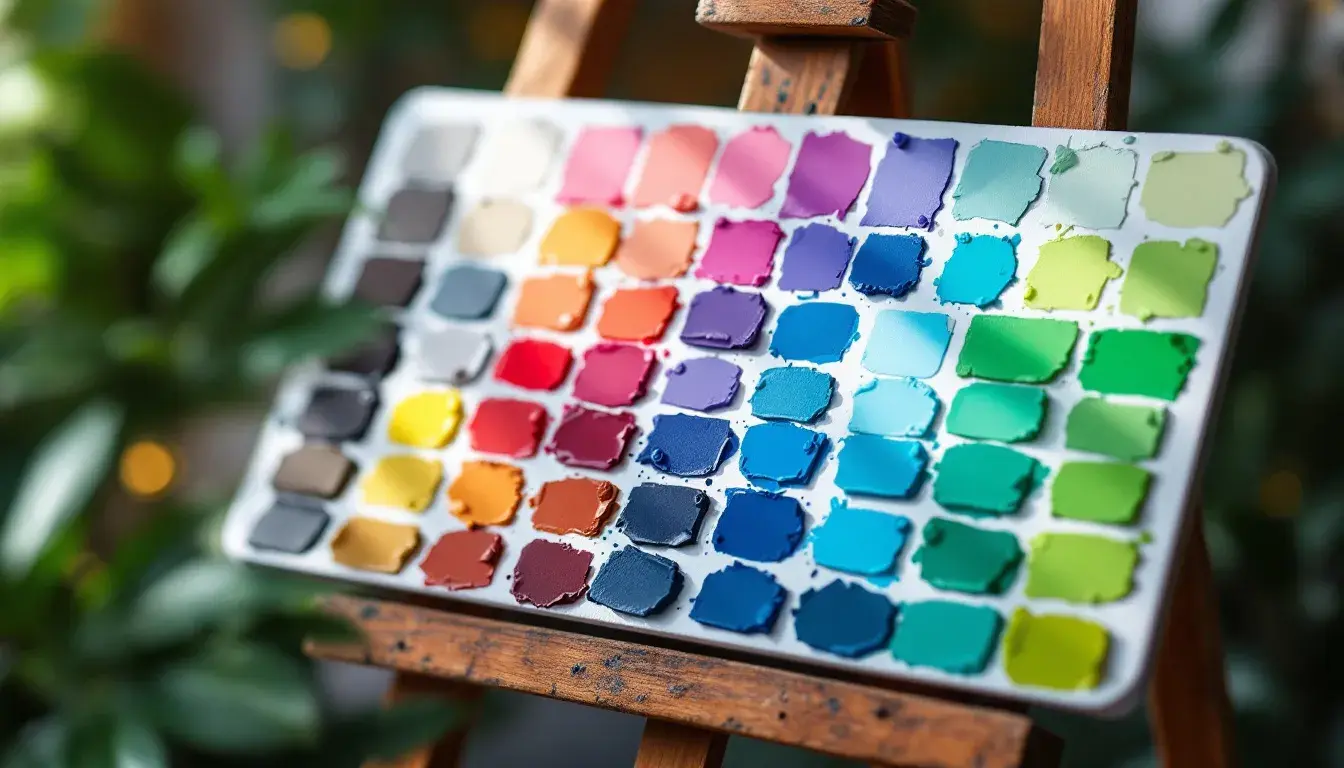
22 May 2025 · 7 min readColor palettes are more than just combinations of hues; they are tools with which we shape feeling, brand identity, and user experience. Understanding how different color schemes operate can markedly change how we approach design. This analysis focuses on monochromatic and analogous color schemes and how different palettes utilize them. Specifically, we will examine how color schemes influence design choices across various applications, from government branding to supermarket aesthetics. By contrasting these elements, we see how color theory translates into real-world applications and design possibilities, and that, while other options are theoretically available, the design world mainly leans on these two distinct, yet related, ways to use color. This exploration offers valuable insights for designers looking to effectively use color to meet specific goals and evoke certain reactions from their target audiences while maintaining their artistic vision and commercial targets. Now, let's explore how these themes appear in different color palettes.
Unpacking Key Palettes
Government Palette
The "Government Palette" steers into serious professional territory. Its chosen colors, Taupe Gray, Sandy Beige, Slate Blue, Deep Azure, and Charcoal Black, propose power and tradition. Reflecting a 'Cool Balanced' warmth/coolness attribute, the tone sets a serious yet stable mood. Its color schemes are Monochromatic and Analogous, both suggesting a measured, reliable approach. In government and education sectors, this palette can build trust through websites and branding. Consider how the dominant deep azure, often paired with white, would create a dependable official image. The slate blue and charcoal combination suggests authority, while the beige shades soften the overall look, making it approachable. Designed to be used in Autumn and Winter, this palette would ideally furnish an office or study, specifically in traditional and contemporary interior design styles, offering an environment that feels both formal and up-to-date. This palette uses analogous harmony – colors that sit next to each other on the color wheel – to reinforce its professional tone.
Seoul Supermarket
"Seoul Supermarket" makes use of fresh, inviting tones appropriate for its theme. The palette includes Soft Blue-Green, Golden Yellow, Muted Teal, Deep Evergreen, and Dark Coffee. Categorized as 'Cool balanced', it suits use in the spring and summer. The brightness level is 'High brightness', and the saturation is categorized as medium. This color story leans on Monochromatic and Analogous color schemes. This palette could energize retail branding and web design. The soft blue-green with golden yellow can grab attention, making product displays attractive. The muted teal and deep evergreen add natural, organic feelings, while dark coffee adds a comforting grounding touch. This palette is perfect for minimalist or Scandinavian interiors in kitchens or dining rooms, adding cleanliness and style to the areas. The use of analogous colors evokes a sense of harmony and ease, inviting customers to browse and spend time. This palette is a study in how closely related colors create a welcoming experience.
Elegant Neutrals
The "Elegant Neutrals" palette has shades such as Light Beige, Soft Gray, Cool Gray, Olive Drab, and Dark Charcoal. Its color schemes are Monochromatic and Analogous, both which reflect a carefully structured and sophisticated look. With a 'Balanced' warmth/coolness feel, and a 'Medium' brightness level, its low saturation lends itself to creating calming atmospheres. This palette is perfect for use in the Autumn season. This is perfect for living rooms and bedrooms in sophisticated interior designs. Each color works to create a sense of calm, while also expressing its high-end market. In web design and branding, these colors suggest calmness. The light beige evokes openness, and the soft and cool grays make users comfortable, while the olive drab adds a touch warmth. Dark charcoal highlights and deepens the aesthetic. In industries such as luxury and real estate, the neutral tones would appeal to a demographic looking for refined style. The palette stands as a perfect example of how a tight color selection can lead to very luxurious results.
Balanced Harmony
"Balanced Harmony" evokes a modern, professional feel. It blends the colors Bright Mustard, Pale Apricot, Cool Gray, Dark Taupe, and Vivid Blue, setting a calm mood. The color schemes are Monochromatic and Analogous, and the palette has a Balanced warmth/coolness, medium brightness, and moderate saturation. This palette is ideal for web designs and branding in technology and finance. In minimalist or contemporary designed offices and living rooms, the harmonious combination of colors enhances a comfortable and attractive working environment. The bright mustard and pale apricot add a warm, inviting touch, while cool gray and dark taupe add a professional stability. The vivid blue then provides a burst of energy. During autumn, the colors reflect the change of seasons. They create an environment of concentrated creativity and organization in offices or living rooms. The analogous design inspires collaboration, perfect for projects requiring a strategic blend of creativity and efficiency.
Ethereal Dusk
The "Ethereal Dusk" palette uses shades such as Pale Lavender, Teal Green, Royal Blue, Shadowed Plum, and Midnight Purple. The 'Cool dominant' temperature and 'Dim' level of brightness, combined with moderate saturation, sets a calming tone. Its color schemes, Monochromatic and Analogous, make it suitable for a winter's evening. Perfect for minimalist or contemporary bedroom and office designs, it will work for technology and design branding and websites. As analogous schemes, it evokes feelings of unity and seamless transitions. The pale lavender can be used as a backdrop and the other colors can add intrigue. Royal blue or shadowed plum, used sparingly, gives depth and richness without overpowering the design. Midnight purple, as the darkest color, offers contrast and definition, grounding the palette's ethereal effect. This set of colors shows how dark and light, when used together, can create a unique atmosphere.
Leaning Toward Similarity: A Summary
After reviewing these five palettes, a trend emerges: the dominance of monochromatic and analogous color schemes. Every single palette defaults to use of one or both of these options. Monochromatic schemes, which use variations of a single color, provide simplicity and consistency, ideal for creating unified and comforting feelings. These are very popular in professional and luxury settings. Analogous schemes, which pair colors next to each other on the color wheel, creates a natural, harmonious picture. They are seen as inviting and calming, making them fit for use in both personal and commercial spaces.
The absence of complementary or triadic color schemes in the data speaks highly about current preference. The choice of monochromatic or analogous in palettes such as "Government Palette" and "Elegant Neutrals" underscores a preference for measured, controlled designs. Even "Seoul Supermarket," intending to attract attention, chooses an analogous palette to create a cozy, non-threatening environment.
The appeal of these color schemes is not arbitrary. Monochromatic and analogous patterns are easier to manage and less risky than color combinations that might appear disorganized or chaotic. As a result, they are preferred, especially in industries desiring to project trust, reliability, and sophistication. The tendency toward simpler color schemes reflects a wider move in design toward simplicity, quality, and user experience, valuing ease of use and visual peace over visual thrill. The lack of complementary style does not mean they are not employed, but indicates a strategic decision to favor more consistent and familiar combinations. Ultimately, the frequent usage of monochromatic and analogous color schemes shows their effectiveness in different design goals, providing a solid foundation for both visual appeal and practical application.