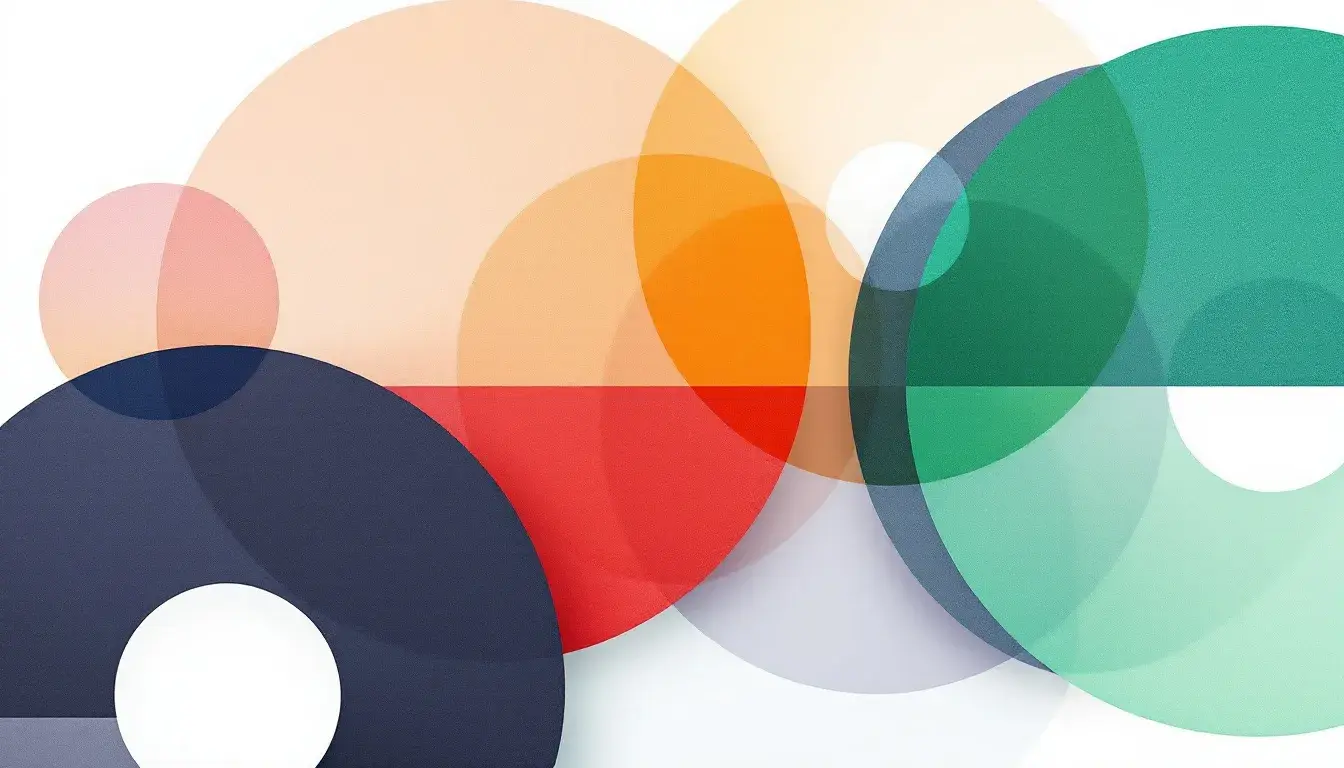
The Color Wheel of Industries: Who Favors What?
16 May 2025 · 3 min readColor impacts how we perceive brands and their industries. Certain colors become closely associated with particular fields, creating a visual shorthand for consumers. Let's explore a few color palettes and their industrial applications.
Bold Contrast 🎨
The "Bold Contrast" palette, favoring pale peach, seafoam green, bright red, deep wine, and ebony black, presents a modern and bold aesthetic. Its balanced warmth and coolness is applicable to the marketing and technology industries. The dominant colors of white, dark gray, and crimson suggest a powerful but elegant style. It is fitting for branding and web design projects, especially when promoting a robust and assertive presence. Deep wine and ebony black may signal sophistication, which can be useful in businesses.
Turf Mutt 🐕
"Turf Mutt" with colors like Cream, Golden Poppy, and Lime Green suggests a natural, energetic feel. Dominant colors are Green and White. Well-suited for landscaping and pet care, the spring-themed palette is ideal for conveying vitality. Project applications for this palette include websites and branding, particularly if the brand aims to connect with consumers through nature or outdoor associations. The presence of Scarlet and Steel Blue add striking visual components, enabling a brand to grab attention, though care should be taken when blending, as they can overwhelm.
Modern Gradients 🎨
The cool-dominant palette "Modern Gradients", consisting of Lavender Blue, Light Indigo, Dark Gray, Plum, and Dark Charcoal, lends itself well to technology and design industries. Its calm aura makes it apt for minimalist and contemporary designs. The dominance of Gray and Blue with a plum accent suggests reliability, modernity and thoughtfulness. Websites and branding projects can get an elegant touch from its medium-bright saturation level.
Vibrant Contrast 🎨
"Vibrant Contrast" uses Off-White, BrightCyan, and Black. Its cool balanced tone is suitable for technology and design industries, especially for a modern and minimalist approach. The combination of cyan and black suggests innovation, modernity, and a forward-thinking approach. Websites and branding projects benefit. The contrasting colors communicate clarity and sophistication.
The Strategic Color Selection Across Industries
As we've explored these diverse palettes, clear patterns emerge in how different industries leverage color psychology to communicate their values and appeal to their target audiences. The marketing and technology sectors often gravitate toward bold contrasts and vibrant elements that command attention, while nature-focused businesses embrace earthy greens and energetic yellows that evoke growth and vitality.
The technology and design industries show particular versatility, spanning from the cool reliability of "Modern Gradients" to the stark innovation suggested by "Vibrant Contrast." This adaptability reflects the diverse needs within these sectors—from establishing trust and dependability to showcasing cutting-edge innovation.
When selecting a color palette for your industry, consider not just current trends but the fundamental psychological associations your audience makes with specific colors. The most effective industry palettes don't merely look appealing—they strategically reinforce brand values and create immediate recognition in an increasingly competitive visual landscape. By understanding these industry-specific color preferences, designers can create more targeted, effective visual communications that resonate with their intended audiences.